shattered-earth:

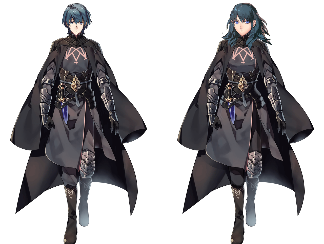
making edits that actually reflect equality of presentation between the two byleths in fire emblem three houses because i think the official outfits are a fucking farce 

we could have bad bad ass f!byleth instead of dressed in the dark in a hot topic byleth jesus

@shattered-earth, who contributed some really great stuff in our redesign tag (among others), never disappoints. Unlike Fire Emblem, which is always eager to indulge in blatant double standards, male-gazey female costumes and general creepyness (like the jailbait dragon). 

It seems like the designers thought the lack of pants between male and female version of FE Fates protagonist, Corrin, was too subtle and went “Hold my beer!” for the next game. 

Glad to see @costumecommunityservice‘s method of leveling the playing field in male/female design comparison employed. We just introduced a new tag for post that use it: costume gender exchange
I just wish this here dude redesign was pantless too. 

Throwing in original versions next to one another, for the reference. 
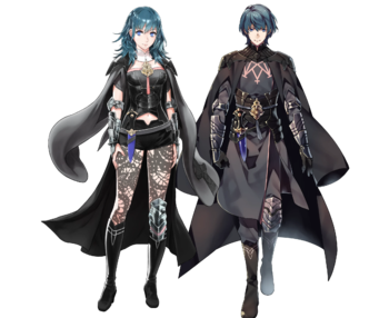
image

Who the hell approved that as equal? Oh wait, we know who

~Ozzie 

h/t: Spag 

Fire Emblem: Pantsening, Part 2

I seriously needed Icy’s last post to remind me where that character comes from! With all those anime-style underclad game heroines I can not tell anymore the difference between That Popular jRPG Which Panders to Perverts More With Every New Game, That Harem Thing With Undressed “Defeated” Sprites and That Sexy Flower Warrior Girl Hentai. Turns out it was the first one. ¯_(ツ)_/¯


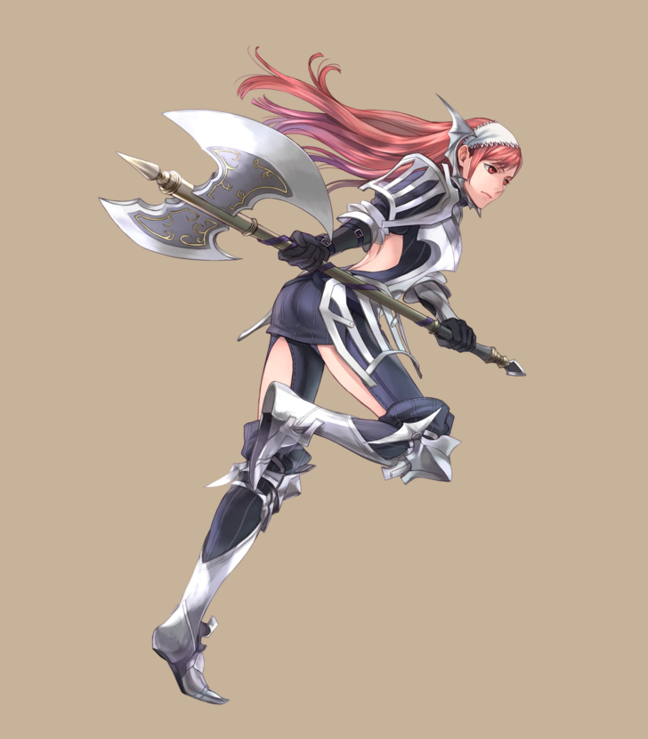
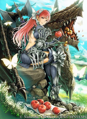
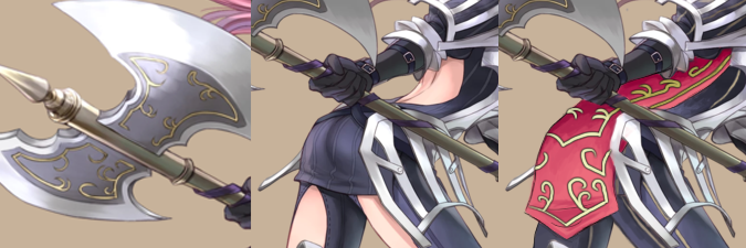
So the character I worked with is Cherche, the wyvern rider. You can totally tell that this lady mounts a big scaly monster by the all the protection her legs get against the chafing, right? 

image

And then there’s the very practical bare back. 

It’s one of those very frustrating designs which you can tell were referenced from some real armor and had some interesting shape language incorporated, then at some point someone just went “FUCK IT, WE NEED TO SEE SOME SKIN!” and cut out a huge chunk of fabric in a few vital places. 

image

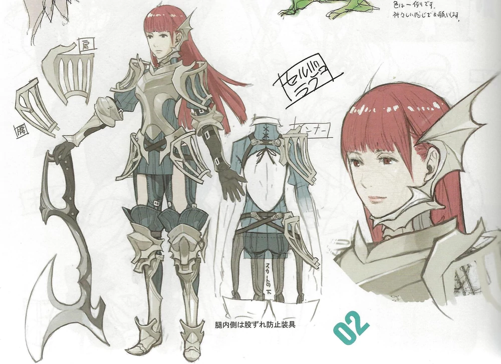
It’s a shame, because while I doubt the practicality of her perforated pauldrons and tassets, they’re very interesting visually and make her costume stand out so much better than the shmexy back and thigh cutouts do. 

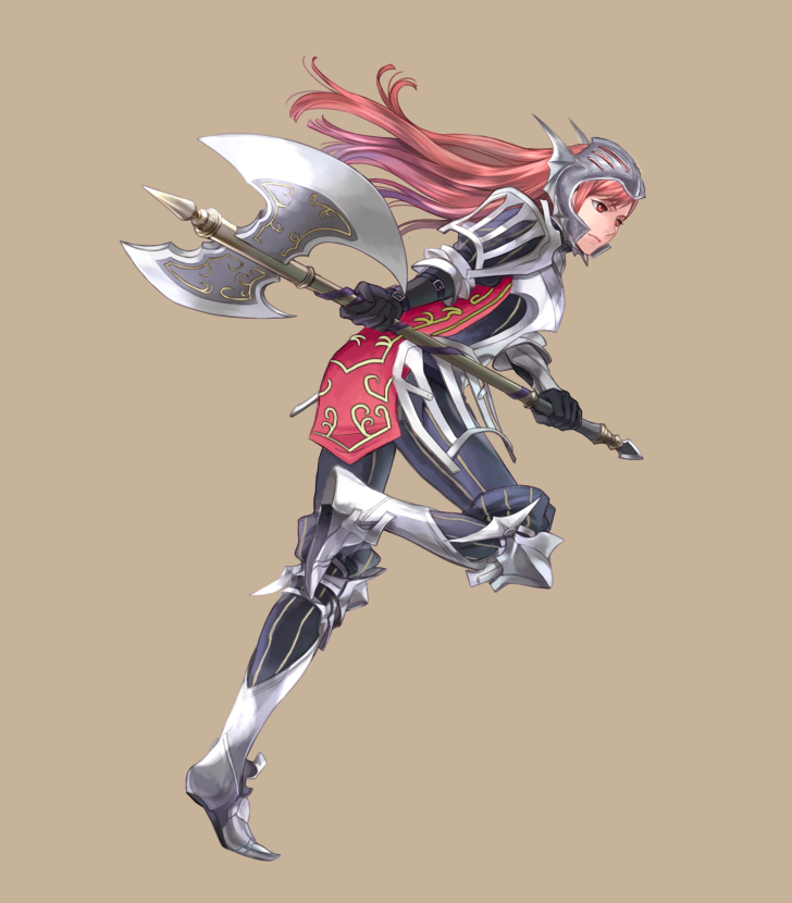
So, of course, my main goal was to get rid of those holes and make it look like a full set of armor. While the pants demanded only to patch those holes with the color of the fabric, I figured that doing the same for the back would be boooring. So I decided to add a tabard, which would also be a splash of color this grey-navy design so desperately needs. I went for rosy pinkish color similar to her hair and lined with golden detailing based on the design on her axe. I’m quite proud of how it came out.

image

The shape of the tabard also helped to mask  the @eschergirls anatomy and not to make this picture all about her butt.

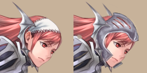
Smaller, but still relevant change was turning her weird batwing gorget (?) into a full helmet (with grilling similar to that on her shoulders and hips). It’s not supposed to be realistic of fully protective, but counts for something.
She, as an axe wielder, should really know that a lacy kerchief won’t protect her cranium from getting split open. 

image

~Ozzie

Fire Emblem: Pantsening, Part 1

(The title is not a joke on Awakening, I know Nyx is not from that game.)

So, doing redesigns for the game series that keeps on giving… its lady characters no pants. I don’t even care if they’re garbage pants, can they please have something, so that they’re not riding frigging scaley wyverns with bARE LEGS-

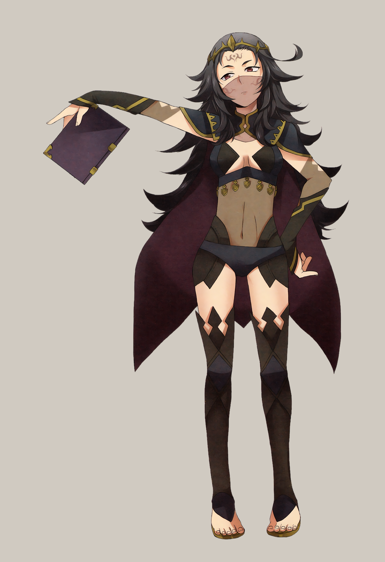
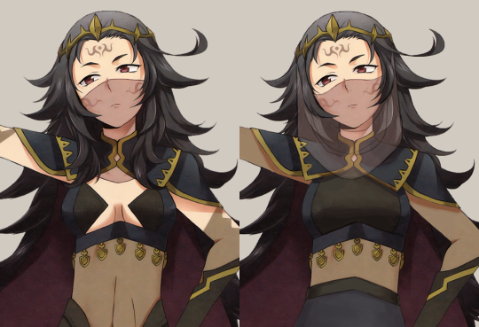
Ahem. Anyway, Fire Emblem. I decided to redesign Nyx. I don’t know what it is with me and FE dark mage types. Mostly, what caught my eye was that this was another FE woman who looks way younger than her age, while wearing strangely revealing clothes.

image

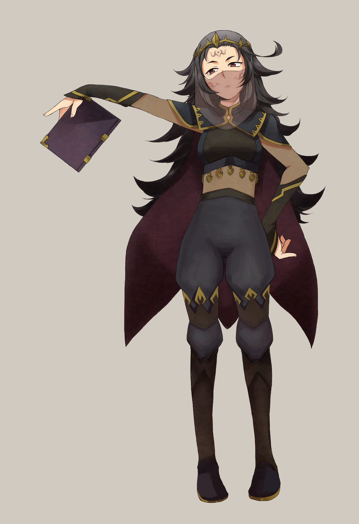
Most of the edits I did involved giving her an actual shirt, rather than…. uhh?? … as well as some PANTS. I also broke up her shoes into two parts mostly for the design aspect. Such tall thigh-highs make any non-leggings look weird. The last big change was her veil, which I tried to make a little more realistic-looking. I’m not sure how, in the original, the veil is supposed to be hanging down, but then be behind her long bangs that fall close to her face??

The dark skin-tone parts on her clothes are opaque, by the way. I was just too lazy to come up with another color for them, to be honest. This was definitely one of those streams where I was struggling to work with what I had… I probably could have done a better job given more time, but I’m fairly happy with it as it is now. I promise I’ll do a non-mage the next time we redesign Fire Emblem ladies.

-Icy

bikiniarmorbattledamage:

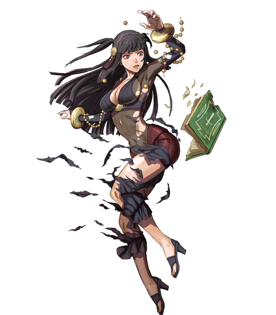
Fire Emblem Heroes has already been getting some flack for their uninspired character design, and this is a good comparison of the changes made to Rhajat for Heroes. Her original design still has problems, primarily the nylon tech this fantasy country seems to have, but the new version (named Virghat) is just so much worse. From the wiki entry on Rhajat:

…It is revealed that her cold personality is a means to mask her loneliness due to being raised in the Deeprealms by herself.

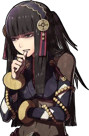
I’d believe that description, given that this was her sprite in Fates:

image

She’s hunched over, her eyes are in shadow, and her arms are in front of and around herself protectively. But the Heroes design and posture? All I’m getting from it, is generic poker-faced cute caster. 

Oh, and of course, there’s a damage sprite, as mentioned in the comparison image.

image

Sigh.

image

-Icy

h/t: thekaizaverse

In these troubling times where our social media platforms must scramble frantically, expunging massive amounts of imagery as the only means to protect us from anything titillating it’s a comfort to know that there will at least be good wholesome content from family friendly companies like Nintendo who make games you can play in your living room or in public without it getting awkward!

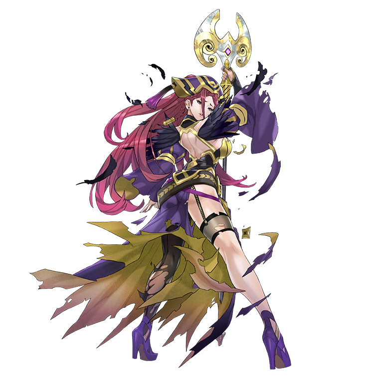
As a side none, it appears that they decided to really lean into the damage sprite with her fashion sister, Loki.

image

– wincenworks

Image from the Official Site for Fire Emblem Heroes

Fire Emblem Gals Part 1

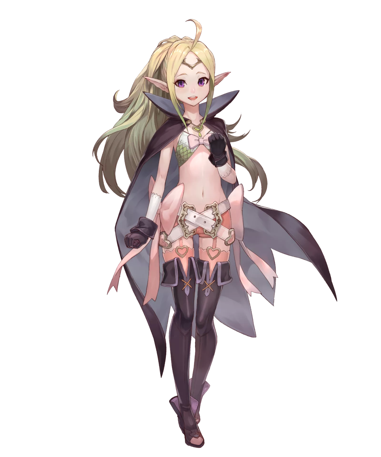
We are assured that Fire Emblem is great game franchise with engaging characters. We have to take the readers’ word for that, because we always find a distinct dissonance between how FE female characters look and what their bios tell us about their stories and personalities. This week, my take on Nowi, the loli dragon.


Nowi 

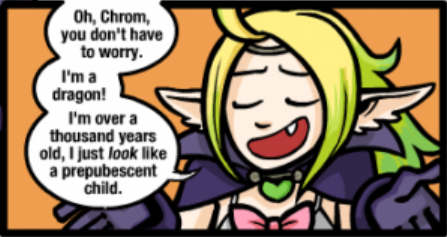
Nowi of Fire Emblem Awakening embodies the “beloved” trope of a centuries-old being taking on the appearance of an underage girl… Who is open as a romance option to the player character. Never forget that Awkward Zombie comic which makes fun of it

image

She chose to wear that!” is a bullshit excuse for a grown woman character running around a battlefield in a bikini, let alone for a thousand year old magical creature who also chooses to have the body and face of a child.

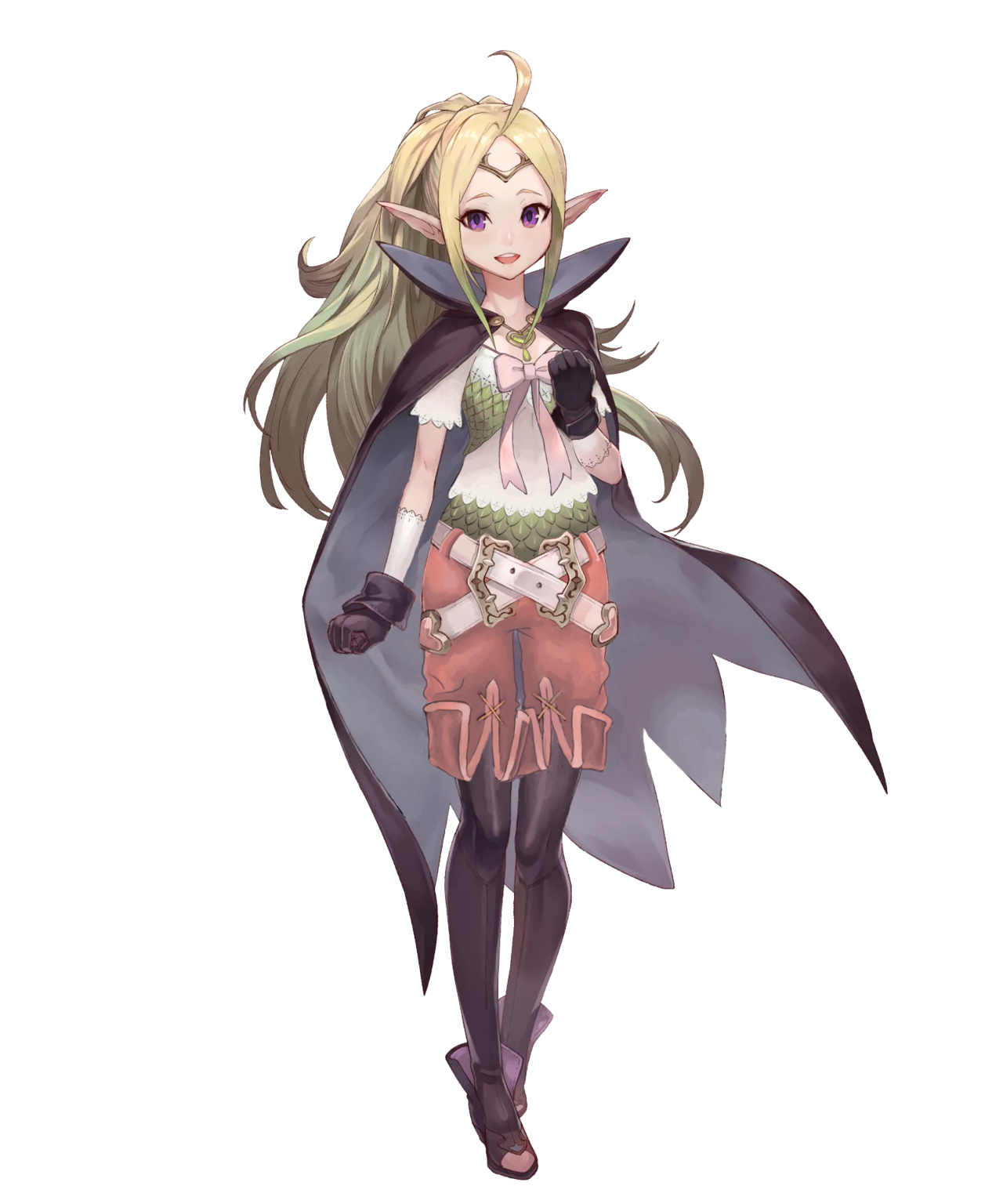
Since she’s really a dragon and probably needs no armor, the goal of redesign was to give her clothes that would look appropriate (rather than protective) for someone who takes form of roughly a 12-year old. 

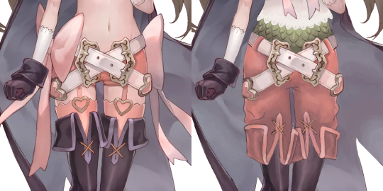
I actually found the color scheme and many shapes in Nowi’s costume very good, just wasted because the focus was on showing skin and adding too many decorations. 

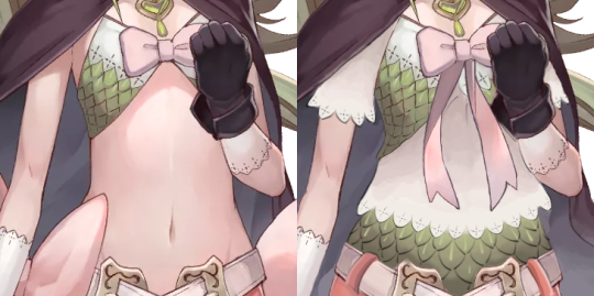
I decided that her teeny tiny scaly bra would make a good vest, if put on top of a crop t-shirt with the same lace finish as those white gloves… which she wears under the black gloves?
Then, since I liked the scale pattern a lot, I recreated it also on her belly. Is that a matching undershirt or her real dragon skin? Who knows! It looks cool. 

image

The area between her belly and knees was made of pure visual noise. It was sexualized and overdesigned at the same time.
The only ridiculous thing I decided to leave in were the crossing belts, because they look cool enough and aren’t implausible… Provided that I added belt loops to her pants. Speaking of which, fetishy short shorts connected to stockings with garter belts had to go, for obvious reasons. 
Since her shoes had such a strange shape, I decided to turn them from thigh-highs with inexplicable ankle boots bottom into tights and ankle boots. All it took was to reverse and change the hem of the boots into that of short pants. 

image

Ribbons weren’t a bad idea on their own, but they just completely didn’t belong as decoration on her sides, so I got rid of them and just transplanted the long tails onto her chest ribbon, making it both cuter and a more prominent splash of pink on her upper half.

All in all, it’s one of my favorite, while most subtle, redesigns. Probably also my best simulation of the original’s coloring style. I really hope it managed to turn creepyness of a sexualized childlike character into cuteness.

~Ozzie 

enecola:

So far the most requested armor fix – Female Corrin in her Nohr Noble armor!

Not gonna lie, I’m not sure why they keep designing those chafing hazards. That honestly bothers me more than the huge boob windows by now.

What a lovely fix! I realize that not a lot had to be changed from the original, but I really like the top of the breastplate, the longer sleeves and the chainmail. There are a lot of strange holes in the armor in the original, so it’s nice to see them gone. And I actually like that the pauldron was made smaller, just because it looks so out-of-place in the original. One thing I would personally change is add a gold accent to the bottom edge of her breastplate. Overall, I think this is a great armor fix.

According to lore, the character does have to be barefoot, but the excuse that it’s because she turns into a dragon is Not Good. I’m not mad about it, in any case. She can still wear socks.

-Icy

enecola:

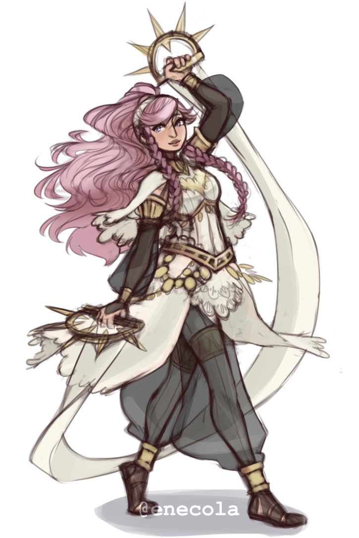
Armor Fix for Olivia!

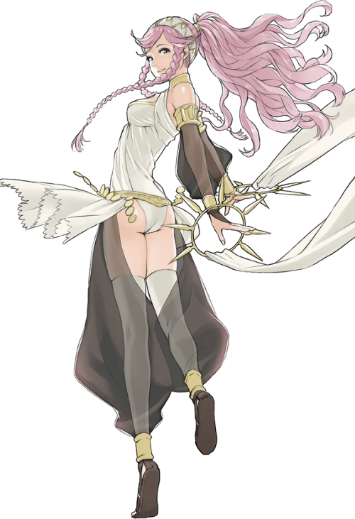
Her legs must hurt… Olivia is pretty fun but I never understood why they made her use a sword when she had these cool rings. Like… that’s not less believable that chrom using his dumbass swords that he keeps sticking into the ground all the fucking time.

I think that fixing a plate armor design is fairly straight-forward in what needs to fixed: put a functional breastplate on the tiddy, add protection to some vital areas that got missed, and add some fabric in-between to pad the armor. I find it harder to fix armor for characters who don’t really wear it. This redesign did that wonderfully. It’s just so darn beautiful!

In Fire Emblem Awakening, Olivia starts out as a Dancer class, and boy do her dancing animations with that original getup look like absolute crap. But I would loooove to see the redesign in motion! There’s so much more potential for interesting movements with all that flowing fabric. I also never noticed Olivia even had a jingly belt until I saw the redesign, and then looked back at the original. That’s how you know you have a Quality Character Design.

I love the subtle touch of the seam lines going down her legs, which lets us know that even underneath the transparent fabric, she is wearing opaque tights. It really is the little things.

I definitely look forward to featuring more of this artist’s redesigns on the blog. <Sequel Hook>

-Icy

Tharja – Medieval Fantasy Body Stocking Technology

Jumping forward a few streams for this post, since this was back when I went way over our allotted time, and those old designs aren’t done yet… They’ll be done one day. ヽ༼ຈل͜ຈ༽ノ

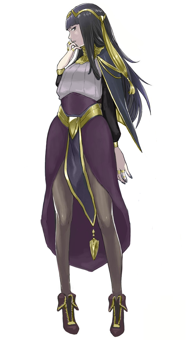
So this was more of a fashion redesign exercise. Tharja, from Fire Emblem Awakening, is a sorceress. In terms of game mechanics, they tend to stay in the back and be pretty squishy, so I don’t expect her to wear full plate. I just wanted her to not wear… that thing. The body stocking, that somehow exists in this universe. Oh, and she comes from a hot desert region, so….

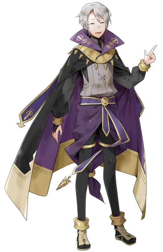
Since this is a fantasy universe that borrows very little from actual desert-dwelling peoples, I took inspiration from her counterpart, who’s from the same country. He looks like this:

image

So I took the skirt-like thing and the shirt he wears and adjusted it for Tharja. I liked her belt, so I kept it, and instead changed the waistline of the skirt to try and form some nice shapes.

Because of the skirt, however, the cape became redundant. I tried 2 different versions of it before scrapping it. Looking at it now, I should have just made it connect to her sleeves at the wrist. Without the cape, the little dangly things on it looked weird, and I hated her hair from the start, so I basically just moved the shapes around. Got rid of the ponytail thing, while adding a similar shape to her circlet, though I probably should have made it smaller. As for her tights, I was too lazy to paint over them, but in theory, they’d be like Henry’s (the boy above) legging-type things.

The last thing I did was adjust the color balance. Her colors were so muted in the original, especially her golden accents, so I upped the saturation on that to complement the purple.

Overall, I was trying to go for a more professional, distancing look. Tharja is antisocial and strange, after all. I do like the redesign, though there’s always things you see after you “finish” a work that could be improved upon. Honestly, I kind of want to redo Henry’s design, cause it’s kinda bad… Purple on purple; genus.

-Icy

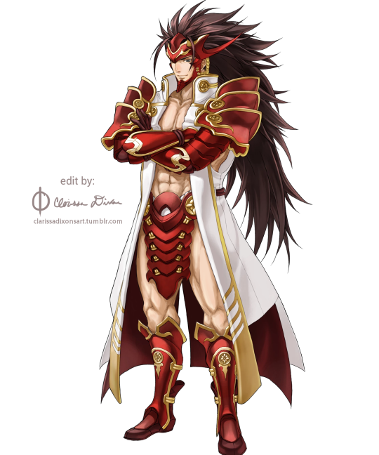
/Whispers/ you should totally do pantsless Ryoma

clarissadixonsart:

image

OK, so I had a lot of fun with this one ?
I forgot how much I enjoy practicing anatomy and whatnot, so this was a treat!

My other edits:
Berkut | Takumi | Shigure

We featured another one of @clarissadixonsart‘s Pantless Emblem redesigns before. But Ryoma, with his loin flap, is probably my favorite one.

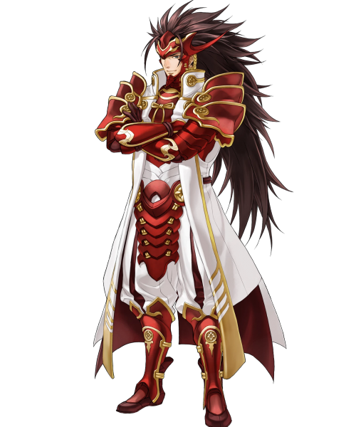
Original: 

image

I wish Fire Emblem was self-aware enough to serve the same sort of costume design for male and female heroes without the need of fanmade fixes…  >_>

~Ozzie 

The empowered version really is so much better design-wise. I mean, the original had white-on-white! Who thought that was a good idea? But in the edit, his skin becomes a contrasting color, and my eyes don’t unfocus looking at him. Not to mention, getting rid of all those pesky armor bits on his torso gives us several clear points of red breaking up the large white shape that is his coat, rather than sticking so much red together around his chest. It’s just better on the eyes in every way~

-Icy

Anonymous:

/Whispers/ you should totally do pantsless Ryoma

clarissadixonsart:

image

OK, so I had a lot of fun with this one ?
I forgot how much I enjoy practicing anatomy and whatnot, so this was a treat!

My other edits:
Berkut | Takumi | Shigure

We featured another one of @clarissadixonsart‘s Pantless Emblem redesigns before. But Ryoma, with his loin flap, is probably my favorite one.

Original: 

image

I wish Fire Emblem was self-aware enough to serve the same sort of costume design for male and female heroes without the need of fanmade fixes…  >_>

~Ozzie 

The empowered version really is so much better design-wise. I mean, the original had white-on-white! Who thought that was a good idea? But in the edit, his skin becomes a contrasting color, and my eyes don’t unfocus looking at him. Not to mention, getting rid of all those pesky armor bits on his torso gives us several clear points of red breaking up the large white shape that is his coat, rather than sticking so much red together around his chest. It’s just better on the eyes in every way~

-Icy