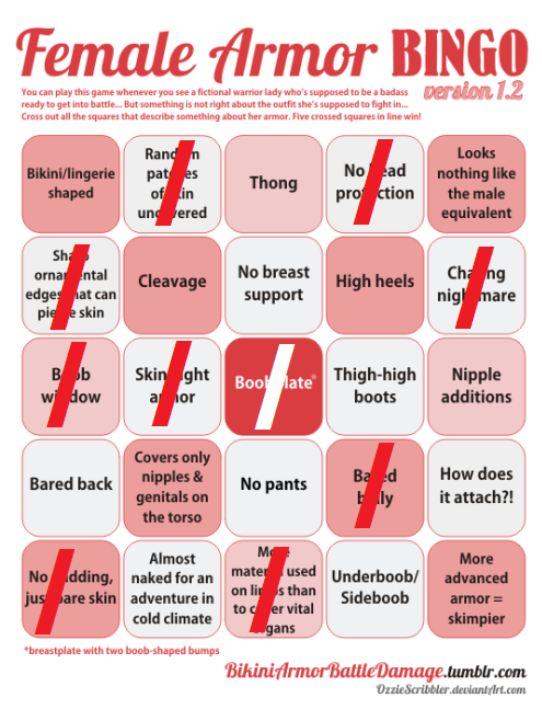
After much deliberation (and coming to a conclusion that a 5-day judging deadline that intersects with our holiday season wasn’t a wise idea), BABD is proud to present winners of the Break the Bingo design contest!.
But first, let’s give shout-out to those of fans who started working on their designs, but didn’t end up officially submitting them, particularly the artists who tagged us in their WIP posts. Those drawings, even when unfinished, were pretty great!
We’re amazed by the ultimate turn-out. A lot of contestants put extra effort into their entries, by doing things things like:
putting them into a form of a comic/concept art pitch/fake advertisement
It’s a bit scary just how close to the industry standards lots of you guys came! Some of the designs look like lifted straight-up from a video game or comic book studio!
Each and every submission is appreciated and we’re sorry we could reward only a select few of them, ones that we found to be the most creative in their use of the Female Armor Bingo tropes. And those are…
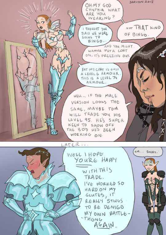
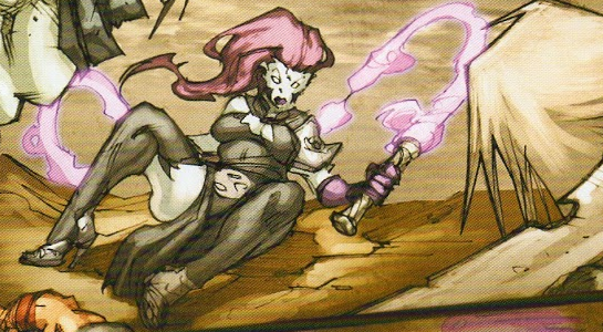
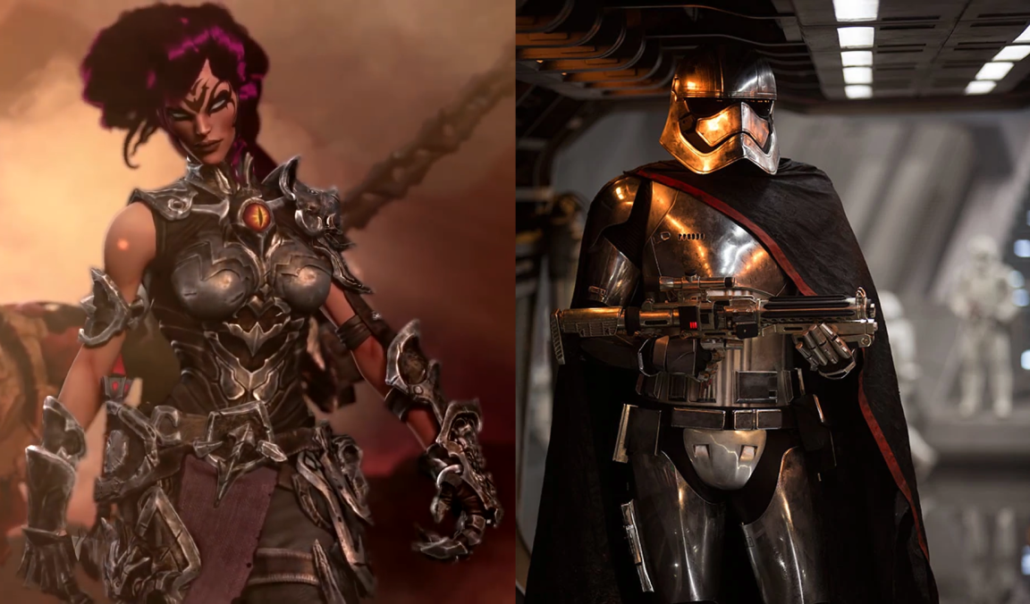
The plexi-boobplate is very clever! Nice way to score “Covers only nipples and genitals” while technically giving her a chest piece 😀 Also best luck to Tom in his never-ending quest of finding the sexy male armor suitable for his empowered body. ~Ozzie
Legitimate depiction of how heavy armor works in video games. – wincenworks
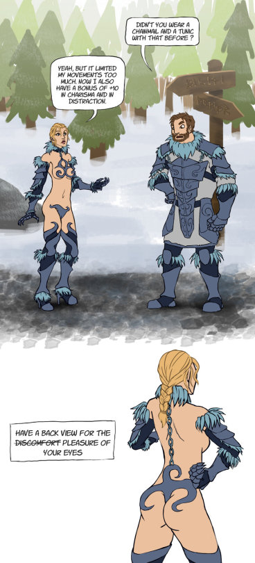
Her main “covering” is mostly mesh/chain mail thing. It’s sorta lingerie stocking AND boob sock armor. What I think is most innovative about this design is the boob holes in her boobplate. The girls can swing free and unencumbered while in action. Great for badass empowered female warriors.
Accurate representation of shoulder plates and fantasy high heels! – wincenworks
Chainmail boobsocks encased in what seems like a boobplate frame… possibly the most painful-looking chest piece in the contest. That + super impossible heels + pointy bits that will stab her whenever she moves = another winner! ~Ozzie
Extra points for showing accurate understanding of how bikini armor artists think how physics work. – wincenworks
Personally I think the original version of this chest piece fitted the definition of “boobplate” a bit better, but both versions are very well designed and look as uncomfortable as expected from a bingo winner! ~Ozzie
Bonus prize:
Thanks to lokificent’s generous prize donation, we were able to choose the fourth winner! And that artist is…
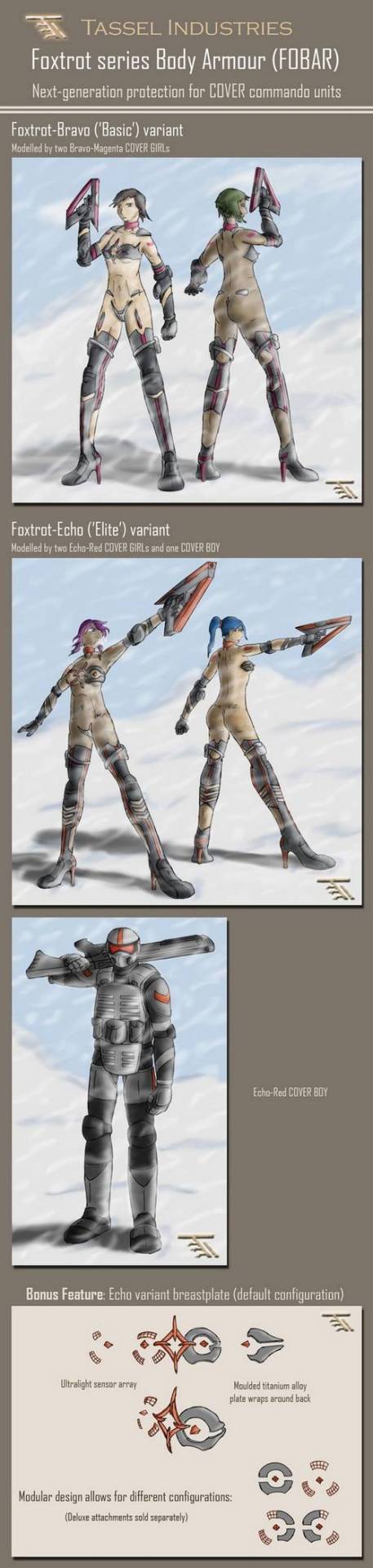
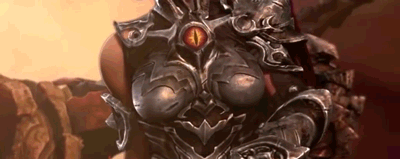
Designing ‘armour’ that would score all 25 squares and the bonus points was equal parts interesting challenge and vicarious thrill. I had to constantly resist the urge to make things less ridiculous. The pinnacle (or nadir, depending on how you look at it) of this exercise was the Echo variant ‘breastplate’; it’s practically a bingo in its own right
Particularly accurate with sci-fi’s tendency to put bits of metal and lights in random places. – wincenworks
I’m getting an impression that more thought was put in designing those modular nipple pieces alone than in many complete outfits we bingo’d before. ~Ozzie
The prizes:
As established above, there are four rewards to choose from:
To collect their prizes, the winners should contact us at bikiniarmorbattledamage via askbox/fanmail or at BikiniArmorBeDamned via private message and the first three of them should specify what is their preferred reward. First prize winner gets whatever they choose, then the second and then the third one pick from the remaining poll. Bonus winner gets whatever is left for them.
All the other contest entries + further commentary under the cut:
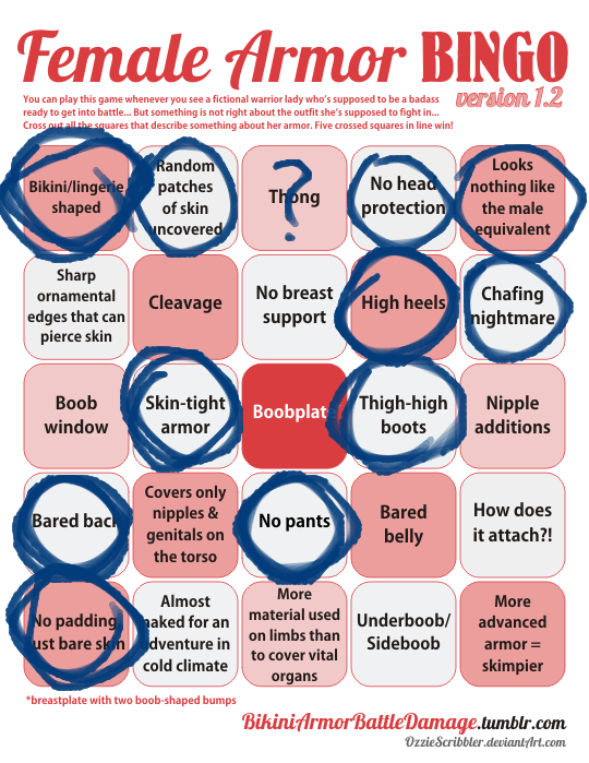
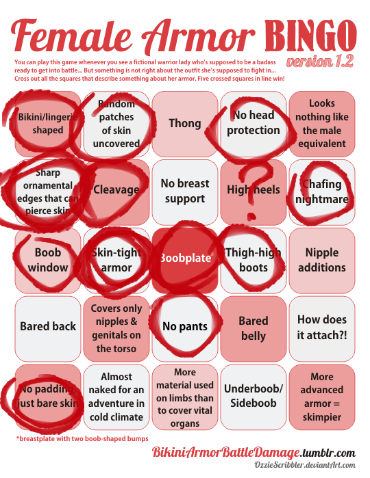
Bonus throwback this week in reference to a question we get periodically regarding the Female Armor Bingo. Credit to the latest asker of it, @deeppurpleskeleton:
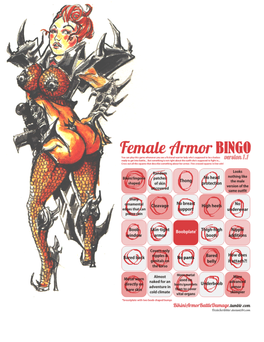
The answer, in short, is: We have, to date, not come across any example that fills all squares of the Female Armor Bingo in the wild. We did, however, run a contest to break the bingo card and were very impressed with the creativity of the entrants.
Please do click on the Keep reading link and view all the entries. We’re very proud that our blog inspired artists of many skill levels to come up with so many distinct, yet equally absurd costume designs. All of them deserve recognition.
~Ozzie
Posted on
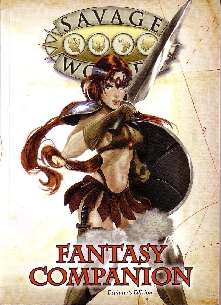
“Savage Worlds is the core ruleset for all of Pinnacle’s current roleplaying games, including Deadlands, 50 Fathoms, Weird Wars: Rome, and more. It has everything you need to play narrative or miniature-based games, with quick, simple, yet comprehensive rules for everything from combat to Dramatic Tasks, Chases, and Interludes. The emphasis is on less bookeeping for the Game Master so he can quickly and easily create worlds and adventures for any setting, and focus on the players and their actions during frenetic combat.”
Frenetic… no wait, I checked, frenetic does not mean combat that involves lots of awkward nip slips and pauses to untangle gear – it’ supposed to mean the opposite of that.
It boggles the mind that studios still think stuff like this somehow signals “for all kinds of players” and “totally legit about the game experience”.
And yet, this particularly example is still better than cover of the the Horror Companion…
– wincenworks
Posted on
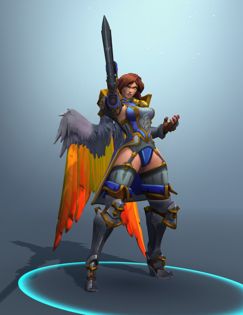
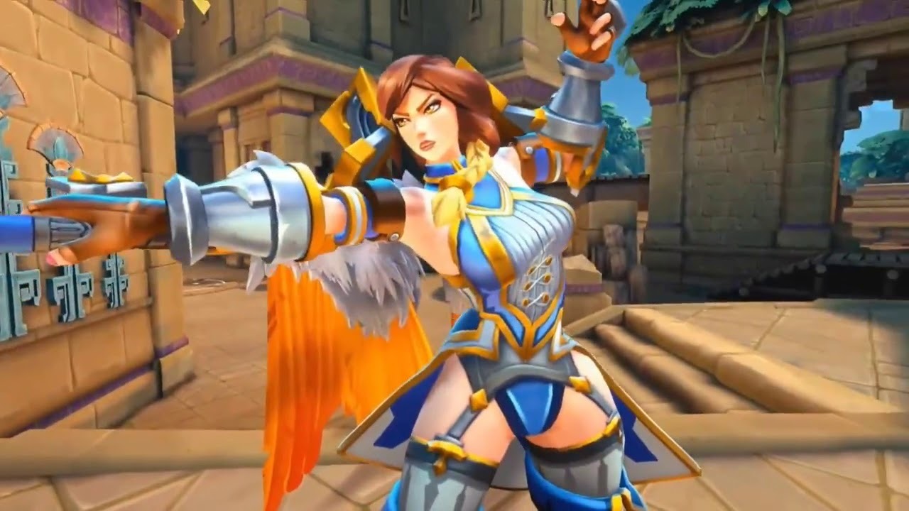
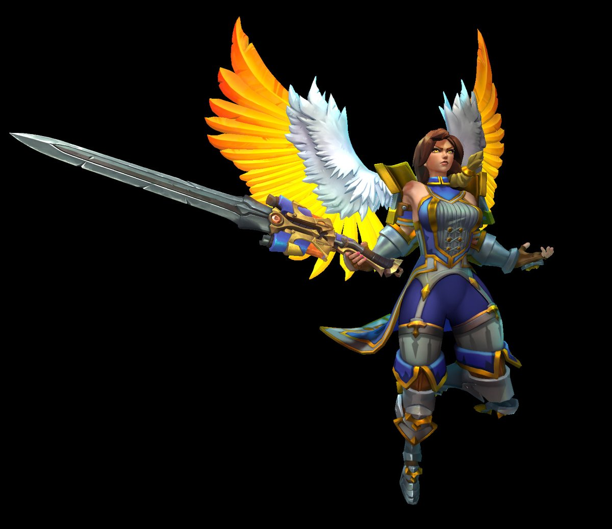
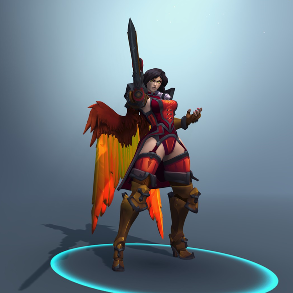
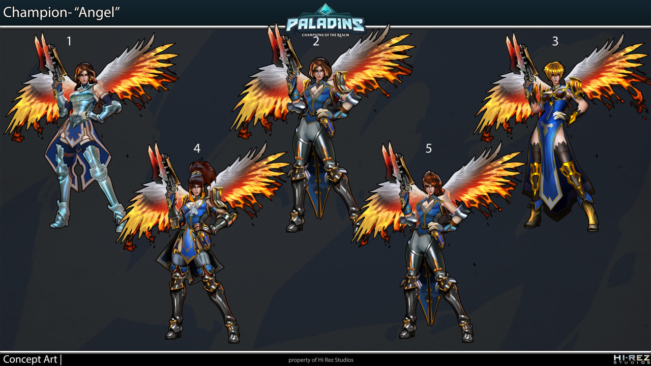
In case anyone forgot that Paladins comes from the same developer as SMITE (if you couldn’t tell by their absolutely “creative” designs), here’s original costume of Furia, one of their newest champions.
Somehow even people at HiRez concluded that visible panties and completely out-of place garter belts are too ridiculous combination, because apparently after some fan feedback she received a slight redesign that includes pants under those garters.
Fret not, perverts! Her original look is preserved through red recolor “Iron Maiden” skin!
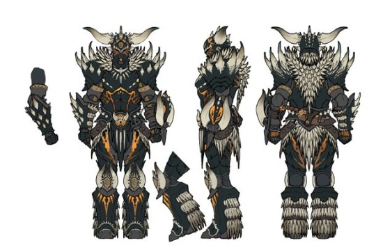
The Monster Hunter series has been a mixed bag when it comes to armor design, and as we’ve shown before, Monster Hunter World has proudly followed in that tradition. We’ve seen that they can do actual armor for both the men and women characters, so what the fresh hell is this? This is high level armor, too. This is what the male version looks like, by the way:
I guess I’m impressed that the characters can hand-mold monster carapaces into boob cups?
-Icy
Posted on
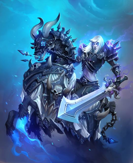
Red is for the High Inquisitor skin, Blue is additionals from the Celestial Empress skin
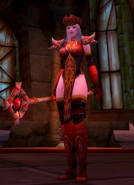
Having blocked out most of my memories of playing World of Warcraft (and I didn’t do raids), I didn’t remember Sally Whitemane, so boy was I surprised to learn she led a religious order!
I’m not sure how anybody took this character seriously as an authority figure of any kind. Her outfit looks like something out of a fetish lingerie catalog. The HotS design is almost exactly the same as her original WoW model, which really highlights how much effort Blizzard is putting into doing women better.
Not to mention, her first alternative skin is some kind of scissors accident, rather than, for example, her Horseman version? Yeah, she became one of WoW’s Four Horsemen (the only woman in the current lineup, of course).
I mean, give her some padding on her exposed stomach, and that would be a fine alternate skin! But she does have a lot of skull motifs all over, so maybe they thought it would be too similar-looking to Sonya’s Death Knight skins.
This is the sort of design that explains why people don’t treat the word “edgy” seriously anymore – artists who want their stuff to look “dark and edgy” literally throw as many sharp edges on their villains and antiheroes as possible, no matter how absurd that looks!
Just imagine all the protection she could get if she used metal from those arm and head spikes to form a practical breastplate!
~Ozzie
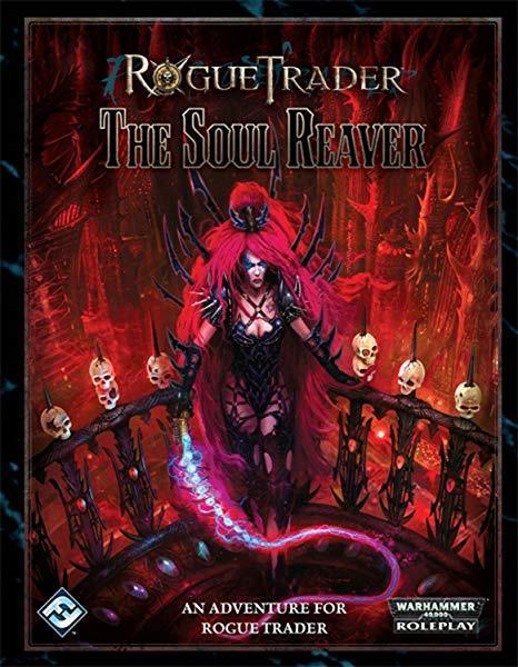
Why does this look like, instead of sending the publisher the actual intended cover art, they accidentally submitted a “how ridiculous can we make it” art piece done on a dare? And the publisher just went with it, because it’s Warhammer?
-Icy
h/t for finding us design to bingo: Gigahorsedeluxe
Posted on
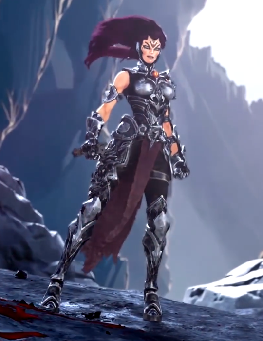
So, Darksiders III is coming out in November and of course we’re getting the promo videos and Fury looks… well the kindest thing that can be said is that she looks better than the comic indicated she would.
When I first watched that trailer, what struck me most is how SERIOUSLY it takes itself, while having a heroine who looks just. that. silly.
And gamer dudebros apparently think that THIS is “SJW pandering”, REALLY? Being encased in skin-tight metal, including a boobplate so ridiculous and badly designed it doesn’t even warrant breast support of a basic bra?
So now, in salty dudebro terms, both this and this is a “politically correct” armor “too unfeminine and no longer recognizable as a woman”:
~Ozzie
Posted on
Okay… so the bright side of this is her backstory (ie a fantasy adaption of the legend of Elizabeth Bathory) does not specify that she is in fact undead… so it’s possible she’s just terrible looking and not yet one sexualized corpse. Not likely though, based off the intro animation.
I’m honestly at a loss about how someone decided that the best way to communicate ruthless, soul stealing necromancer was… underboob.
Though I suppose I’ll have plenty of time to consider it in the nightmares this is going to give me. You’re welcome.
– wincenworks
Posted on
Yesterday – while looking with Icy through Heroes of Newerth’s art page, the endless depository of painfully generic, often plagiarized, and even more often super sexist and racist artwork – we found this fairy… thing and agreed she’s a perfect bingo material. And boy is she!
If not for her weird furry feet, she’d very likely get a bingo with high heels.
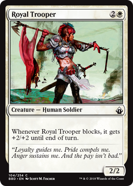
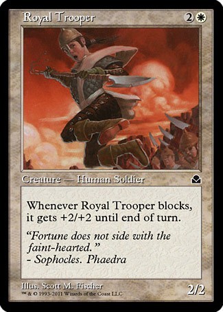
I stump for Magic the Gathering hard. I often feel like, in a sea of boring design and policies written by the Creepy Marketing Guy, Magic stands out as really trying to do better for inclusivity and diversity, even if it does stumble from time to time.
But this time, they REALLY stumbled.
Behold, from the recent Battlebond set… Royal Trooper!
… like… what the hell.
This is my first time doing one of these bingo cards, so if I missed one or didn’t interpret one properly, let me have it:
Now, the hilarious thing is, I passed this by my fiancee in case I missed one, and she said that the male version of this card was probably better. That sparked an idea, and lo and behold, there was an earlier version of this card:
…it’s also a woman, in MUCH BETTER ARMOUR… FORWARD, Wizards of the Coast. We’re supposed to go FORWARD. Yeesh…
Thanks for subsmission and the commentary! We learned not to have high expectations of Magic and Gathering’s illustrations. At best, they’re a mixed bag.