The line up currently... as per Overwatch standard there are multiple body types for men and one thin, conventionally attractive one for women.Something something sexy back, a hood without a cape is certainly a decisionThe most important thing when aiming a bow is to show off as much leg as possible

Hello Diablo my old friend.

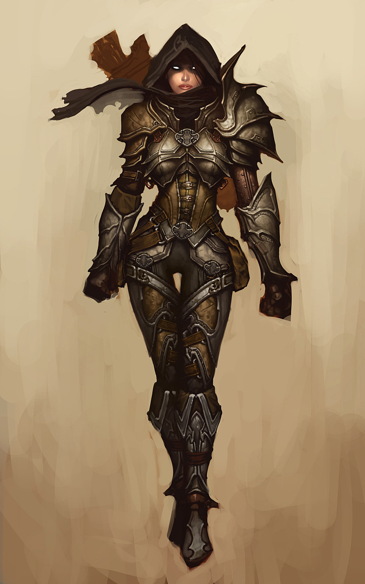
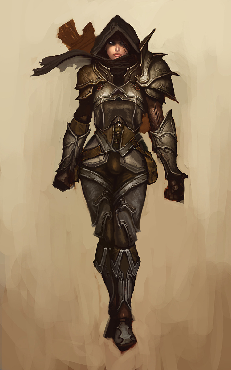
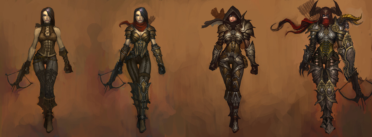
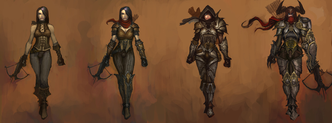
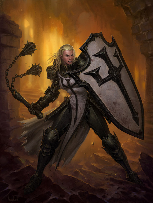
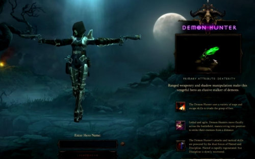
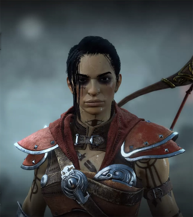
They recently announced the latest class, the rogue, with a bizarre trailer and an even more bizarre costume as the iconic look which seems to try to hedge in a few ideas in bizarre contradiction.

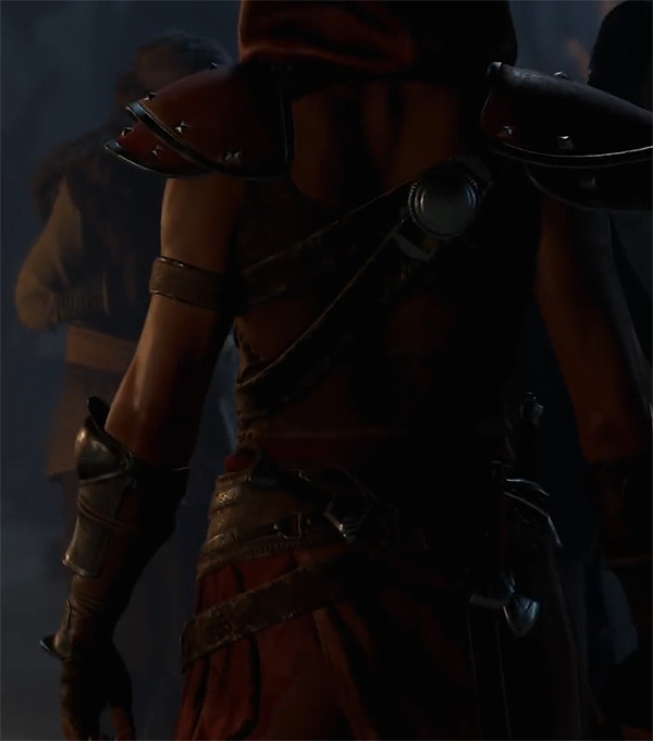
  • An Assassin’s Creed style hood without any cape attached
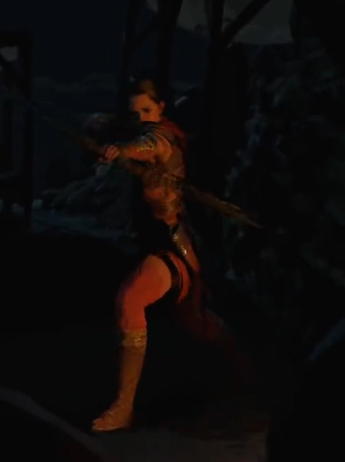
  • Two part thigh highs that are cloth from the top of the calf up

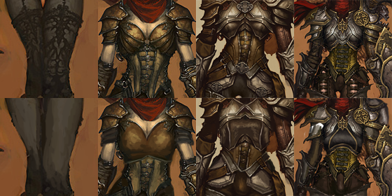
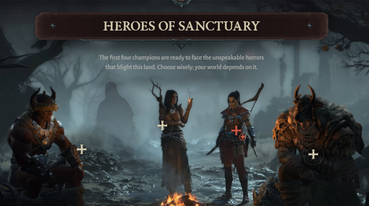
But of course, they have most of the classics as well.

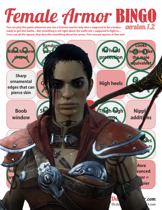
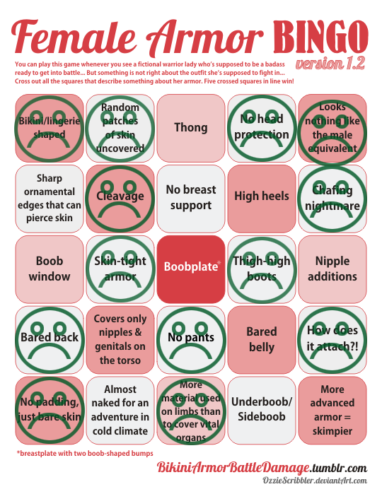
  • A Xena style combat corset with pauldrons and bracers, but no pants or helmet
  • Extremely high profile, attention grabbing outfit for someone who supposedly pick pockets and moves unseen
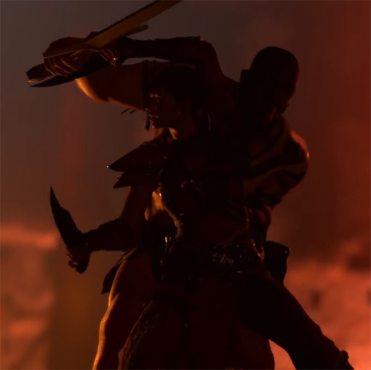
  • Combat style is sexy dancing with knives
image

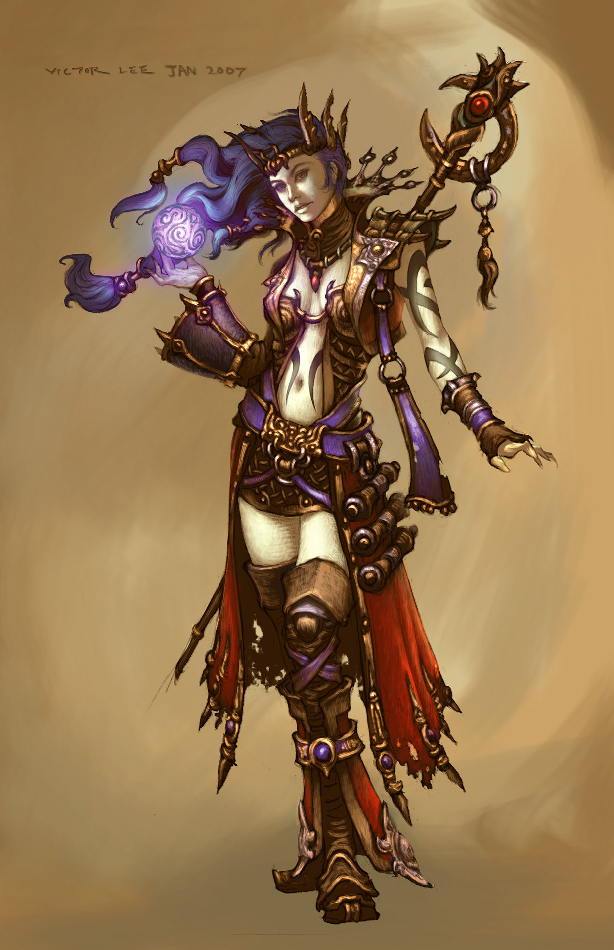
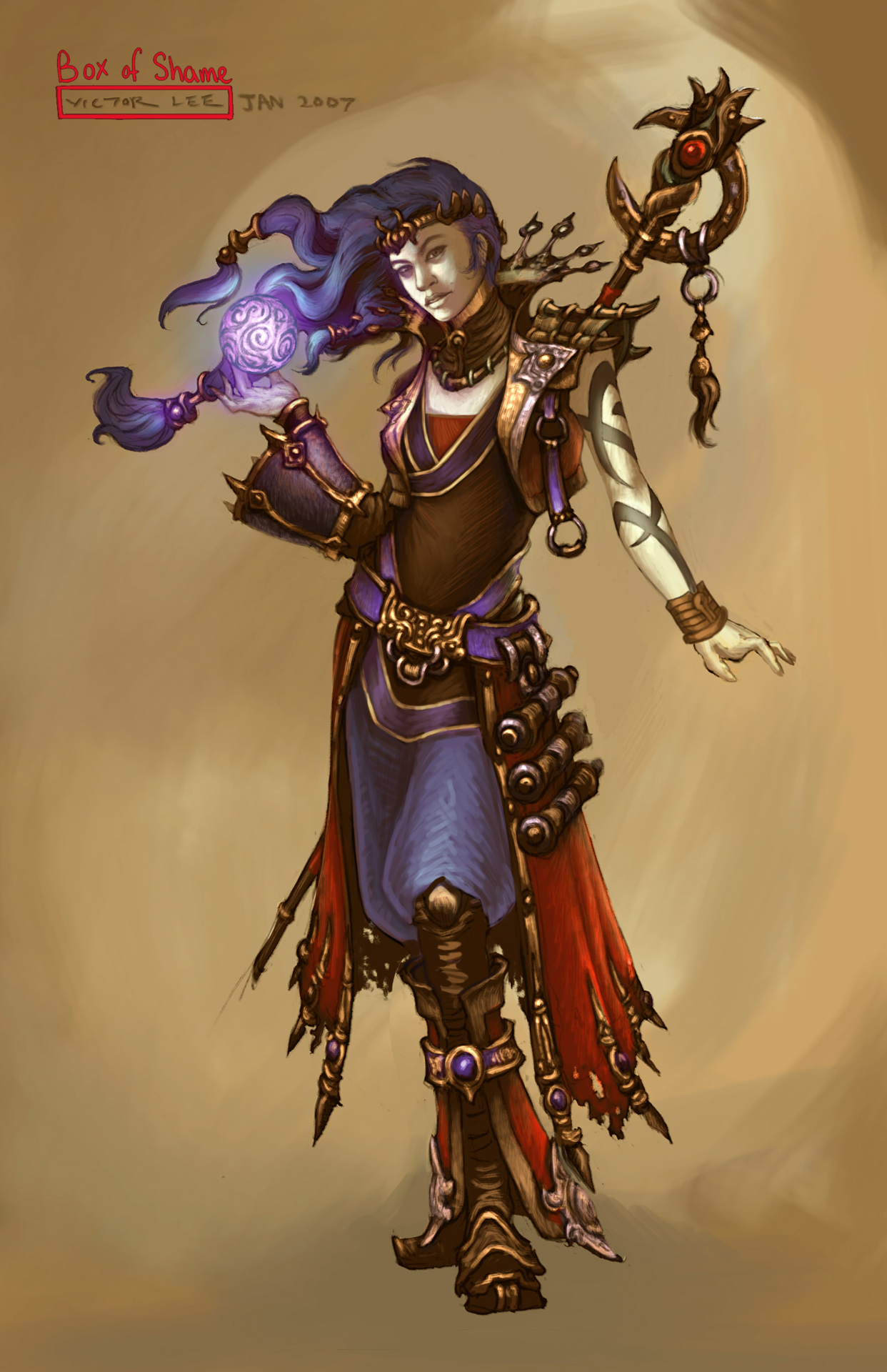
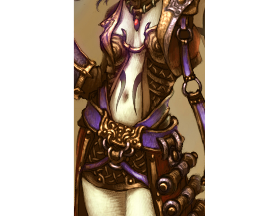
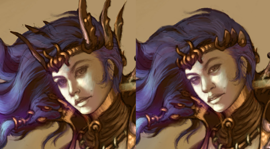
Also, while she does look ambiguously brown in the final videos and character model… it seems pretty clearly this was a last minute decision based off the concept art.

image

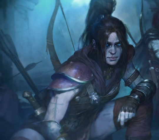
Because brown women apparently need more media depicting them as morally bankrupt sexy thieves… according to Blizzard.

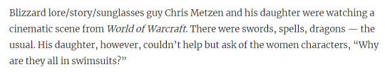
So I would like to take this opportunity to draw attention to this quote from November 2014, regarding Blizzard’s intentions with another game.

image

They really need to stop getting celebrated for talking the talk while they do the opposite of walking the walk.

– wincenworks

More on Blizzard on BABD

Simplifying the Diablo Ladies, Part 2 

Demon Hunter from Diablo 3 was… a challenge, to say the least. Mainly because I couldn’t decide where to even start with that ridiculousness!
Not only is she super sexualized via the enforced “feminine” silhouette of skin-tight armor, boobplate and giant thigh gap, including a cameltoe… she’s also the most overdesigned thing I ever tried my Photoshop skill on. 

Apparently to work as an artist at Blizzard, you have to willfully forget the most basic rule any design school worth its salt teaches: Less is more
For concept art of what would ultimately be a small character model in-game, all those pieces have SO. MUCH. NEEDLESS. DETAIL! Teeny tiny little shapes of distracting ornamentation, basically nothing to rest your eye upon. 

I feel really sorry for anyone who ever attempted cosplaying this shitshow – so much work added into recreating all those arbitrary seams, textures and spikes, sheesh. 

image

I was so busy simplifying the shape language that I overlooked some stuff I do pretty routinely, like getting rid of the cleavage in the first and second levels, and modifying the hourglass silhouette (I did add some bulk in higher levels, just not much). 

Preparation for posting this redesign is why I threw back this post lately (also, you know, it’s just a good post to resurface) – because those level ups convey neither a better set of armor, nor more protective layers, except for pauldrons. The shape of her boobs and thin waist remain a constant, no matter how much more “armored up” she’s supposed to be.

Like with Ashe before, I decided that my version is a trans lady, with a noticeable crotch bulge

in the place of the creepy thigh gap. Though I discarded my initial gag related to its size, as it was just in poor taste and not my joke to make. 

Overall, this thing took two or three weeks to finish (last level seemed unsalvagable at first), but hopefully I managed to put some actual design thought into this hot mess.

~Ozzie

Simplifying the Diablo Ladies, Part 1

We’ve talked about how Diablo makes such an effort to make very disappointing characters. So, it was finally time to take on some of those designs and try to make them less overdone and less….

Anyway, I went for a concept art of the Wizard from Diablo 3. I stayed in the color scheme because I was more distracted by…. everything else that was happening. All the tiny details that only highlighted how little she was wearing… it had to go. I ended up giving her a simple tunic and pants, in order to have some grounded large shapes in the middle of all the small ones. I do like the shoes (below the knee, anyway) and the jacket, so I left them alone.

I did remove some weird-looking accessories, like the not-glove and the awful crown sharps, and I changed her face as I always do.

Definitely a simpler redesign, but it was still not easy to work around all the things that I wanted to keep in the design. I probably should have made her tunic a different color, but it’s still way easier to look at than the original. Hope y’all enjoy!

-Icy

Okay, so we’ve received approximately… more requests than I can bother to count to comment on Blizzard finally announcing Brigitte Lindholm as a playable character and releasing her on the test server.

Now, initially I put off commenting on this because she had only one skin and the minimum features to allow people to play her on the test server.  This felt suspicious to me, because put simply: The default skin is, in isolation, good:

image

There are minor issues, such as her hair, waist and the weird hip cape designed to remind us she has a (presumably sexy) butt.

However, once the Legendary skins came out, the conversation became more complicated (expect more posts in the near future) because well, the come in two themes (knight and mechanic) and… let’s just look at them:

image
image

Yes, it seems that while someone at the Overwatch art team managed to get her primary look to be pretty good, the powers that be decided her Legendary Skins (ie the prestigious ones) need to have the standard sexualized nonsense.

On top of that, despite that visually she is a distaff Reinhardt (who still does not have a sculpted codpiece) and her video announcing she is not content to be a support character and wants to tank… she is Support:

image

Reminder: She maintains all Reinhardt’s gear… so there’s no in game explanation why her shield is roughly one third the strength.

Also, while there is some joking about her being a copy of a Paladins character (that would be the ultimate irony), I can’t help but think I’ve seen this shield and flail combination somewhere in a Blizzard game before…

image
image

Overwatch, supposed to be Blizzard doing women characters better.

– wincenworks

karniz replied to your post “have you seen the armor for characters on Diablo III, and if so, what’s your opinion on them?

Why do you guys just look at concept/promo art and not actual in-game armors? The actual armor within DIII is very well designed and not as sexualized as the samples you show. I feel it’s a disservice to your viewers that you don’t do more research..

Oh wow, you’re telling me that the promotional material Blizzard creates to market Diablo 3 are completely misleading and non-representative of the game… and not only has nobody mentioned this before but somehow it’s my fault?

Wow, I better look into that right away. Thankfully there’s always YouTube to provide us with Let’s Play videos so I can take screenshots that look slightly off since the live footage is always in motion and was never intended for still frames!

I bet the the in game models look completely different.  I bet they’re huge and so detailed that you’d be a fool to look at anything but what the actual in game play looks like.  It’d be ridiculous to propose that Diablo figures are displayed, by default, so tiny that you can’t make out any real detail beyond basic colours and silhouette right!?

image

Oh… well never mind! The first thing you do when you start one of these games is create a character.  Obviously the Barbarian models in character creation will be completely different to those used in promotion and the ones that someone made gifs (from gameplay) of!

image

(Full size)

Oh wow… what a co-incidence!  Oh well, there’s always the Demon Hunter right?  It’d be ridiculous to think that they’d use that stupid stance where she poses one leg in front of the other, sacrificing her balance to flaunt her hips! Or have her arms posed to both look like a she’s trying to be an action movie star and draw attention to her boobs.  That’d never…

image

(Full size)

Wait a minute… does this game actually have all the problems previous suggested? Is it possible I just use promotional art and cleaned up gifs because they are easier to read and communicates clearer?

Is it possible that this kind of rampant double standard and objectification of women is so common in gaming that many people just assume it’s justified and normal?  And that it’s long overdue people called it out and didn’t just forgive games because there were a few good examples in it if you looked?  Or even games where it’s mostly good with some outrageously bad items used in marketing?

Outrageous! Someone should start a blog about this kind of thing… they could even like, make some sort of checkbox game to help illustrate the point!

– wincenworks