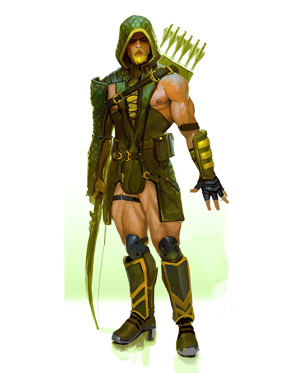
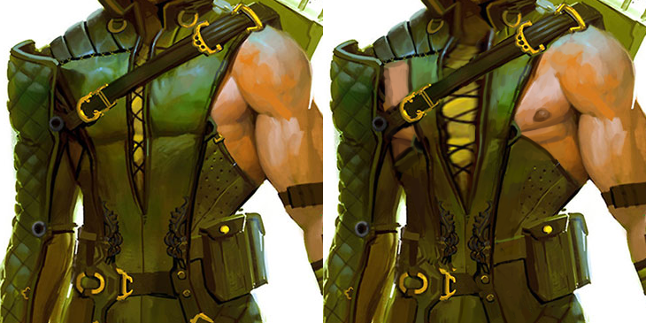
For starters, he was already striking a vogue pose. And just look how easy it was to expose his male-presenting nipple with that giant armpit cutout!
I also widened that lacing in the middle of his chest… my regret is not replacing the yellow undershirt (?) with his skintone 🙁
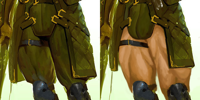
Since this was concept piece, not a final render for the game, the artist went wild with Ollie’s thicc thighs compared to tiny knees, so I also run with it!
I shortened his tunic flaps, exposed the thigh skin entirely and used some particularly beefy reference for the musculature. Also, of course, made his codpiece much obviously bulge-shaped (while rather restrained compared to how big and detailed we usually make them). Also changed his shoes into high heels, as per usual 😉
Hope you guys like it. I’m quite satisfied with the edits here, especially how they blend into the original’s painting style.
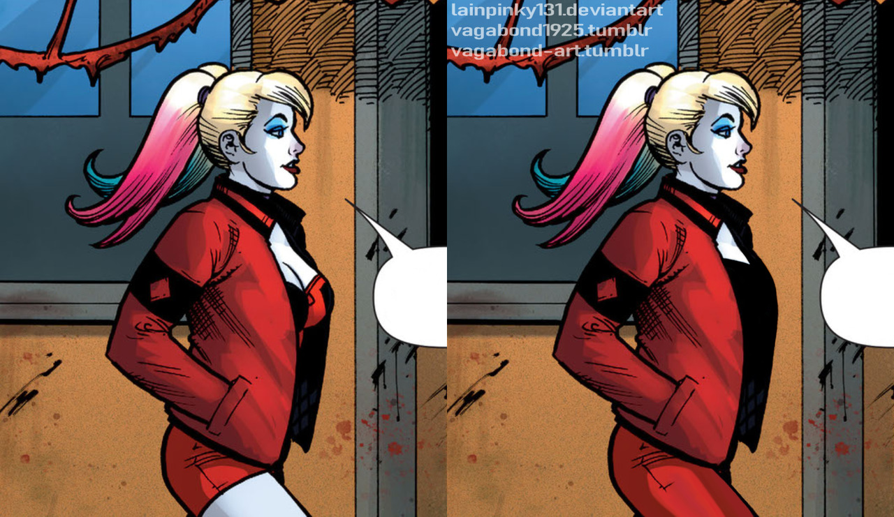
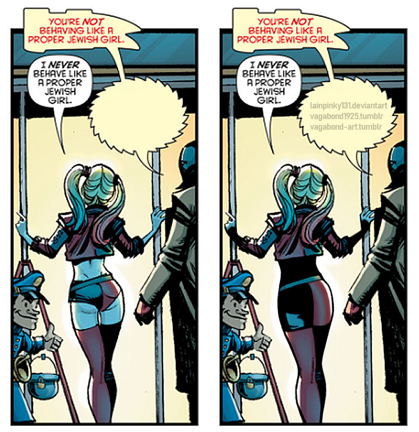
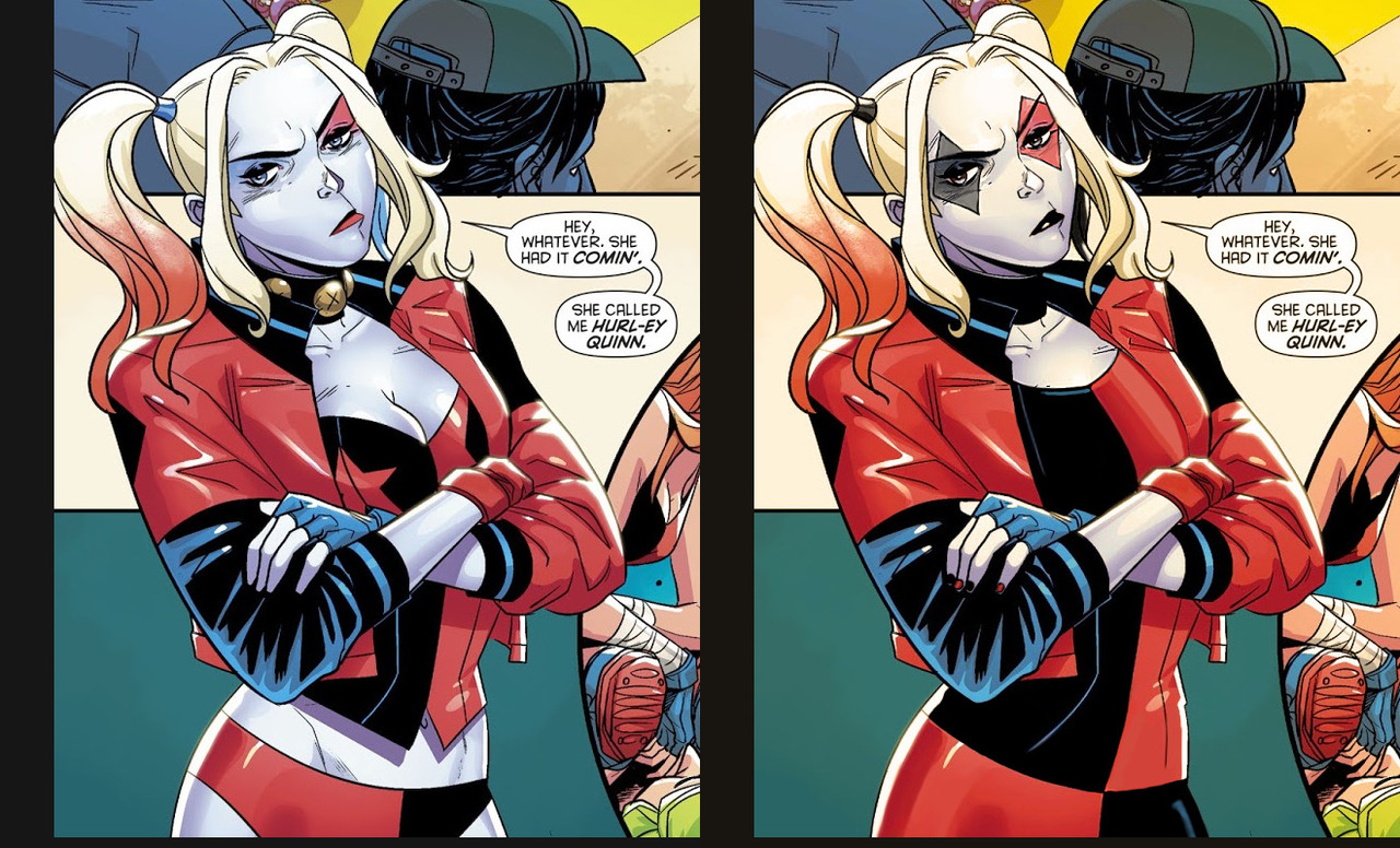
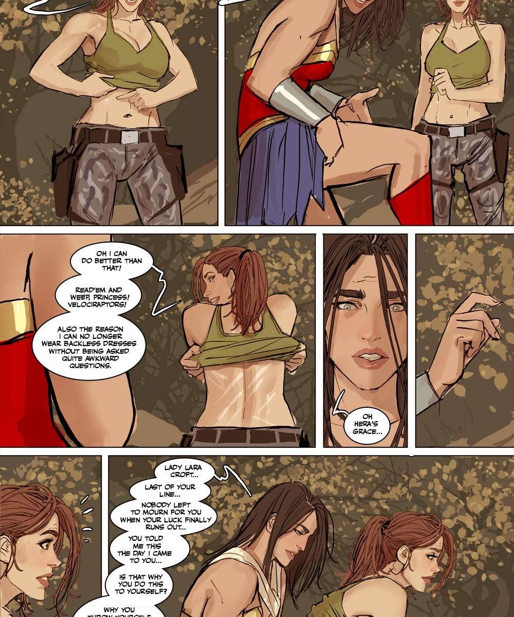
unpopular opinion: harley quinn is better with clothes
made w @chokit-pyrus on paintshop pro 9 and paintshop pro X8
Also unpopular opinion: she looks more badass that way.
Further unpopular opinion: it just makes sense for her to wear more than a bikini. Gotham is fucking cold and she’s a graduated psychiatrist and psychologist, not someone immune to cold. Plus, body armor and potential for concealable weapons.
I especially appreciate the reinforcement of the diamond motif and red/black color scheme that got changed to red (sometimes pink?!)/blue for no reason over the years.
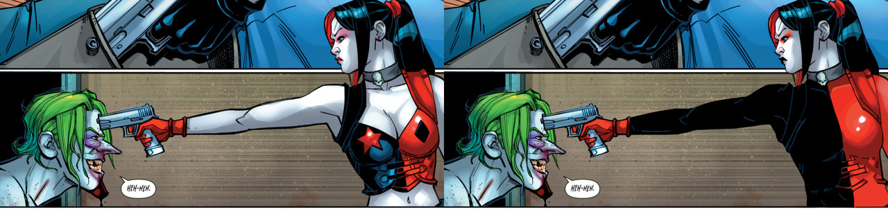
We touched upon this before, but the big problem with most contemporary depictions of Harley Quinn is that her designs convey anything but her Harlequin/jester theme.
Who is that? Some randomly underdressed biker chick? Why is she wearing a cropped leather jacket directly over drafty lingerie? Where are her pants? Is there a reason for her girlish pigtails? Hell if I know! ¯_(ツ)_/¯
Good character design, including costume and make-up, should work context-free. The only thing thing we’re told by this sort of Harley design is “she sexy”.
This stream session was devoted to antagonistic women of DC universe. They might be fiends to superheroes, but mostly to wearable fashion.
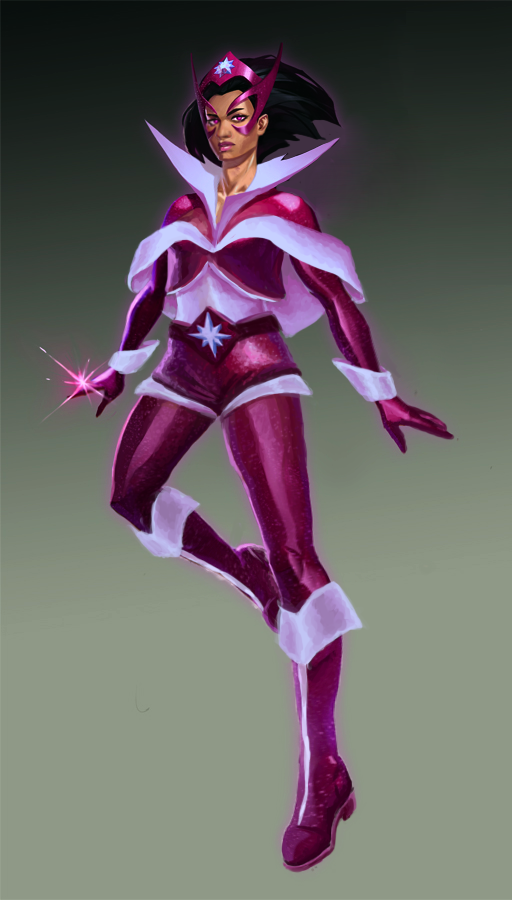
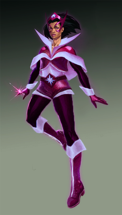
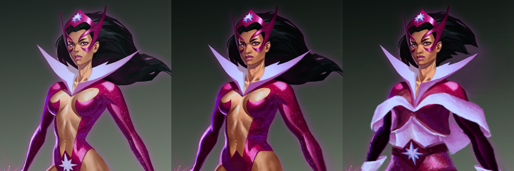
Star Sapphire
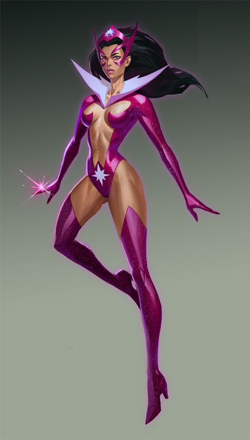
I knew that at some point we’ll discuss the amazingly awful modern costume of Star Sapphire (not to be confused with Starfire, also a DC property), so around the same time we redesigned and bingo’d two equally skimpy takes on the same character.
Managed to find this official concept art for Infinite Crisis game on the artist’s dA account (please do not bully them for doing a commission of a character who already looked sexualized) that looked like a good material to work of off – digital painting that represents quite fairly how she tends to look in the comics.
There were so very little things worth preserving in the original, so I ended up redoing it almost from scratch. First I readjusted her cartoonishly thin figure, made her olive skin a little less ambiguously brown and gave her a bigger nose – she’s more often an antihero than a villain since Star Sapphires got retconned into a Lantern corp, so I don’t think she needs to be white-passing. Also changed her haircut to a less bothersome bob.
Leaving in her white popped collar, I decided to use white detailing to break up purple shapes on her. Little cape with big white trim and lining is probably my favorite original part. When I was done, we concluded that it’s probably still a bit too purple, so I ended up making an alternate version, with dark violet for sleeves and pants, to have the color scheme contrast better.
Completely coincidentally we’re posting this redesign, which turned out a lot like a Ms. Claus outfit, around the Winter Holiday season. But I’ll take Santa Sapphire over Skin Sapphire any day of any season.
~Ozzie
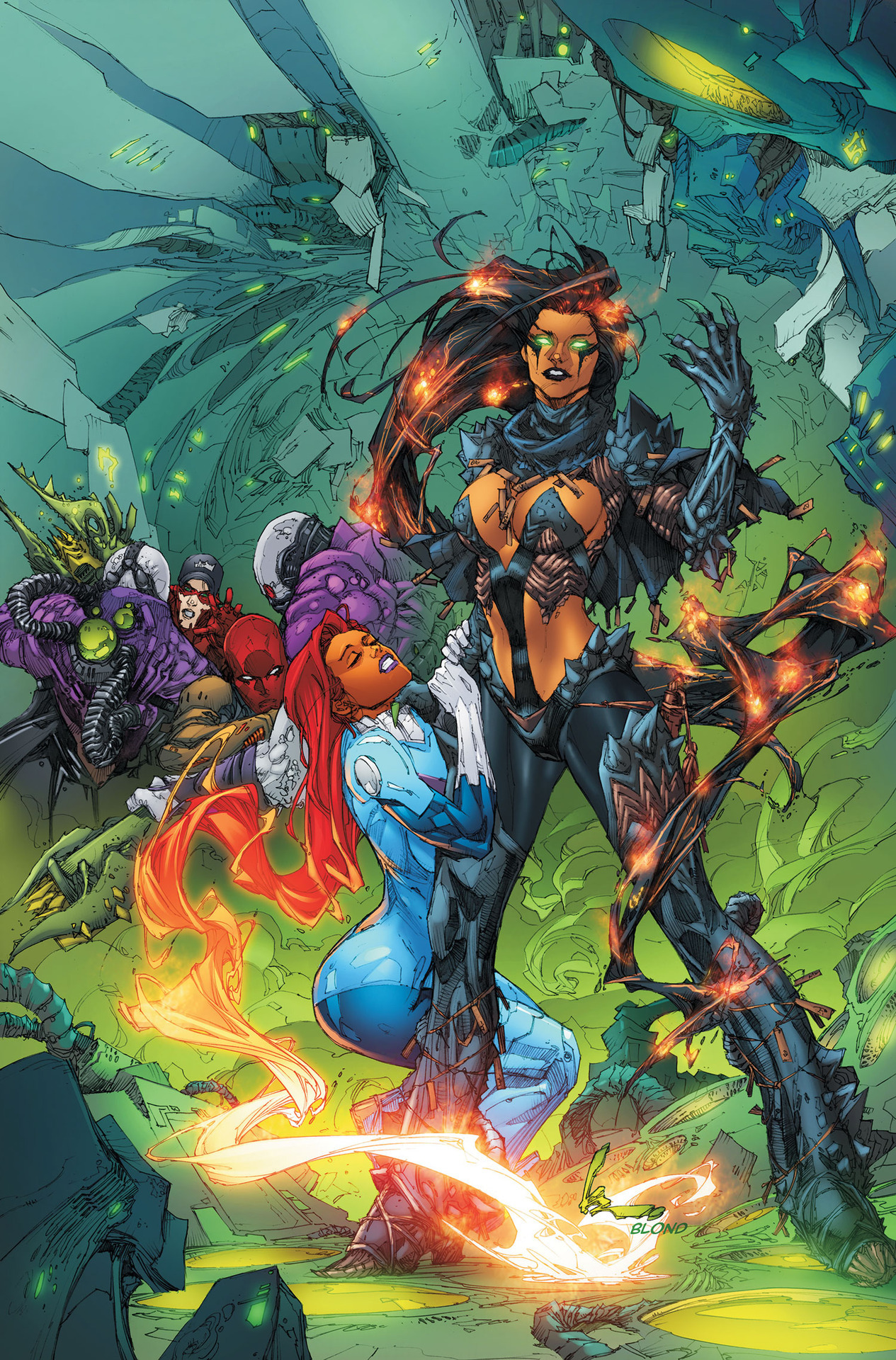
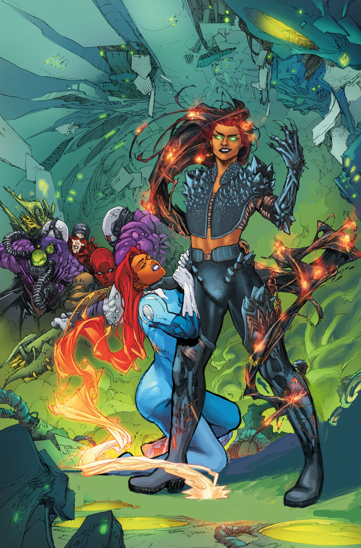
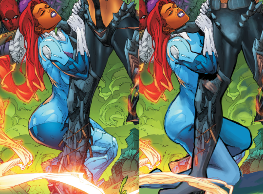
Blackfire
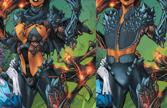
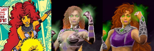
This was another one of those images where everything in it was just Bad. (See Valkyrie redesign for the first of these that I worked on.) So, I ended up fixing Starfire’s body too. That’s actually what I started with, because it kept distracting me how she’s doing a T&A pose while being choked. Not sure what the thought behind that was….
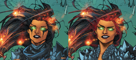
After that, I had to redline Blackfire to fix her back and legs, and I got to fixing her… “clothes.” I decided to go with the spikes motif and extend it into a vest. I left some of her abs showing because she’s kind of a cocky lady, and I feel like she’d want to show off a bit. I just think that she’d show off while wearing reasonable clothes.
Her face is one of my all-time favorite edits of mine. I also gave her hair red roots because I think that siblings should share at least a small piece of a design element, like I did with Morgana.
This was definitely a fun redesign. People who were there for the streams may remember that I wanted to make Blackfire trans, but I decided to back down on that, since she is a villain, and I didn’t want that association. We don’t have enough of a track record of non-evil trans ladies here, but there will definitely be more of an effort to change that.
-Icy
Posted on
Posted on
Posted on
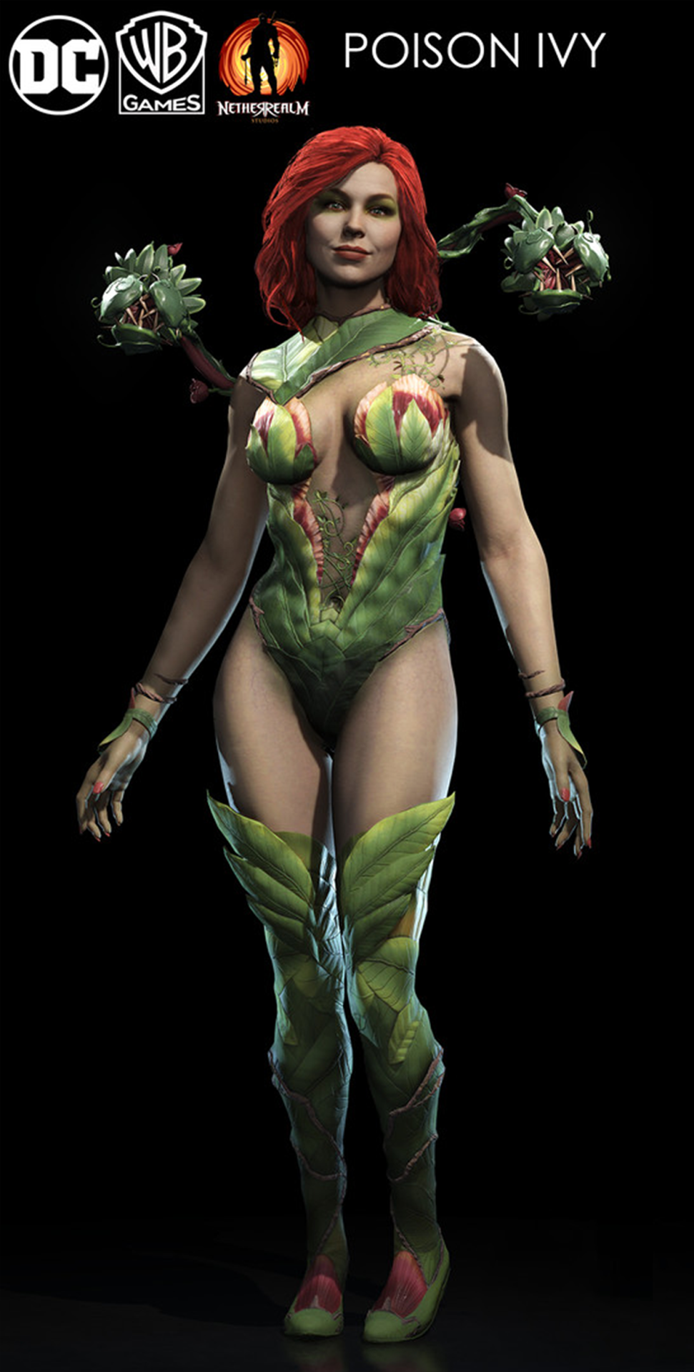
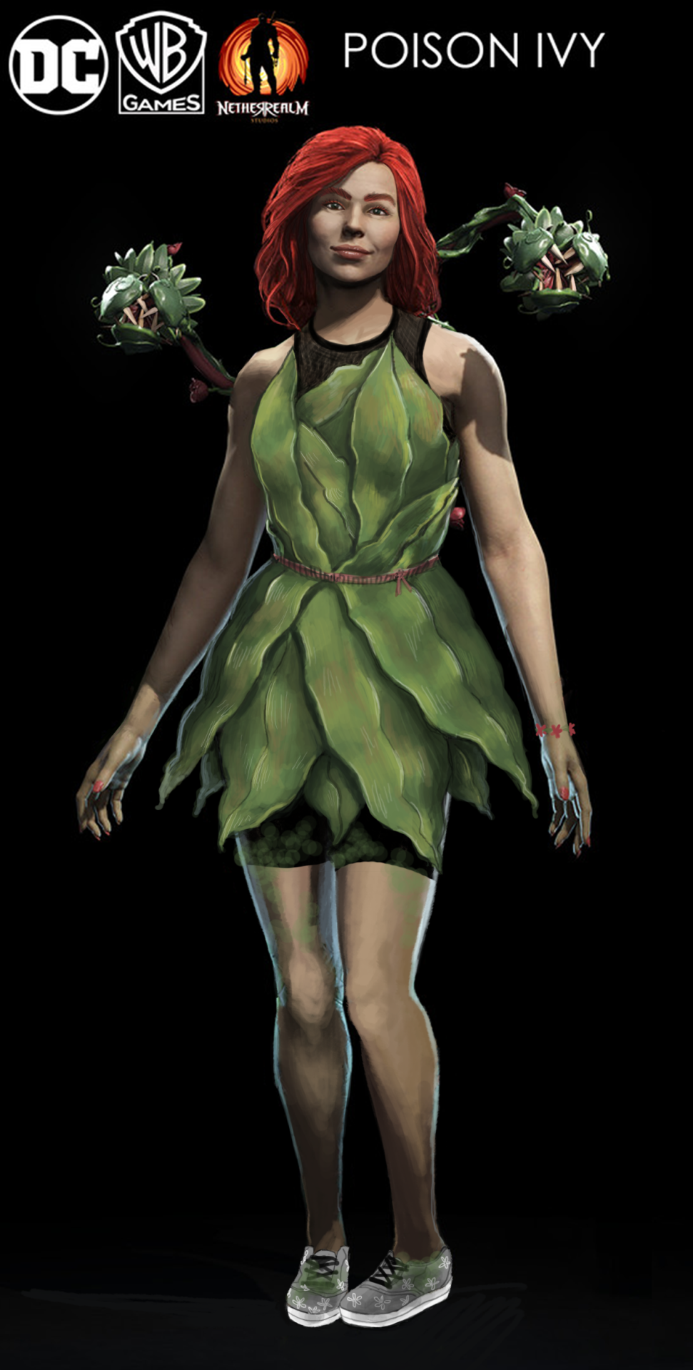
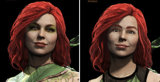
Poison Ivy’s Design Team has Clearly Never Touched a Plant
We’re going back in time a little with this one, as I was working on this at the same time that Ozzie was doing her Starfire redraw. With this one, I was mainly focusing on giving her an actually plausible costume for the Gritty and Realistic “aesthetic” (insert a few more quotes around that word) of Injustice 2. Wearing plants against bare skin sounds like a bad idea to me, so I instead decided to give her a sports bra and shorts, and a leaf dress on top. After all, Black Canary and Harley Quinn (and Catwoman, sorta) get to wear Real People clothes. Why does Ivy have to (ironically) get the rash?
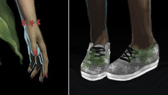
I also wasn’t really a fan of the almost militaristic “plants should rule the world” motivation she has the game, so I decided to just make her into an overenthusiastic plant lover. Although her vine…. things, have bigger teeth, she’s got a bracelet and flowers on her sensible non-high-heel shoes, as well as moss on her legs so that the green is not restricted to only the top half of the design.
Her makeup was predictably hideous, so I reduced it and gave her a more defined face shape, though I should have given her deeper eye sockets. I decided to give her lip gloss instead of the cliche red lipstick, because I was thinking that if I was going to a fight, what kind of don’t-have-to-worry-about makeup would I put on in 5 minutes? Mascara and gloss were the ones.
I think with more time, I probably could have worked the design to be more interesting, with vines and flowers everywhere. As it is now, it’s a pretty simple design overall. I rendered the crap out of those frigging dress leaves though!
-Icy
Posted on
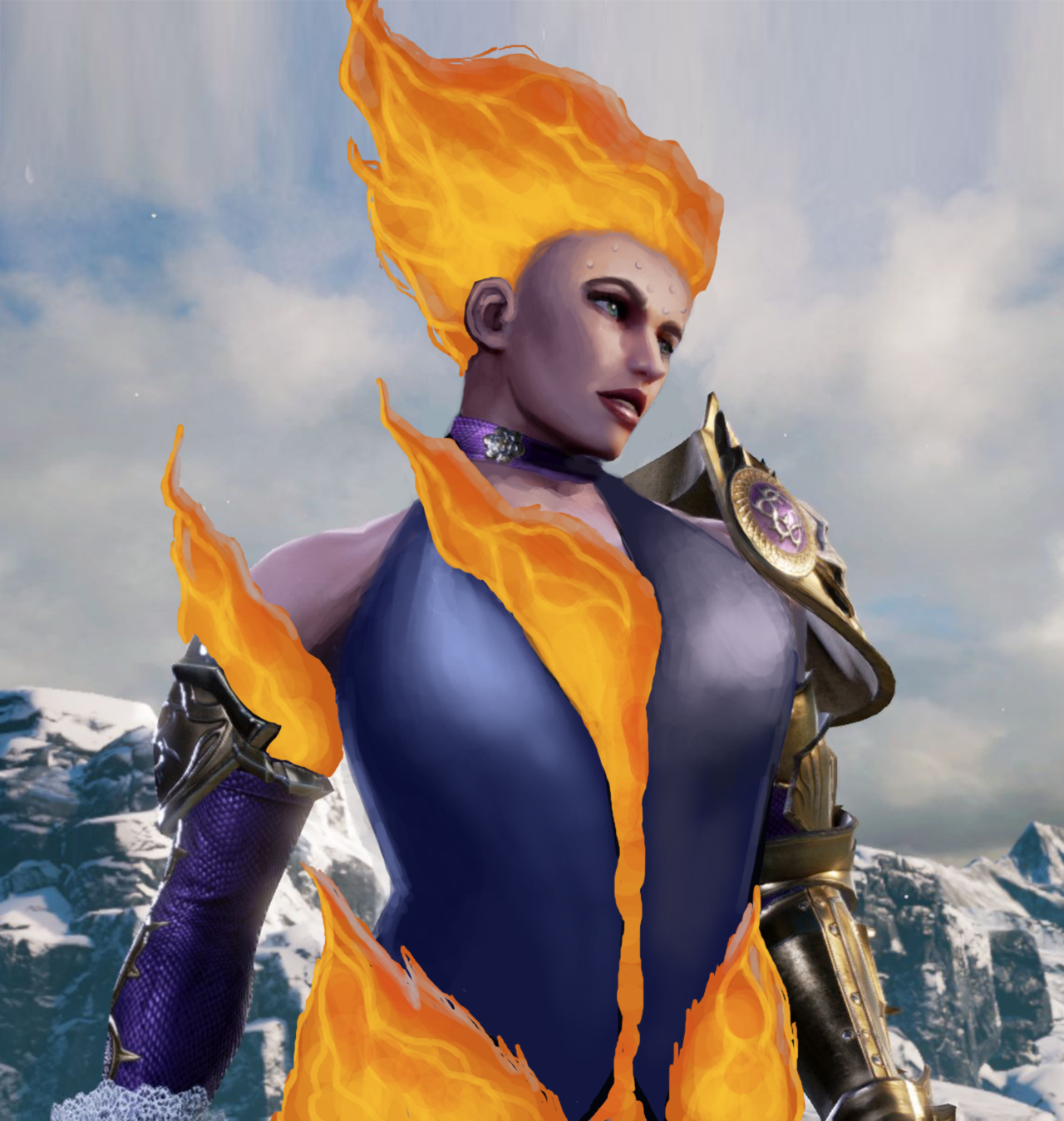
Ivy & Starfire: Fan Feedback edition!
Jumping ahead for this post to past weekend’s 50th Stream Extravaganza Finale so we can showcase two pieces that would not exist without our Fans.
I decided to take them up on their advice, and made Ivy into a hot, firey, Machiavellian goddess. She’s so hot, she’s even sweating a little!
And in case you’re wondering, everything below the waist there is Fire–as it should be.
-Icy
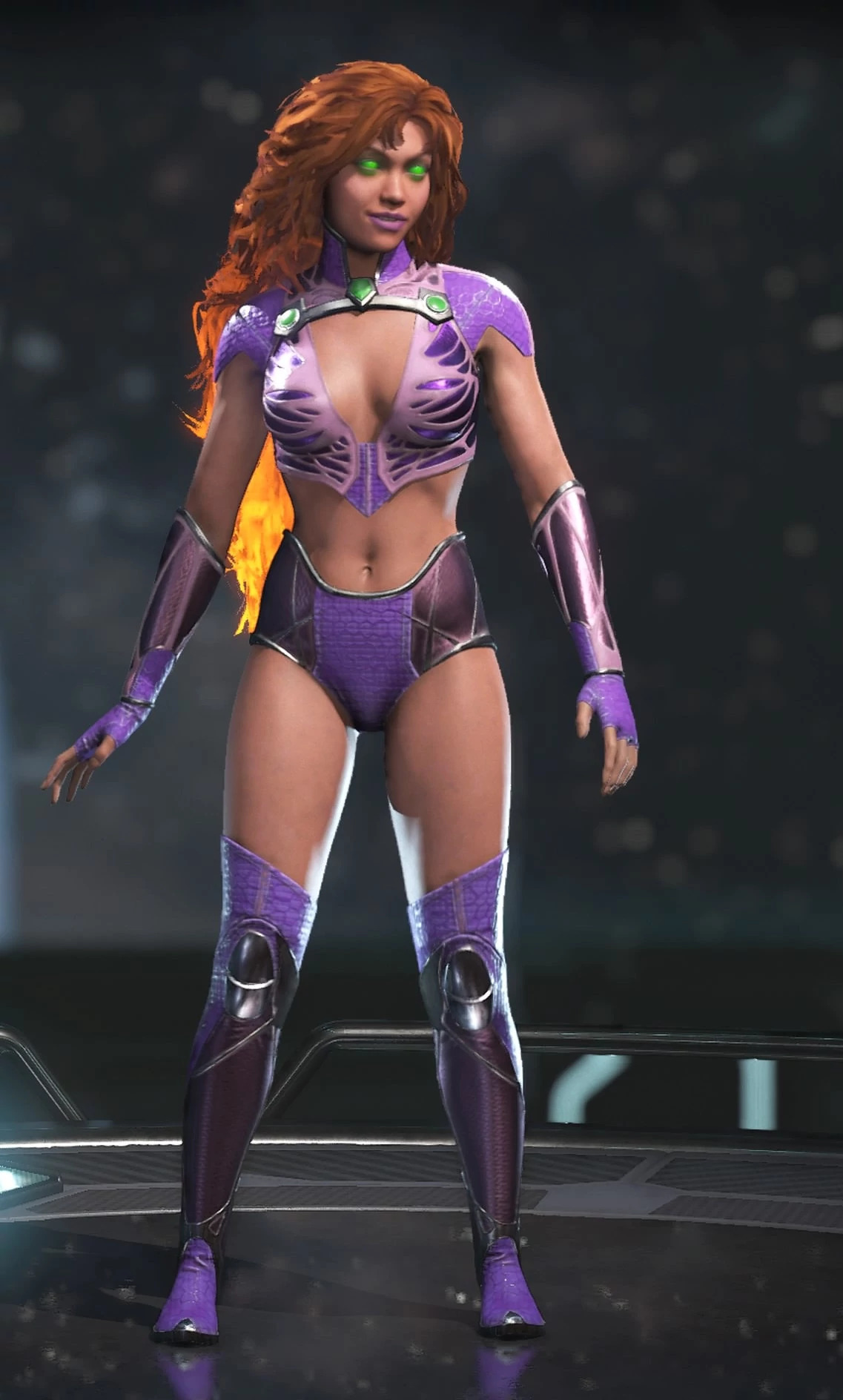
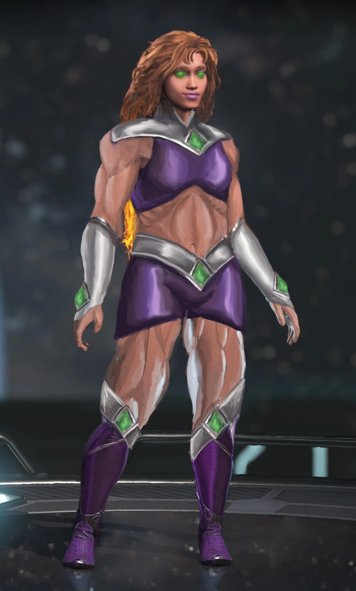
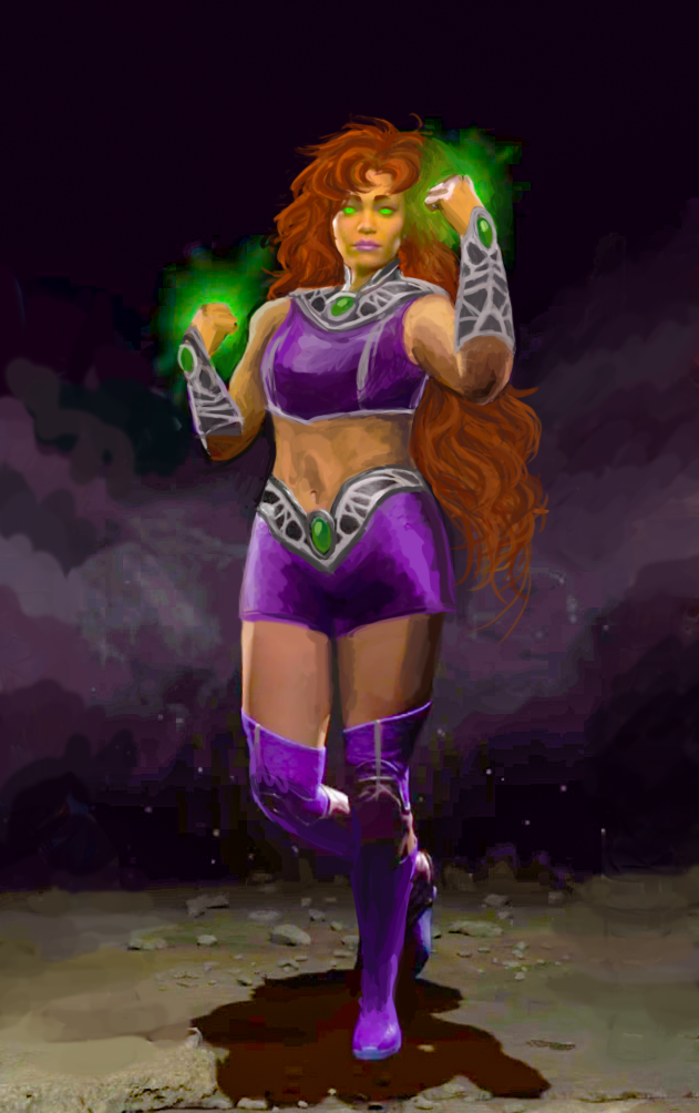
The second is an attempt to meet the very vague expectations that some random new commenter left under the old Injustice Starfire redesign. They implied that compared to the super-skinny original, my stouter version actually wasn’t muscular… and at the same time implied that this alien humanoid might be too heavy to use her power of flight.
Following this very helpful comment, I used two newer, better quality images from the game, redid Star’s bodytype and gave her a costume redesign I was working on in my free time.
NOW princess Koriand’r is of perfectly muscular and aerodynamic shape, not to mention the adequate weight to get off the ground and get decent momentum!
~Ozzie
Posted on
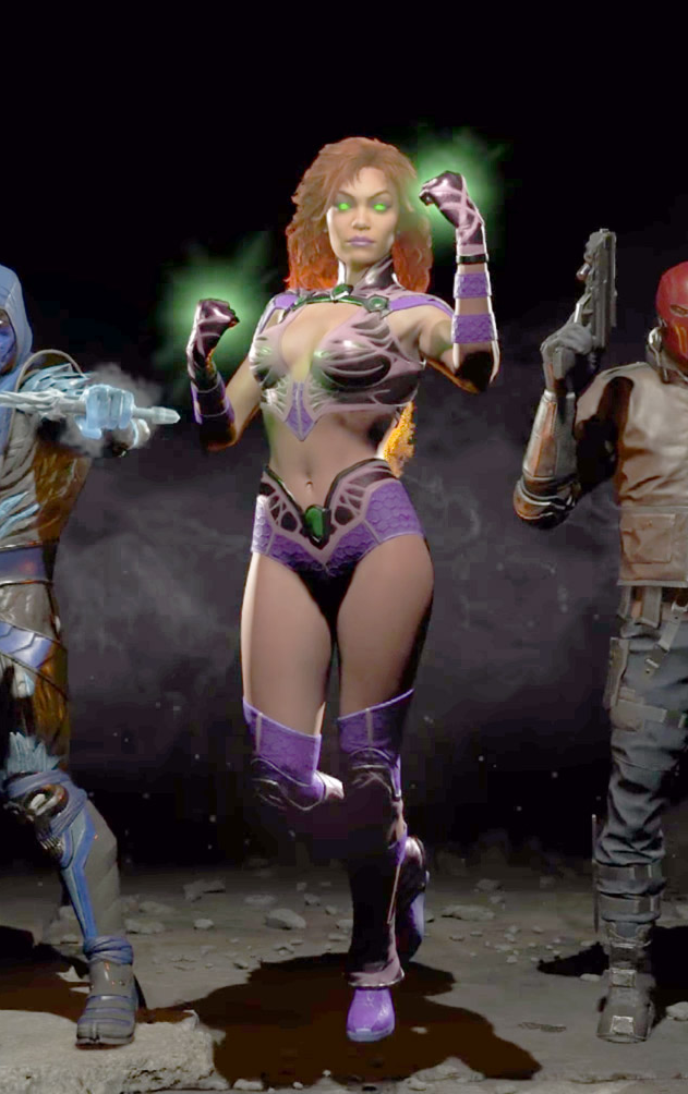
Starfire and the Legend of Murky Colors
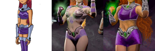
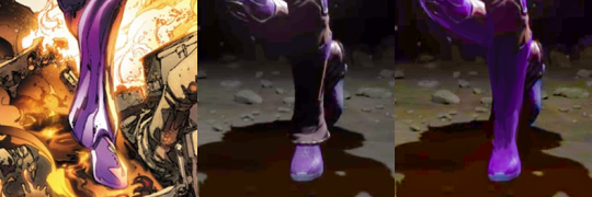
Injustice 2′sStarfire was a challenge with very little potential, so I mostly redid her from scratch, arriving at a mix of her 2000s cartoon outfit and 80s comics hair.
This was by far the hardest design to work with palette-wise, considering not only how desaturated colors in Injustice graphics are, but how outright low quality the official image is – it looks like something’s wrong with how they rendered the lightning! Muted colors were a double insult, considering Starfire’s vibrant color scheme corresponds with her vibrant personality. Did my best to recreate it by cranking up saturation, salvaging the few colors it did bring out and painting over the badly-lit parts with them.
Changed her bodypaint-bikini into a crop top and shorts (with all do respect to Glen Murakami’s cartoon Starfire design, flying in a skirt is just the worst idea).
Only part of her Injustice design worth salvaging were decorative bits on her belt, which I recolored silver and recreated the pattern on her new collar and arm guards to match. Painted her limp, lifeless hair to actually look fiery without even being made of flame – by simply basing them on her original New Teen Titans hairstyle.
Got rid of those weird bellbottom things on her ankles, which served no purpose and seemed like a throwback to her ugly New 52 footwear. Also, as usual, made her less skinny.
All in all not necessarily my best or most original redesign, but it’s best I could do with limited time, constant computer crashes and very hard material to work off of.
Are those super heavy armors on all the male characters, including Superman who’s way more invincible than Diana? Yes, they are.
Truly, the double standard is but a cherry on top of the utter ugliness that is this overdesigned figure set.
This reminds me of the old Jimquisition video in which Jim uses another ridiculous Square Enix statue of egdelord Batman as a perfect metaphor for Squeenix’s skewed priorities in game and visual design: