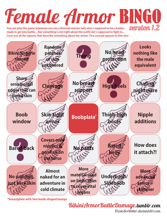
image

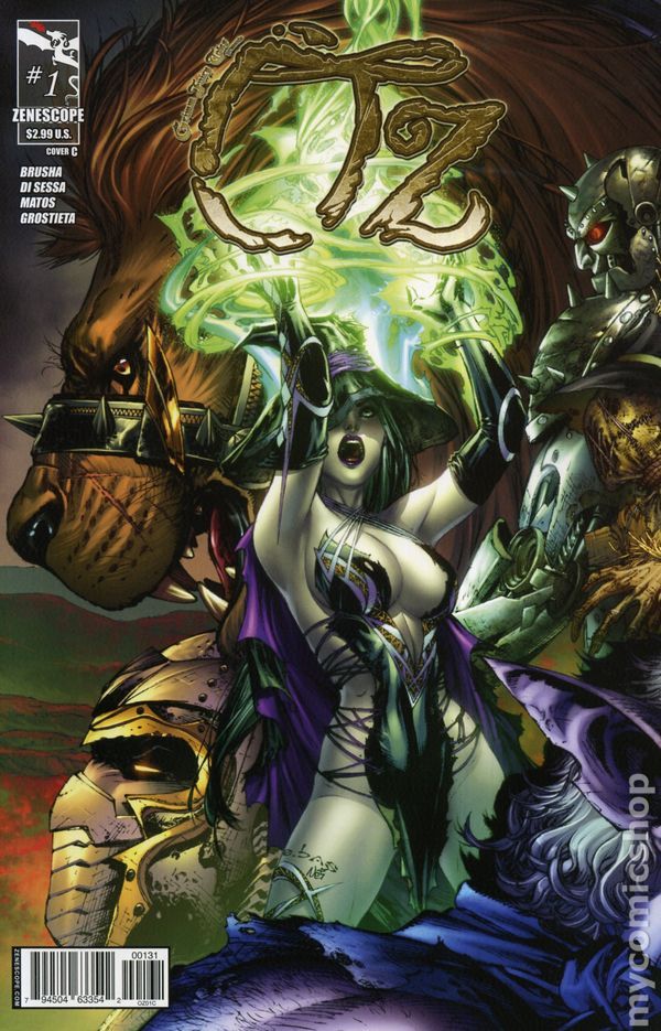
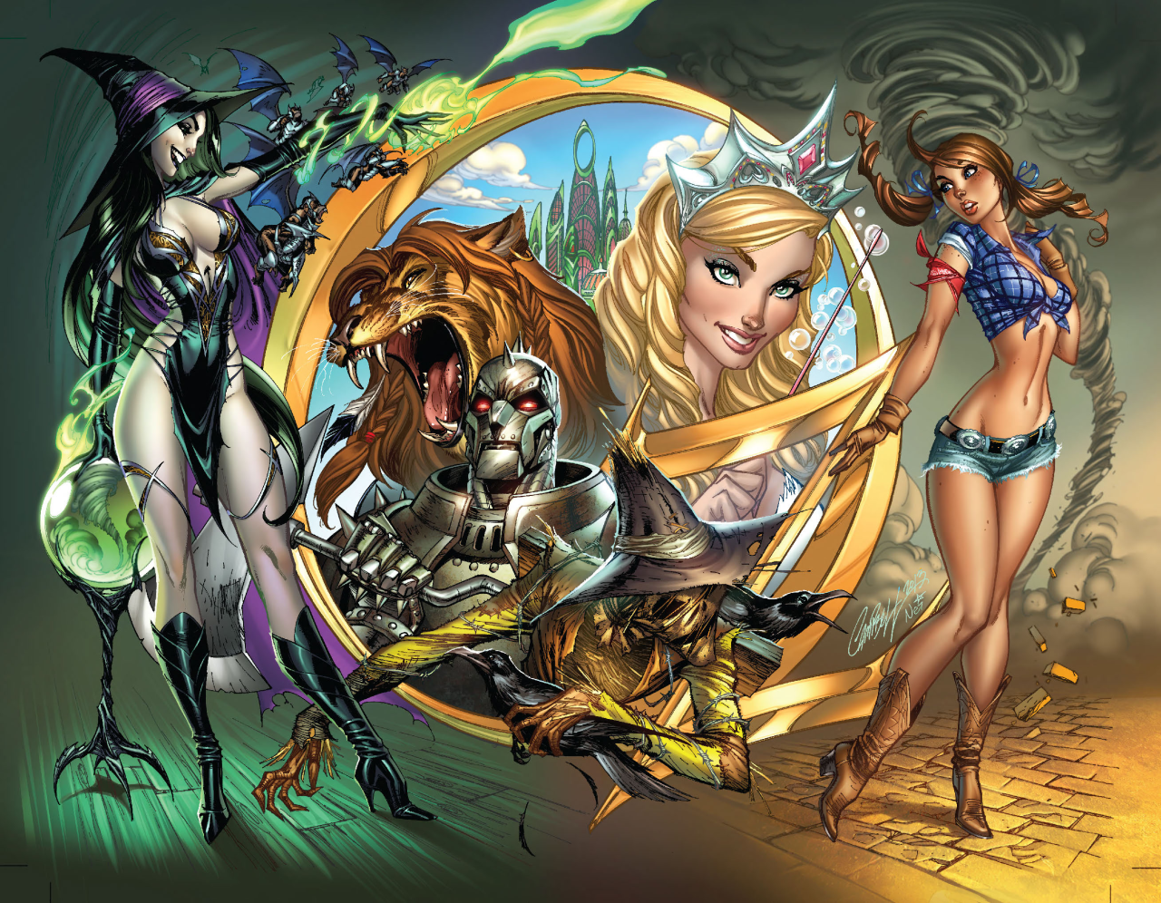
I feel ya, Dorothy, I am also appalled at what passes for clothing in Zenescope’s Oz. Are clothes taxed per inch of fabric in the West?

image

Have you ever looked at L. Frank Baum’s books about a land ruled and influenced by strong, complicated women, and thought “man, I wish these characters were drawn like plastic dolls by J. Scott Campbell so I could masturbate to them”? Well then, do we have the series for you!
image

(We also recommend you find actual people to interact with, we’re worried.)

Not technically armor, but I know 0 people who would wear this fabric scrap in real life. I guess J. Scott Campbell* knows more people than me… who are imaginary. At least Dorothy over there is wearing what might pass for clothes. I don’t even know what to call the Wicked Witch’s…. bodily coverings.

At least the series doesn’t fall into the Evil is Sexy trope, since everyone is barely allowed clothes? Yay?? ?

-Icy 

My eyes, upon seeing Zenescope’s idea of what “Kansas Farmgirl” and “Powerful Evil Witch” look like: 
image

~Ozzie 

* I realize Campbell may not have had any input on these character designs, but it’s just the sort of thing he would design, so he still gets 0 points.
@vertiga submitted:

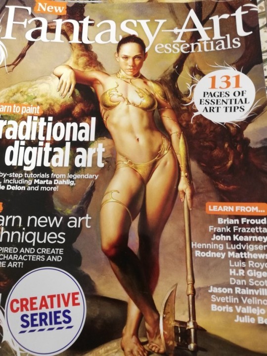
I saw this magazine in tesco and stared at it for a good minute just going ??? This is the cover image they chose for a magazine about the *essential* things for fantasy artists to learn, and doesn’t that just say it all?

image

We featured this magazine on the blog before, but it never got bingo’ed! Now that’s been rectified.

This design honestly looks like when you’re drawing the figure to figure out pose and what not, and end up putting way too much detail into it that you like. And then you feel bad for having to put clothes on top of your hard work, so you just kinda… stick some liquid metal to the essential areas, add some small decorative pieces, and call it good.

“Create better characters” indeed.

But worry not, everyone, their standards for the actual in-magazine content is the same:

image

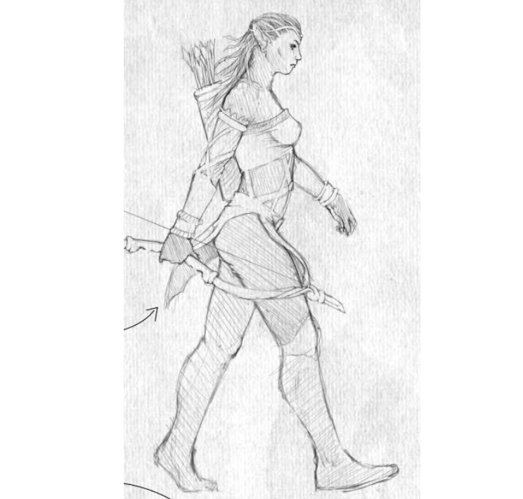
She’s supposed to be a ranger.

image

-Icy

More Bad Drawing Guides on BABD

image

Sooooo….. this is a thing.

image

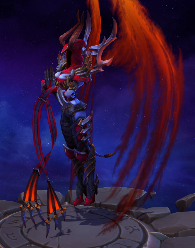
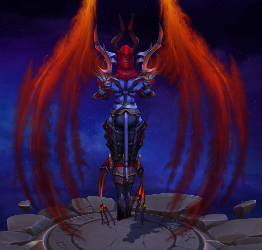
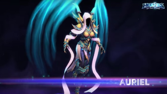
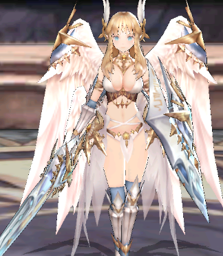
This the Demonic skin for Aurelia, an angel character in Heroes of the Storm. She normally looks like this:

image

So of course when she becomes a demon (or almost, according to the backstory blurb), she wears an S&M outfit, cause that’s what demons are about? Where’s my S&M Azmodan skin, then, Blizzard?? 

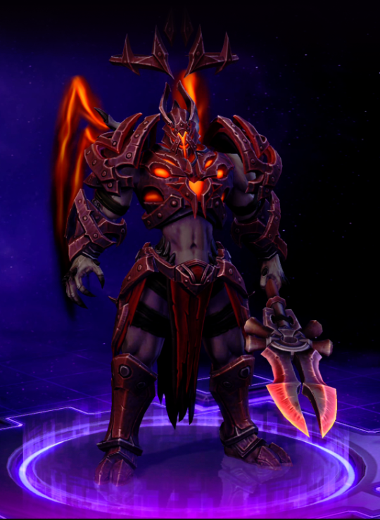
The closest a male equivalent outfit gets is the Demonic Imperius skin, where he shows off his abs but unfortunately doesn’t wear a leather harness.
image

At least he wears hot pants, but at the same time, he gets, like, a legitimate chest piece. Auriel is getting a nip slip the second she casts anything, assuming angels have nipples. Imperius also has an actual demonic appearance about him, whereas Auriel is just a Hot Chick with red wings. The fact that none of the angels have faces only makes it worse with her design.
Ugh. It’s such a shame, they could have made her actually scary-looking, but we can’t have that. After all, even an alien insect queen has to have a hot skin.

-Icy

Gotta Fix Everyone’s Weird Boob “Armor”

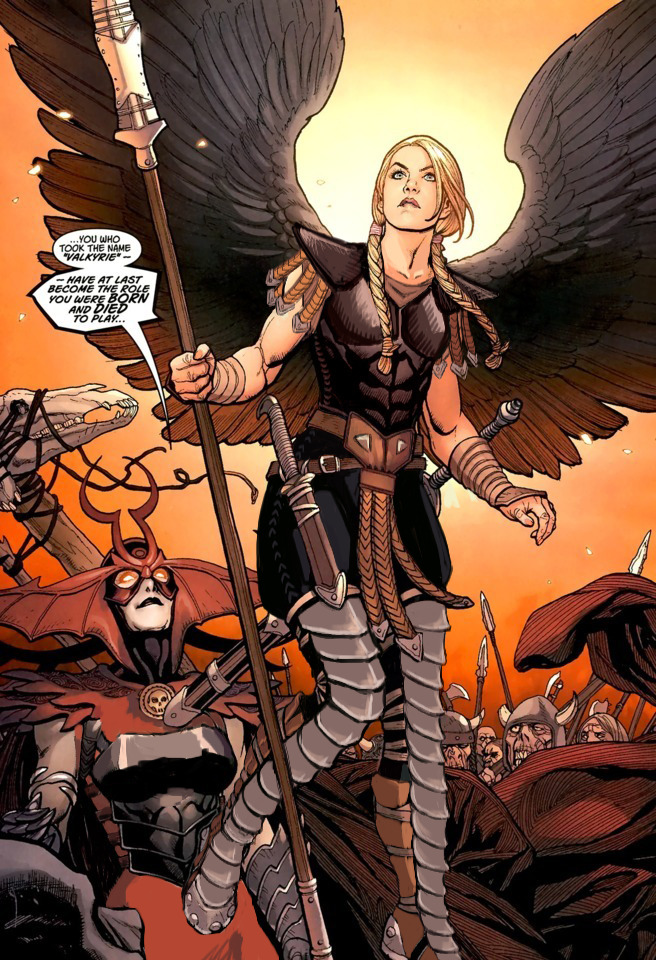
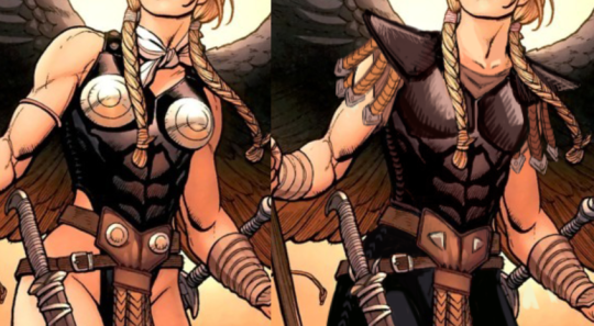
I was frustrated with how Marvel’s Valkyrie was just a sequence of weird design decisions. This particular version ticked me off because they had the cool cuirass with the abs, but then the chafing and the metal boob cones…. ugh.

I started with fixing that chest armor: getting rid of the weird metal bra and adding cool (to me, anyway) shoulder guards. I wanted to give her a more powerful look. I added some small dangling leather straps to mirror those on her belt.

image

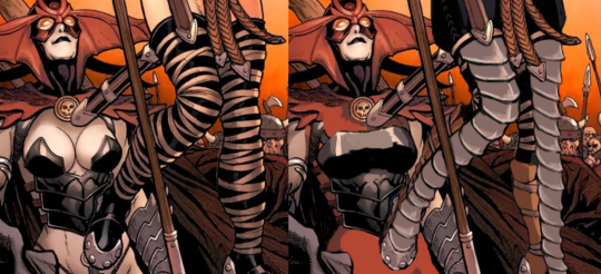
When it was time to fix her…. boots? I took the liberty of, at the same time, painting over poor Hel’s painful-looking <biggest air-quotes ever> “armor.” I actually started giving her a more reasonable breastplate but gave up. That would be a project all on its own.

Those leg ropes seemed very stupid to me, and they didn’t go with the rest of the design, so I gave her plate armor that kept the small shapes. I then gave her simple pants to be the large shape in the design. In hindsight, I feel like I should have gone through with the metal gauntlets I wanted to give her but bailed on.

image

Finally, I replaced her Generic Pout™ with a more determined expression. Now both ladies can go forth and fight whoever it is they’re fighting. 

-Icy

image

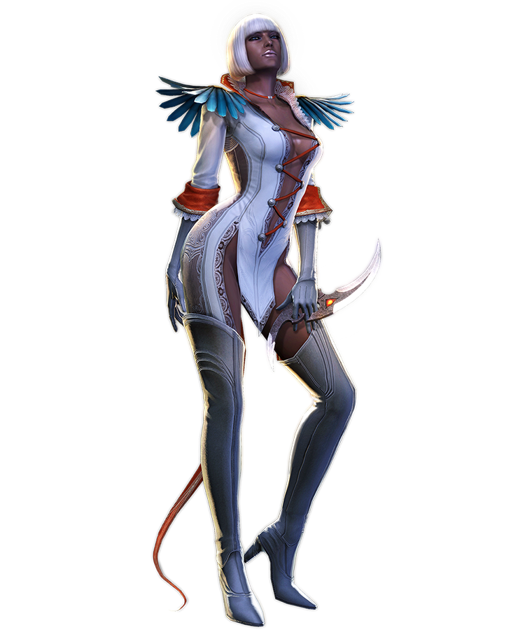
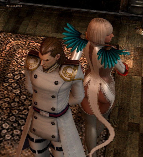
Ah, Gloria… What in the Nine Hells is even going on.

Gloria here is from Devil May Cry 4, where she is a high-ranking soldier. Yes, you read that right. She even demonstrates her “acrobatic and combat skills” in the game, to even the horror of VergilNero*, the main character. Watch the video at your own risk, not in public if possible.

For those who don’t want to scar their eyes and brains, here’s instead a picture of what the back of her “outfit” looks like:

image

In case you thought that the front of her could not be outdone.

image

-Icy

* The series really needs to consider in giving male leads distinct appearances or unique personalities… or maybe just personalities at all.

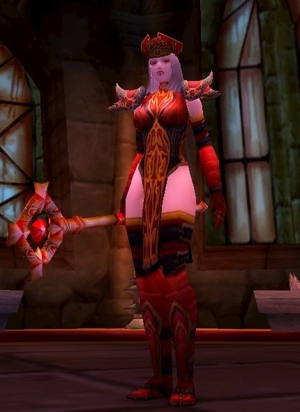
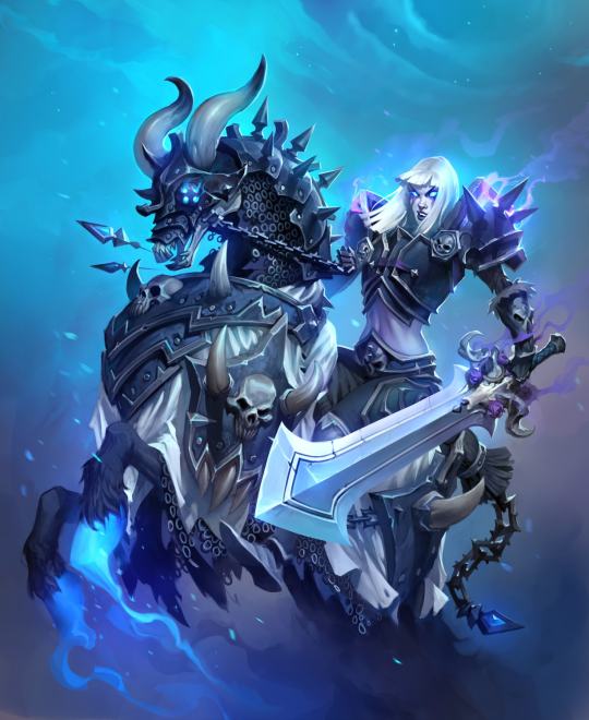
Red is for the High Inquisitor skin, Blue is additionals from the Celestial Empress skin

Clickbait Title: You Won’t Believe What Character Blizzard is Adding to Heroes of the Storm!

Having blocked out most of my memories of playing World of Warcraft (and I didn’t do raids), I didn’t remember Sally Whitemane, so boy was I surprised to learn she led a religious order!

image

I’m not sure how anybody took this character seriously as an authority figure of any kind. Her outfit looks like something out of a fetish lingerie catalog. The HotS design is almost exactly the same as her original WoW model, which really highlights how much effort Blizzard is putting into doing women better.

image

Not to mention, her first alternative skin is some kind of scissors accident, rather than, for example, her Horseman version? Yeah, she became one of WoW’s Four Horsemen (the only woman in the current lineup, of course).

image

I mean, give her some padding on her exposed stomach, and that would be a fine alternate skin! But she does have a lot of skull motifs all over, so maybe they thought it would be too similar-looking to Sonya’s Death Knight skins.

-Icy

h/t: @evjazurian

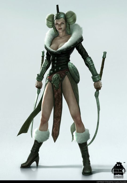
This design comes from a game about Norse mythology. I challenge you, our readers, to take a guess at which character from Norse mythology this is. I’ll wait.

Did you say Hel, who is the villain of the game Viking: Battle for Asgard? If you did, you must have read our post about Foldable Human Dan Olson looking into So Bad They’re Good games from a few months back. Because that awfully specific answer is indeed correct…. unfortunately.

image

I can’t even comprehend what the art direction was for this concept. What in the Hel (ha) is this? I was only able to find this single promo picture where the full glory of this design is shown, which I can only assume is because if she stands in any other way, that belt bra will slip off. 

But let’s also not forget Freya, who also makes an appearance in the game!

image
image

-Icy

King’s Raid is a mobile game with good graphics and artwork, typically addicting gameplay through psychologically rewarding progression mechanics, and a fun, cooperative Raid gameplay mode.

In other words, a Skinner box game with Sexy Girls, got it. Could have just said that, it’s much shorter.

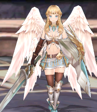
I got an ad for this game the other day, so I decided to check out the wiki for some Bingo material, and now I’m feeling really bad for the poor Bingo card. This one is literally the first character listed under their first category in the Heroes tab: Aselica the Knight (she’s a Tank, can’t you tell??). Here’s a better look at her “armor:”

image

Good Graphics and Artwork™, as advertised.

And of course, this is what her lesser version looks like:

image

At least her wings acquired more protection…?

-Icy

image

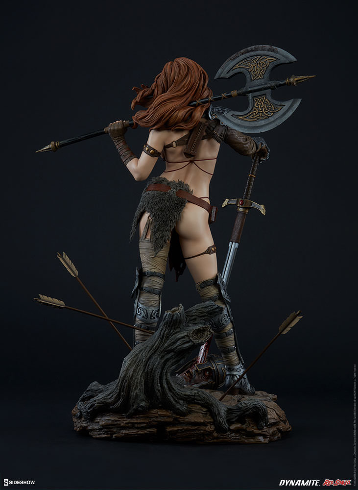
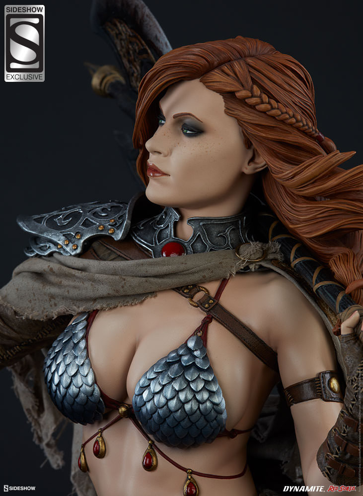
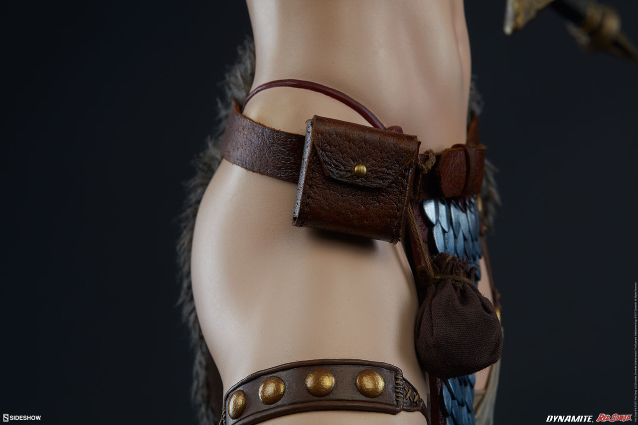
Time to come back to Sideshow Toys and probably their best example yet of how much amazing craftsmanship (that sculpt! the intricate paint job! the fabric and synthetic leather details!) can be wasted on super garbage design.
This time, a classic garbage that is Red Sonja in her standard scalemail bikini

How do the mail bra and loincloth even hold up with such flimsy straps?
What is the point of protecting your neck with metal collar when your heart, guts and skull are all totally exposed?
Why worry about reasonably padding your leg and arm protection, but wear a scalemail bra (that will sand your nipples off) directly on your skin?

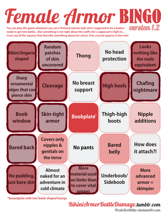
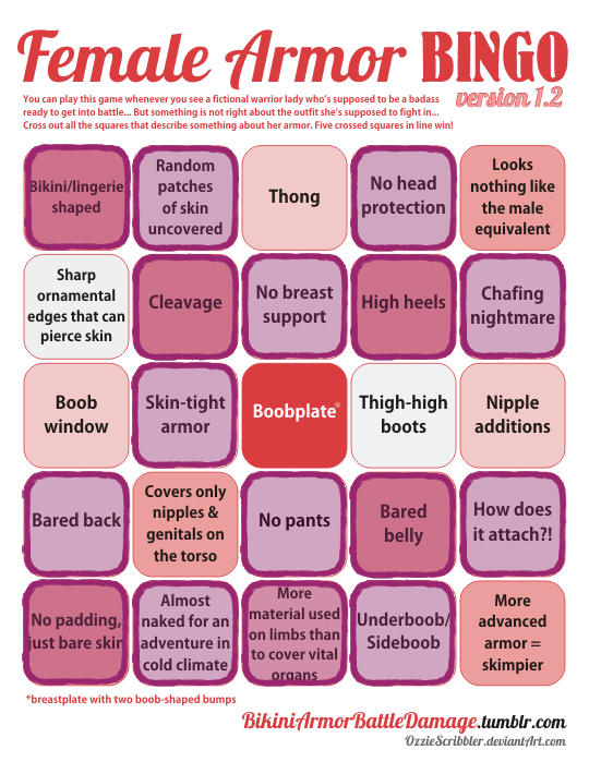
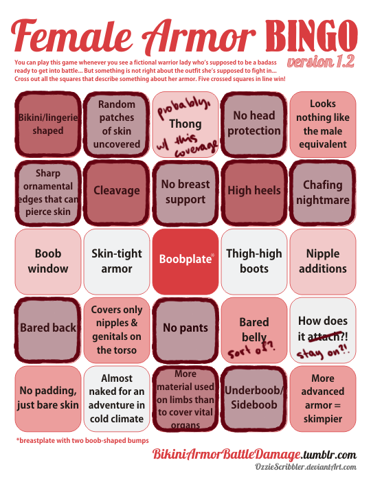
“Looks nothing like male equivalent” checked, of course, because of Conan.
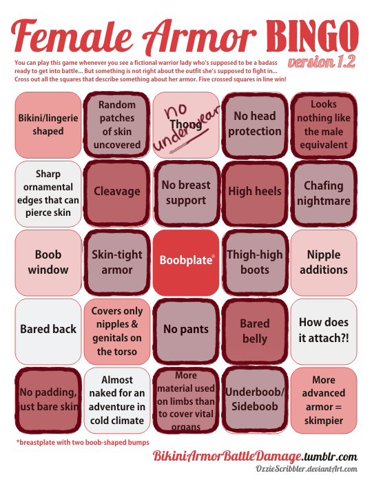
Not crossing out “High heels” square, since that (cw: gore) is a reasonable heel size for a horse riding and wouldn’t be out of ordinary for a male character either. 

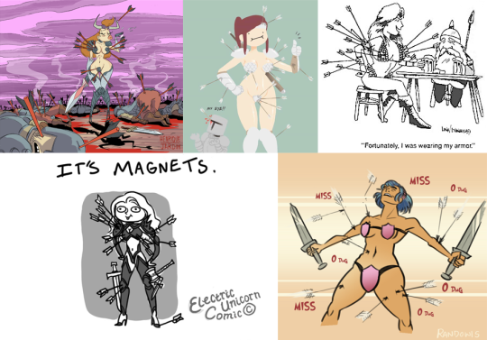
Also note how all those arrows that apparently completely missed Sonja, presumably due to her “costume” being more of a plot armor than anything else.
Reminds me of those couple “bikini armor makes you completely resistant to arrows” parodies we featured before: 

image

Full comics to be viewed here: 1, 2345.

~Ozzie