Join us this week as we encounter a league of celestial beings in order to give them better armor!
Same (though relatively new) BABD Time, same BABD channel! Saturday 10 AM PST / 7 PM CEST.
See you there!
~Ozzie and Icy
Posted on
Posted on
Posted on
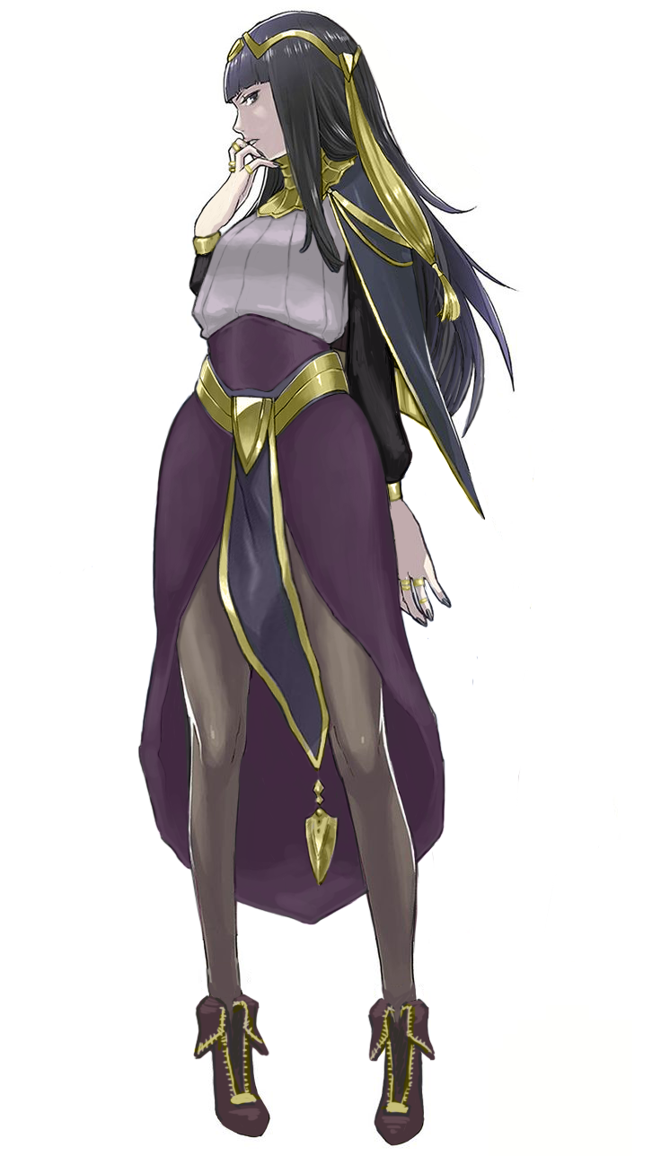
Tharja – Medieval Fantasy Body Stocking Technology
Jumping forward a few streams for this post, since this was back when I went way over our allotted time, and those old designs aren’t done yet… They’ll be done one day. ヽ༼ຈل͜ຈ༽ノ
So this was more of a fashion redesign exercise. Tharja, from Fire Emblem Awakening, is a sorceress. In terms of game mechanics, they tend to stay in the back and be pretty squishy, so I don’t expect her to wear full plate. I just wanted her to not wear… that thing. The body stocking, that somehow exists in this universe. Oh, and she comes from a hot desert region, so….
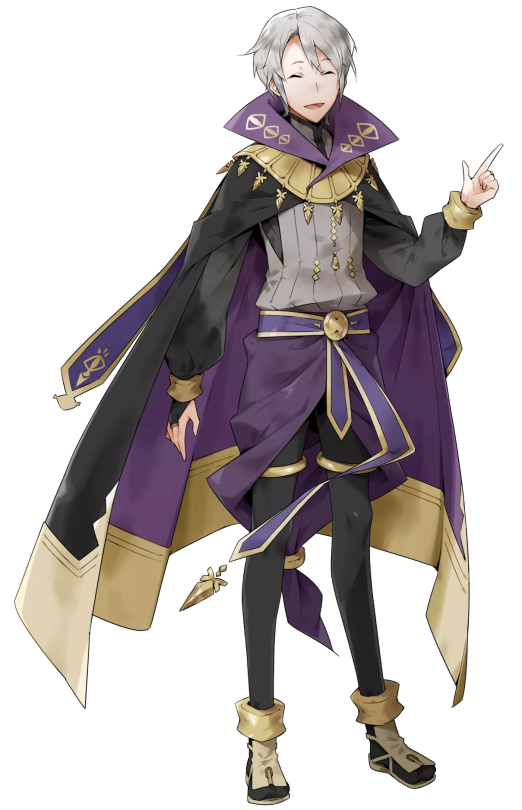
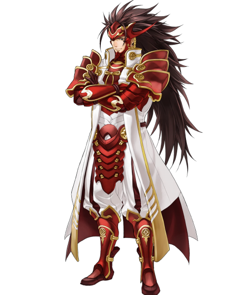
Since this is a fantasy universe that borrows very little from actual desert-dwelling peoples, I took inspiration from her counterpart, who’s from the same country. He looks like this:
So I took the skirt-like thing and the shirt he wears and adjusted it for Tharja. I liked her belt, so I kept it, and instead changed the waistline of the skirt to try and form some nice shapes.
Because of the skirt, however, the cape became redundant. I tried 2 different versions of it before scrapping it. Looking at it now, I should have just made it connect to her sleeves at the wrist. Without the cape, the little dangly things on it looked weird, and I hated her hair from the start, so I basically just moved the shapes around. Got rid of the ponytail thing, while adding a similar shape to her circlet, though I probably should have made it smaller. As for her tights, I was too lazy to paint over them, but in theory, they’d be like Henry’s (the boy above) legging-type things.
The last thing I did was adjust the color balance. Her colors were so muted in the original, especially her golden accents, so I upped the saturation on that to complement the purple.
Overall, I was trying to go for a more professional, distancing look. Tharja is antisocial and strange, after all. I do like the redesign, though there’s always things you see after you “finish” a work that could be improved upon. Honestly, I kind of want to redo Henry’s design, cause it’s kinda bad… Purple on purple; genus.
We’ve been informed that a Tumblr user from whom we reblogged two bingos, including the last one, expresses transphobic views on their blog. We apologize for not picking up on that earlier.
BABD can not stand behind giving exposure to a transphobe, therefore both posts will be marked as private from now on.
Another apology for not noticing that the awesome unofficial Laura Kinney/X-23 redesign we reblogged yesterday was drawn by Kris Anka, who’s definitely a comic industry professional.
Tumblr unmarked our blog from “sensitive” and also apparently fixed the bug that didn’t allow to mark individual posts as sensitive on PC version of the platform.
Now worst of the worst posts from our NSFW tag are also invisible in Safe Mode. They’re additionally tagged as “sentitive” – but before clicking that link please keep in mind they’re the ones that feature imagery of distinctly explicit and/or suggestive and/or disturbing and/or violent nature – viewer discretion highly advised.
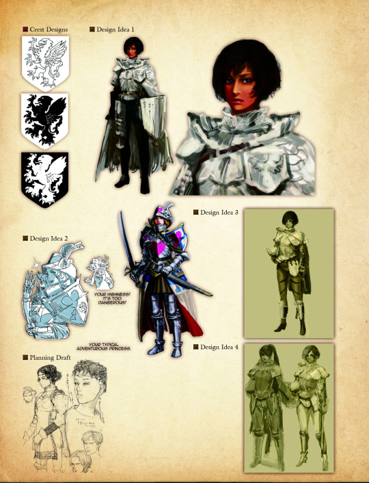
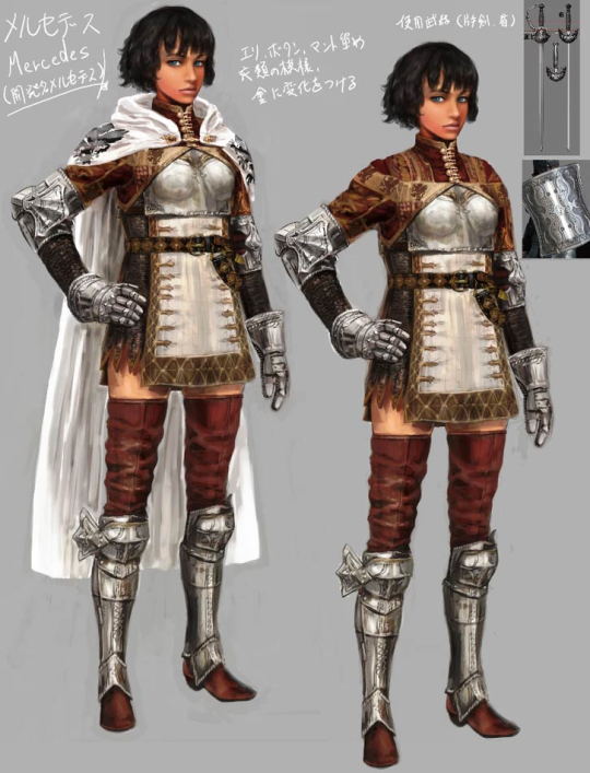
Excuse me, but literally the first concept for this character is fully armored, in reasonable plate, with no Tiddies and with actual pants??
E X C U S E M E ? ? ?
-Icy
Just in case the “no pants” part wasn’t clear enough from the image used by the OP, here’s some concept art for the final design, pants definitely not included:
I think it’s reasonable to say that Dragon’s Dogma, both with outright bad stuff and clearly missed opportunities, like this one, belongs firmly on our Wall of Shame.
Are those super heavy armors on all the male characters, including Superman who’s way more invincible than Diana? Yes, they are.
Truly, the double standard is but a cherry on top of the utter ugliness that is this overdesigned figure set.
This reminds me of the old Jimquisition video in which Jim uses another ridiculous Square Enix statue of egdelord Batman as a perfect metaphor for Squeenix’s skewed priorities in game and visual design:
I wish Fire Emblem was self-aware enough to serve the same sort of costume design for male and female heroes without the need of fanmade fixes… >_>
~Ozzie
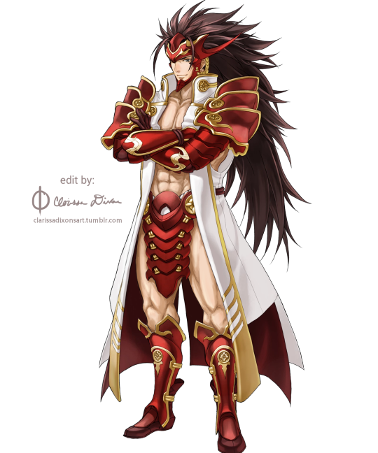
The empowered version really is so much better design-wise. I mean, the original had white-on-white! Who thought that was a good idea? But in the edit, his skin becomes a contrasting color, and my eyes don’t unfocus looking at him. Not to mention, getting rid of all those pesky armor bits on his torso gives us several clear points of red breaking up the large white shape that is his coat, rather than sticking so much red together around his chest. It’s just better on the eyes in every way~