The hilarious front line in the tragic war against ridiculous female armor
Tag: bikini armor battle damage
Posted on
Okay… so the bright side of this is her backstory (ie a fantasy adaption of the legend of Elizabeth Bathory) does not specify that she is in fact undead… so it’s possible she’s just terrible looking and not yet one sexualized corpse. Not likely though, based off the intro animation.
I’m honestly at a loss about how someone decided that the best way to communicate ruthless, soul stealing necromancer was… underboob.
Though I suppose I’ll have plenty of time to consider it in the nightmares this is going to give me. You’re welcome.
I’d say I need to update rhetorics bingo but I don’t see a square for outright calling people assholes and telling them to go fuck themselves.
I like how he has to go and actually repeat points from that rhetorics despite how bad they are. I mean, he even went back to the old “she chooses to dress that way” argument with “Women like Laura do what they fucking feel like”.
I would lose all desire of supporting Laura’s new book after this if it wasn’t for the fact that I know Marvel will learn nothing from its eventual failure. They will claim they were totally right to force her back into a skimpy outfit because “sex sells” and to undo her character development and force her back to a codename she rejected (and that stands for dehumanization and abuse did to her more than anything else) because “X-23 is an established brand” and will simply blame Mariko Tamaki for not being able to stop a boat they blew dozen of holes in from sinking. I will still give serious thought if I actually will support that book because it feels to me Marvel is hell-bent on making it fail and I could use my time helping other titles stay afloat.
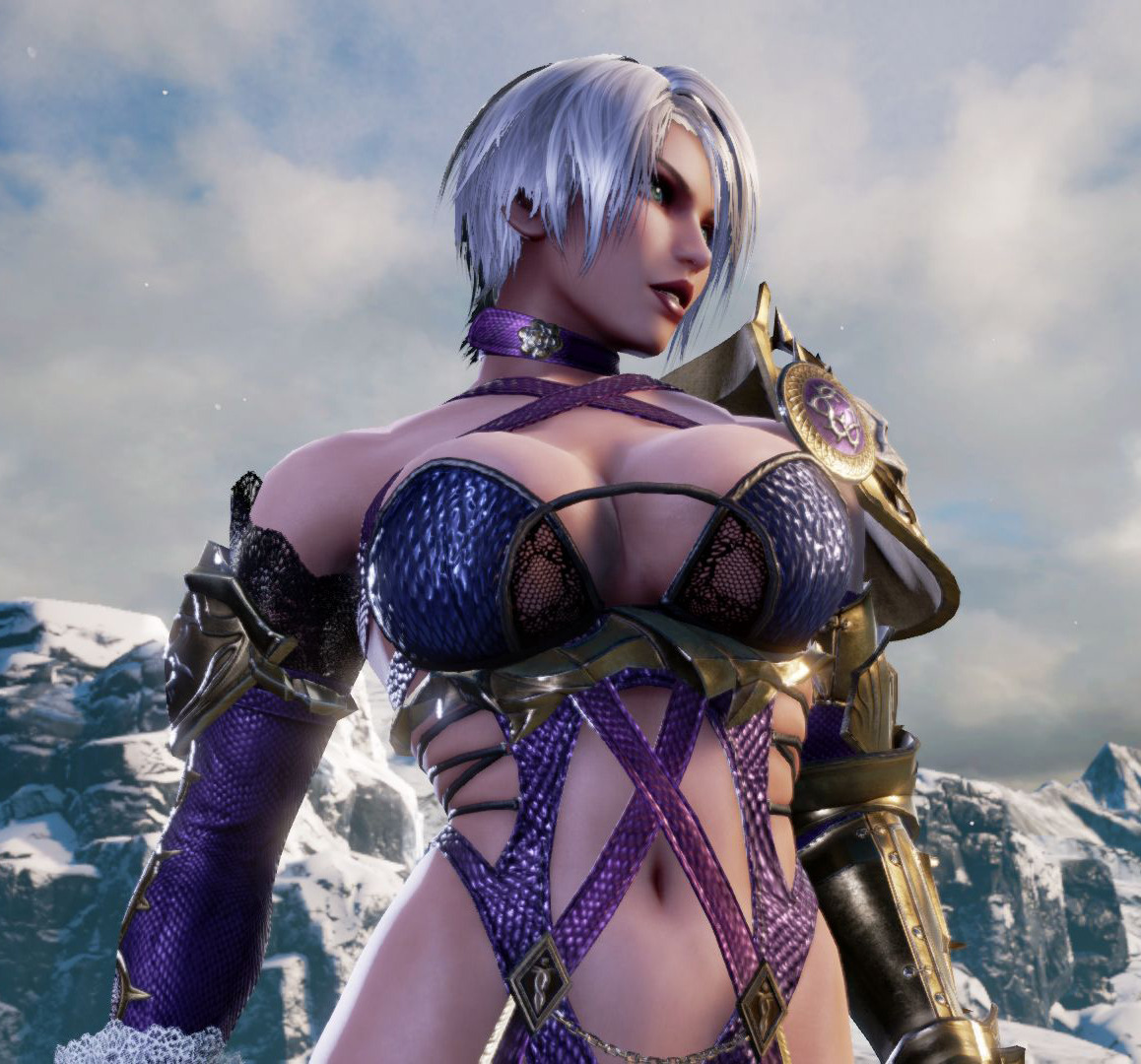
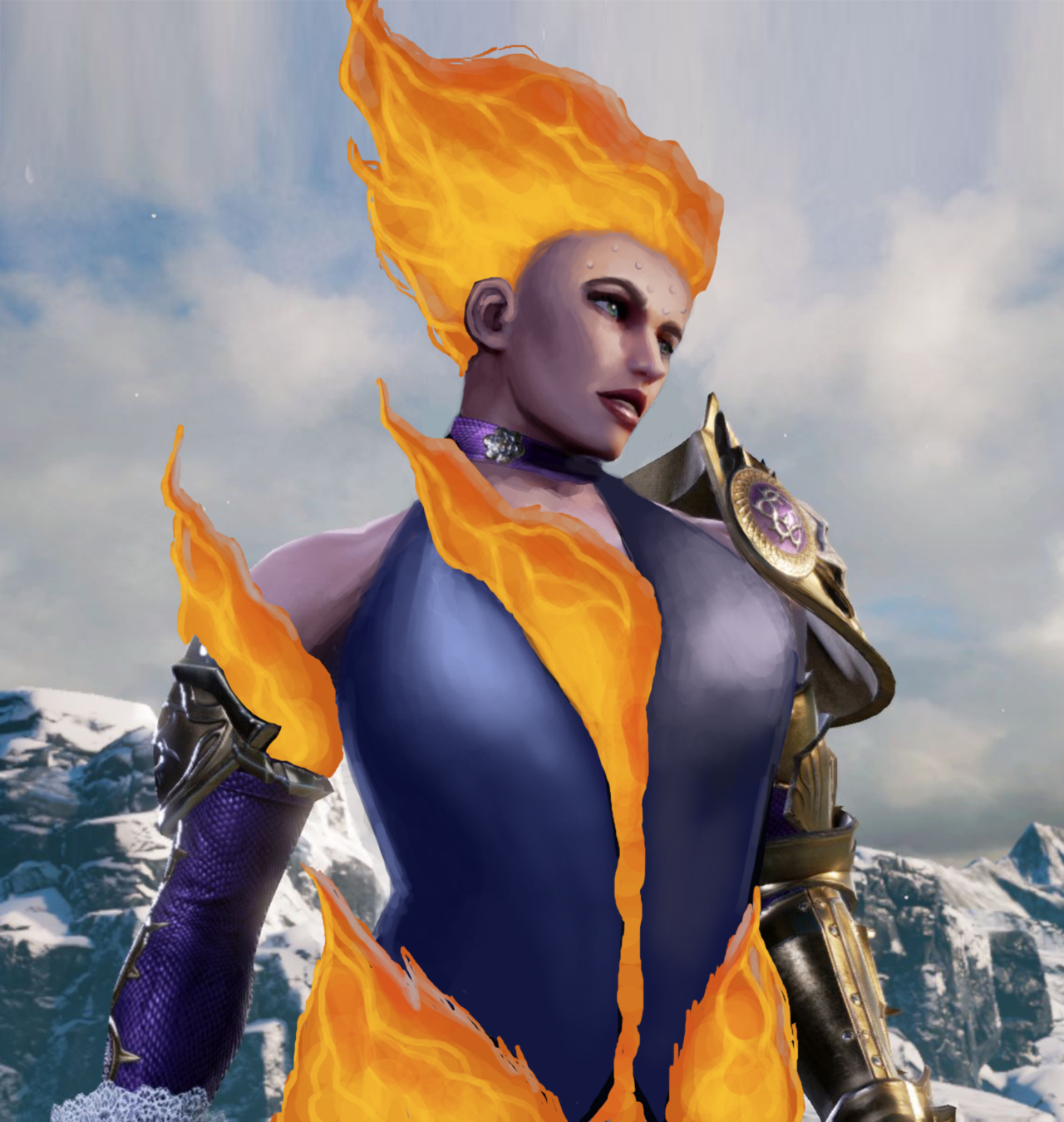
I decided to take them up on their advice, and made Ivy into a hot, firey, Machiavellian goddess. She’s so hot, she’s even sweating a little!
And in case you’re wondering, everything below the waist there is Fire–as it should be.
-Icy
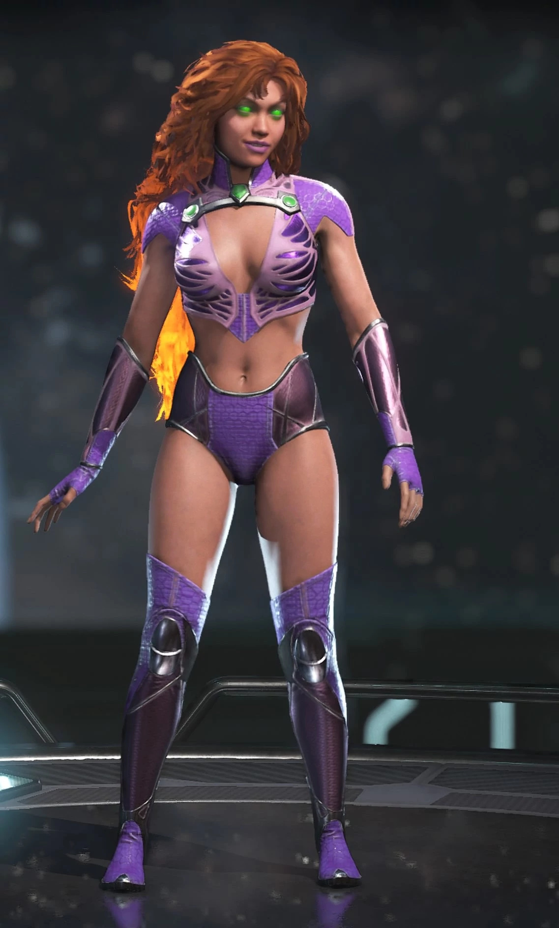
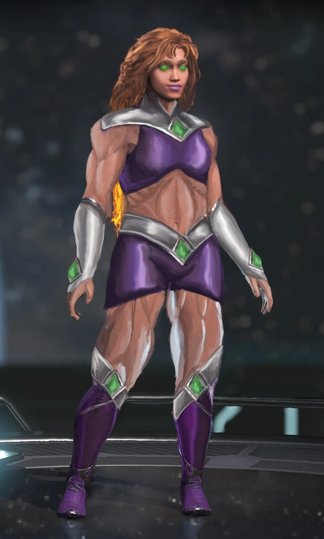
The second is an attempt to meet the very vague expectations that some random new commenter left under the old Injustice Starfire redesign. They implied that compared to the super-skinny original, my stouter version actually wasn’t muscular… and at the same time implied that this alien humanoid might be too heavy to use her power of flight.
Following this very helpful comment, I used two newer, better quality images from the game, redid Star’s bodytype and gave her a costume redesign I was working on in my free time.
NOW princess Koriand’r is of perfectly muscular and aerodynamic shape, not to mention the adequate weight to get off the ground and get decent momentum!
So far the most requested armor fix – Female Corrin in her Nohr Noble armor!
Not gonna lie, I’m not sure why they keep designing those chafing hazards. That honestly bothers me more than the huge boob windows by now.
What a lovely fix! I realize that not a lot had to be changed from the original, but I really like the top of the breastplate, the longer sleeves and the chainmail. There are a lot of strange holes in the armor in the original, so it’s nice to see them gone. And I actually like that the pauldron was made smaller, just because it looks so out-of-place in the original. One thing I would personally change is add a gold accent to the bottom edge of her breastplate. Overall, I think this is a great armor fix.
According to lore, the character does have to be barefoot, but the excuse that it’s because she turns into a dragon is Not Good. I’m not mad about it, in any case. She can still wear socks.
-Icy
Posted on
Yesterday – while looking with Icy through Heroes of Newerth’s art page, the endless depository of painfully generic, often plagiarized, and even more often super sexist and racist artwork – we found this fairy… thing and agreed she’s a perfect bingo material. And boy is she!
If not for her weird furry feet, she’d very likely get a bingo with high heels.
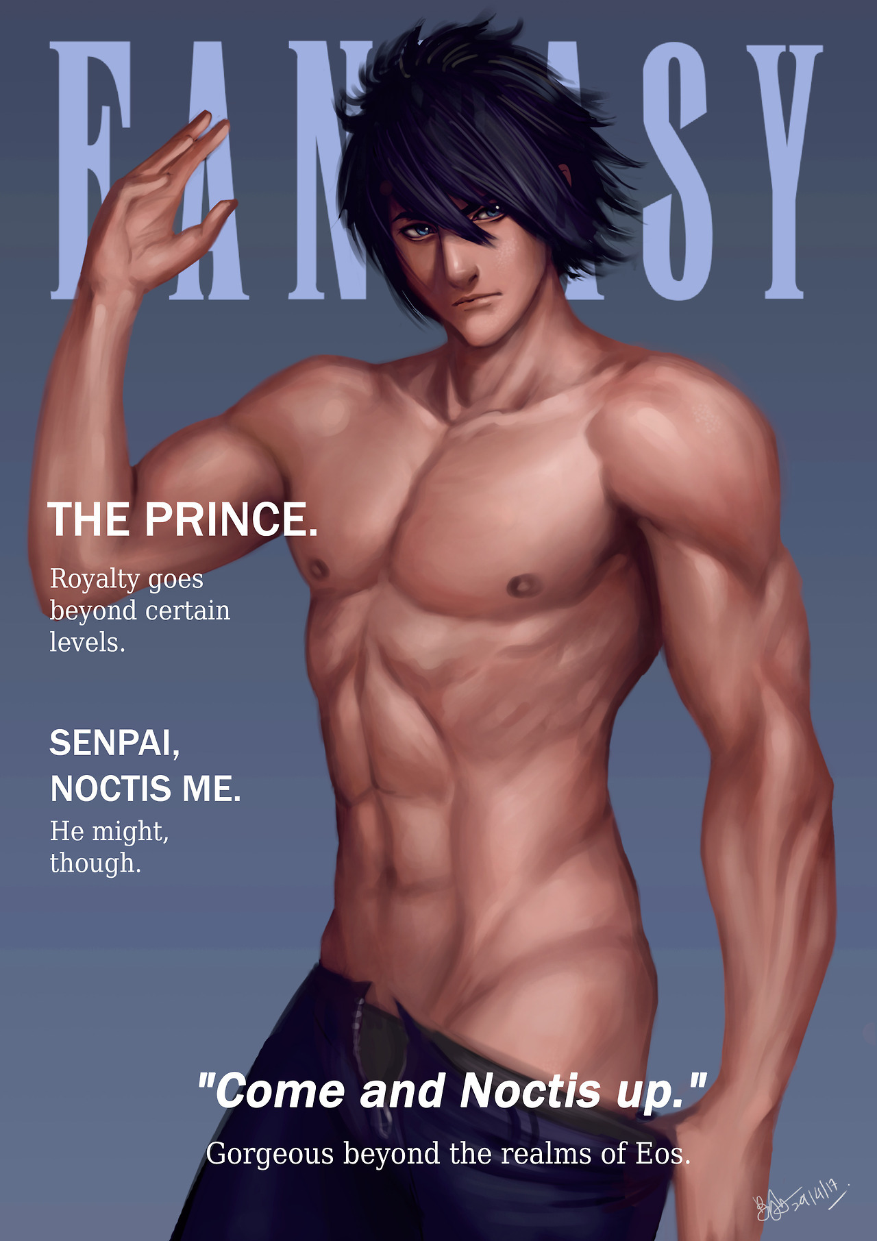
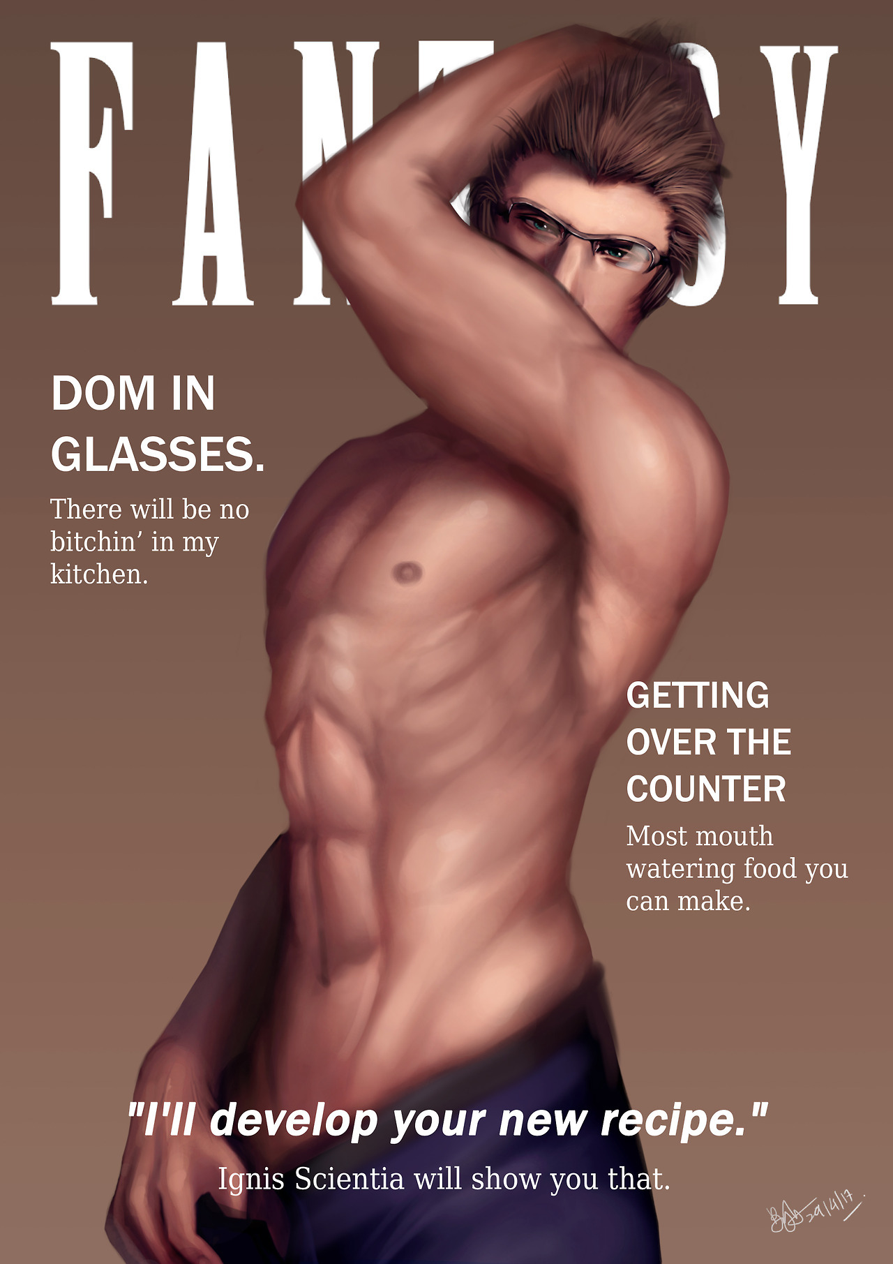
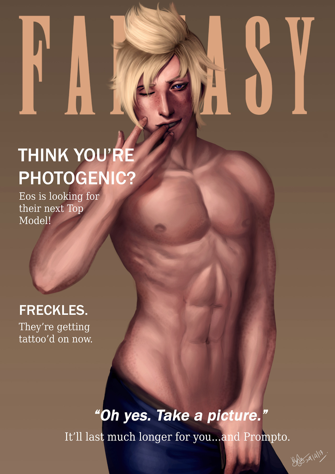
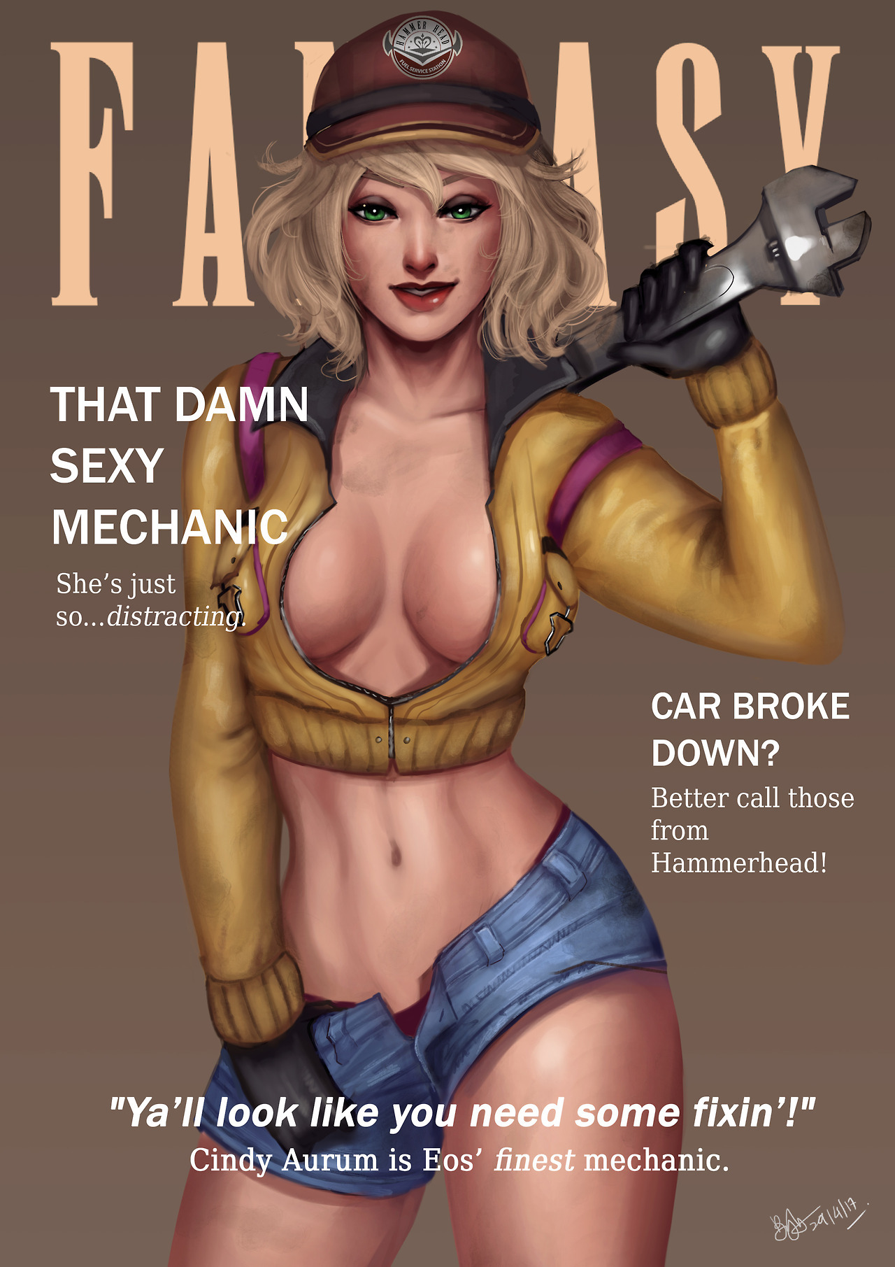
You know, I’m glad that someone realized that it’s just unfair that Cindy gets all the empowerment in Final Fantasy XV… I’m so glad we can count on the fan community to think of looks for the boys that are every bit as impressive and and practical for battle as Cindy’s is for working in a mechanic shop.
That post about “attractive armor without bikini” actually left me wondering: why would you actually want an attractive armor? Sure, everyone loves an aesthethically pleasing armor, but we can’t just forget that armor is mostly made to be, well, intimidating. It’s supposed to make people both safer in combat and also more powerful. Not having to battle – because you look so threatening or even downright unbeatable – is some 40% of the purpose of an armor piece. Why does it need to be attractive?
But let’s set some things straight first: armor is done primarily to be protective. It sure helps if the design makes the wearer intimidating enough to make the opponents surrender right away, but at its core it was invented as a physical barrier between a person and whatever or whoever threatens their life or health.
That doesn’t mean there isn’t a place for decorative armor in the history. Highly ornamented muscle cuirass (male equivalent of boobplate) was designed to impress and worn by high-standing officers during non-battle special occasions, like parades.
That said, in the world of fiction the distinction between purely functional and decorative armor is not necessary. It’s not real, and unless the setting of choice is gritty life-like naturalism, the armor (and any other design) needs just to be believable, not realistic. We commented on it before.
This is where those two bingo squares come in. Fictional worlds, especially the more fantastic ones, can be stylized, sometimes even to ridiculous degree, as long as all of the world is consistent with its level of stylization. That’s why it’s not inherently bad to have people fight monsters in G-strings… It just needs to all make sense within its own narrative and preferably not be gendered (which basically never happens).
Hope that answers it.
~Ozzie
Sometimes we make comments about how attractive a person looks in armor, because a lot of the time, their design is going for that. Unfortunately, the shorthand for that tends to be More Skin, High Heels, the usual offenders. But even if a character is designed to be attractive, that can be done without resorting to tired sexist tropes. And so we bring attention to it sometimes, when it’s done well.
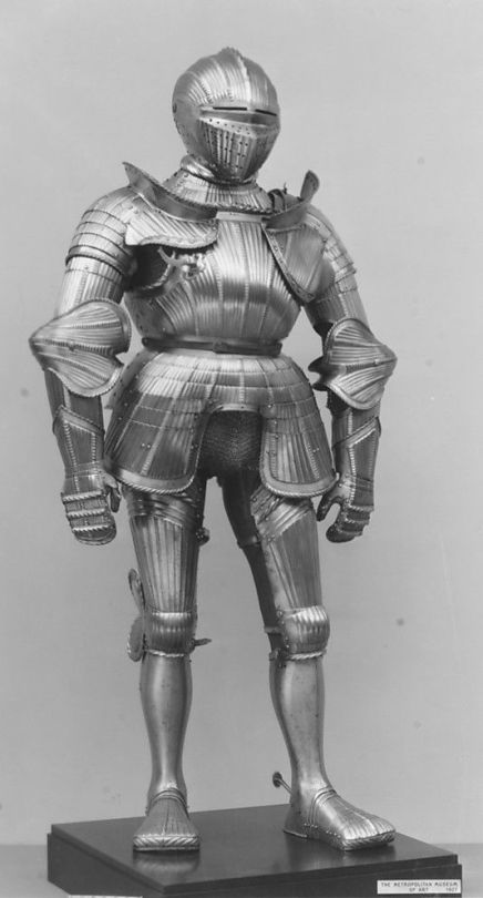
Historically speaking, a lot of European plate armor was quite ugly from a design perspective, actually.
Look at that silhouette, the tiny shapes everywhere, that scarecrow head-adjacent helmet, those duck feet. Beautiful.
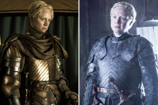
Compare that to any armor in Game of Thrones, which is functional, but is just so much nicer to look at.
As critics of art and design, we care more about seeing women’s designs being consistent (and good) in their universe, rather than having 100% Organic Free Range Realism. (Don’t worry though, we will continue to feature actual ladies in actual armor for positive examples.)