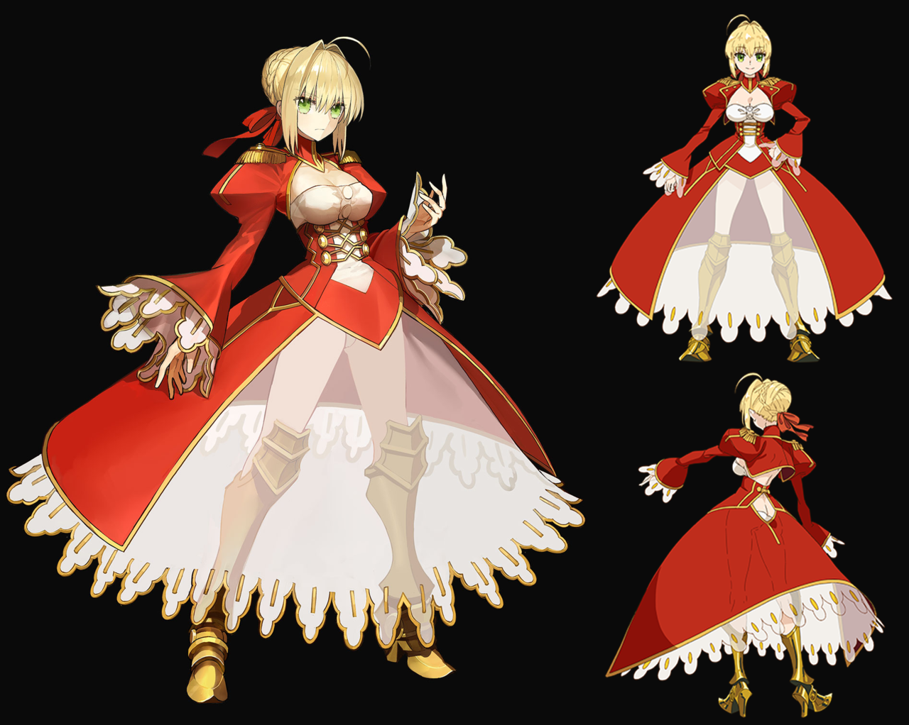
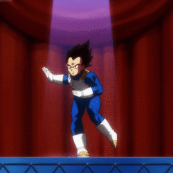
Fate’s Red Saber Nero – No, you can not unsee it. You’re Welcome!
Since Fate’s fandom is the way it is, I decided to dedicate a very special stream redesign to them!
When we commented on Fate: Last Encore’s version of “Saber”, the fanboys predictably, as with many previous posts on that franchise, rushed in to explain to us that this is not the same Saber we used as a positive example before (Artoria, aka waifu King Arthur).
No, apparently it’s just a completely unrelated character who happens to look exactly the same, allegedly because the designer for the franchise has a fetish for this one particular appearance, affectionately referred to by fandom as “Saberface”. Which justifies the shitty sameface syndrome how…? ¯_( ͠° ͟ʖ ͠° )_/¯
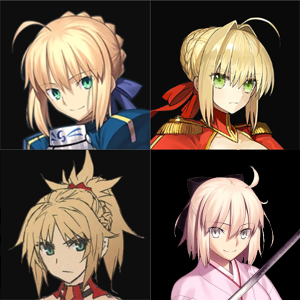
[Yes, those are four different people in various parts of the franchise. Only two of them are related. And yes, there are plenty more Saber clones.]
Also, Fate’s lore is an incomprehensible mess with no single continuity. If we were to fully explain that every time a new Saber with giant boobs or stupid butt window comes out, our posts would be ten times longer. ?
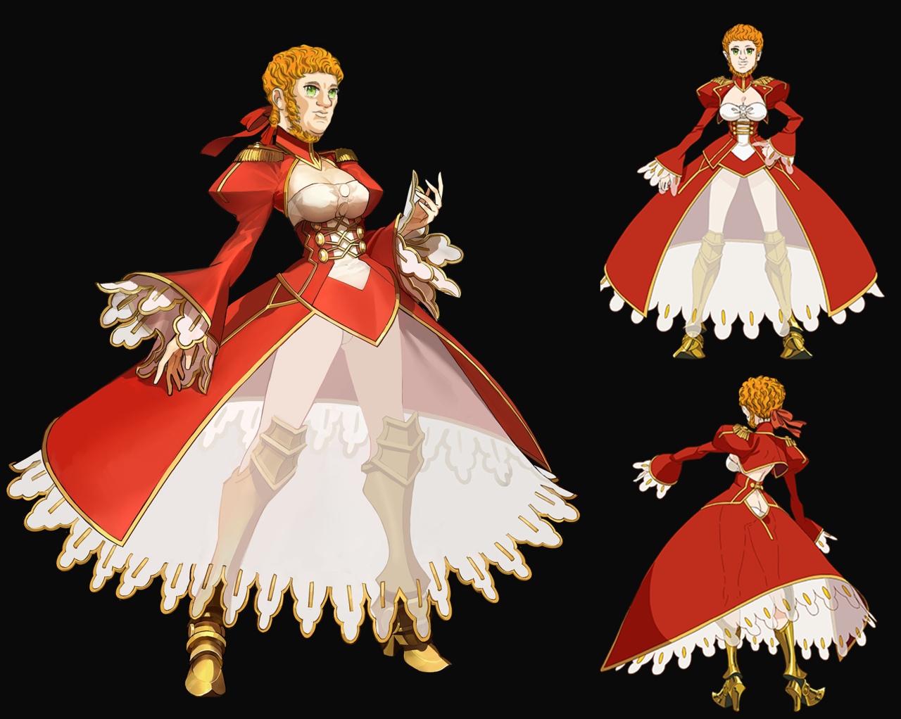
So, considering that this here Red Saber (not confused with the one with spiky hair) happens to be emperor Nero, I decided to right that wrong and make it abundantly clear that this is who this character is supposed to be.
Enter anime waifu Nero.
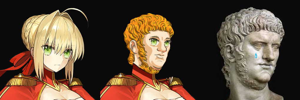
While usually I redesign the outfit, leaving character’s face more or less intact, this time I’m leaving the body and the awful boob-and-ass-window (plus visible panties) dress entirely unedited. After all, it fits her personality, or so I’m told. It’s the exact same sexualized anime girl, except she happens to have the face of an ancient Roman ruler, neckbeard included.
And if you respect Nero’s own choice of clothing, please don’t shame her choice to grow out a beard. She rocks that look so much harder than she did Artoria’s face and haircut.
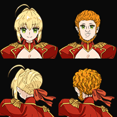
Obviously I used the most famous Nero statue as a reference and did my best to recreate the cell-shaded anime look. Which is also why I incorporated her original eyes into the new design. Of course she needs to remain consistent with Fate aesthetic. I’m not an art-ruining barbarian.
Overall this was a really fun stream and I’m pretty happy with the results. Not likely to happen again, but who knows?
Once again, YOU’RE WELCOME.
~Ozzie
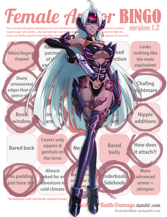

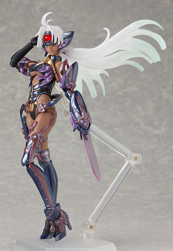
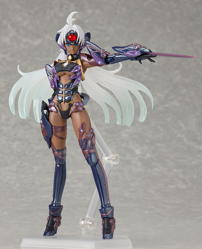
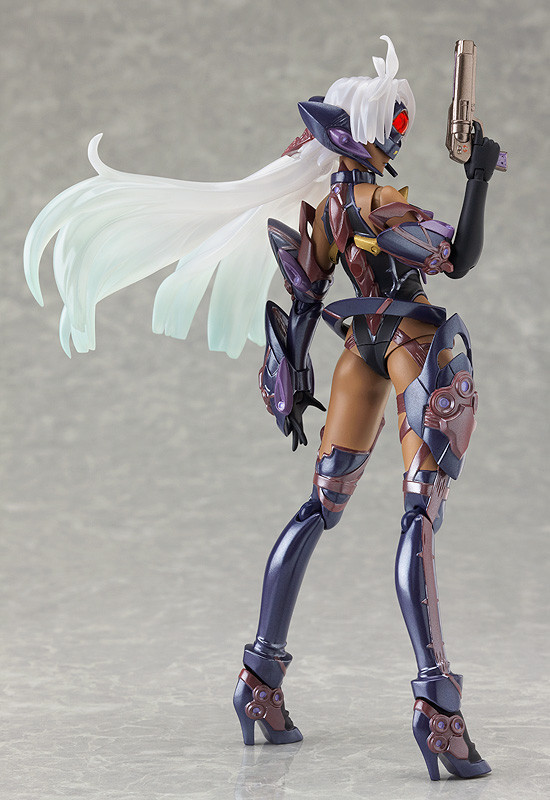
Remember that time looong ago when we commented on Kos-Mos from Xenosaga? The gynoid who needs her boobs exposed to use her ultimate energy blast attack?
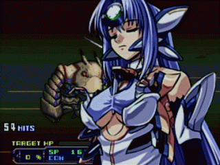
Ever wondered if that game could do female robot design any worse? THEN YOU’RE IN LUCK! The bingo today is T-elos, who seems to be some sort of darker (and even more underbooby) counterpart/nemesis to her.
When I found pics of T-elos Figma action figure (so we’re provided with 3D view from all angles), I couldn’t not put it on the to-bingo list.
Bonus racism points for having the robot lady with “a more malevolent personality” (literal quote from game’s Wiki) have darker skin and more revealing costume.
~Ozzie
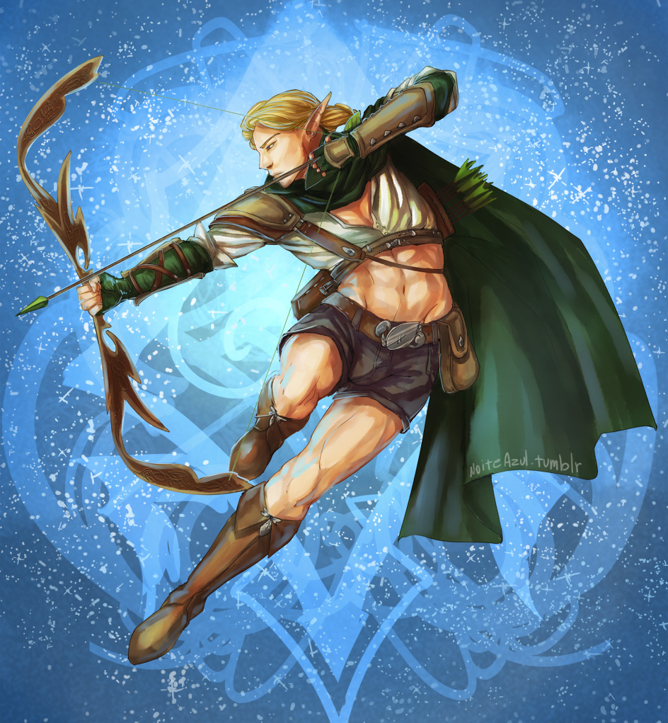
Weekly BABD Stream #80
It’s that time again, for another Hot Guy stream! Awwwww yeeaaahhh~
Join us at our regular BABD time on Saturday at 10 AM PST / 7 PM CEST!
~Ozzie and Icy
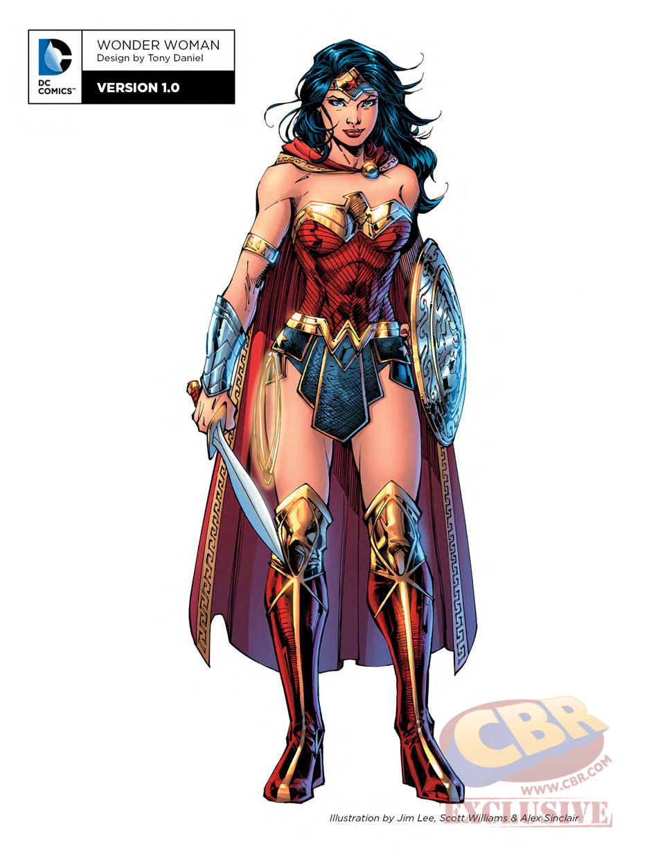
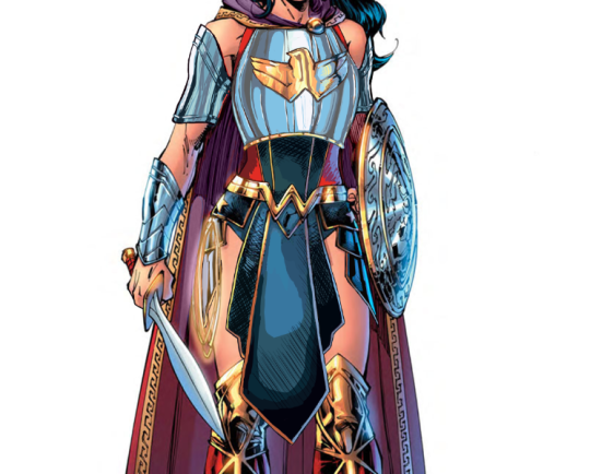
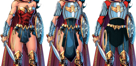
Another Wonder Woman, Why Not
Ozzie made a great Wonder Woman redesign waaaay back, but I wanted to try my hand at something more akin to the movie design. I enjoyed the Wonder Woman movie a lot, but that outfit of hers was such an eyesore. Also had to deal with constant second-hand cringe at imagining what it was like wearing it.
Sooo…. I ended up changing almost everything, obviously. I didn’t really have a specific theme or time period I was taking inspiration from; I just knew I wanted to give her a nice breastplate, and then worked around it for everything else. I gave her chainmail in a similar shape to her uhh… skirt? And then the gambeson makes a comback for the leggies.
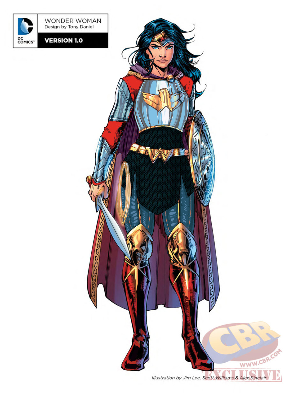
Since the design is pretty clear and simple, let’s instead show my first attempt at a redesign, where I was trying to make the skirt work… somehow.
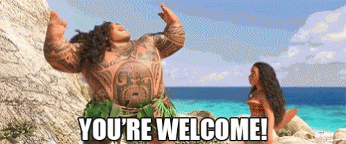
After coming back to this later, I realized that I was just doing the redesign equivalent of this gif:
Sooooo I got rid of that tabbard and redid it all.
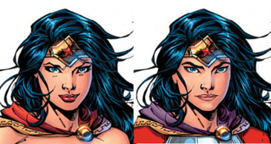
I also changed her face. I gave her thicker, more natural (but still fun) eyebrows, and a stronger nose. I also cut back on her makeup, and changed her expression to look more determined, rather than “awkwardly chuckling at someone’s joke on a first meeting.”
Overall, I think I gave it a good try. I feel like it’s missing something in some spots, but I can’t think of anything else to add besides like… some colored ribbon in her chainmail, but I don’t think that’s characteristic for her.
Would still have preferred my design over the original for the movie.
-Icy
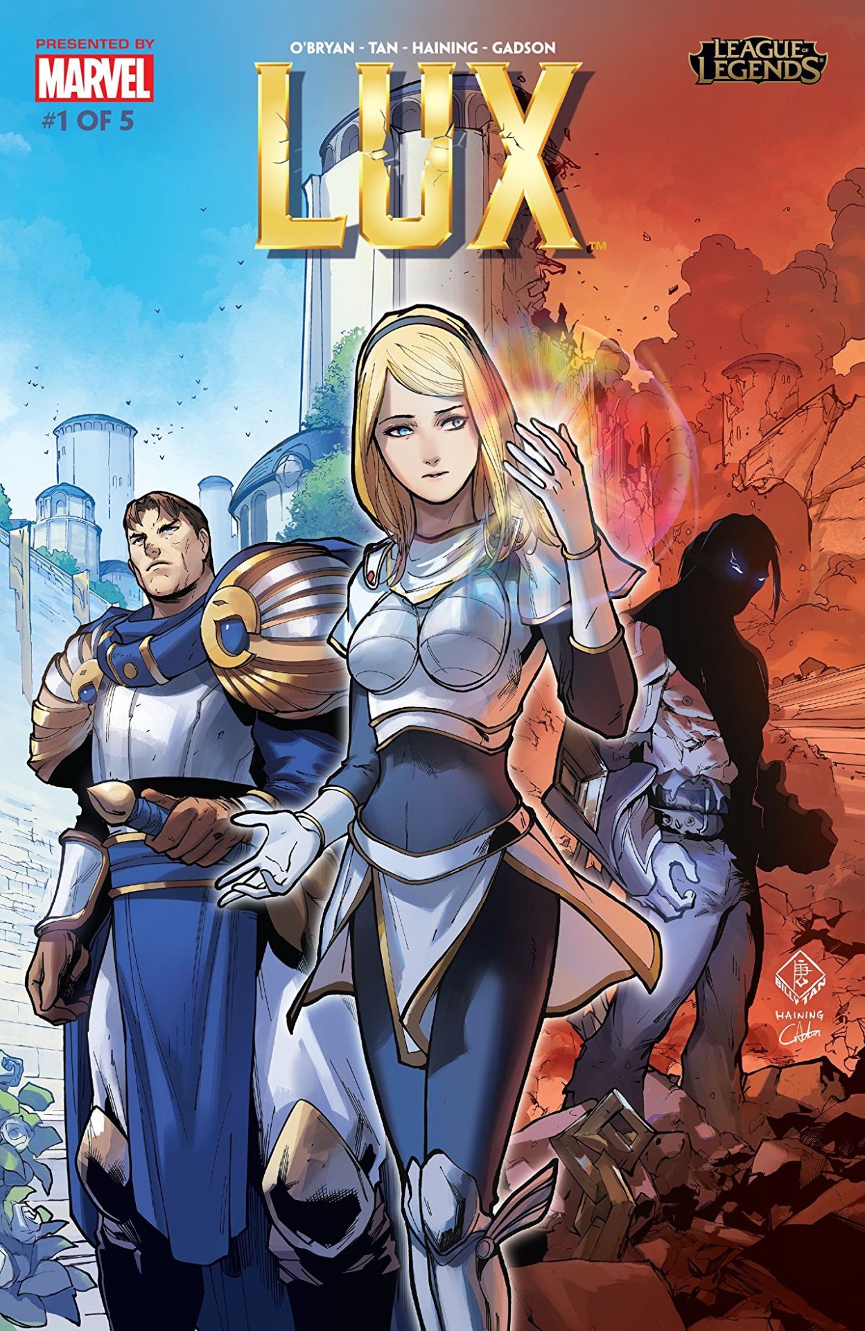
So, recently League of Legends decided to release this origin story for Lux, which has really helped showcase how terrible her design is in comparison to that of… well the rest of her culture. Right off the cover makes it look like she’s the princess to be rescued, not the heroine to reach her potential.
The best thing that can be said about this comic is that they’re depicting her within the society she supposedly came from: it’s now well illustrated how tacky and impeding that shitty boobplate would be.
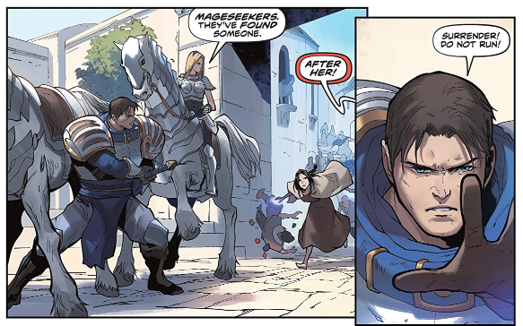
If it wasn’t for the title, you’d assume this was actually a story where Garen was the hero for baby sitting a generic damsel in distress… Which is kind of horrifying when you realize Lux has been in the game for eight years, and somehow fixing her design or evolving her default into something better has never occurred to the folks in charge.
– wincenworks
The design process for this definitely not sexualized, because not skimpy (?) “armor”:
- Draw a naked chick, make sure her (obviously nipple-less) breasts have an amazingly implausible shape.
- Add the tiniest hint of texture (and little to no volume) on parts that you think might need to pass as armored (hence the boobplate).
- Loincloth/buttflap for modesty.
- Literally everything else: fill in with non-flesh colors!
- Profit?????
~Ozzie
No Livestream This Week
But we’ll be back next week with some hot dudes!
~Ozzie and Icy

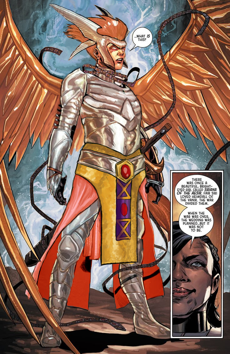
Leveling up with Angela
Trying to recapture lightning in the bottle that was my original Angela redesign, I decided to have a take on her upgraded armor… And it was beyond me, really.
This thing was so bad to begin with that it should have been remade from scratch, not by modifying the unsalvagable original. I did my best, though.
Before doing anything to the costume, though, I had to take care of the ABSOLUTE GARBAGE color composition on this whole splash page. What genius thought that orange background was optimal way to present a character with big orange hair and even bigger orange wings?
Fixing it required all the sophistication of the easiest color theory trick in the book – I recolored the background. Wow, amazing! What do you mean orange pops out from blue better than from more orange? What even is complimentary colors?
?
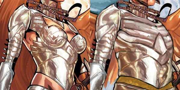
Only then I could start working on the armor itself. Boobplate proved to be much less inspiring than Angela’s normal golden bikini top, as the shape language and colors in the original gave me much more to work of off. This I could only change into actual, rather boring, breastplate.
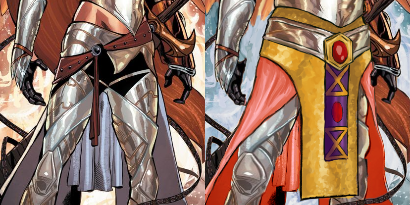
I had no idea what was happening to the leg region, so to cover the nonsensical crotch area and to give the design some consistency with my previous one, I recreated the mail tabard (just in gold this time) and gave her an updated version of the belt I was so proud of the last time. This time not only I let her keep the butt cape, I made it bigger and recolored it to light red, for another splash of color. and also to recreate the look her gambeson tassets.
The lesser changes include: fixing the giraffe neck, getting rid of the 90s comic hair (which also seemed to be clipping into her wings?), making her headpiece bigger and connected in the middle, giving her a bit smaller wedge heels and stockier built.
I’m afraid this really isn’t half as good as my previous Angela redo, but I hope you guys like it anyway!
~Ozzie