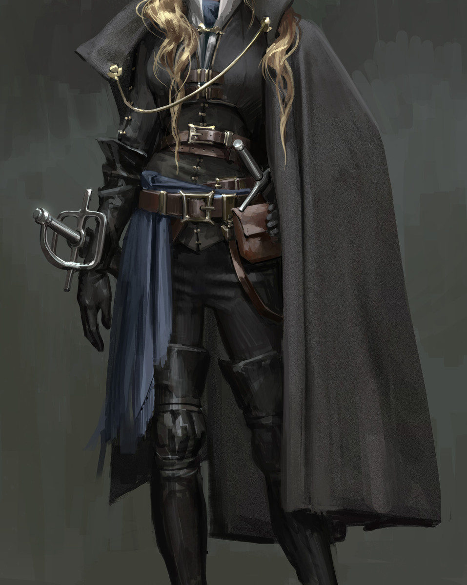
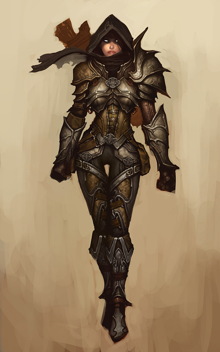
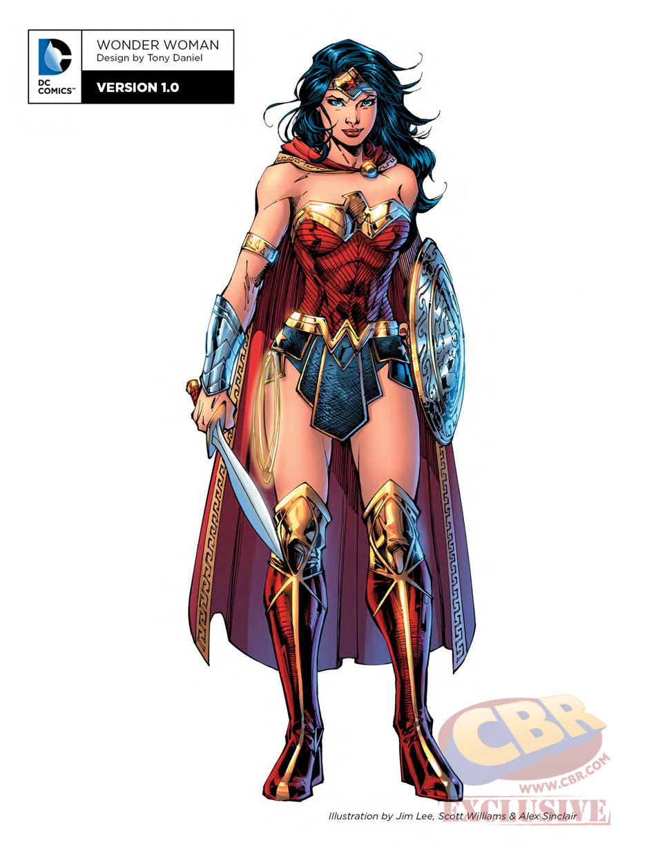
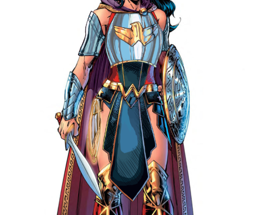
Another Wonder Woman, Why Not

Ozzie made a great Wonder Woman redesign waaaay back, but I wanted to try my hand at something more akin to the movie design. I enjoyed the Wonder Woman movie a lot, but that outfit of hers was such an eyesore. Also had to deal with constant second-hand cringe at imagining what it was like wearing it.

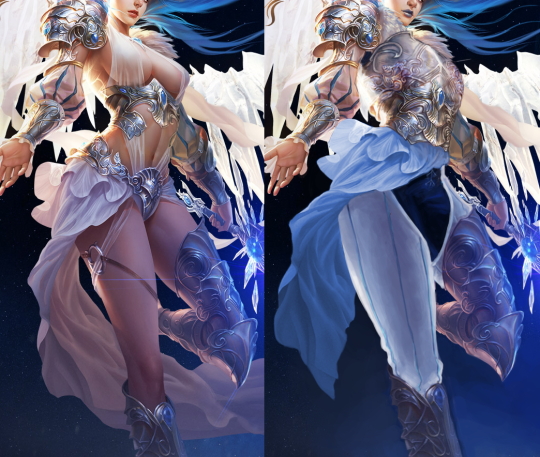
Sooo…. I ended up changing almost everything, obviously. I didn’t really have a specific theme or time period I was taking inspiration from; I just knew I wanted to give her a nice breastplate, and then worked around it for everything else. I gave her chainmail in a similar shape to her uhh… skirt? And then the gambeson makes a comback for the leggies.

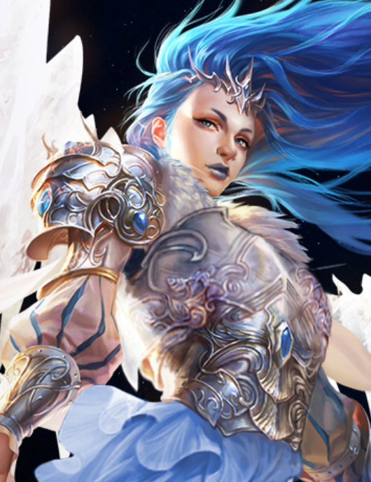
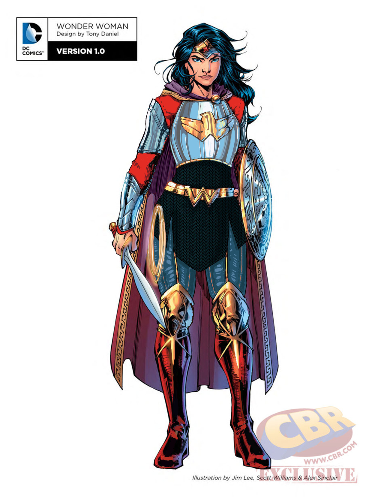
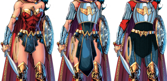
Since the design is pretty clear and simple, let’s instead show my first attempt at a redesign, where I was trying to make the skirt work… somehow.

image

After coming back to this later, I realized that I was just doing the redesign equivalent of this gif:

image

Sooooo I got rid of that tabbard and redid it all.

image

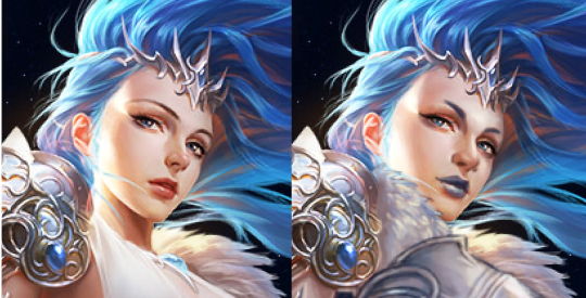
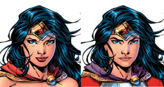
I also changed her face. I gave her thicker, more natural (but still fun) eyebrows, and a stronger nose. I also cut back on her makeup, and changed her expression to look more determined, rather than “awkwardly chuckling at someone’s joke on a first meeting.”

image

Overall, I think I gave it a good try. I feel like it’s missing something in some spots, but I can’t think of anything else to add besides like… some colored ribbon in her chainmail, but I don’t think that’s characteristic for her. 

Would still have preferred my design over the original for the movie.

-Icy

Leveling up with Angela

Trying to recapture lightning in the bottle that was my original Angela redesign, I decided to have a take on her upgraded armor… And it was beyond me, really. 

This thing was so bad to begin with that it should have been remade from scratch, not by modifying the unsalvagable original. I did my best, though.


Before doing anything to the costume, though, I had to take care of the ABSOLUTE GARBAGE color composition on this whole splash page. What genius thought that orange background was optimal way to present a character with big orange hair and even bigger orange wings? 
Fixing it required all the sophistication of the easiest color theory trick in the book – I recolored the background. Wow, amazing! What do you mean orange pops out from blue better than from more orange? What even is complimentary colors? 

image

Only then I could start working on the armor itself. Boobplate proved to be much less inspiring than Angela’s normal golden bikini top, as the shape language and colors in the original gave me much more to work of off. This I could only change into actual, rather boring, breastplate. 

I had no idea what was happening to the leg region, so to cover the nonsensical crotch area and to give the design some consistency with my previous one, I recreated the mail tabard (just in gold this time) and gave her an updated version of the belt I was so proud of the last time. This time not only I let her keep the butt cape, I made it bigger and recolored it to light red, for another splash of color. and also to recreate the look her gambeson tassets.

image

The lesser changes include: fixing the giraffe neck, getting rid of the 90s comic hair (which also seemed to be clipping into her wings?), making her headpiece bigger and connected in the middle, giving her a bit smaller wedge heels and stockier built. 

I’m afraid this really isn’t half as good as my previous Angela redo, but I hope you guys like it anyway!

~Ozzie  

Queen Concept Art, by Ástor Alexander

A fun concept for a queen’s variety in wardrobe, horns included! Besides the idea of designing headwear around the horns, I just love the designs themselves. This is also a good opportunity to reiterate that here at BABD, we’re not against lady characters wearing dresses, or even revealing clothes, for the right occasion. The Queen has a dress to wear to fancy events, but she also has a cool suit of armor to wear when she’s among her knights, as well as a more casual riding outfit. It’s when a fictional lady wears a ballgown or swimsuit to the battlefield that we have words.

Anyway, check out the artist’s gallery for some pretty cool concepts and illustrations.

-Icy

De-failing League of Angels Part 2: The Angel of my Personal Hell

You’d think I would have learned my lesson, regarding picking The Worst Things for redesigns, but not before I had to fix this!! I didn’t even have alcohol to keep me company while I worked on it.

I’ll start by briefly noting that every redesigned element, besides the face, took up to 4 tries to figure out, just in terms of shapes alone! I wanted to keep certain elements from the original, such as that belt motif, so I spent a lot of time just trying to figure out what the hell I could do with them. At least one ended up in a weird place.

I will also say that while working on this piece, I decided that this character feels more like an agender rather than a woman angel, so they’re agender now. On that note, let’s begin with what I loved working on the most: the face. I made the eyebrows and nose more interesting, made the makeup more gender-neutral, and changed the palette. Definitely one of my favorite and least painful edits.

image

After doing that… I just changed everything else about the design! Oh, except I did keep the foorwear and the arms. The under-boobs belt became a breastplate, with the crotch armor (?) belt thing incorporated into it. The cloth thingie hanging off the crotch armor (?) got moved up to probably be part of some shirt under the breastplate.

Everything besides that is me exercising my painting and suffering skills, so y’all better appreciate it. I decided to go with some gambeson for the legs, instead of our regular poofy pants, because the cloth thingie was conflicting with the poof. I added black pants and a similar undershirt visible in the armpit to tie the design to the background a bit. Also, I needed another color besides light grey, sky blue, and white. The original palette is pretty limited when you’re not distracted by the tiddy.

image

My rendering skills are obviously not as good as the artist for the original, but I tried (Oh my God, did I try). And I do believe that at least in the design aspect, my reworking is an improvement.

Bonus closeup of the breastplate because it sucked to work on.

image

-Icy

Argos – Clothing & uniforms, by Remy Paul

What’s this? Organizational uniforms that are not illogically altered for the women to be hot? The exploration suit even gives both the women and the men a slight heel, probably for that much-needed rocket boost. 

I am sad that the bridge crew lady gets tights instead of pants, and the artist is definitely hit-and-miss when it comes to their lady characters, but I still like these designs overall. The iron legion is, of course, my favorite. I just can’t say ‘no’ to a woman in combat boots and a gas mask.

-Icy

SAO/GGO Figurine Redraws, Part 1: “Bulletproof Armor”

This one was Ozzie’s idea, as she’s heard a lot about Sword Art Online and then got me in on those videos. I decided to stay in the franchise but go to a different fictional MMO. This is Sinon from the in-anime game Gun Gale Online, which is about characters with guns running around doing… stuff. 

I was doing some Googling trying to find the online store where I first found this thing and am now regretting I didn’t go for this picture instead:

image

Just kidding, I don’t regret it at all. This is a totally Serious Action Anime, not about girl butts at all.

Anyway, I’m stalling because my redesign is pretty boring, I think. Most of my time was spent trying to fix her posture. Is this another casual, confident pose? Oh sorry, the description says she “marches along the battlefield.”

Apparently she is supposed to be wearing “bulletproof armor” in the original?????????? Where is it??????? So I gave her actual coverage that would allow her to lay on the ground and snipe without getting dirt and sand inside her clothes (also known as a Yikes). Honestly, I was so distracted by her pose that I couldn’t really think of any cool design elements to give her. I even kept the stupid boob-supporting buttons on her shirt.

Maybe one day I’ll go back to this and do it some justice. At least now I can believe she’s actually a sniper wearing bulletproof armor.

-Icy

PS – God, I forgot what the back of her looked like…. enjoy!

image

Simplifying the Diablo Ladies, Part 2 

Demon Hunter from Diablo 3 was… a challenge, to say the least. Mainly because I couldn’t decide where to even start with that ridiculousness!
Not only is she super sexualized via the enforced “feminine” silhouette of skin-tight armor, boobplate and giant thigh gap, including a cameltoe… she’s also the most overdesigned thing I ever tried my Photoshop skill on. 

Apparently to work as an artist at Blizzard, you have to willfully forget the most basic rule any design school worth its salt teaches: Less is more
For concept art of what would ultimately be a small character model in-game, all those pieces have SO. MUCH. NEEDLESS. DETAIL! Teeny tiny little shapes of distracting ornamentation, basically nothing to rest your eye upon. 

I feel really sorry for anyone who ever attempted cosplaying this shitshow – so much work added into recreating all those arbitrary seams, textures and spikes, sheesh. 

image

I was so busy simplifying the shape language that I overlooked some stuff I do pretty routinely, like getting rid of the cleavage in the first and second levels, and modifying the hourglass silhouette (I did add some bulk in higher levels, just not much). 

Preparation for posting this redesign is why I threw back this post lately (also, you know, it’s just a good post to resurface) – because those level ups convey neither a better set of armor, nor more protective layers, except for pauldrons. The shape of her boobs and thin waist remain a constant, no matter how much more “armored up” she’s supposed to be.

Like with Ashe before, I decided that my version is a trans lady, with a noticeable crotch bulge

in the place of the creepy thigh gap. Though I discarded my initial gag related to its size, as it was just in poor taste and not my joke to make. 

Overall, this thing took two or three weeks to finish (last level seemed unsalvagable at first), but hopefully I managed to put some actual design thought into this hot mess.

~Ozzie

Gamasutra: Anna Jenelius’s Blog – Armor for Dummies and/or Game Developers

Gamasutra: Anna Jenelius’s Blog – Armor for Dummies and/or Game Developers

bikiniarmorbattledamage:

A handy armor design 101 for games (but works for other visual media as well). It approaches a lot of tropes we often discuss, like the importance of covering vital body parts or the absurdity of adding boobplates and high heels to female armor.

I especially like how the article handles the double standard in gendered armor silhouettes, a subject we alluded to before a few times, but didn’t have opportunity to talk in depth about. Thus, here’s an excerpt:

Tight armor and layers

image

Looking at the Demon Hunter (Diablo III, Blizzard Etertainment, 2012) above, you will notice that while her shoulder pads and scarf increase in size with her armor level, her waistline does not. In this case, it looks like she keeps wearing only some sort of leather corset to protect her stomach, while strapping on enough excess metal on the rest of her body to build a spare suit of armor. Honestly, I would have advised her to trade the sexy female silhouette for actual protection. This would mean adding for example a gambeson and maybe also a mail under the harness, which would make her waistline several inches thicker.

image

[source]

[…] While you would most likely want the layer that looks like leather here to be padded to soften incoming blows, and the harness probably is too tight to actually move around in, it shows quite well how layers are put upon layers in heavy armor. This sadly means that you’ll have to choose between looking like an hourglass and surviving while fighting.

Bolding mine.

Thanks to storiesfromthevoices for directing that link at us!

So yeah, that’s also why we don’t settle on announcing any outfit “good” just because it covers more skin than a bikini. You can’t just paint a skin-hugging suit silver, label it “armor” and call it a day. Armor design doesn’t work like that.

~Ozzie

more on why padding is crucial in armor designmore on armor design | more reference | more resources

This week we’re bringing back the nice little guide to armor design for fiction, with special emphasis on double standard in portrayals of layering in male and female armored characters. 

~Ozzie