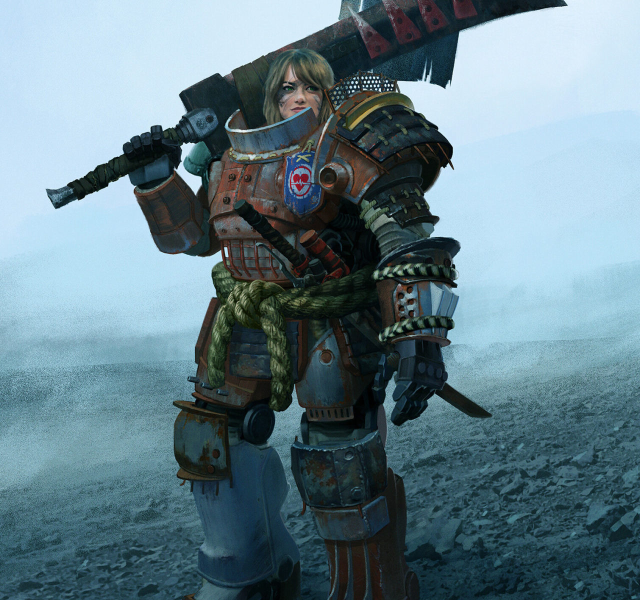
The Scorch Eater by Young Kim

I love this artwork so much because it is an amazing example of so many things:
- How powerful it can be when you give female characters equal consideration in design
- How simple it really is to do so
- How you can use good design to sell fantastic elements
The touches like the banner pole, the loose hair, the suspiciously “made up” looking face, the spikes on the mega-sword and the katana in her “belt” all carry a certain amount of credibility due to the work put into making her power armor look servicable and used.
There is so much storytelling happening here… and all she’s doing is standing around and looking off to her left.
– wincenworks
