
@vertiga submitted:
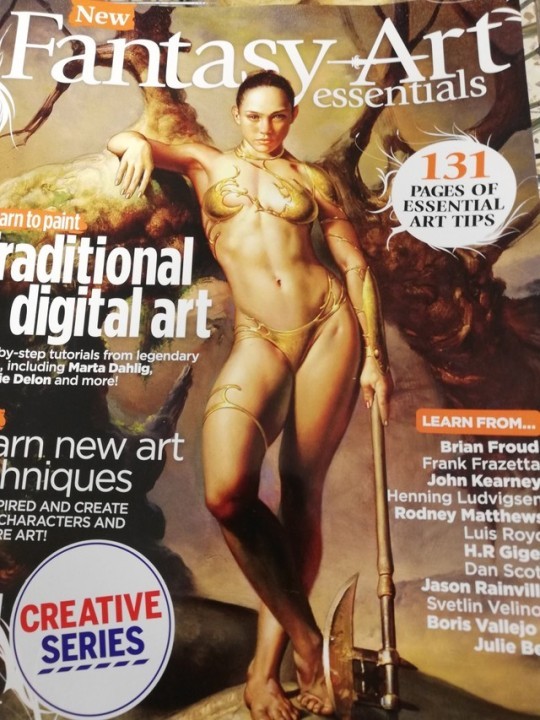
I saw this magazine in tesco and stared at it for a good minute just going ??? This is the cover image they chose for a magazine about the *essential* things for fantasy artists to learn, and doesn’t that just say it all?

We featured this magazine on the blog before, but it never got bingo’ed! Now that’s been rectified.
This design honestly looks like when you’re drawing the figure to figure out pose and what not, and end up putting way too much detail into it that you like. And then you feel bad for having to put clothes on top of your hard work, so you just kinda… stick some liquid metal to the essential areas, add some small decorative pieces, and call it good.
“Create better characters” indeed.
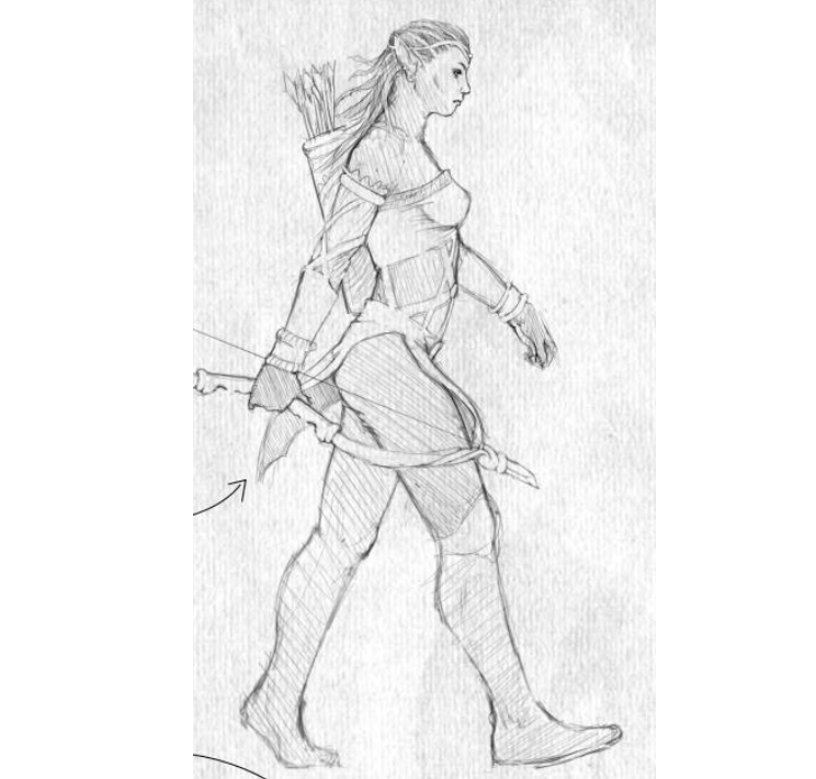
But worry not, everyone, their standards for the actual in-magazine content is the same:

She’s supposed to be a ranger.

-Icy