A handy armor design 101 for games (but works for other visual media as well). It approaches a lot of tropes we often discuss, like the importance of covering vital body parts or the absurdity of adding boobplates and high heels to female armor.
I especially like how the article handles the double standard in gendered armor silhouettes, a subject we alluded tobeforea fewtimes, but didn’t have opportunity to talk in depth about. Thus, here’s an excerpt:
Tight armor and layers
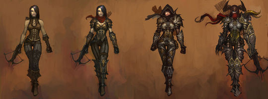
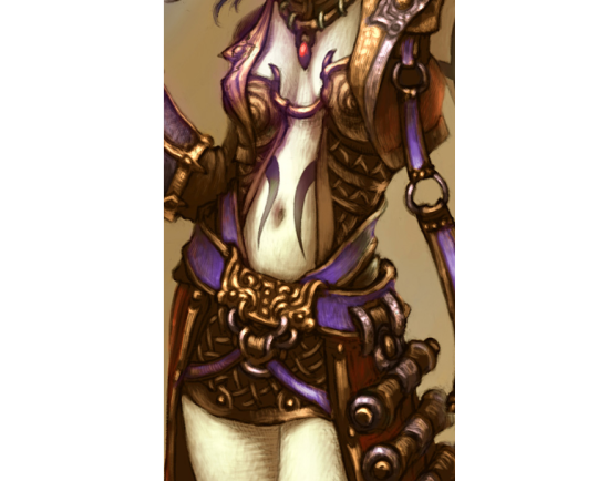
Looking at the Demon Hunter (Diablo III, Blizzard Etertainment, 2012) above, you will notice that while her shoulder pads and scarf increase in size with her armor level, her waistline does not. In this case, it looks like she keeps wearing only some sort of leather corset to protect her stomach, while strapping on enough excess metal on the rest of her body to build a spare suit of armor. Honestly, I would have advised her to trade the sexy female silhouette for actual protection. This would mean adding for example a gambeson and maybe also a mail under the harness, which would make her waistline several inches thicker.
[…] While you would most likely want the layer that looks like leather here to be padded to soften incoming blows, and the harness probably is too tight to actually move around in, it shows quite well how layers are put upon layers in heavy armor. This sadly means that you’ll have to choose between looking like an hourglass and surviving while fighting.
This week we’re bringing back the nice little guide to armor design for fiction, with special emphasis on double standard in portrayals of layering in male and female armored characters.
~Ozzie
Posted on
Simplifying the Diablo Ladies, Part 1
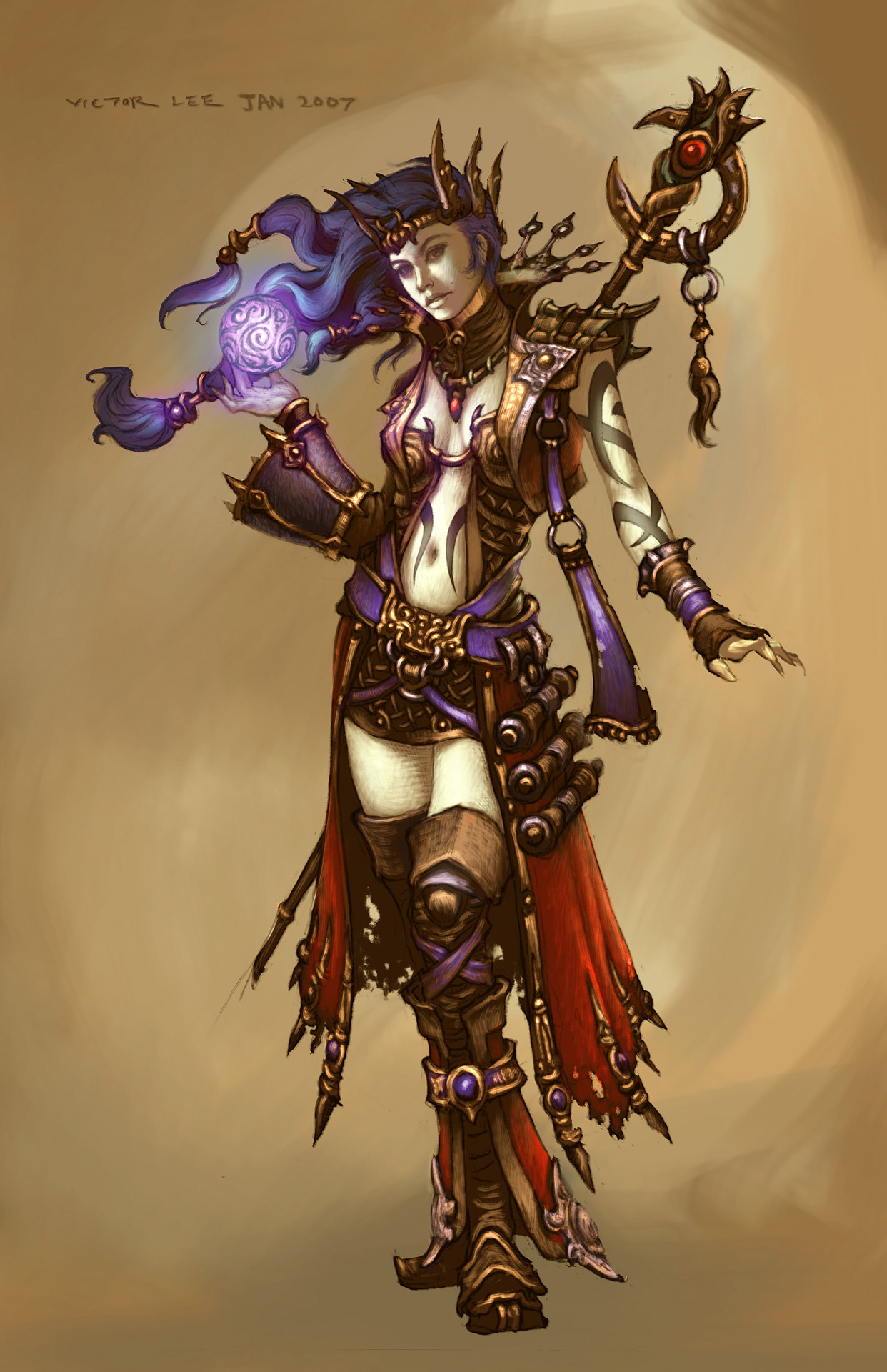
We’ve talked about how Diablo makes such an effort to make very disappointing characters. So, it was finally time to take on some of those designs and try to make them less overdone and less….
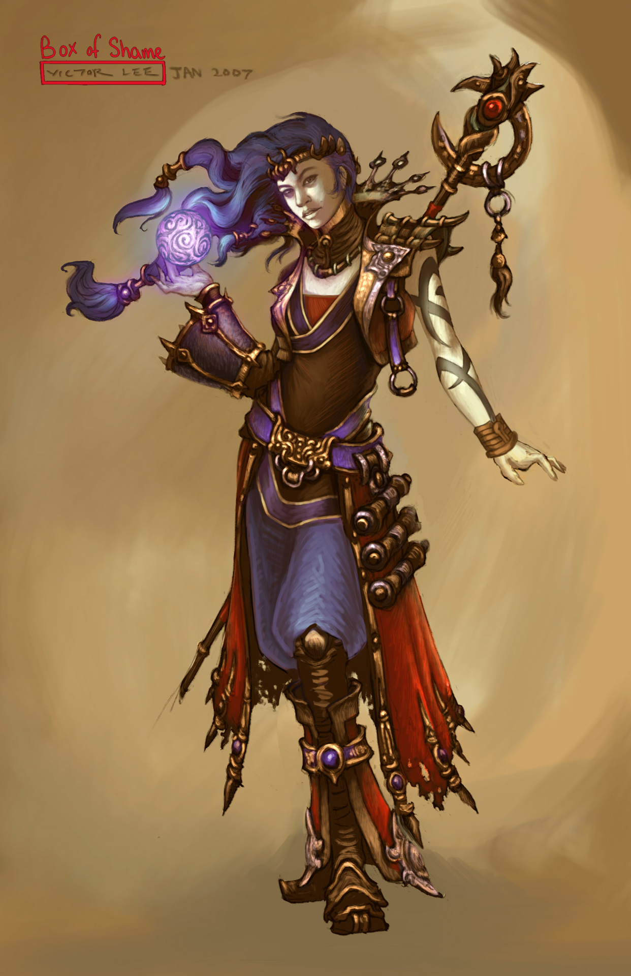
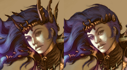
Anyway, I went for a concept art of the Wizard from Diablo 3. I stayed in the color scheme because I was more distracted by…. everything else that was happening. All the tiny details that only highlighted how little she was wearing… it had to go. I ended up giving her a simple tunic and pants, in order to have some grounded large shapes in the middle of all the small ones. I do like the shoes (below the knee, anyway) and the jacket, so I left them alone.
I did remove some weird-looking accessories, like the not-glove and the awful crown sharps, and I changed her face as I always do.
Definitely a simpler redesign, but it was still not easy to work around all the things that I wanted to keep in the design. I probably should have made her tunic a different color, but it’s still way easier to look at than the original. Hope y’all enjoy!
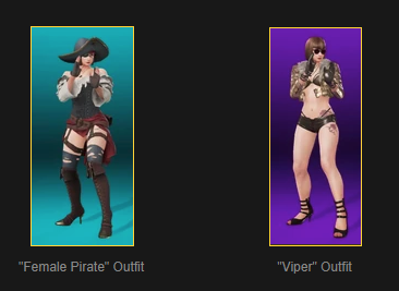
Of course, it’s not just this outfit that’s terrible… she has a couple of others which look like really bad Halloween costumes “sexy pirate” and… I don’t even know.
And just in case that wasn’t horrifying enough – apparently she’s hiding not just throwing knives but a rocket launcher within that outfit.
Another impending wave of snow, as well as just life stress/burnout, means we won’t be streaming this week, unfortunately. But we hope to be back next week, weather permitting.
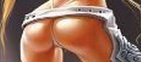
Look, I’m not saying that this marketing strategy wouldn’t be effective at getting the attention of twelve year olds… but is this really the best way to market products supposedly suitable for pre- teens?
– wincenworks
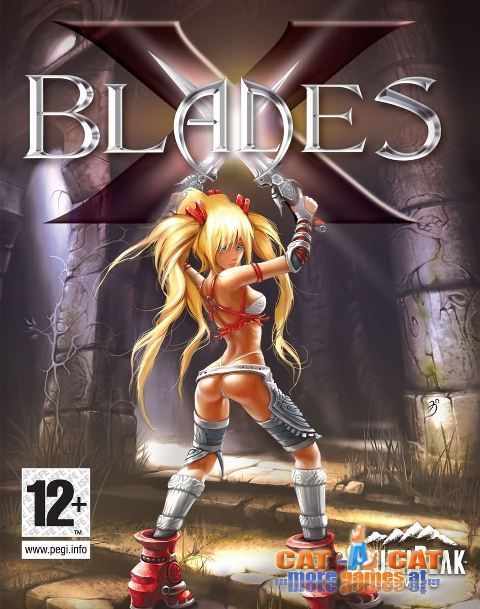
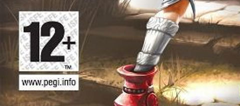
This week’s throwback: cover image that totally tells us what the game is about and is very definitely appropriate to tweens. Yup, totally.
Seriously though, while 12-year olds are not too young to begin understanding their own sexuality interest in butts, how about we don’t make them internalize the idea of reducing women to body parts? And maybe consider what kind of message it sends to 12-year old girls?
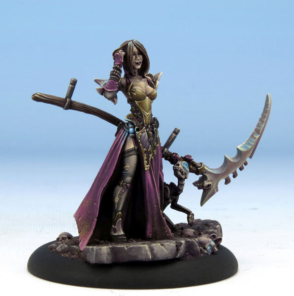
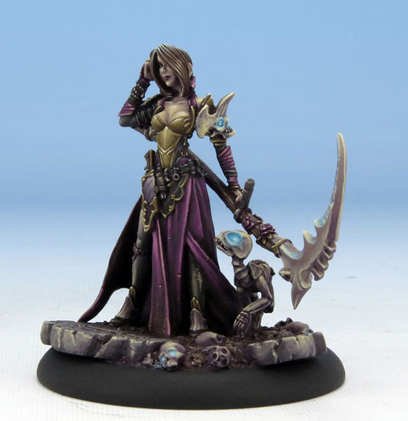
I like me some goth characters with perky attitude (that smile is adorable!), and Jen was actually based on the woman who did this miniature’s paint job, but wow is that costume some generic fantasy garbage, scoring some typical bingo points without hitting a single row.
Obviously not the worst we’ve seen, just disappointingly uncreative.