
Boring LoL ladies redesign, Part 1
League of Legends, despite having maybe two highlights and occasionally attempting to improve, generally SUCKS at female character design. For more details as to why, consult our related blog, @leagueofsexism
Ashe
LoL heroines were among the first stream redesigns by Icy, but this was my first attempt at redoing a lady champion. I chose Ashe, the archer.
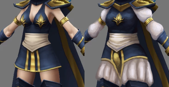
While she has completely serviceable color scheme and some nice looking shapes in cape, hood and limb departments, her core costume is just a short dress with deep cleavage and fabric belt. Also nipple adornments ¯_( ͠° ͟ʖ ͠° )_/¯
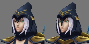
Since LoL fails at giving most female characters distinct facial features, I felt obliged to change this generic oval face with tiny nose and pouty lips into something more interesting. Now her face and nose are longer, with sharper jawline and cheekbones.

I decided that instead of her ghastly pale skin, the design should be broken up white elements that will compliment her hair and belt.
You can never go wrong with Elizabethan pants. I’m especially proud of the matching poofy sleeves broken up by golden arm braceletes that were already there.
Obviously, I wouldn’t leave ornaments on each of her boobs, so I reduced it to a single one at the center of her chest. And her pauldrons no longer just hover on her shoulders, they (and presumably, the cape) are connected now at the sternum.

Last change, suggested by Icy, was a codpiece, matching the period fashion of her pants. Yes, my redo of Ashe is an openly trans lady, because why not?
All in all, I’m quite satisfied with how I managed to keep the silhouette and shape language relatively unchanged, while adding some more interesting stuff where gratuitous skin displays were before.
~Ozzie