
Saint Seiya Online SWITCHEROO Part 2: Empowering the gentlemen!
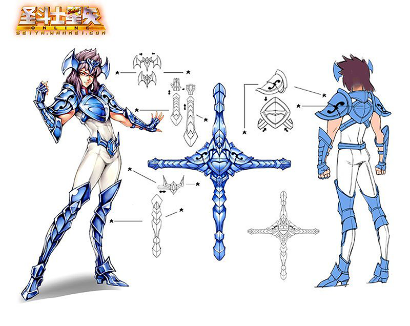
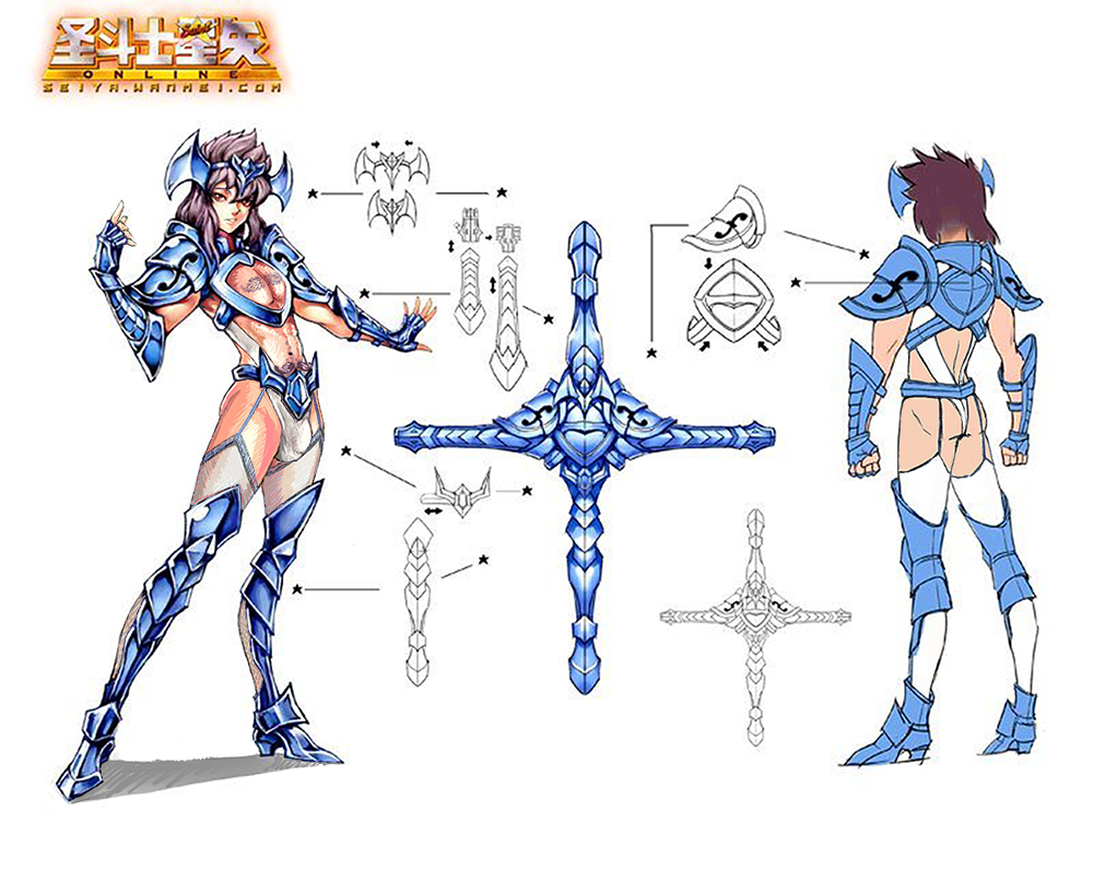
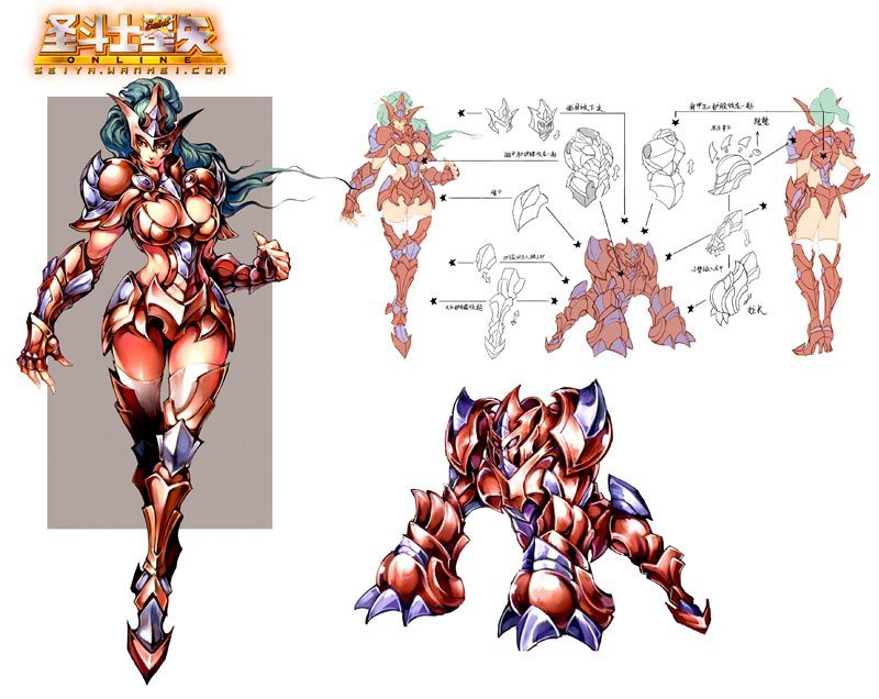
In the latter part of our Saint Seiya redesign stream (or, for Ozzie, out of technical difficulties, last Saturday >_>), we doubled down on the switcheroo aspect and swapped armors around. Icy did the sexy male version of the blue knight, while Ozzie took on the male bronze knight.
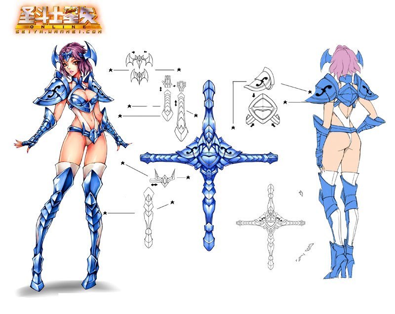
Well, considering the blue lady’s… creative design, I had no shortage of material to work with. Besides transplanting the boob window breastplate and giving him the same mankini-adjacent undergarment, I decided to switch the original boring stockings out for more interesting ones, with lace! Premium stockings.
I gave him a softer facial expression, to match our lady’s pout, and made his right hand less aggressive. I decided not to give him heels, but I gave him a booty. And last but not least, I gave him glorious mustache-shaped body hair! Thank you to the person who suggested it!
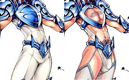
Does every sexy boy I redesign for this blog have very defined junk? … The answer is probably yes. I definitely had a lot of fun with this one, despite this shading style that I had a hard time emulating.
-Icy
Despite the ugly “muscular wide-shouldered male is equivalent to a lady with big boobs and wide hips” motif, the bronze knights had one thing in their favor… the dude has his oblique muscles exposed equally to the female version! Now all I had to do is to recreate all the other weirdly exposed spots from her costume on his.
First thing I decided to do was to make his pose more equal to hers without just straight-up copypasting her legs onto him. Instead, I switched his leg position to simulate her sexy strut, then slightly changed forearm position to be closer to hers. Then I allowed myself to replace his right hand with hers, which is posed less aggresively. And of course, I left the long nails on 😉
His pants are now just underpants and thigh-high stockings. He also acquired high heels. I wondered for a while how to turn his breastplate into something similar to the boobplate with window for each breasts, and finally decided just to copy her piece and reshape it to match his pecs.
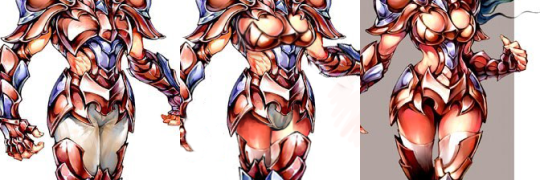
Major negative (other than double standard, that is), was the armor’s color scheme that blends with their skin tone. If it wasn’t against the idea of our exercise, I’d probably slightly adjust those colors to contrast better, then the pec windows would be more obvious. Oh well.
~Ozzie