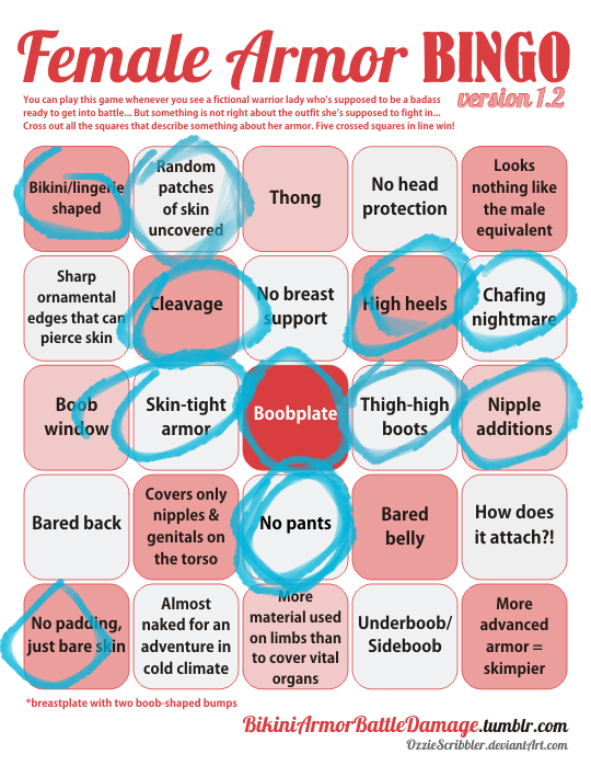
the-midnight-doe submitted (and Ozzie bingo’d):

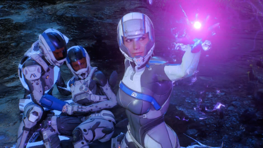
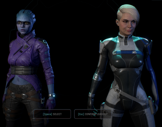
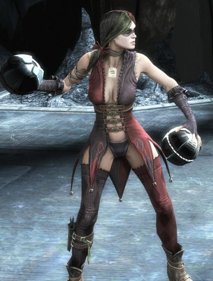
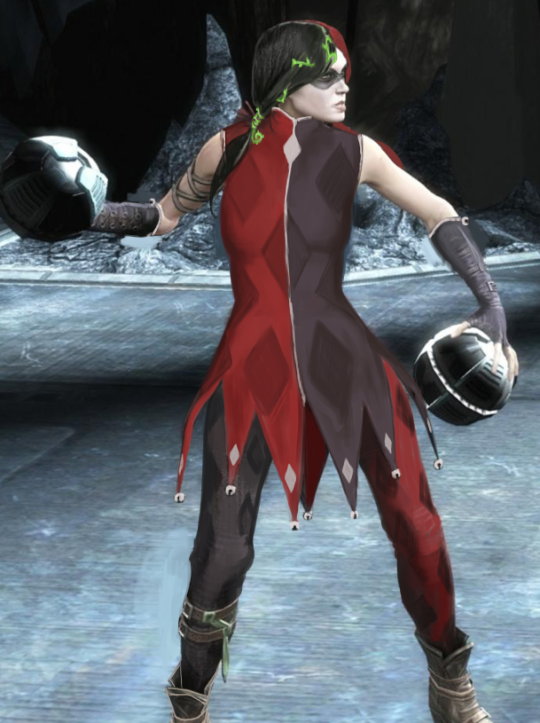
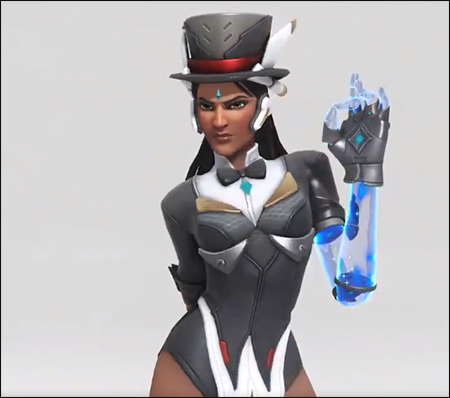
And on today’s episode of Doing Women Better™, Blizzard finally granted us the much requested Magician Symmetra. Only instead of going for something super classy like the many fan interpretations out there or even just ladies in suits from real life, they went with…this.

Lack of pants and framing her bust (what is even with those metal plates) aside, the fact that this is a legendary skin and costs 3000 credits when it’s so close to her default skin makes this whole thing very disappointing. 

Thanks for submitting this highly requested post, including some quality scathing commentary! The Saga of Pantless Symmetra continues. 

This would be insulting enough just by the virtue of being a fetishy leotard instead of a suit, but what the hell are those boob-holder bars?! 
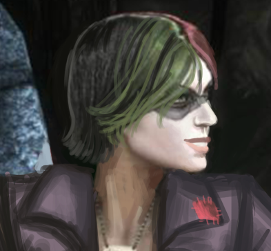
They’re some sort of garbage afterthought slapped on to make this look more “sci-fi”, I guess? Why would a costume need that? Because you can’t be science fiction without framing the tits with random pieces of metal? 

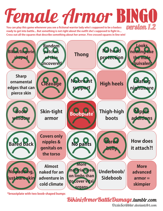
Since the bingo lacks a “What the fuck am I looking at?!” square, I marked “Boobplate” instead.

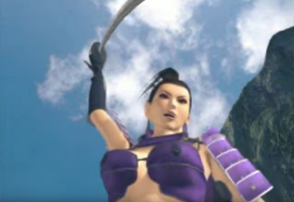
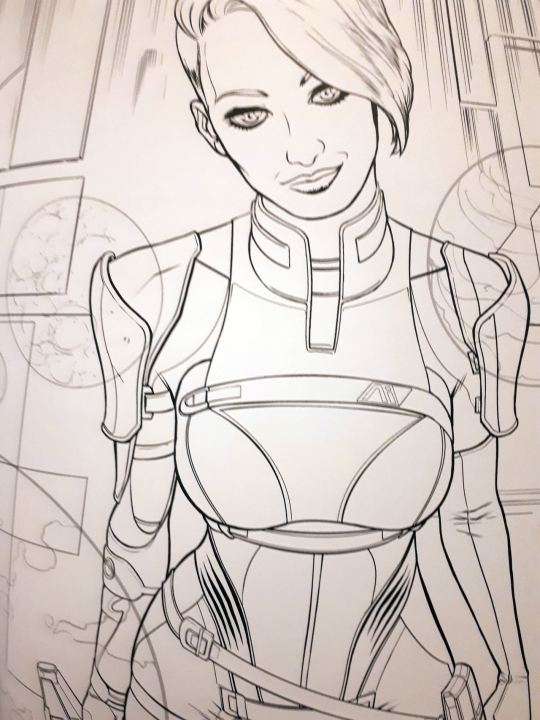
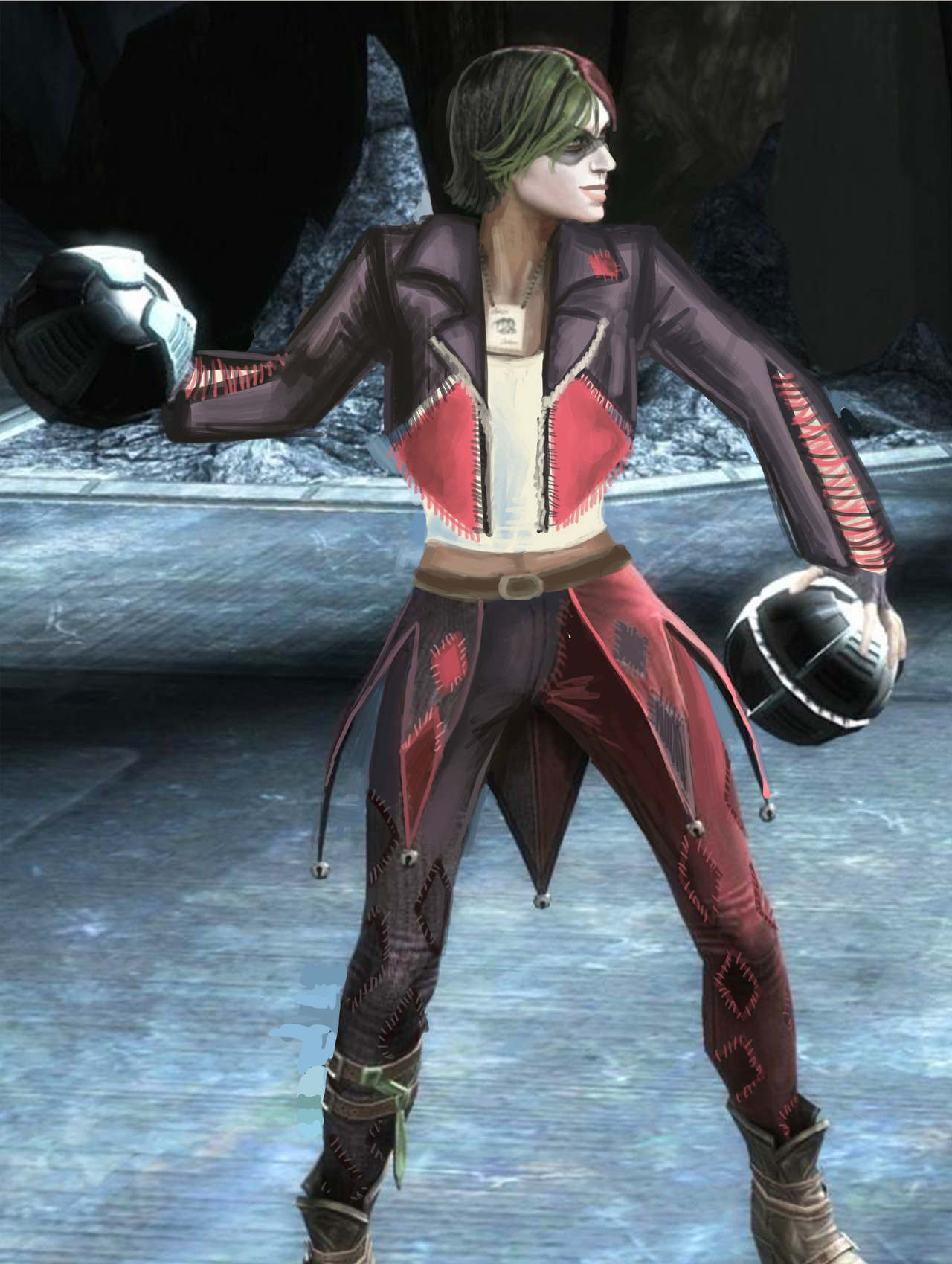
Here’s some closeup, to see their full absurdity, provided by @red-queen-on-the-heathen-throne:

image

Fun fact: a convention I attended last week had an Overwatch: Character design done right! talk that I just couldn’t subject myself to come to, both out of the fear of my brain melting on sight and because I didn’t want to rain on some enthusiastic fan’s parade when the time for Q&A comes. 

I’m still amused that at the same time Blizzard made THIS, easily disproving the “character design done right” claim. 

But sure, Overwatch is totally ready to do women better. Anytime now.

~Ozzie 

#GiveSymmetraPants2k18

Gotta love the “creativity” of web ads presenting just another grizzled military dude as an equivalent to a generic pretty girl with long flowing hair, cleavage and belly out. Totally legit and “equal” soldier designs! Especially for a game that apparently takes place during WW2? 

Um, is that supposed to be some sort of parallel universe? Because other than USSR imagery slapped on like an afterthought, even the guy doesn’t look anything close to a soldier from the 1940s…

~Ozzie 

Seris, the Oracle of Nothing

I decided to do a redesign of the oracle Seris from Paladins basically 5 minutes after I first saw her design. It was just so… disjointed. The leather top, the pointless belts, the tassel on her magical orb… Ugh. It told me absolutely nothing about her. That purple orb was the only indicator of her oracle-ness.

The only things I liked were: the hood (for the most part), the shawl, and the geometric designs on her skirt. I kept those, and decided to go with a moth-y motif overall, making the shawl longer and adding the top with wing-like tips. I really did not like the color scheme, so I added more light grey and some black, getting rid of all the we-need-another-color-but-got-no-ideas brown.

I made her float (though it’s a bit hard to tell), as it seemed fitting to me since she has an in-game ability of becoming invisible by stepping into a parallel dimension. It’s a symbolic detachment from the material dimension, as well as making her feel a bit more alien. She is supposed to be an oracle, after all. It also fixes her proportions a bit.

I took a few sessions to get to an idea I liked, and then a few hours to execute it. I probably would have added more details to her top, if I had the time. This redesign is back from the days when I was trying to redesign basically everything, which we’ve moved away from since then.

-Icy

So Lady Kagami was the main antagonist of Tenchu 2… which was supposed to be an epic battle between ninja clans and rulers in Feudal Japan but somehow ended up with this as the major villain.

How seriously can you expect to take people take this kind of villain when facing off against a protagonist like this:

image

For those rushing to type that it’s an old game and doesn’t matter – it’s worth remembering what the final installment in core series was.   Design aspects like this left unaddressed can kill otherwise unique and engaging properties.

– wincenworks

There seems to be something with the Call of Duty: Black Ops games that they feel they need to 1) include a zombie mode and 2) use that zombie mode as an excuse to have female characters in ridiculous costumes.

The upcoming game seems to incorporate time travel so they can have massive, carefully crafted settings with nonsensical outfits.  Honestly, it makes no sense, since the same press footage they’re releasing confirms… they know how to make sexy badass ladies.  I mean, look at this babe:

image

If you’re not in lustlove you’re just not paying attention.

Of course, most of the current fuss is not over the zombie mode but rather over the lack of a single player campaign.  Though personally, I’m glad we get this moment that I’m choosing to believe depicts a female character getting to meet the Creepy Marketing Guy responsible for this.

image

– wincenworks

Screencaps and gifs made from Outside X-Box: Black Ops 4: 7 Things That Made Us Go Wait What (warning for body horror and gore)

bikiniarmorbattledamage:

I think it’s been long enough but if you find yourself getting ready to type up a comment related to Mass Effect: Andromeda’s animations please consider watching this educational video from Extra Credits and not commenting here instead.  This post is going to be a clarification of what we mean when we say Creepy Marketing Guy, and since the first post on this topic featured Samara, it’s only fair that Cora be the star of the clarification.

First, let’s start with what we do not mean when we refer to Creepy Marketing Guy.  It does not refer to:

What we instead refer to is a product where you can see the development team’s intentions are to create something where every element is involved in telling a specific story – and then someone (usually marketing) steps in and makes the change specific parts of them with the assumption that the cishet male demographic needs the sexual availability of at least one female character broadcast to them in order to be interested in the unrelated aspects.

In this case, they pick Cora Harper, who is an ultra-professional soldier (one of the most battle hardened in the team), introduced as being calm in a crisis, the second in command on the mission, and seems to use “male” set of animations for her running, etc (instead of the elbows-in butt wiggle run generally assigned to female characters, including fem!Ryder).

Then you see in the outfit in the top of the post before launching into the tutorial mission, during which she appears in cut scenes like this:

image
image

Pretty much every other female character in the establishing chapters of the game has pragmatic, non-gendered attire on and off the battlefield. But, since Cora is a romance option for bro!Ryder, she apparently needs to wear a fetish outfit sculpted around her boobs and butt, while on the battlefield. The other female member of the away team who is a romance option also similarly needs to broadcast she’s got a sexy side (she also only owns one set of clothes).

image

All other traits other than romance option to bro!Ryder are considered secondary – to the extent now Cora looks not just contradictory to her character but out of place in the game about exploring a new galaxy, finding wondrous alien technology and shaping humanity’s future. 

(This does not seem to apply to the male romance options, examples 1 & 2)

Ironically this now means she is so out of place cannot be included in marketing material without making the game look a ridiculous parody of a dramatic adventure exploring alien worlds in a new galaxy. It’s almost like they should have just given her one of the dozens of pragmatic outfits I am sure the concept artists designed for Cora before being told to sex it up.

– wincenworks

What is it with the “above boobs and under boobs belts” design feature that’s become so popular lately? Also, I thought Ashley’s outfit in Mass Effect 3 was insulting; the new BioWare studio really took it up a notch, though. … Good job?

I’ve read none of the promotional material for ME:A before it came out, so when I watched part of a Let’s Play of it out of curiosity, I couldn’t believe that Cora was this battle-hardened badass soldier type; I thought she was just another human on the ship. Her design makes me think of EDI before anything else. Those really sad attempts at actual armor pieces (like the baby plates on her shoulders) somehow make it worse, like Creepy Marketing Guy begrudgingly allowed it.

Also, send help, that butt window is staring into my soul.

-Icy

Cora Harper Official Character Sheet 

This throwback is as the reminder that the problem of ridiculous female armor design is a wide spread enough probably that even studios known for being progressive end up falling prey to it.

That and well I recently acquired the Mass Effect Adult Coloring Book, which features Cora in it, but she’s clearly more inspired by the costume design than the writing in the game…

image

So much good work can be lost by pandering to an unappreciative demographic.

– wincenworks

Harley’s Bad Joke of an… “Outfit”

One of my earlier redesigns that I finished recently because of things was for Harley Quinn from Injustice. So, the problems here are pretty obvious… Lots of pointless and impractical skin, shit color saturation…. everything….

I originally was going to make her outfit more like a jester’s, in the vein of the original Harley design. I was just using the original design as a jumping-off point, but it was becoming very dull and uninteresting. 

[Pictured above: The diamond market crash]

I ended up scrapping it for a more DIY look. I figured Harley would have fun making a quirky outfit to commit crimes in.

I kept the color scheme, though upped the saturation by a bunch. The idea is that she bought 2 pairs of identical but differently colored pants, a biker jacket, a tank top and some fabric. Then she went home, cut the pants in half and sewed them together, cut out huge chunks of the jacket in diamond shapes, and cut the jacket sleeves so they’re not as restricting. Then she just sewed a bunch of diamonds on everything, without any particular care for making it look professional. I think adding some sequins to her jacket would also not go amiss.

I hated her hair, so I cut it off. I also changed her face a little bit, and gave her back her smile!

image

Since she’s not a super-powered person with tons of money, I didn’t want to go with the standard power suit look, especially since I don’t think she would prefer one as a character. However, I also don’t think she would prefer to wear a Victoria’s Secret ensemble but with leather belts rubbing against her bare skin. She’d stick to her theme, but in a fun way, and that’s what I tried to convey in the redesign.

-Icy

filipfatalattractionrblog:

artofmisi:

me? dying? it’s more likely than you think.

I finally sat down and drew an armor for the girl! I had been wanting to for forever, but I knew I was in for a headache, and oh boy, was I right :’D

Initially I thought about going the DA way, but honestly the in-game chevalier armor I find severely lacking, and Nadette is one to wear more refined things, so I knew I wanted one of those very fancy engraved armors that make the wearer look knightly and rich.

The gambeson had to be pink because that is her color, and of course she wears fancy frilly underthings (that are not period appropriate, but honestly. honestly. she deserves them). As for the armor, it is made of silverite, and there is a twin of it that belonged to her husband. The armor is engraved with floral motives and roses and (in the one I envisioned) also thorny branches, alluding to the family name, Desrosiers. The helm is decorated with the yellow feather that distinguishes chevaliers.

I’m super satisfied with how this turned out, I think I did her justice and she makes a pretty and very protected knight :3

Disclaimer: I did not draw the engravings, I just slapped some engraving drawings on top of it and added some highlights because this is for personal use and I did not have the patience nor the mastery to do it justice :’D

@bikiniarmorbattledamage

Full, functional plate armor with feminine touches that are NOT boob-shaped?

image

This is simply lovely. The attention to detail in the design decisions really shows what a person can do when they’re not just making a design for the tiddy. I’d love to see her with her weapon. The engravings are a bit too much for me, but honestly, I can totally see a noble family overdoing the fanciness on their armor to one-up the other nobles.

-Icy