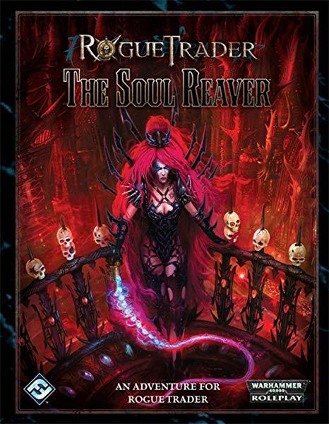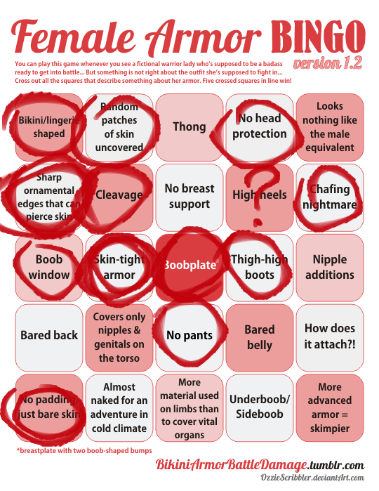

This is the sort of design that explains why people don’t treat the word “edgy” seriously anymore – artists who want their stuff to look “dark and edgy” literally throw as many sharp edges on their villains and antiheroes as possible, no matter how absurd that looks!
Just imagine all the protection she could get if she used metal from those arm and head spikes to form a practical breastplate!
~Ozzie
Why does this look like, instead of sending the publisher the actual intended cover art, they accidentally submitted a “how ridiculous can we make it” art piece done on a dare? And the publisher just went with it, because it’s Warhammer?
-Icy
h/t for finding us design to bingo: Gigahorsedeluxe