@dinopasta33 submitted: 

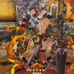
The designs used in Windscar’s advertisement are an absolute travesty. Like, I’m pretty sure she needs more than a chiropractor with her back bent like that 

Wow, good find for BABD and for @eschergirls! The closest to this contorted promo pic I found from this game was this: 

image

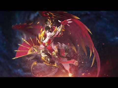
And generally WindScar seems to be very satisfied with looking like every other generically boobastic shit in our web ads tag.

image

~Ozzie

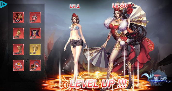
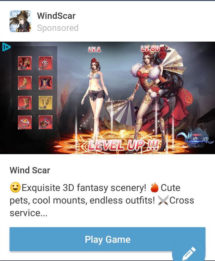
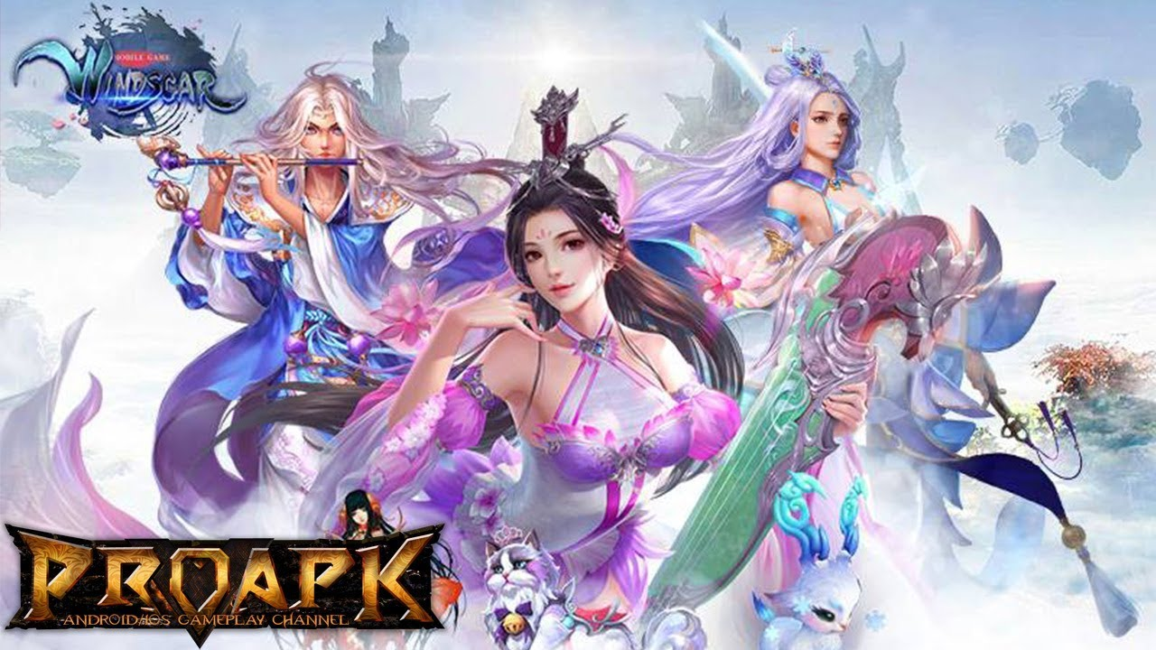
What I find amusing about these designs is they are made by an Chinese company – but there’s almost no link to Chinese fashions, clothing, designs, etc.

These are basically Chinese artists looking at how Western artists have tried to imagine these costumes, then trying to make them kind of like the weird western fantasy designs they see in western video games.

Thus creating a cycle of terrible where some guy in a western company is now going to look at these and go try to outdo them….

*sigh*

– wincenworks

Royal Trooper Bingo

dimestoretajic submitted:

*sigh*

I stump for Magic the Gathering hard. I often feel like, in a sea of boring design and policies written by the Creepy Marketing Guy, Magic stands out as really trying to do better for inclusivity and diversity, even if it does stumble from time to time.

But this time, they REALLY stumbled.

Behold, from the recent Battlebond set… Royal Trooper! 

… like… what the hell.

This is my first time doing one of these bingo cards, so if I missed one or didn’t interpret one properly, let me have it:

image

Now, the hilarious thing is, I passed this by my fiancee in case I missed one, and she said that the male version of this card was probably better. That sparked an idea, and lo and behold, there was an earlier version of this card: 

image

…it’s also a woman, in MUCH BETTER ARMOUR… FORWARD, Wizards of the Coast. We’re supposed to go FORWARD. Yeesh… 

Thanks for subsmission and the commentary! We learned not to have high expectations of Magic and Gathering’s illustrations. At best, they’re a mixed bag. 

Occasional positive female example or sexy man doesn’t justify the fact that Wizards of the Coast aren’t all that bothered with keeping their card artist guidelines more than a little vague about what’s encouraged in depictions of women. So we end up with whole variety of generic sexy fantasy chicks with bared skin and boobplates galore. 

Just the fact that every version of Chandra Nalaar sports prominent boobplate says a lot about their dedication to never strive for actual change. 

So yeah, WotC, you’re supposed to go forward, not… sideways?

~Ozzie

the-midnight-doe submitted (and Ozzie bingo’d):

And on today’s episode of Doing Women Better™, Blizzard finally granted us the much requested Magician Symmetra. Only instead of going for something super classy like the many fan interpretations out there or even just ladies in suits from real life, they went with…this.

Lack of pants and framing her bust (what is even with those metal plates) aside, the fact that this is a legendary skin and costs 3000 credits when it’s so close to her default skin makes this whole thing very disappointing. 

Thanks for submitting this highly requested post, including some quality scathing commentary! The Saga of Pantless Symmetra continues. 

This would be insulting enough just by the virtue of being a fetishy leotard instead of a suit, but what the hell are those boob-holder bars?! 
They’re some sort of garbage afterthought slapped on to make this look more “sci-fi”, I guess? Why would a costume need that? Because you can’t be science fiction without framing the tits with random pieces of metal? 

Since the bingo lacks a “What the fuck am I looking at?!” square, I marked “Boobplate” instead.

Here’s some closeup, to see their full absurdity, provided by @red-queen-on-the-heathen-throne:

image

Fun fact: a convention I attended last week had an Overwatch: Character design done right! talk that I just couldn’t subject myself to come to, both out of the fear of my brain melting on sight and because I didn’t want to rain on some enthusiastic fan’s parade when the time for Q&A comes. 

I’m still amused that at the same time Blizzard made THIS, easily disproving the “character design done right” claim. 

But sure, Overwatch is totally ready to do women better. Anytime now.

~Ozzie 

#GiveSymmetraPants2k18

@silks-stuff submitted:

Awful WW design, 90% skin; DC Comics at it again

If only the men had the same outfits as WW!

Is that a big ol’ belly window in Wonder Woman’s already amazingly skimpy costume? Yes, it is. 

Are those super heavy armors on all the male characters, including Superman who’s way more invincible than Diana? Yes, they are. 

Truly, the double standard is but a cherry on top of the utter ugliness that is this overdesigned figure set.

This reminds me of the old Jimquisition video in which Jim uses another ridiculous Square Enix statue of egdelord Batman as a perfect metaphor for Squeenix’s skewed priorities in game and visual design: 

~Ozzie