dimestoretajic submitted:
*sigh*
I stump for Magic the Gathering hard. I often feel like, in a sea of boring design and policies written by the Creepy Marketing Guy, Magic stands out as really trying to do better for inclusivity and diversity, even if it does stumble from time to time.
But this time, they REALLY stumbled.
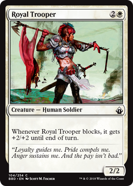
Behold, from the recent Battlebond set… Royal Trooper!

… like… what the hell.
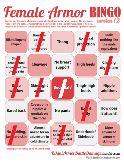
This is my first time doing one of these bingo cards, so if I missed one or didn’t interpret one properly, let me have it:

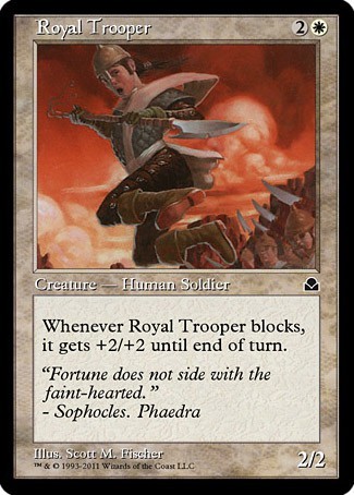
Now, the hilarious thing is, I passed this by my fiancee in case I missed one, and she said that the male version of this card was probably better. That sparked an idea, and lo and behold, there was an earlier version of this card:

…it’s also a woman, in MUCH BETTER ARMOUR… FORWARD, Wizards of the Coast. We’re supposed to go FORWARD. Yeesh…
Thanks for subsmission and the commentary! We learned not to have high expectations of Magic and Gathering’s illustrations. At best, they’re a mixed bag.
Occasional positive female example or sexy man doesn’t justify the fact that Wizards of the Coast aren’t all that bothered with keeping their card artist guidelines more than a little vague about what’s encouraged in depictions of women. So we end up with whole variety of generic sexy fantasy chicks with bared skin and boobplates galore.
Just the fact that every version of Chandra Nalaar sports prominent boobplate says a lot about their dedication to never strive for actual change.
So yeah, WotC, you’re supposed to go forward, not… sideways?
~Ozzie