Concerning my previous ask: I think it’s time we stop beating around the bush and ask the real question that has been looming. What makes a guy sexy to women? What is the “t ‘n’ a” of men? What makes Conan different from Jacob from Twilight?
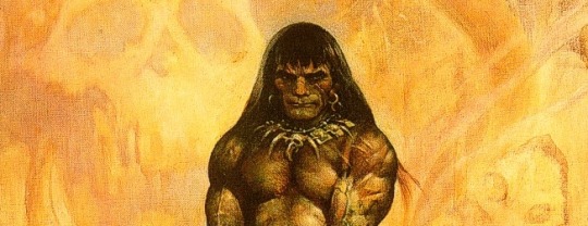
Well, the most obvious differences between Conan and Jacob is that Conan was what his creator, Robert E Howard (who struggled his entire life with the pressures of society and toxic masculinity) not-secretly-at-all yearned to be and Jacob is the Stephanie Meyer’s idea of semi-exotic potential boyfriend.Check out this classic depiction of Conan by Frank Frazetta and try to remember the last time you saw a guy like this on the cover of a romance novel.
What makes guys sexy to women (physically)?
Well, it turns out since women are not a monolith and women don’t get to dictate beauty standards for men there’s no real standard.
Research has shown that men in general overestimate how much muscle women find attractive. They also tend to overestimate the importance and the preferred size of penises. (Seriously guys, don’t send unsolicited dick pics and don’t expect bragging about ridiculous endowment to help you)
Honestly though, the notion that you have to adhere to beauty standards in order to make a character attractive is kind of ridiculous. I mean, butts are sexualized across genders. Feeling comfortable pressed up against someone and kissing them is usually a plus. Looking like they may find you interesting as a person or want to impress you are definite help.
When designing a sexy male character: Leave the books about primary and secondary characteristics alone and forget about what manly men say a man should be like and ask, “What’s she going to like in this guy?”
Nothing is genuinely universally attractive, but at least this way you have a chance that the audience will see the appeal even it’s not for them.
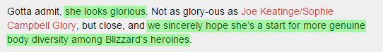
Given that Blizzard has said they’re making this game to improve representation for women in video games and even address things like “why all the bikinis?”
Zarya is currently the quick “we fixed it” response from a company with a long history of going back on their “fixes”. They’re preaching that they want to fulfill the desire for diversity – but the sexy purple skinned assassin lady, a robot, a gorilla all got priority over so many types of real people.
Currently they are only vaguely close to meeting their stated goals due to a few isolated, individual characters. Pretty much all the tokenism alarm bells are ringing loud and clear.
“Much good work is lost for the lack of a little more.“ – Edward H. Harriman
– wincenworks
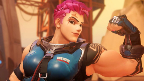
*Not to say that Zarya is ugly. She’s still “unconventional” in the safest way possible.
is it possible to create an armor that fills all the squares of the bingo? i mean one of the squares is “thong” but then another of the squares is “no underwear.” is it possible to make an armor SO AWFUL that it managed to fulfill both??? you’d need some sort of weird armor that goes into the buttcrack but doesn’t actually connect into functional panties??? this is brain breaking…
The answer is: a definite and resounding… “maybe?” ^_^’ It really depends how much you want to stretch the definitions of every square’s trope. There’s purposely some room left for interpretation with those.
The example you give was actually achieved a couple of times, cause we tend to, exactly as you say, count all things that go into buttcrack as “thong”, no matter if they look like panties or not (see, for example: the latest bingo). Not sure about wincenworks, but I’m also pretty generous with “no underwear” square, cause lots of those things just don’t look like wearable bras/panties to me (and, you know, rarely actually go UNDER the rest of the costume).
Still, I made the bingo as a collection of the worst and most pervasive problems I noticed in female “warrior” costume design, it was never really supposed to be 100% full (and thankfully, never got to it).
But now, as we’re all in on the joke, we’re having some fun with the idea, cause why not. Stretching the boundaries of ridiculousness is the purpose of our Break the Bingo contest!
That said, everyone please remember that the contest’s deadline is 11:59 pm CET on March 31 2015! Updated rules and FAQ for the contest can be found here.
I would just like to point out that WotC have addressed the state of dress that characters in the art for their cards are in, and for all of their other merchandise for that matter. They simply commission an artist to draw, say “Elf rogue in cityscape”, that the artist then hands them a female in skimpy leather armor, isn’t their fault. Essentially, they give the artists pretty free reins, and if they manage to fit the description given, it usually goes through. So blame the artists, not WotC.
I assume you’re referring to this blather where Matt Cavotta tried to explain that he didn’t want to be responsible for his decisions are Creative Lead and basically didn’t want to do his job (which is probably why he isn’t the creative lead anywhere anymore). He also admits (Myth #5) that he doesn’t speak for Wizards of the Coast (WotC), just himself.
If you actually read it though, there’s a few very damning points here and a lot of strawmanning and standard issue rhetoric while throwing his fellow artists under the bus. See how he keeps referencing the style guide and saying “Well they’re not doing anything they’re not allowed to… creative freedom!”
Avoid making things look high-tech or sci-fi. Magic stretches the definition of “fantasy,” but there are limits.
Don’t use real-world letters or symbols. This includes religious symbols such as crosses and ankhs.
Keep gore at a PG-13 level.
Because we sell Magic cards in China, please avoid prominently representing human skulls or full skeletons.
And of course:
Make an effort to illustrate a variety of races, genders, ages, and body types.
Feel free to paint beautiful women, as long as they’re shown kicking ass. No damsels in distress. No ridiculously exaggerated breasts. No nudity.
Despite all the do’s and don’ts, we want you to have fun! If you want to experiment or bend a rule, just run your idea by the art director.
See, art directors and their bosses are supposed to supplement guides and provide guidance to artists so that the artist creates the best possible product for the company and the artist themselves. It helps to fix mistakes and smooth out issues, this one was an issue in 2005 when Matt made his statement and it’s continued tobe one.
Now, there are several things that WotC can and should have done before 2005 to fix this. By could I mean both as part of being a responsible company and in terms of trying to maintain brand image and profits:
Amend the standard style guide to be more specific about the depictions of women
Tell the art directors, creative leads and other creative staff to be vigilant about this issue and to pro-actively provide guidance to the contracted artists
Include a separate document in the artist package stating their concerns and expectations specifically depictions of female characters
WotC easily had the infrastructure to do this by 2000 – I know this because I worked for WotC in the early 2000s (up until July 2005 in fact) as an online chat room moderator and even in this minor role I had to sign an NDA, memorize pages of regulations and undergo supervised training. When I left, they were not slowing down on that in the slightest.
This has nothing to do with Wizards of the Coast wanting to be a cool relaxed company, or offer artist freedom or being somehow unable to make decisions on what they do and don’t publish – it’s that they simply haven’t cared to properly address this issue and set high standards for things other than being viable to sell in China and Walmart.
They publish things, they are responsible for the what they publish. It’s that simple. They have more power than the artists over what gets published because they have the ability to refuse, crop or edit submitted artwork – artists, on the other hand, can only get published if they meet the publisher’s expectations… and then it might get cropped or edited.
– wincenworks
Also, themystisk, even if the nonsense you wrote somehow WAS true, it would still prove our point:
It would mean that Wizards of the Coast is completely irresponsible with how they conduct art commissions (because apparently they don’t care at all about what artwork is produced with their money). Such a sound business practice!
It would also mean that fantasy artists are by default all pervy and whenever asked to draw anything remotely female, they deliver “the sexy”, even when not asked for sexyness specifically.
Either way, it’s part of a larger problem with media’s and society’s expectations towards women. Blaming random bad artists for it is just a disingenuous, oversimplified answer and offers no solutions to the issue.
Important thing we’ve been noted regarding that comic: breast binding with bandages is a big no-no! Compression bandage is designed rather to reduce blood flow to the wounds than to change the body shape; using it to contain a perfectly healthy body part may cause serious circulation issues and/or, with prolonged use, deformation. Sports bras or special binders are the healthier, preferred option for keeping one’s boobs in place.
Answering publicly so we can get the word out about the binding problem.
It doesn’t matter what kind of armor you intend to wear – the better fitted it is to you the better it will protect you and the more efficient you will be in it.
The only way it won’t apply is if you happen to have the exact same measurements at the mannequin used in production (which doesn’t apply in the cases of things like field plate – which are always custom made). As with so many things in life, being rich is a definite advantage when it comes to armor of any sort or time period.
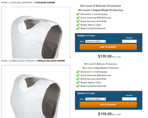
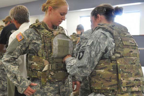
Guidelines for police and other parties that regularly use bullet vests recommend that the wearer not change their body mass by more than ten percent after being fitted for their vest. That means bulking up, no slimming down or putting on fat.
Many women are quite comfortable wearing even covert Kevlar armor intended for men because it just happens to fit comfortably. Many men cannot fit comfortably into a standard vest because they are not “standard” shape and size (I’m one of them).
The only difference with “female” vests is allowing space for breasts, primarily for covert body armor (that is either concealed under clothes, make to look street clothes or easily concealed with a jacket). While there is less variety in stores entry level concealed vests for women cost the same as entry level concealed vests for men.
And again, the actual reason for different shaped armor here is not about effectiveness of stopping bullets but rather about comfort while maintaining a silhouette in order to conceal the presence of the armor -by making the wearer meet society’s expectations and fit into their regular clothes.
Actual military grade armor is not just Kevlar, but also additional features such as ceramic plates. That’s why you won’t see any boob bulges on the anti-ballistic armor worn by real female soldiers (who wear the same tactical vests as the male soldiers).
Needless to say that the people who train for very specific tasks and tend to have low amounts of body fat (and so are unlikely to be busty).
There is really no reason to think of Kevlar as an inherently problematic armor for women. There’s nothing special about the way if functions, it’s simply an awesome material for making fabric for armor out of and has been the core of modern anti-ballistic armor for decades.
Like every armor of every era, modern armor is designed around the expectations of the market – as women are becoming a larger part of that market, it is adjusting accordingly.
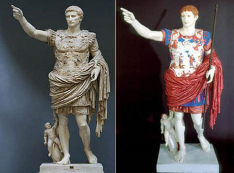
Of course. A lot of the armor that is on display in museums and owned by private collectors (and hence shown in books) was purely ornate and never intended to be worn into battle. After all, not setting foot on a battlefield does help improve the chances of your armor not being destroyed.
Prior to firearms, crossbows and other innovations making heavy armor redundant, it was commonplace for rich leaders who didn’t actually set foot on the battlefield to decorate their armor. Roman Emperors in particular seemed fond of looking absolutely fabulous in armor.
Ancestral armor was not really a thing in most places because generally a memorable suit of armor was part of an individual’s identity. A noble’s armor were also unlikely to fit their heirs – outside of Disney movies few families have identical measurements from generation to generation. Finally there was the issue that armor adapted as weapons did – wearing the previous generation’s armor exposed you to the current generation’s weapons.
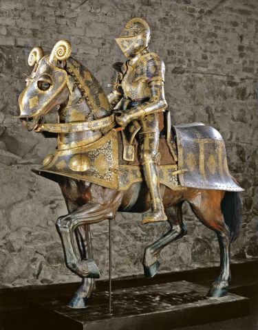
The armor above was made for Sigismund II Augustus, the then King of Poland (who it seems probably never set foot on a battlefield) – and was one of twenty private armors owned by him at the time of his death. It would not have been unusual for a noble wearing such as suit in a parade to accessorize with a sash and/or long cape.
The important part about purely ornate armor is that it looks like armor – just with decorations that go beyond being practical. They still reflect the core armor values of the era but they’re just over decorated*, questionable accessorized and may have reductions made to facilitate their non-combat use (such as no gauntlets or arm protection if it’s for wearing to dinners and parties).