Return of Kanpani Girls

Our second Kanpani Girls redesign. Fixing more soldier waifus!

Elmina

So this character is supposed to be the highest ranking soldier among the Holy Knights (whatever they are in the game) and basically is supposed to be perfect leader and fighter, including über-pretentious part in character description: 

There’s not a single hole in her fighting technique. The spear is actually a perfect metaphor for her existence itself. She very rarely takes center stage. 

Mary-Sue-ish description aside, I gotta admit that Elmina’s stance and *parts* of uniform do inform what a confident authority figure she is. Then there are ridiculous patches of bare skin, schoolgirl face and ridiculously busy costume shape. 

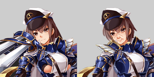
First, obvious thing to fix were the random cutouts. Then I decided that whatever that giant pauldron thingy on her right arm is supposed to be looks just too absurd and uncomfortable to leave it as it is. Instead I recreated her left pauldron best as I could, to make it a simple symmetrical uniform. 
image

Next thing was to give her face conveying the experience and age you’d expect from a high ranking officer. I made her look older with a bigger nose, some minor wrinkles and a tiny bit more detailed lips and jawline. Crossing scars over the bridge of her nose communicate that she acquired her mastery of the spear at a cost – no real badass warrior authority should go scarless.
Also she got a haircut. Her cape is epic enough to blow in the wind and the long hair just asked to get stuck in her weapons or armor.
image

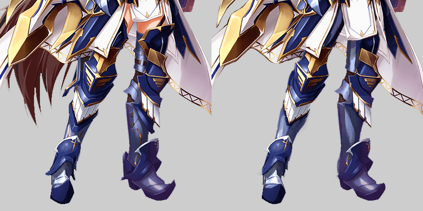
The rest of the stream I spent reversing all those tiny little ornamental shapes from her uniform into simpler, bigger shapes that don’t tire the eye so quickly. Most such changes can be observed on her greaves, as her legs were the least exposed part of the costume.

~Ozzie


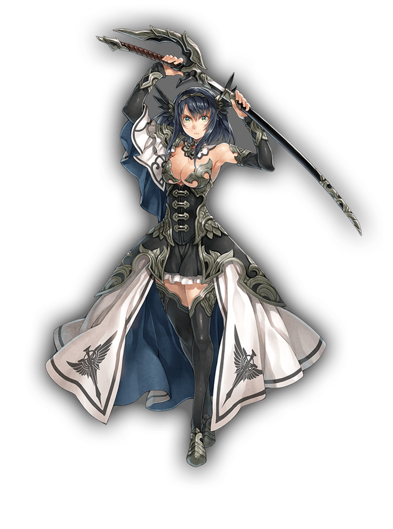
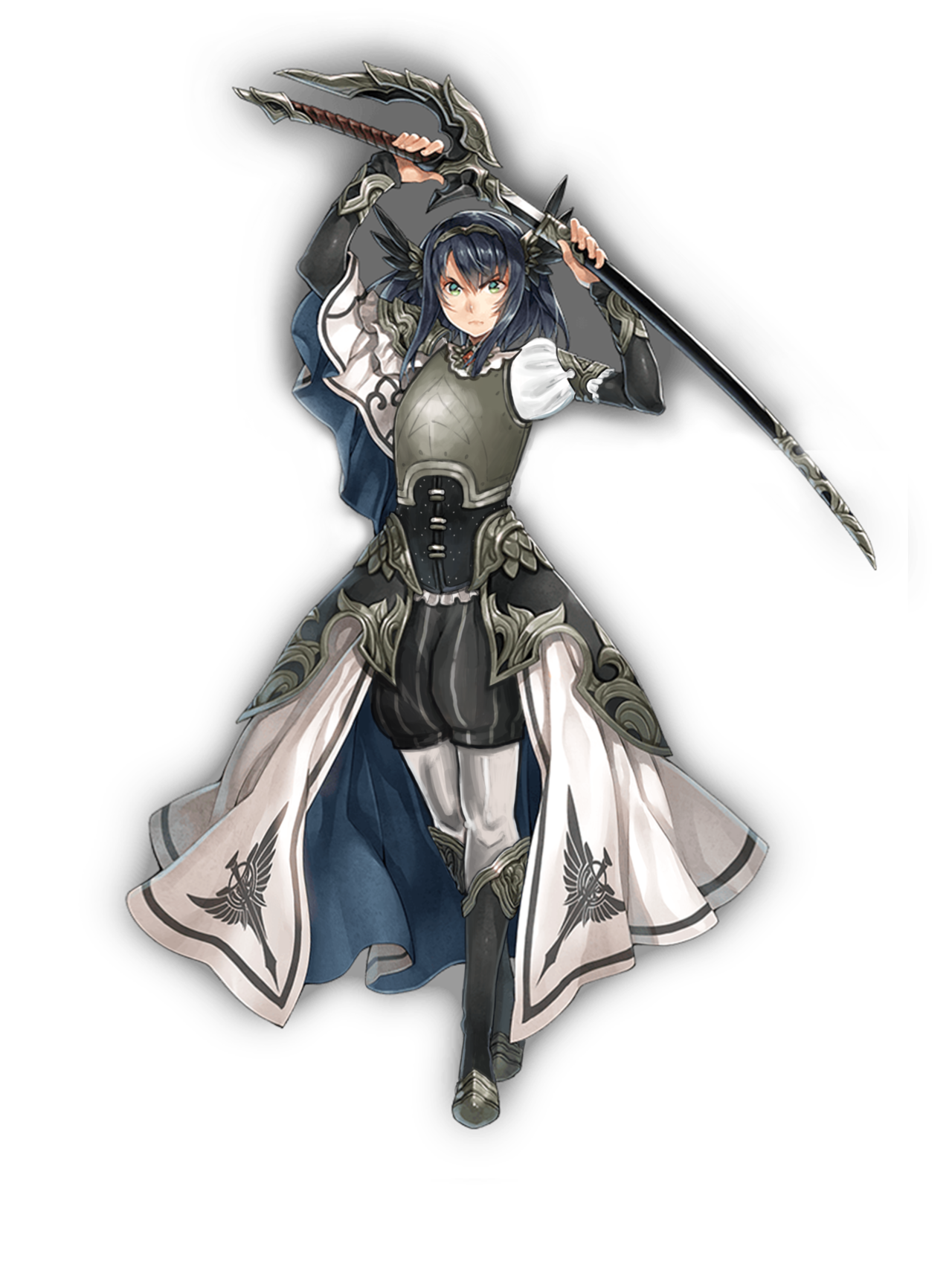
Helga

I decided to tackle the lovingly-rendered but very unfortunately dressed Helga. She has no backstory that I found, so nothing was stopping me from doing whatever I wanted. Insert evil redesigner laugh!

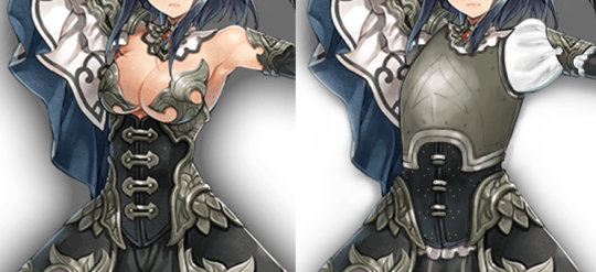
I started by giving her an actual breastplate to replace the…. um. I’m not actually sure what she was supposed to be wearing in the original? It’s not pasties, but there’s not enough coverage to call it a bra… anyway. I got it outta there fast. I also gave her a sleeve while I was at it.
image

I used the same breastplate design as I used for my other Kanpani Girl redraw, because the metal bits under her breasts lead easily into it. I just moved it down to that it’s an actual armor. And thanks to feedback on the previous design, I knew to give her a brigandine under that breastplate: that’s what the metal rivets are.

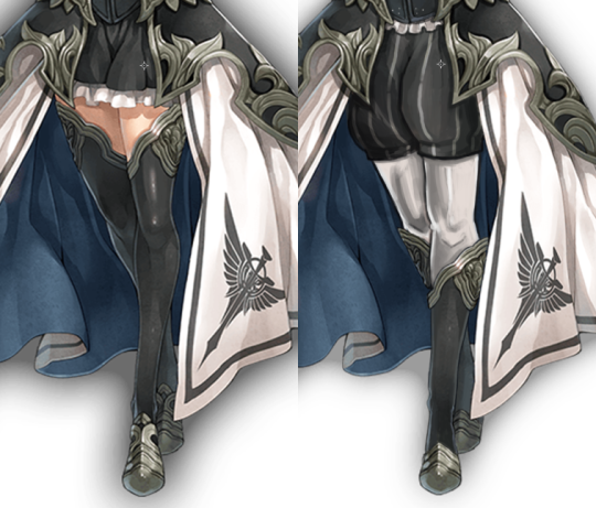
Next, I debated over what to do with her legs. At first, I wanted to give her a tabbard and get rid of her massive skirt almost entirely, but I actually like the skirt. It goes well with her flowy sleeve, and I decided that she was a noblewoman who learned sword-fighting. No backstory, no rules!! It wouldn’t be the most practical, but I decided she still held onto vain nobility ideals and thus kept the skirt. I just made it a little less wide.

I also noticed that her short inside skirt had the beginning shapes of pants, and I ran with that. The trademark Poofy Pants™

make an appearance again, with white tights underneath for contrast. I moved her stocking decorations to her shins and made shoes out of them.
image

And finally, I made her actually look determined. She feels like a person who only recently picked up the sword, so no scars for her yet.

I definitely had fun rendering this out, though having to switch to a different idea part-way through once again meant that I didn’t finish this during the stream. I’m better about it now, I swear! 

-Icy

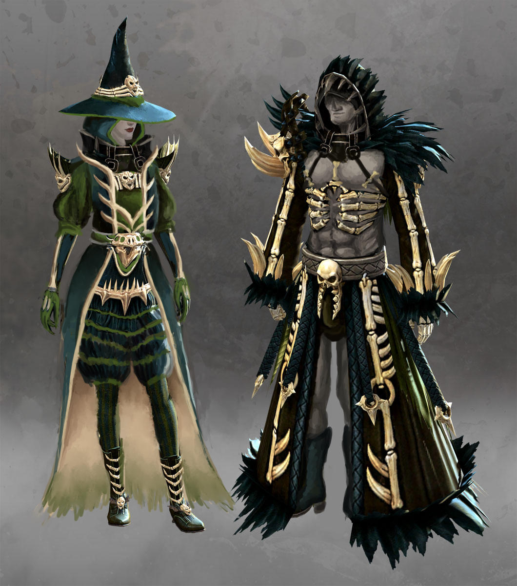
Guild Wars 2′s Sexy Spooky Witch

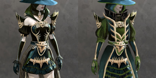
Kept especially for Halloween, my redesign of witch’s outfit from Guild Wars 2 (human version). 

So, what does the original give us? Amazingly washed out monochromatic color palette, generic witch hat, bare thighs and shoulders, majorly over-designed bone ornamentation that looks super stabby (not to mention, frames her boobs)… and, of course, male version which looks nothing alike


After covering the gratuitous bare skin parts with poofy pants and sleeves, I decided to stick to two priorities: 

  • Make her color scheme more balanced (original, especially model sheet version I found on GW2 Wiki, is basically all just one shade of emerald!). Hope that dark teal, moss green and ebony compliment each other better when not so washed out.
  • Turn those needless small ornamental shapes into bigger, less distracting and less likely to stab her if she leans down. Obviously most of what was on her chest had to go in favor of something that doesn’t focus on the bebws.

All the actual design details and shapes were mostly incidental, as I was changing everything as I moved along, over two or three separate streaming sessions. 

image

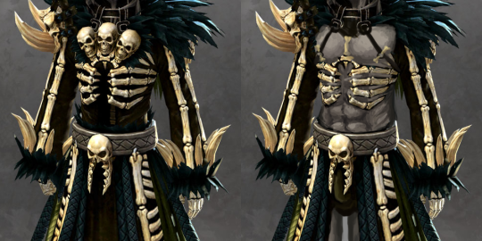
I guess I could have gone the path of what we did to Saint Seiya Online and change the lady’s design to that of her spooky (warlock? lich?) skeleton male version, but I don’t like his design either, just for reasons different than overt sexism.
His bone motif is somehow even more overdone than hers (three little skulls on chest, one on right arm, another one on his… crotch?) and there’s the vague “witch doctor” vibe to him that puts this in exotification category. 

image

I decided to go with the traditional sexified male armor path of stripping him down to as little clothing as possible without changing the silhouette. And gave him face skin, because if lady witch doesn’t have a skull head, why should he?

Also made that weirdly suggestive crotch skull actually frame his package with its scary jaw, because we would never miss such opportunity.

~Ozzie

Gotta Fix Everyone’s Weird Boob “Armor”

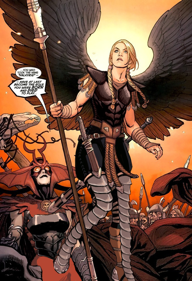
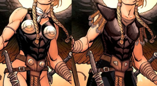
I was frustrated with how Marvel’s Valkyrie was just a sequence of weird design decisions. This particular version ticked me off because they had the cool cuirass with the abs, but then the chafing and the metal boob cones…. ugh.

I started with fixing that chest armor: getting rid of the weird metal bra and adding cool (to me, anyway) shoulder guards. I wanted to give her a more powerful look. I added some small dangling leather straps to mirror those on her belt.

image

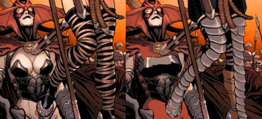
When it was time to fix her…. boots? I took the liberty of, at the same time, painting over poor Hel’s painful-looking <biggest air-quotes ever> “armor.” I actually started giving her a more reasonable breastplate but gave up. That would be a project all on its own.

Those leg ropes seemed very stupid to me, and they didn’t go with the rest of the design, so I gave her plate armor that kept the small shapes. I then gave her simple pants to be the large shape in the design. In hindsight, I feel like I should have gone through with the metal gauntlets I wanted to give her but bailed on.

image

Finally, I replaced her Generic Pout™ with a more determined expression. Now both ladies can go forth and fight whoever it is they’re fighting. 

-Icy
If You Hate It, Then You Should Have Put a Sweater on It (and we did)

We wanted to do a silly stream where we put sweaters on a few poor ladies drawn for Applibot’s ridiculous requests. We apologize in advance for any discomfort caused by looking at the originals.


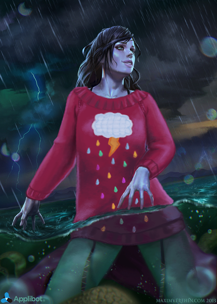
Hoo boy. The Rain Goddess, as she is called, from the Totally-Not-Collectible-Cheesecake-Game Legend of the Cryptids. (Although I couldn’t find her page on their wiki, maybe she was removed.) I have mixed feelings about this one, because on the one hand, I’m glad I could give her a sweater, but on the other, I end up scrolling past her original picture every time I look through my BABD image folder. It’s like looking into the Void. Or as the young’ins are calling it, a Cursed Image.

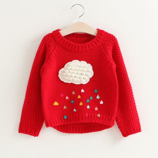
Since she’s a rain goddess (I guess? that’s what the artist called her), I googled “rain sweater” for inspiration, and found this lovely children’s sweater design.

image

It was perfect, really. Most of the stream time was spent rendering this out so that it would somewhat match the original style. If nothing else, the artist had a great technique. It’s a shame about the subject matter, is all.

The final touches were on her face, where I gave her more of a smirk instead of a pout, and made her mascara/eyeliner run a little. 

May the Rain Goddess be comfy and warm in her bright rain sweater. While kneeling in the ocean. I couldn’t fix that part. Or her evolved form.

-Icy

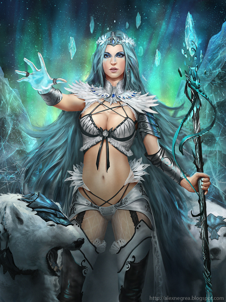
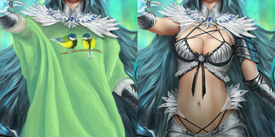
There’s no-one who needs a cozy sweater more than Arctic Permafrost Empress (also from Legend of the Cryptids), both due to her icy domain and one of the most eyes-melting (:P) costumes. 

I referenced some batwing sweaters for this, and since one-color garment looked a tiny bit bare, I decided to paint great tits similar to the ones from the Sadira redo post and made them into a fun puntastic print on the sweater. (Edit on the left)

image

I also changed her facial features to be more distinct and replaced her boring makeup with some blue face paint (which I only hope doesn’t appropriate any culture), just to make her tad more interesting than Random Supermodel #05867 

Here’s the original artist’s blog post, with some references he used for the Empress’ design. Amazingly,  seems like he came up with the weird lingerie shapes almost entirely on his own (or at Applibot’s request?). 

~Ozzie 

image

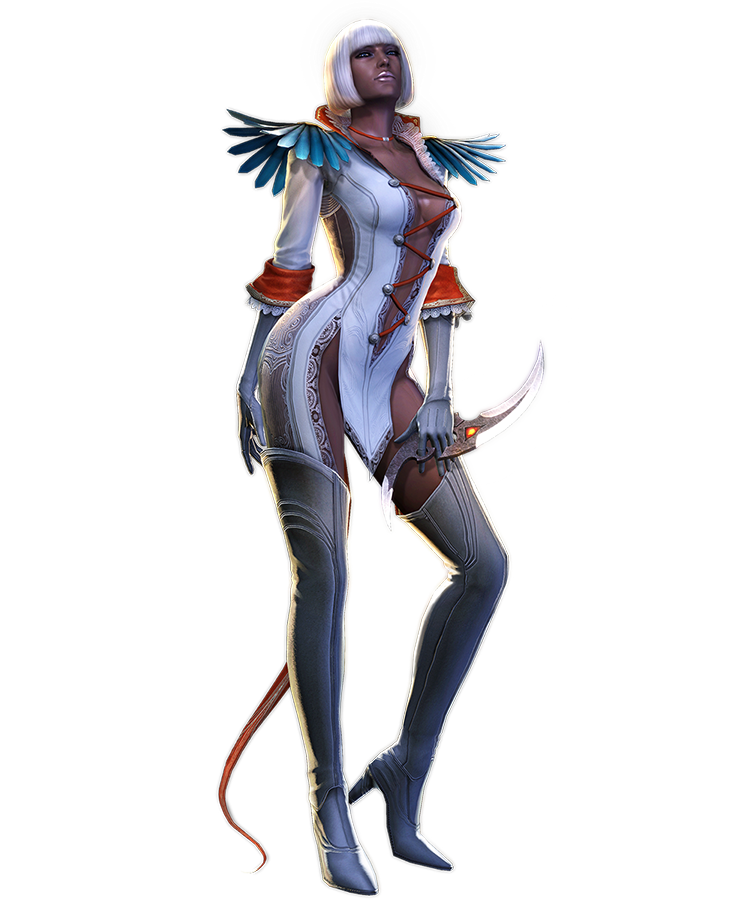
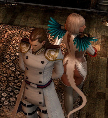
Ah, Gloria… What in the Nine Hells is even going on.

Gloria here is from Devil May Cry 4, where she is a high-ranking soldier. Yes, you read that right. She even demonstrates her “acrobatic and combat skills” in the game, to even the horror of VergilNero*, the main character. Watch the video at your own risk, not in public if possible.

For those who don’t want to scar their eyes and brains, here’s instead a picture of what the back of her “outfit” looks like:

image

In case you thought that the front of her could not be outdone.

image

-Icy
* The series really needs to consider in giving male leads distinct appearances or unique personalities… or maybe just personalities at all.

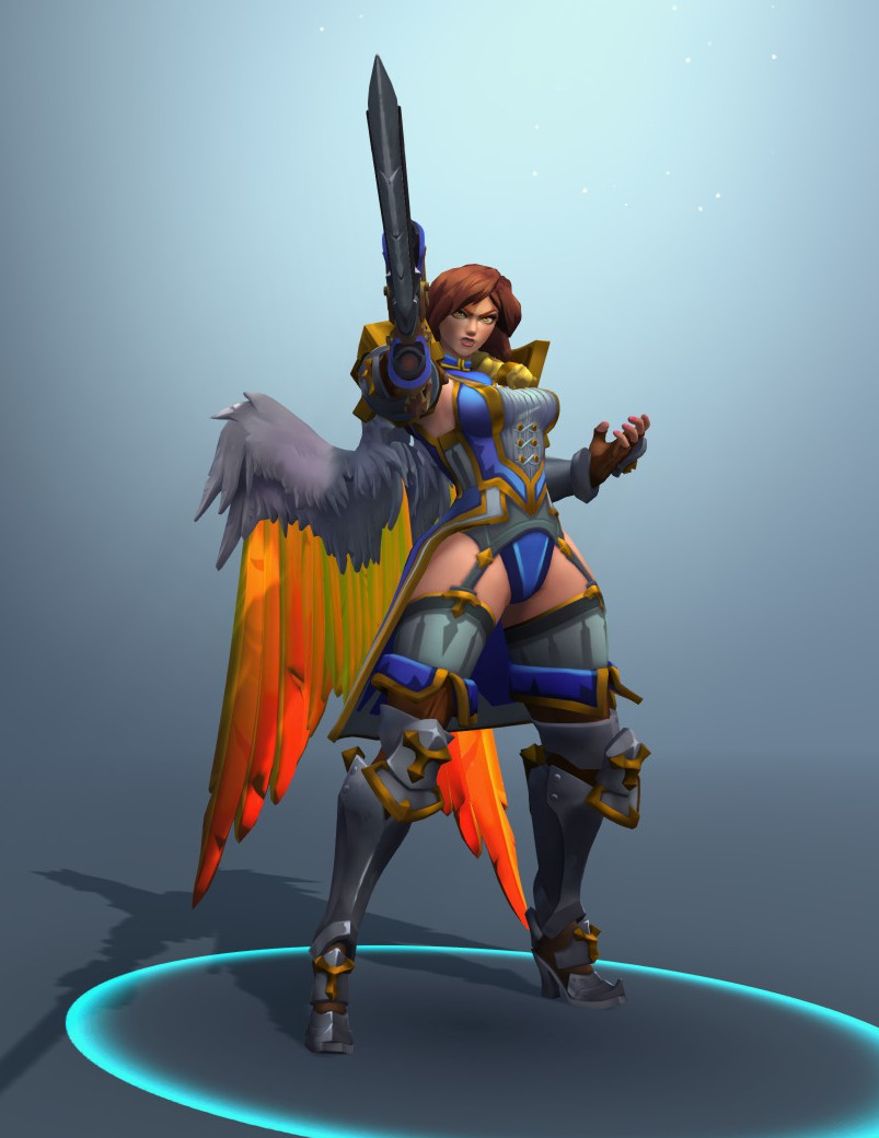
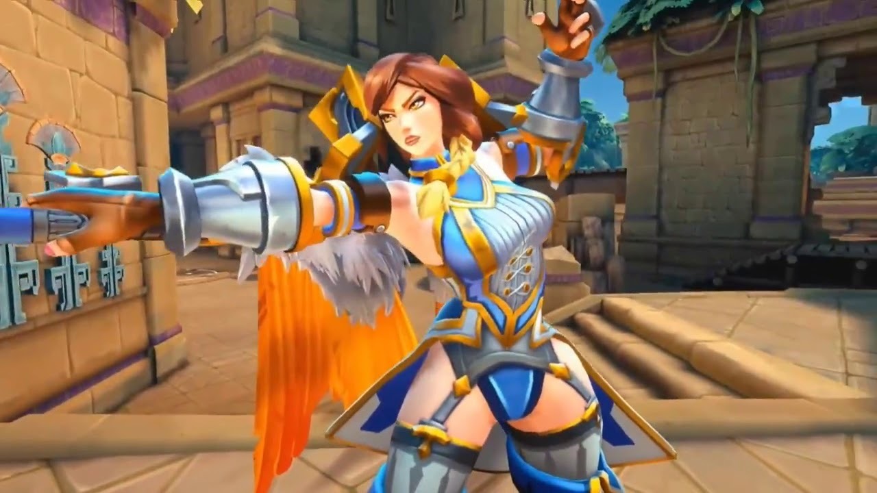
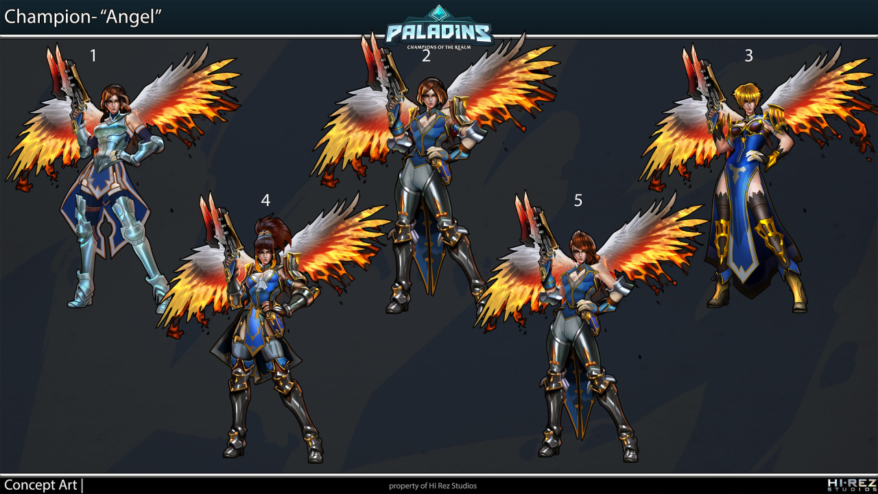
In case anyone forgot that Paladins comes from the same developer as SMITE (if you couldn’t tell by their absolutely “creative” designs), here’s original costume of Furia, one of their newest champions. 

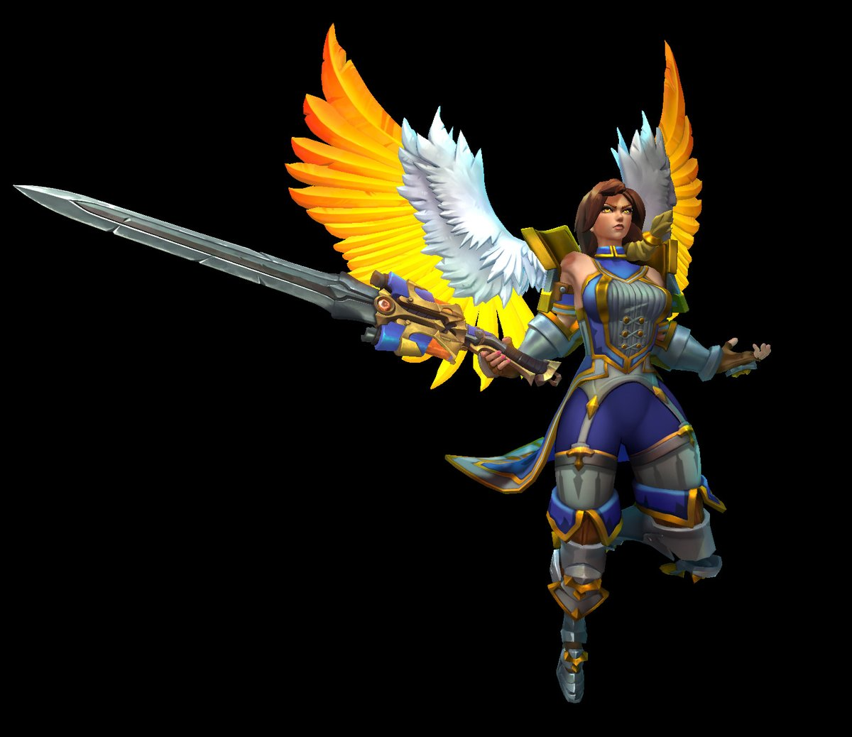
Somehow even people at HiRez concluded that visible panties and completely out-of place garter belts are too ridiculous combination, because apparently after some fan feedback she received a slight redesign that includes pants under those garters.

image

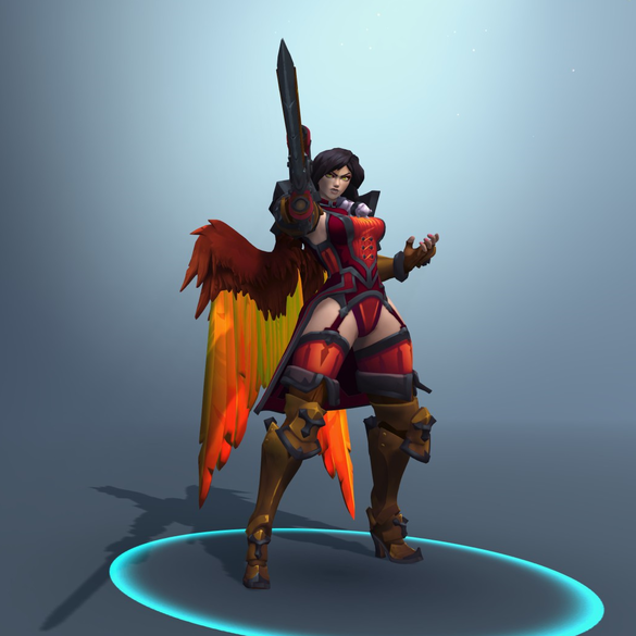
Fret not, perverts! Her original look is preserved through red recolor “Iron Maiden” skin! 

image

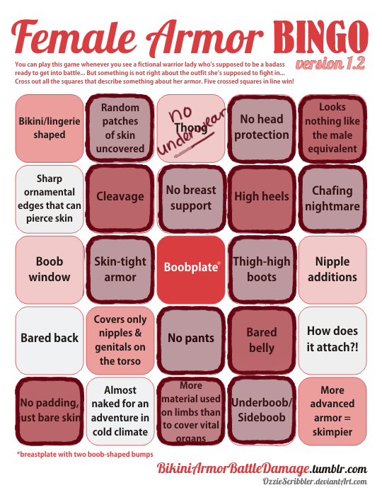
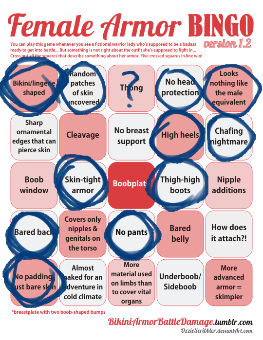
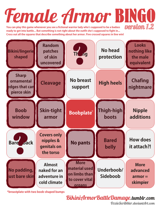
And just in case you wondered whether some actually creative designs got discarded during Furia’s development, don’t worry! No matter how many revisions she went through, there was always at least one “beloved” Female Armor Bingo element in there, like boobplate, cleavage/boob window or otherwise uncovered skin! 

image

~Ozzie

h/t: @randomrobin 

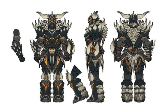
The Monster Hunter series has been a mixed bag when it comes to armor design, and as we’ve shown before, Monster Hunter World has proudly followed in that tradition. We’ve seen that they can do actual armor for both the men and women characters, so what the fresh hell is this? This is high level armor, too. This is what the male version looks like, by the way:

image

I guess I’m impressed that the characters can hand-mold monster carapaces into boob cups?

image

-Icy
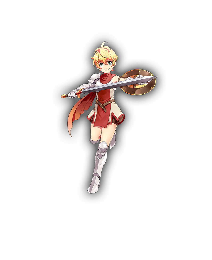
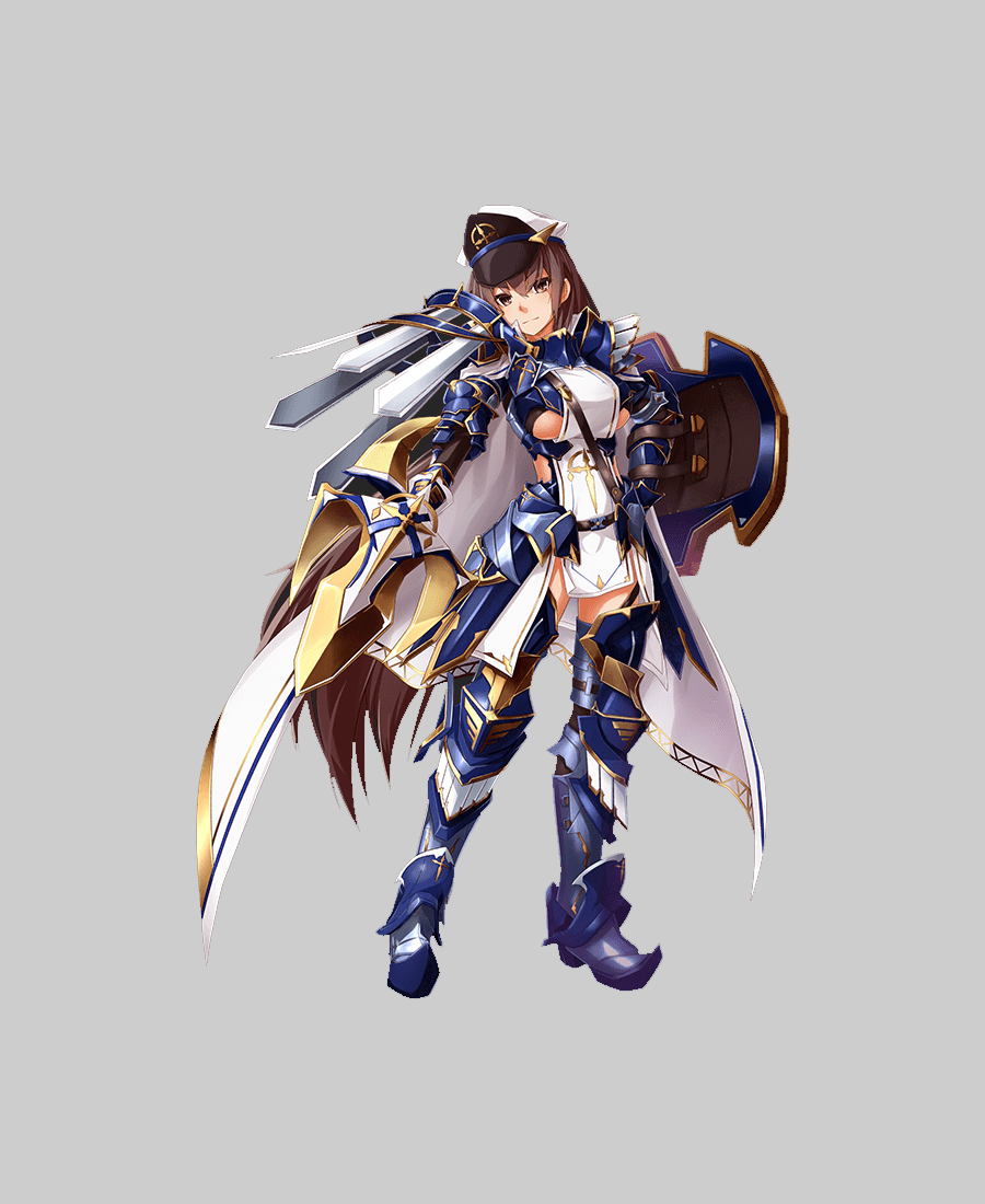
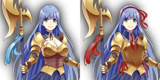
Flavie - originalFlavie - Icy's redesignMarica - originalMarica - Ozzie's redesign

Kanpani Girlfriends

When we discovered that Kanpani Girls is a perfect candidate for our Wall of Shame, we dug through their massive library of really badly designed waifus and picked some relatively easy fixes. Reading up their bios, our choice were two Holy Knight friends, Flavie and Marica, whose defining characteristic is being self conscious about being too short and too tall, respectively. 
Liking the cute dynamic of them both helping overcome one another’s complexes, we decided our versions should be girlfriends. 


Flavie 

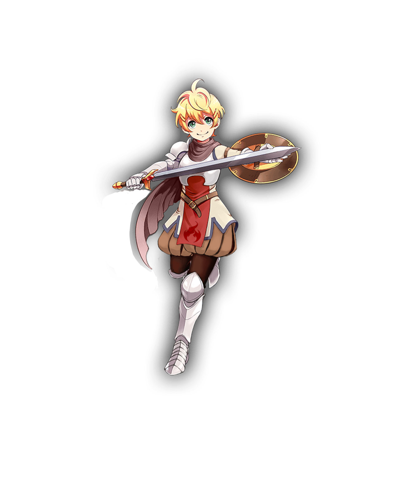
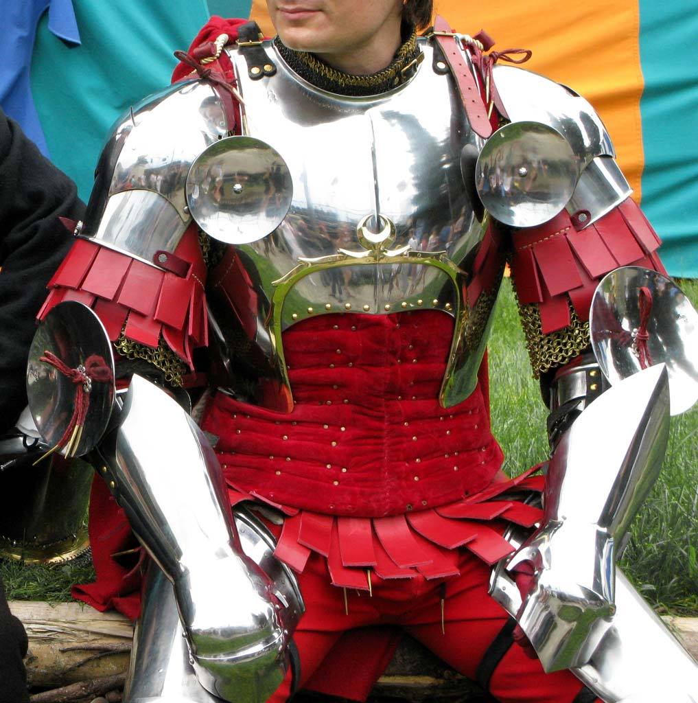
Well, the obvious first thing to go was that single-breasted boob plate, which was a…. unique design, I guess? I instead changed it to a design I saw when looking up armor references for my OCs.

image

I gave her Elizabethan poofy pants because everyone should wear them, honestly. I decided to go for an overall brown and cream color scheme, but left in the red and added some blue to tie the colors in with Marica’s red and blue details, since they are girlfriends. The flame on her tabbard comes from her element in the game, which is fire. Her design is basically all large and medium-sized shapes, so I wanted to add something small. It’s hard to see, but I also gave her a cream-colored sleeve on her left arm. Finally, I adjusted the scarf shapes to look better, both around her neck and as it blows in the wind.

Even though the final redraw is fairly simple, it was definitely fun to work on. I ended up trying like 3 different pants shapes for her before I settled on these. Cell shading is definitely not my thing, though.

-Icy


Marica 

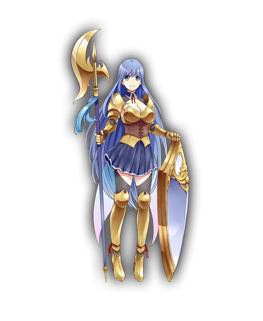
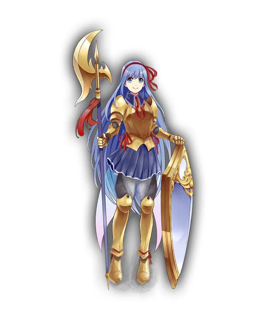
It was one of those designs that’s very close to working as a stylized girly armor, but doesn’t, because someone HAD to give her big ol’ cleavage and exposed thighs. So, my aim was to bring back its potential. 

I’m quite happy with how the breastplate shape came out, with its high curve and slightly bigger tassets. First I intended to incorporate that leather cincher into it, but it just didn’t work. I also gave her semi-poofy pants with diagonal pattern similar the absurd shape of her original  thigh-baring stockings. 

Another thing was to make her shoes at least a tiny bit flatter and more planted on ground, considering the original artist drew her as if she was floating in air rather than supporting her own weight on her feet. High heels not only are universally stupid footwear for a knight, but Marica is supposed to dislike being tall! Why would she wear shoes that add to her height? 

Finishing touches were to establish her better as the girlish one of the couple (big part of her and Flavie’s actual bios) by making her red ribbon/bow motif more significant, especially with hair bow that nicely contrasts with her blue locks (inspired largely by the ending of one of my favorite anime). Also last minute change: decorative piece on her halberd is now red too, to tie everything together.

Bonus point that red accents connect her to Flavie 🙂

If I were to do it today, I’d also turn her skirt and collar into the same graphite color as her armor joints and dark part of her pants, so that they wouldn’t blend into her blue hair.
All in all, not my best or most complex rework (I also had big trouble with cel shading style, obviously), but I think it goes to show how small changes can make a difference between gratuitous sexualization and cute girlishness. 

~Ozzie