Best and Worst of 2019
So a new year is upon us, it’s a good time to reflect on our best and worst of the past year. There’s always plenty of good stuff in our positive examples, and sexy male armor, tags of course.
The Best of 2019
Pretty good year for video games and other media in that more studios seem to be trending towards creating more equitable attire for characters to varying degrees. Even Games Workshop has released some new Sisters of Battle that look like formidable warriors (as opposed to well…), and have promised more. There are a few stand outs:
Captain Marvel by Marvel Entertainment
This movie was a great start to the year and addition to the dialogue regarding the Marvel movies. Representation of women and same-gender relationships were great discussions sparked by it, and it smashed a box office record in the process.
Control by Remedy Entertainment
Weird, compelling and a whole lot of destructive fun – the adventures for Jesse Faden warrant almost infinite exploration and interpretation – all without needing to engage in exploitation of women.
Wolfenstein: Youngblood by Arkane Studios & Machine Games
The iconic game of killing Nazis provided as with the new and exciting opportunity let the players co-operate as a pair sisters killing Nazis for themselves.
Apex Legends by Respawn Entertainment
Battle Royales are a big market right now, and it’s nice to see one that embraces diverse characters and provides the female characters with interesting roles and equipment (that is also practical looking)
And because I’m not too proud to admit to schadenfreude:
Sex Sells – Confirmed invalid, again
Amongst others we took great delight in that the attempts to use sex to sell by EM83R completely fall over, along with the release of the Kill la Kill video game going pretty much unnoticed.
The Worst of 2019
For simplicity I’ve limited this to major media and not the various groups of the worst people supporting the worst celebrities – because those people don’t need our platform and never change.
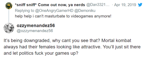
Mortal Kombat fanbase highlights general toxicity in gamer culture
So, Mortal Kombat 11 came out and it’s… well it’s a Mortal Kombat game, but a few changes to default designs and made a few female characters have less conventionally sexy outfits… and well, capital G gamers did not take it well:
(And of course, Final Fantasy had a small riot due to a portion of the cis male fan base having no idea of how boobs or bra sizes work)
League of Legends studio, Riot Games, confirmed as misogynistic cesspit
Throughout the year various details came out about the studio being a horrendous to female staff – to the point where a judge ruled they have to pay ten million dollars compensation to female employees. It’s good that they received some compensation, but it shows how the video game industry still has a long way and how if a studio’s products look like it doesn’t care about women… it probably doesn’t.
Media and platform capitulation to Nazis
If you’re wondering why you hadn’t seen more on Wolfenstein: Youngblood or Control, it’s because pretty much the vast majority of platforms such as Steam and rating services such as MetaCritic still want to take a hands-off approach to their communities because they just don’t care. Of course, there’s also the issue of how Kelly Marie Tran was all but written out of Rise of the Skywalker.
Bloodstained: Ritual of the Night
Well the game is out now and while it was celebrated for its nostalgic qualities, it sadly also carried along all the nostalgic ideas on how female character’s costumes should just be generically sexy without anything thought on… anything else at all… not even whether the clothes can even exist.
Of course, the comic industry remains a trash fire… for many years running now.
– wincenworks

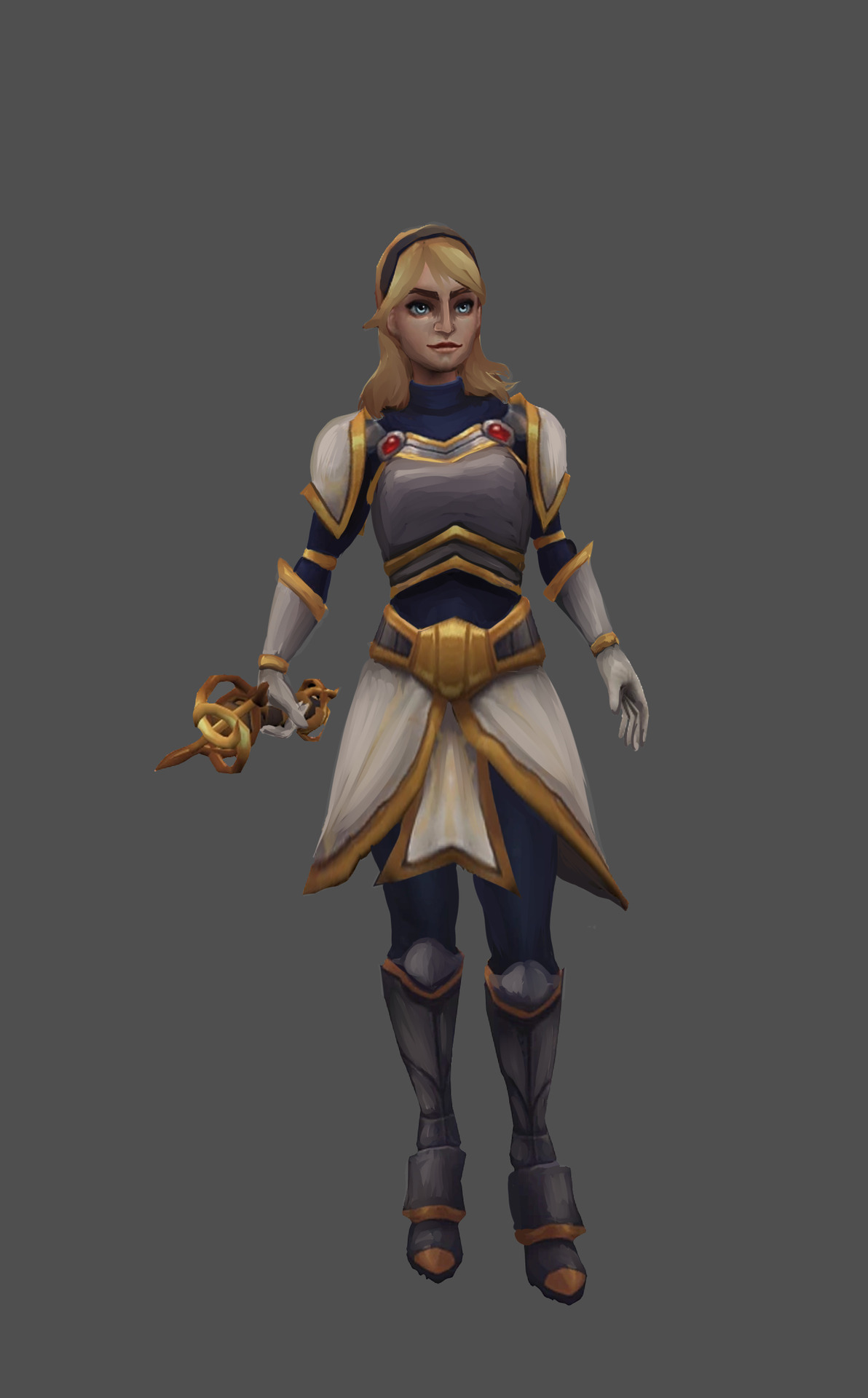
desided to try my hand at redesigning something that isn’t winx, so here’s sketch of lux from league of legends
i wanted to make her look more like her brother, and to give her more serious vibe – after all, she is member of religious order.
What a nice redesign! And I feel like you made her face resemble her brother’s more, which I appreciate. Is it me, or does it seem like LoL has some sibling issues… I like the changes to the breastplate and boots, and of course the fact that she actually has mass now. And her armor isn’t a painted-on afterthought! I also find it interesting how just the shape of her belt can make her look that much more like she knows what she’s doing. Or maybe it’s just me.
(That belt is seriously, like, the Zero-Suit-Samus-shoes of belts.)
-Icy
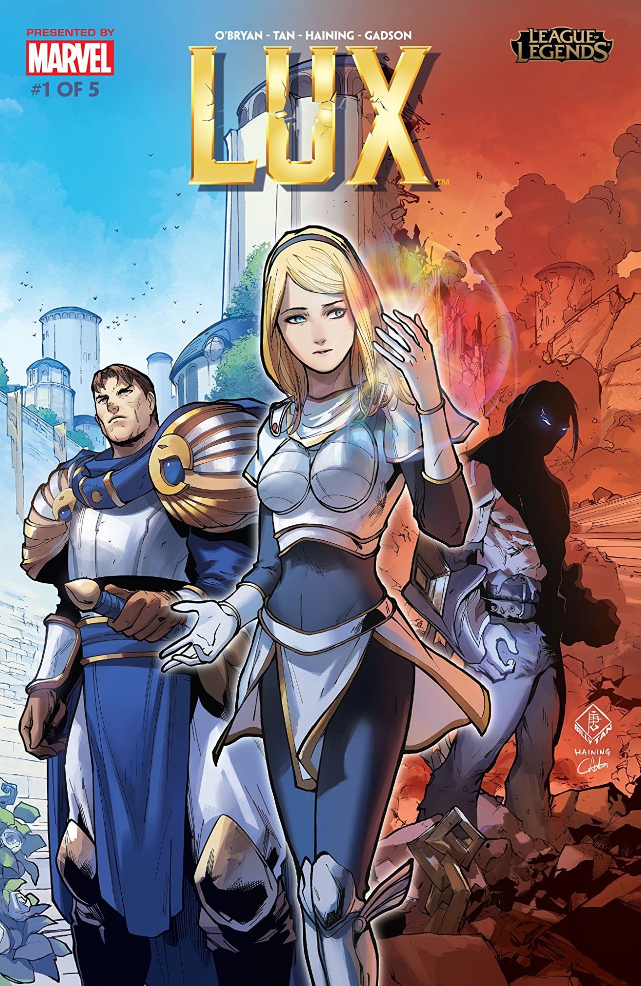
So, recently League of Legends decided to release this origin story for Lux, which has really helped showcase how terrible her design is in comparison to that of… well the rest of her culture. Right off the cover makes it look like she’s the princess to be rescued, not the heroine to reach her potential.
The best thing that can be said about this comic is that they’re depicting her within the society she supposedly came from: it’s now well illustrated how tacky and impeding that shitty boobplate would be.
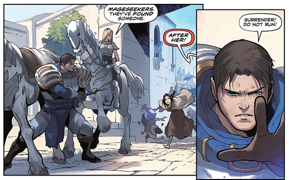
If it wasn’t for the title, you’d assume this was actually a story where Garen was the hero for baby sitting a generic damsel in distress… Which is kind of horrifying when you realize Lux has been in the game for eight years, and somehow fixing her design or evolving her default into something better has never occurred to the folks in charge.
– wincenworks
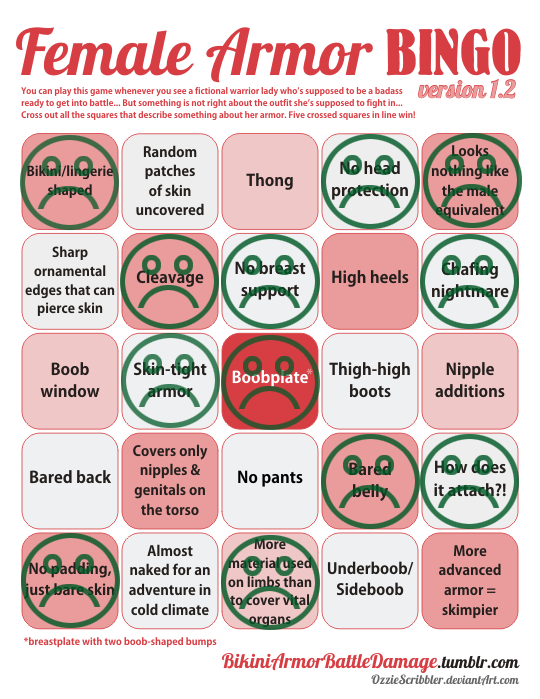
The design process for this definitely not sexualized, because not skimpy (?) “armor”:
- Draw a naked chick, make sure her (obviously nipple-less) breasts have an amazingly implausible shape.
- Add the tiniest hint of texture (and little to no volume) on parts that you think might need to pass as armored (hence the boobplate).
- Loincloth/buttflap for modesty.
- Literally everything else: fill in with non-flesh colors!
- Profit?????
~Ozzie
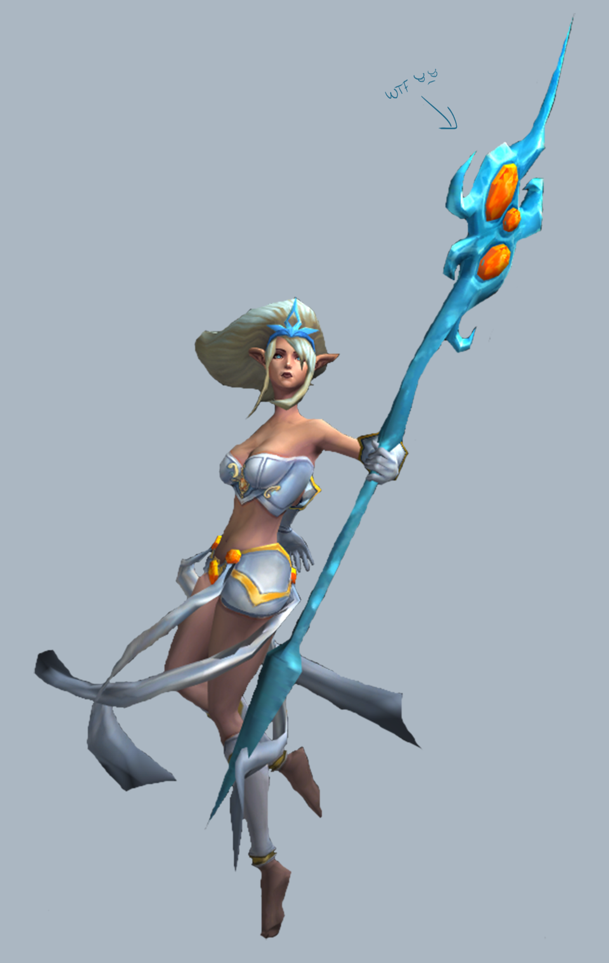
Boring LoL ladies redesign, Part 2
Unimaginative and pointless bikini armor? Clothes that don’t make sense? A two-color color scheme? We’re got it all, on this week’s League of Legends redesign feature.
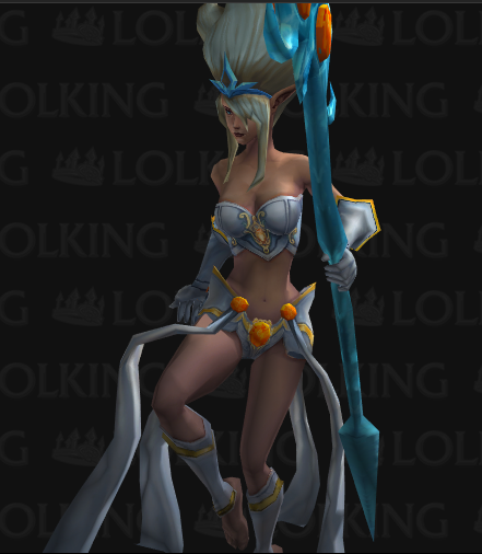
(We included a bonus image cause the redesign picture doesn’t show the full Generic-ness in all its glory. Enjoy!)
<part 1: Ashe> <@leagueofsexism>
Janna
Boy, do I know how to pick the worst ones. So according to her (old) backstory blurb, Janna is an Extremely Talented wind sorceress, to the extent where she sort of became one with the wind. She’s aloof and fickle, focused entirely on her craft. Maybe that’s why the designers thought they could dress her in a swimsuit? “She doesn’t care what she’d wear, right? Just put her in underwear!”
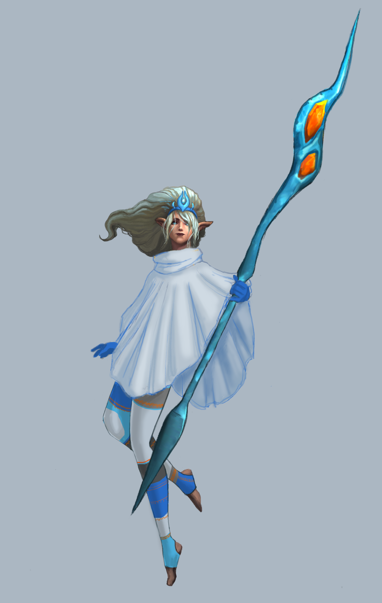
I figured the opposite: being surrounded by wind (she floats and everything), she’d probably want to be warm. I decided on a sleeved poncho so that she would be warm, while also wearing a loose cloth that can flutter in the wind, for the Aesthetic.
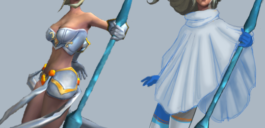
I made it a single, large, flowy shape, keeping the smaller shapes to frame it. I found some fun winter tights online that I used as reference. I made them asymmetrical because besides the staff, her design would end up perfectly symmetrical (hair doesn’t count), and I try to avoid that when I can. I kept the original color scheme to a simple light/dark greys and blue, colors that I associated with the wind and clouds.
The blurb said her powers gave her an “otherworldly appearance,” but her face was just bland and generic, like most of the LoL ladies. I gave her a more elongated, narrow face, with wide narrow lips. The hair detail was mostly just me trying to work with the low-res original I had. I did shorten her bangs, to unify the hair shapes.
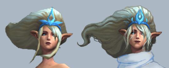
Finally, I changed her awful staff into a more simple wind-looking shape, and added some orange to her tights to tie the color of the gems in the staff to the rest of the design.
For people who keep up with the LoL lore (the LoLore, if you will), this design will not work for her new backstory as a wind spirit. Still, for the original concept, I’m pretty proud of this one. I feel like it’s one of my better full redesigns. It did take me longer to do than a single livestream, but I think it was worth it.
-Icy


Boring LoL ladies redesign, Part 1
League of Legends, despite having maybe two highlights and occasionally attempting to improve, generally SUCKS at female character design. For more details as to why, consult our related blog, @leagueofsexism
Ashe
LoL heroines were among the first stream redesigns by Icy, but this was my first attempt at redoing a lady champion. I chose Ashe, the archer.
While she has completely serviceable color scheme and some nice looking shapes in cape, hood and limb departments, her core costume is just a short dress with deep cleavage and fabric belt. Also nipple adornments ¯_( ͠° ͟ʖ ͠° )_/¯
Since LoL fails at giving most female characters distinct facial features, I felt obliged to change this generic oval face with tiny nose and pouty lips into something more interesting. Now her face and nose are longer, with sharper jawline and cheekbones.
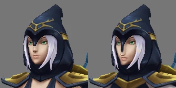
I decided that instead of her ghastly pale skin, the design should be broken up white elements that will compliment her hair and belt.
You can never go wrong with Elizabethan pants. I’m especially proud of the matching poofy sleeves broken up by golden arm braceletes that were already there.
Obviously, I wouldn’t leave ornaments on each of her boobs, so I reduced it to a single one at the center of her chest. And her pauldrons no longer just hover on her shoulders, they (and presumably, the cape) are connected now at the sternum.
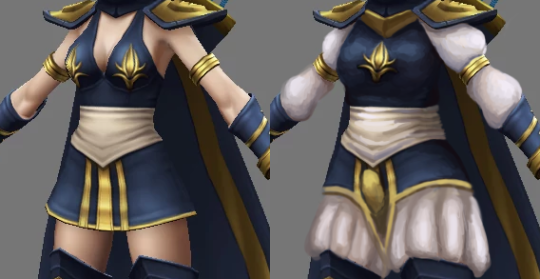
Last change, suggested by Icy, was a codpiece, matching the period fashion of her pants. Yes, my redo of Ashe is an openly trans lady, because why not?
All in all, I’m quite satisfied with how I managed to keep the silhouette and shape language relatively unchanged, while adding some more interesting stuff where gratuitous skin displays were before.
~Ozzie
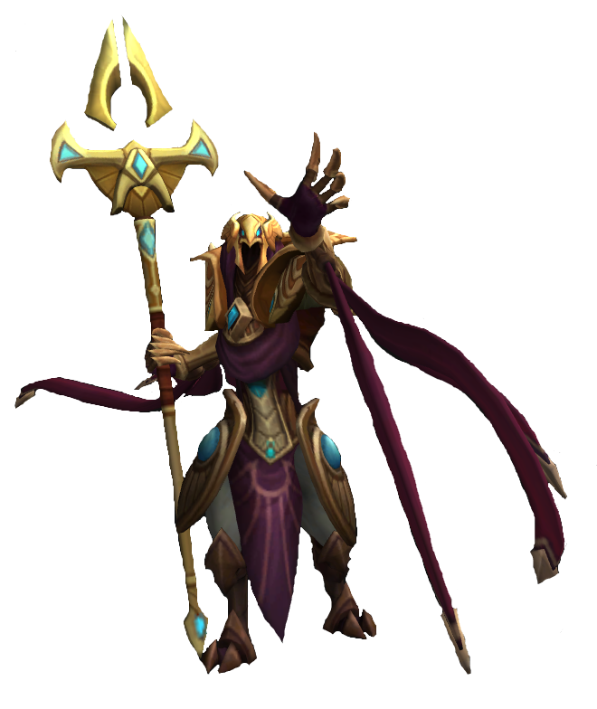
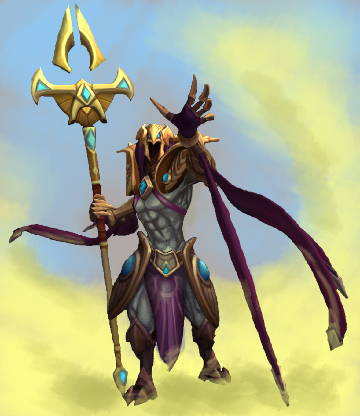
Azir Arises
[The title is a double entendre based on one of Azir’s moves in LoL]
For my first Sexy Male Armor redesign, I decided to do a male version of the trend we see with boobs being put on things that really shouldn’t have them. You know, like reptilian humanoids, bug creatures…. this….. so I went with Azir from League of Legends, to turn him into the sexy bird man we all knew he could be (while making many Hatoful Boyfriend references).
I tried to go for realistic-ish anatomy, working all I could from that sensual twist he does in this picture. I also took off all of his unnecessary chest armor. He’s a mage anyway, and we all know mages don’t wear armor. I only kept his arm and head pieces to tie into his belt and legs, and, of course, to frame his pecs, which is the purpose of armor.
Finally, taking inspiration from one of my favorite Sexy Male Armors on this blog (NSFW link), I gave him semi-transparent nipple coverings, and (what has become a trend in my sexy male redesigns, for better or worse) a matching semi-transparent loincloth.
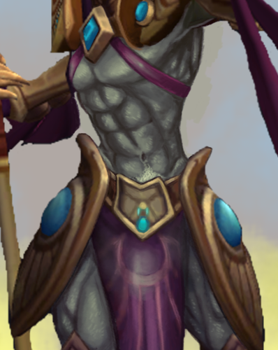
Now Azir can go forth and restore his empire with confidence and empowerment!
-Icy
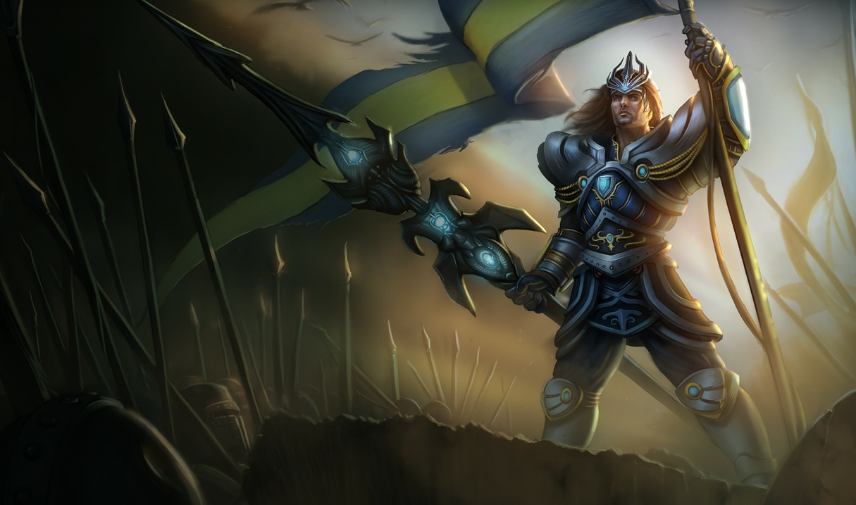
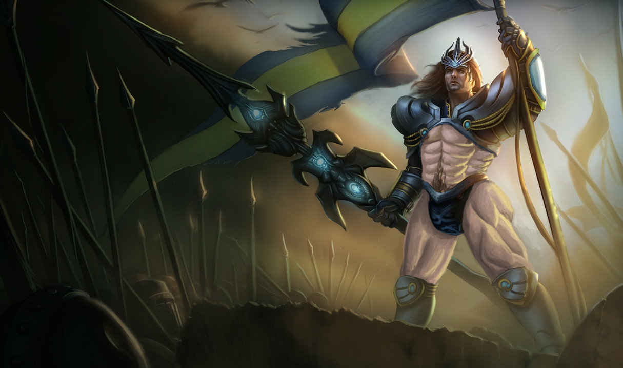
Jarvan of the Thousand Abs
My first sexy man redesign (and, as far as we can tell, first stream done along with Icy), was Jarvan from League of Legends.
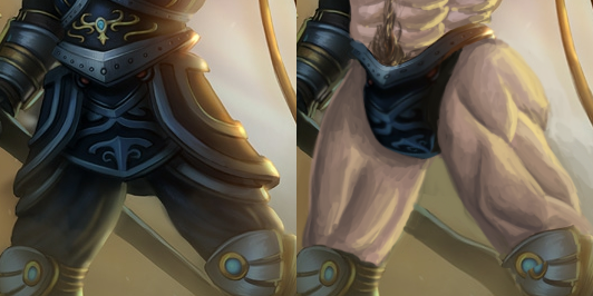
The initial thought was very basic: leave those enormous pauldrons while exposing most of his torso and also thighs. Then the idea to give him infinite abs was brought up and here we are.
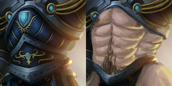
While for thunder thighs I used some photo reference, with abzilla I was deliberately ignoring any anatomical knowledge. This was my homage to all the “creative” ways in which female bodies, especially boobs, tend to be drawn.
While some would claim that Tarik fills LoL’s sexy men quota, he definitely won’t balance out all the sexualized female characters in that game. Not to mention that “irony” of his presentation is pretty damn problematic, as @leagueofsexism summarized it in this post.
~Ozzie


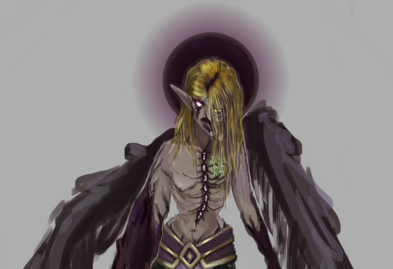
One of the complete redesigns I did when we first started streaming: Morgana from League of Legends. I read her background blurb and got angry cause she has a lot of potential with a backstory involving familial strife, law vs. chaos as ideology, and resorting to dark powers to fight for what you believe in. But her design was…. just generic bra and skirt, and some evil makeup, I guess?? Ugh. So I basically started from scratch, which means this write-ups is gonna be just a little longer than the first.
More under the cut.
What Stayed In:
I kept the color scheme, for the most part, the belt part of her skirt, and her posture. Or rather… what I think her posture was supposed to be, cause she sure doesn’t look hunched over in the original, more like she’s got a sore shoulder.
So not much.
Initial Redesign Ideas:
I decided that Morgana should be more monstrous because of the dark magic she was using. I wanted to give her more colors than just purple and gold (LoL has a problem with 2-color costumes), so I went for a sickly green that would add to the “wrongness” of her design, as well as hint at multiple sources of corruption. They tried to make her look malnourished, I guess?? –
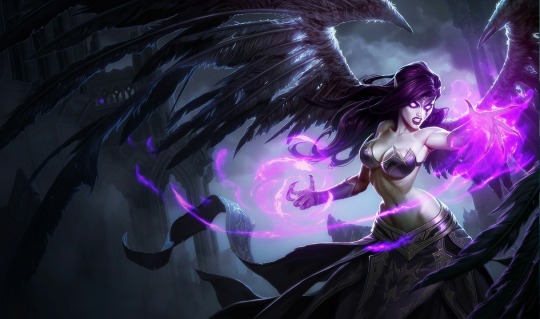
[Not even the splash artist was sure what was going on with her torso.]
–so I pushed it to the extreme in the redraw. I was also trying to maintain triangles as the main shape in the design.
Storytelling Elements and Later Additions:
So, Morgana has a sister in the game who fights against her, named Kayle.
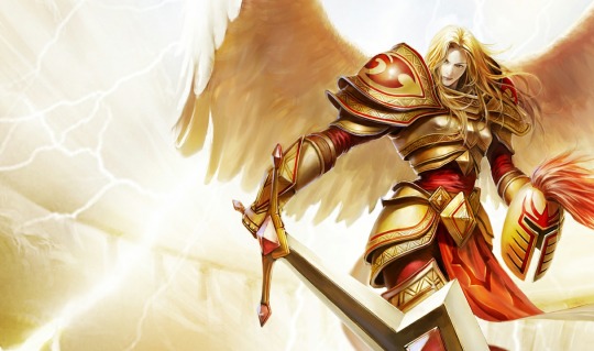
I wanted to add elements of that old life to her appearance, so I changed her hair to blonde, like her sister’s. I also gave Morgana a tabbard similar to Kayle’s, with the same symbol on it, albeit old and worn-out. Forgotten, almost. The final change I did was adding the corrupted halo. The blurb on Morgana’s life sounds very obviously disapproving of her life choices, but I was more interested in making the sisters not so cut-and-dry good or evil. Kayle is very lawful, so she has to eliminate evil, at any cost. Morgana disagrees with that kind of ideology, and ends up resorting to making some bad deals in order to face her sister. Is either of them right? They both sound like they’re suffering in their respective positions. So I wanted Morgana to be a bit more sympathetic and interesting.
Final Thoughts:
You could call me out for giving her even less clothes than she had before, but I would argue that it makes sense in this context. Morgana’as power comes from dark, unnatural magic, unlike her sister’s armor and sword (Kayle’s equipment has a backstory of its own). I feel like she would have continued to give more and more of herself to gain more power, possibly even to the point where she can’t wear armor anymore.
But I didn’t give her a silly bikini and buttcrack-showing skirt and call it a day. The developers couldn’t even be bothered to give her any indications of her backstory. If they had at least given her some deformities or something, I probably wouldn’t have been so angry. At least something fun came out of it.
-Icy

