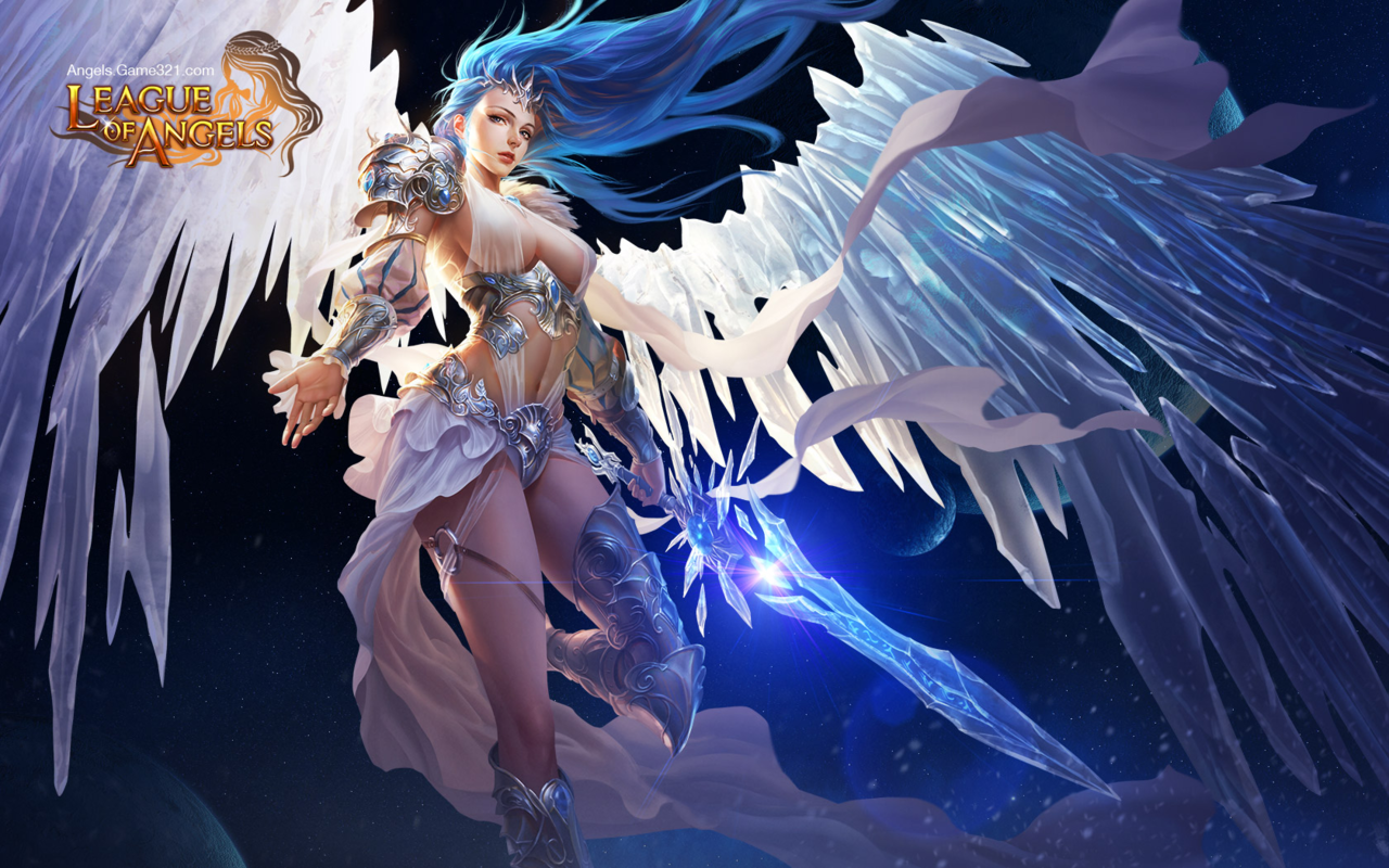

De-failing League of Angels Part 2: The Angel of my Personal Hell
You’d think I would have learned my lesson, regarding picking The Worst Things for redesigns, but not before I had to fix this!! I didn’t even have alcohol to keep me company while I worked on it.
I’ll start by briefly noting that every redesigned element, besides the face, took up to 4 tries to figure out, just in terms of shapes alone! I wanted to keep certain elements from the original, such as that belt motif, so I spent a lot of time just trying to figure out what the hell I could do with them. At least one ended up in a weird place.
I will also say that while working on this piece, I decided that this character feels more like an agender rather than a woman angel, so they’re agender now. On that note, let’s begin with what I loved working on the most: the face. I made the eyebrows and nose more interesting, made the makeup more gender-neutral, and changed the palette. Definitely one of my favorite and least painful edits.
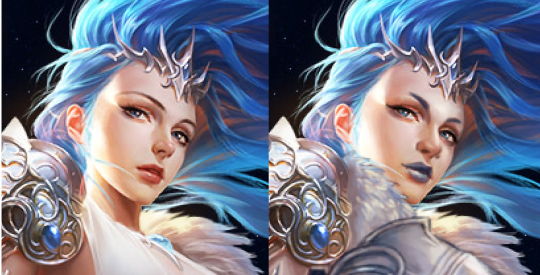
After doing that… I just changed everything else about the design! Oh, except I did keep the foorwear and the arms. The under-boobs belt became a breastplate, with the crotch armor (?) belt thing incorporated into it. The cloth thingie hanging off the crotch armor (?) got moved up to probably be part of some shirt under the breastplate.
Everything besides that is me exercising my painting and suffering skills, so y’all better appreciate it. I decided to go with some gambeson for the legs, instead of our regular poofy pants, because the cloth thingie was conflicting with the poof. I added black pants and a similar undershirt visible in the armpit to tie the design to the background a bit. Also, I needed another color besides light grey, sky blue, and white. The original palette is pretty limited when you’re not distracted by the tiddy.
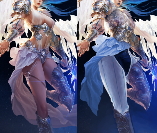
My rendering skills are obviously not as good as the artist for the original, but I tried (Oh my God, did I try). And I do believe that at least in the design aspect, my reworking is an improvement.
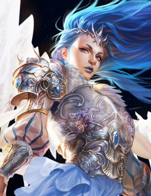
Bonus closeup of the breastplate because it sucked to work on.
-Icy

De-failing League of Angels Part 1: Stabby leather lingerie
Apparently we felt like taking a challenge the day we made those edits, because, well, it’s League of Angels, the epitome of creative bankruptcy in video game marketing.
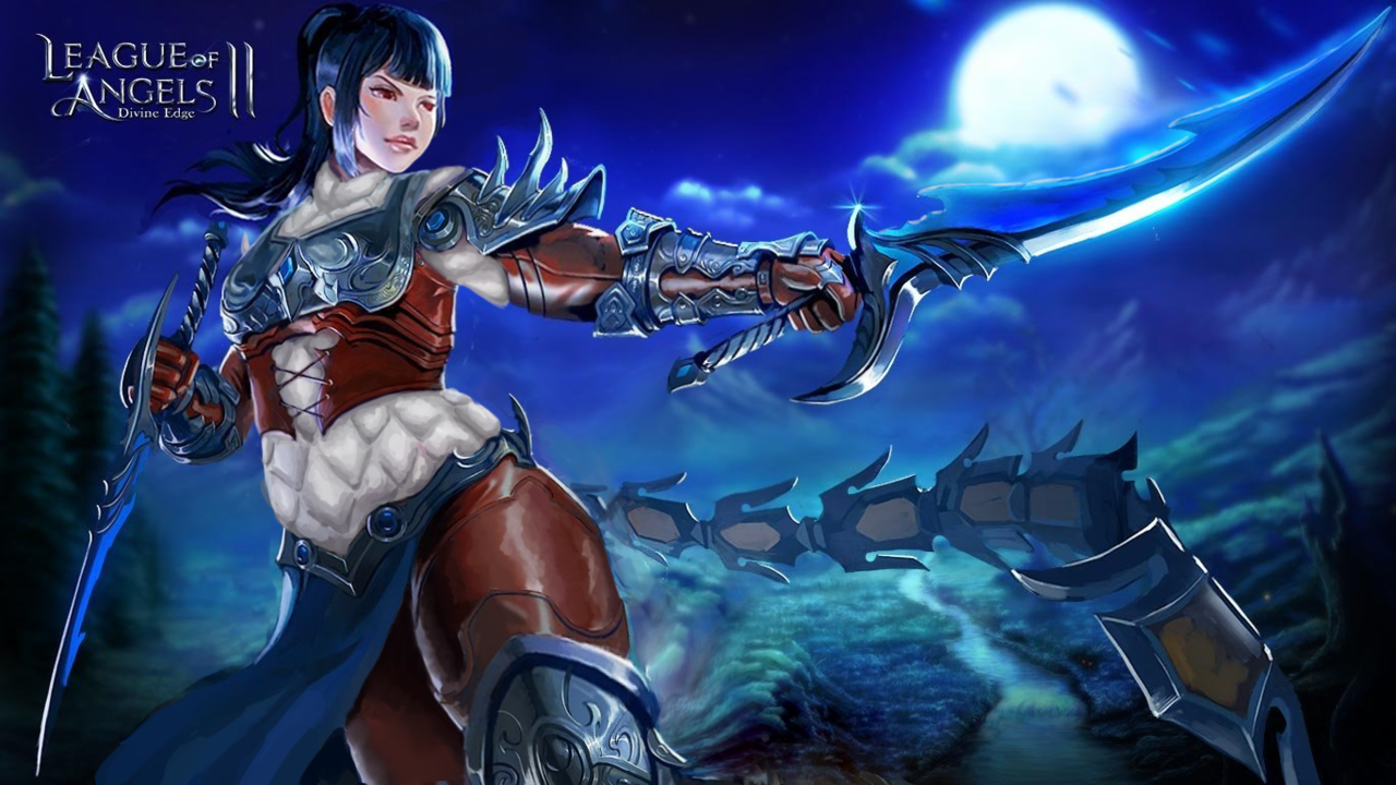
What I decided to redesign was this extra-stabby leather… um… outfit that I bingo’d before.
After the initial shock of how uncomfortable that “armor” must be, the literally biggest thing that caught my attention in this artwork were her thighs. HOW FREAKING HUGE ARE THEY IN PROPORTION TO THE REST OF THE BODY? Unfortunately this seemed mostly like an epic fail at foreshortening rather than an attempt at ‘thicc’ fetish, let alone at earnest fat representation… So I decided to reverse that.
Instead of shrinking the thighs to give her conventionally attractive model proportions, I readjusted the rest of the body to fit them, resulting in a chubbier figure.
Her arms now have some heft and her head isn’t tiny anymore.
Though most important changes went into the torso, which now has a human-sized waist and connects to other body parts at humanly possible angles, instead of those of a Tetris puzzle.
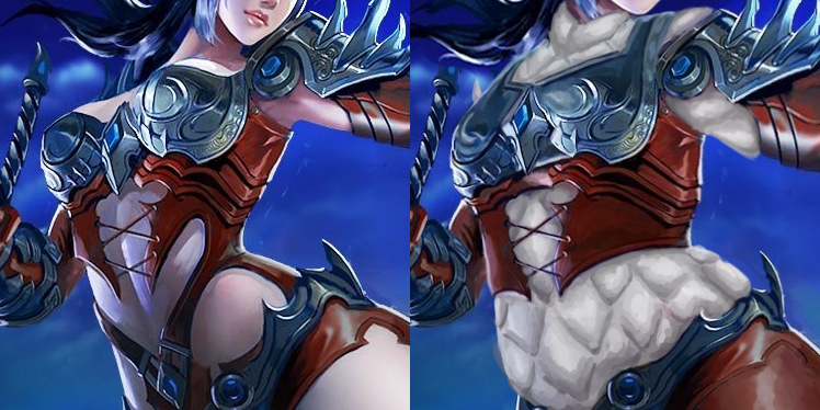
I am very satisfied with what I managed to do with that shameless boobplate. The idea was to still have it be a breast-oriented armor without making it look like two coconut halves with extra-emphasis on cleavage, and while retaining as much of the original’s decorative aesthetic. Basically a more sophisticated attempt at what I did with Regime Wonder Woman waaay back.
I also slightly reshaped the stabby laced leather part under it, because it looked cool enough… just not on bare skin. Speaking of which, of course there was no way I left this poor woman with no padding, so in place of all this pale skin I painted white gambeson, retaining the original color scheme. She also now has full leather pants, because why wouldn’t she?
All in all, I think I managed to improve this image significantly. Not all edits are seamless, but I’m quite proud of the way they came out. How do you guys like it?
~Ozzie
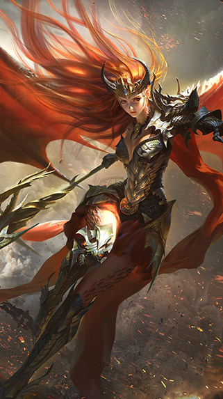

League of Angels 2 is very determined to keep their armor design strictly in the “Elaborately generic metal lingerie” category. So determined to never do anything even remotely original they can’t even score a proper bingo this time.
~Ozzie


