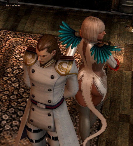
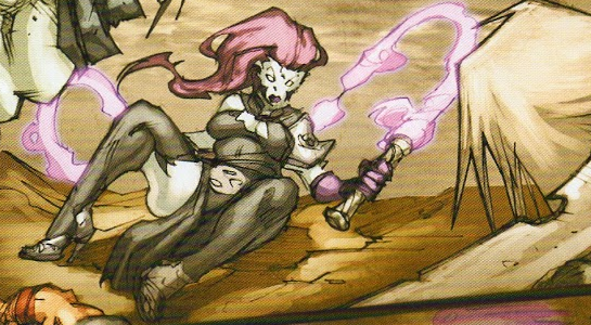
Ah, Gloria… What in the Nine Hells is even going on.
Gloria here is from Devil May Cry 4, where she is a high-ranking soldier. Yes, you read that right. She even demonstrates her “acrobatic and combat skills” in the game, to even the horror of VergilNero*, the main character. Watch the video at your own risk, not in public if possible.
For those who don’t want to scar their eyes and brains, here’s instead a picture of what the back of her “outfit” looks like:
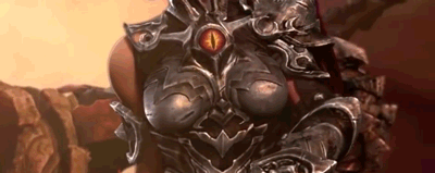
In case you thought that the front of her could not be outdone.
-Icy
* The series really needs to consider in giving male leads distinct appearances or unique personalities… or maybe just personalities at all.


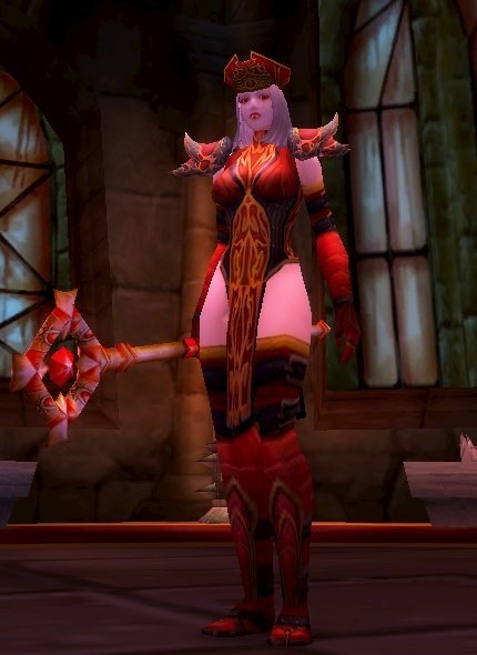
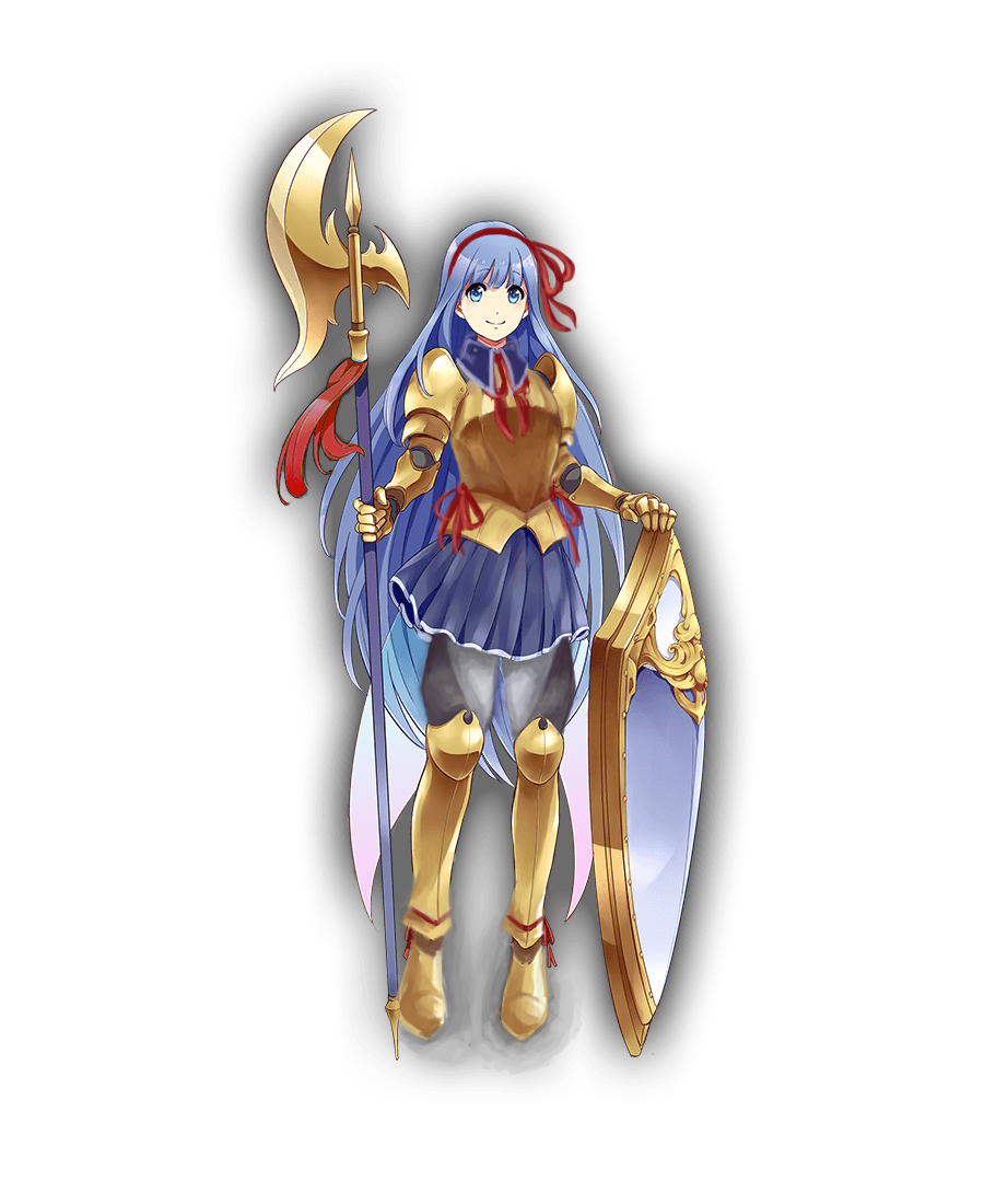
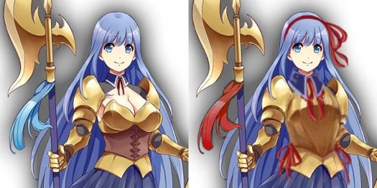
Red is for the High Inquisitor skin, Blue is additionals from the Celestial Empress skin
Clickbait Title: You Won’t Believe What Character Blizzard is Adding to Heroes of the Storm!
Having blocked out most of my memories of playing World of Warcraft (and I didn’t do raids), I didn’t remember Sally Whitemane, so boy was I surprised to learn she led a religious order!

I’m not sure how anybody took this character seriously as an authority figure of any kind. Her outfit looks like something out of a fetish lingerie catalog. The HotS design is almost exactly the same as her original WoW model, which really highlights how much effort Blizzard is putting into doing women better.
Not to mention, her first alternative skin is some kind of scissors accident, rather than, for example, her Horseman version? Yeah, she became one of WoW’s Four Horsemen (the only woman in the current lineup, of course).
I mean, give her some padding on her exposed stomach, and that would be a fine alternate skin! But she does have a lot of skull motifs all over, so maybe they thought it would be too similar-looking to Sonya’s Death Knight skins.
-Icy
h/t: @evjazurian
Kanpani Girlfriends
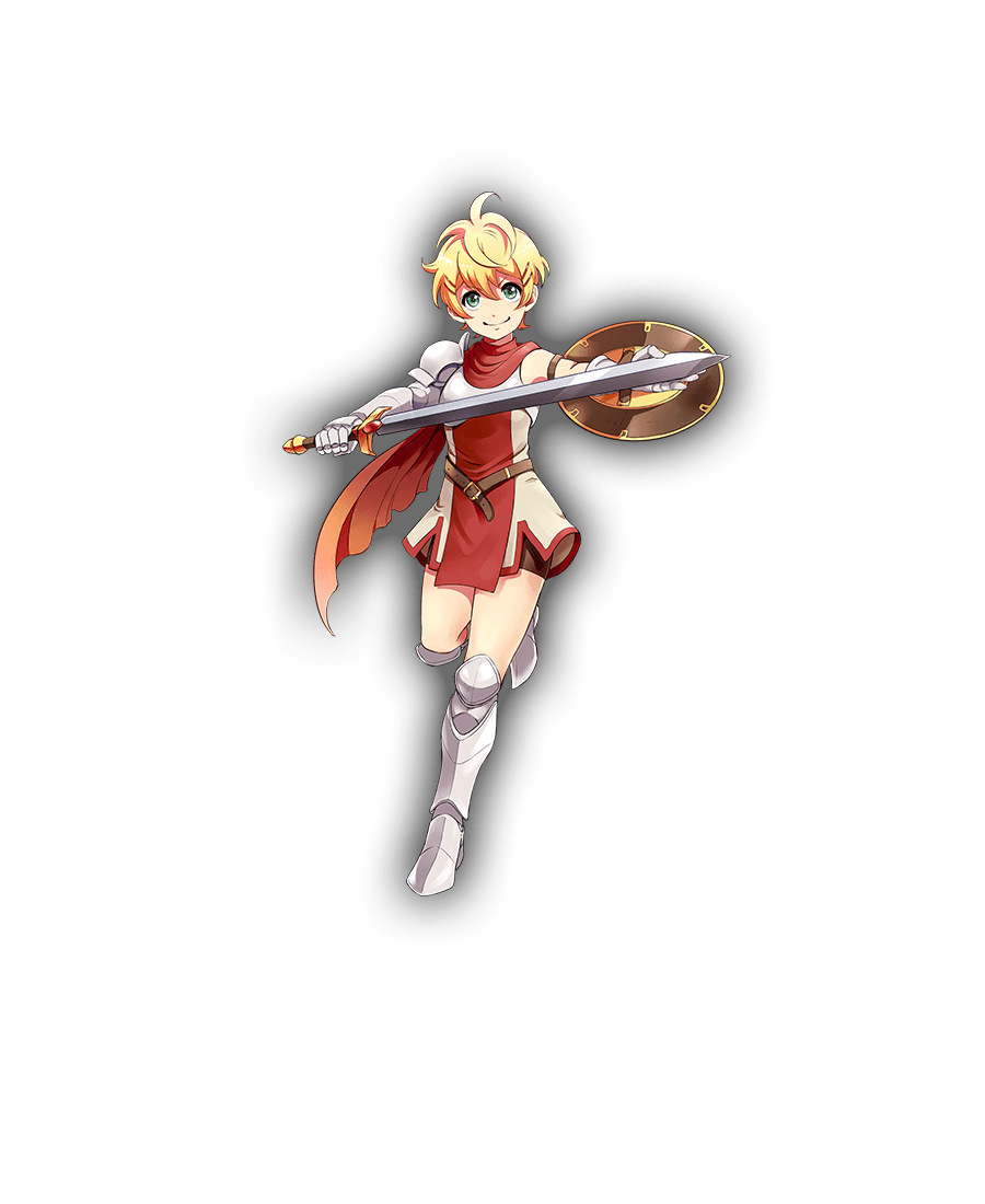
When we discovered that Kanpani Girls is a perfect candidate for our Wall of Shame, we dug through their massive library of really badly designed waifus and picked some relatively easy fixes. Reading up their bios, our choice were two Holy Knight friends, Flavie and Marica, whose defining characteristic is being self conscious about being too short and too tall, respectively.
Liking the cute dynamic of them both helping overcome one another’s complexes, we decided our versions should be girlfriends.
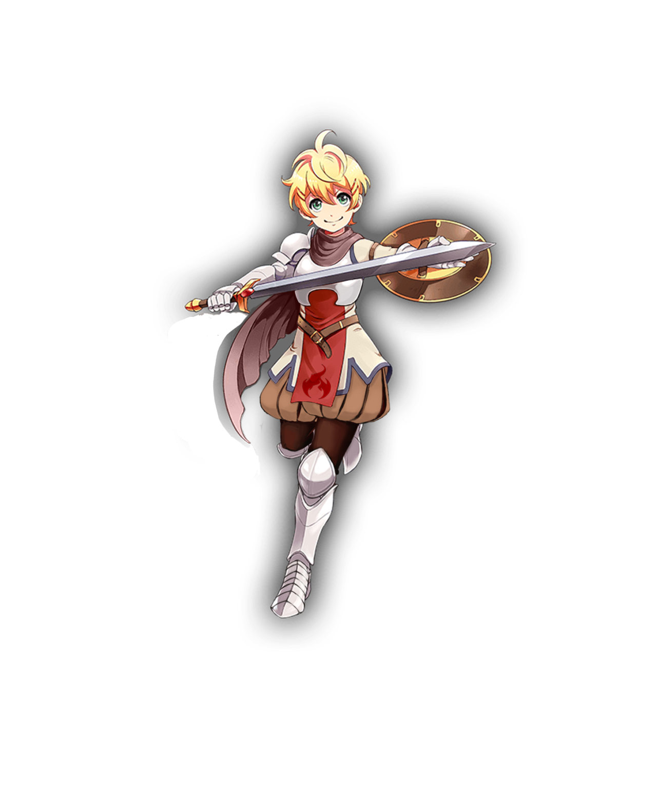
Well, the obvious first thing to go was that single-breasted boob plate, which was a…. unique design, I guess? I instead changed it to a design I saw when looking up armor references for my OCs.
I gave her Elizabethan poofy pants because everyone should wear them, honestly. I decided to go for an overall brown and cream color scheme, but left in the red and added some blue to tie the colors in with Marica’s red and blue details, since they are girlfriends. The flame on her tabbard comes from her element in the game, which is fire. Her design is basically all large and medium-sized shapes, so I wanted to add something small. It’s hard to see, but I also gave her a cream-colored sleeve on her left arm. Finally, I adjusted the scarf shapes to look better, both around her neck and as it blows in the wind.
Even though the final redraw is fairly simple, it was definitely fun to work on. I ended up trying like 3 different pants shapes for her before I settled on these. Cell shading is definitely not my thing, though.
-Icy
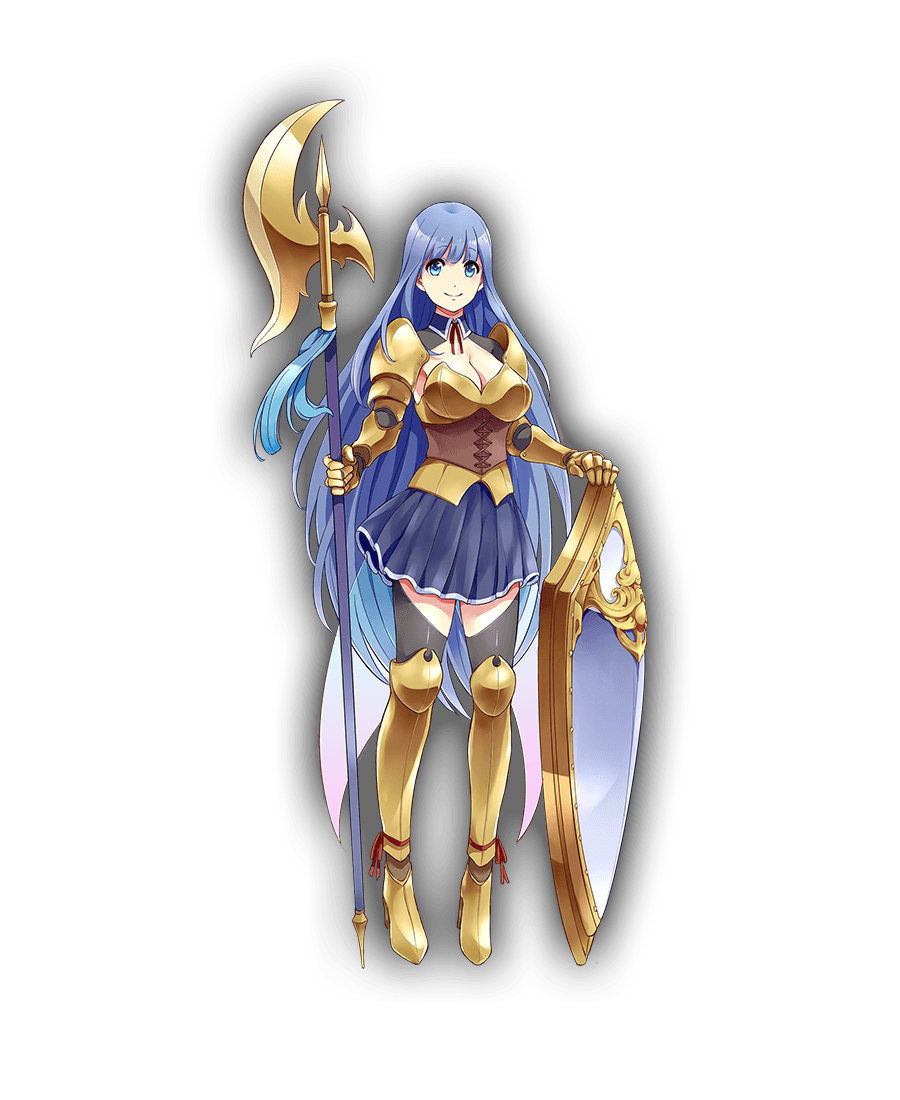
It was one of those designs that’s very close to working as a stylized girly armor, but doesn’t, because someone HAD to give her big ol’ cleavage and exposed thighs. So, my aim was to bring back its potential.
I’m quite happy with how the breastplate shape came out, with its high curve and slightly bigger tassets. First I intended to incorporate that leather cincher into it, but it just didn’t work. I also gave her semi-poofy pants with diagonal pattern similar the absurd shape of her original thigh-baring stockings.
Another thing was to make her shoes at least a tiny bit flatter and more planted on ground, considering the original artist drew her as if she was floating in air rather than supporting her own weight on her feet. High heels not only are universally stupid footwear for a knight, but Marica is supposed to dislike being tall! Why would she wear shoes that add to her height?
Finishing touches were to establish her better as the girlish one of the couple (big part of her and Flavie’s actual bios) by making her red ribbon/bow motif more significant, especially with hair bow that nicely contrasts with her blue locks (inspired largely by the ending of one of my favorite anime). Also last minute change: decorative piece on her halberd is now red too, to tie everything together.
Bonus point that red accents connect her to Flavie 🙂
If I were to do it today, I’d also turn her skirt and collar into the same graphite color as her armor joints and dark part of her pants, so that they wouldn’t blend into her blue hair.
All in all, not my best or most complex rework (I also had big trouble with cel shading style, obviously), but I think it goes to show how small changes can make a difference between gratuitous sexualization and cute girlishness.
~Ozzie
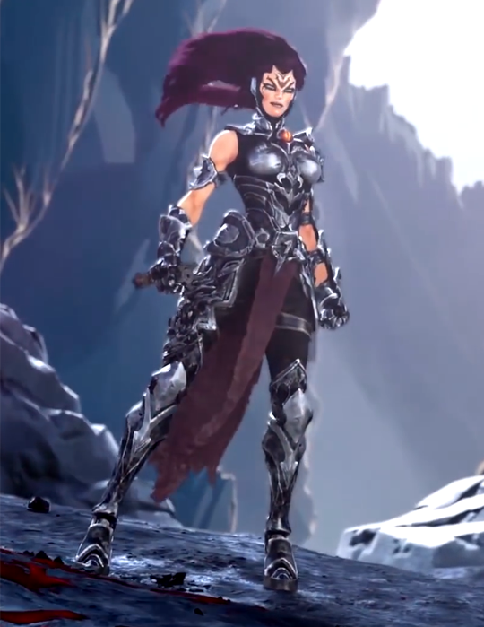
So, Darksiders III is coming out in November and of course we’re getting the promo videos and Fury looks… well the kindest thing that can be said is that she looks better than the comic indicated she would.
Naturally this has led to a certain demographic deciding that her appearance is… unsatisfactory and they last year they needed to declare their discontent and declare it representative of “gamers” and alleges that the design above makes her “armored up to the point of being unfeminine and almost no more clearly recognizable as woman.” (actual quote, after having a year to edit it)

I mean…
– wincenworks
When I first watched that trailer, what struck me most is how SERIOUSLY it takes itself, while having a heroine who looks just. that. silly.
And gamer dudebros apparently think that THIS is “SJW pandering”, REALLY? Being encased in skin-tight metal, including a boobplate so ridiculous and badly designed it doesn’t even warrant breast support of a basic bra?
So now, in salty dudebro terms, both this and this is a “politically correct” armor “too unfeminine and no longer recognizable as a woman”:
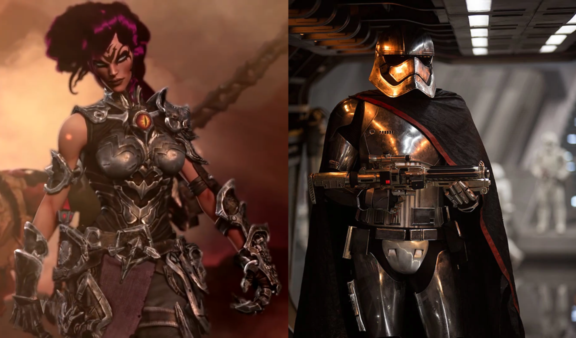
~Ozzie

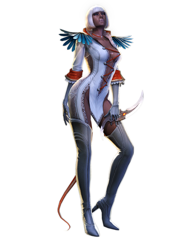
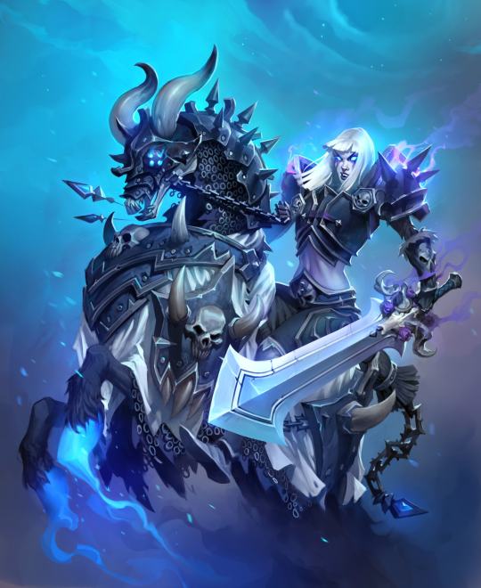
This design comes from a game about Norse mythology. I challenge you, our readers, to take a guess at which character from Norse mythology this is. I’ll wait.
Did you say Hel, who is the villain of the game Viking: Battle for Asgard? If you did, you must have read our post about Foldable Human Dan Olson looking into So Bad They’re Good games from a few months back. Because that awfully specific answer is indeed correct…. unfortunately.
I can’t even comprehend what the art direction was for this concept. What in the Hel (ha) is this? I was only able to find this single promo picture where the full glory of this design is shown, which I can only assume is because if she stands in any other way, that belt bra will slip off.
But let’s also not forget Freya, who also makes an appearance in the game!
-Icy

the-midnight-doe submitted (and Ozzie bingo’d):
And on today’s episode of Doing Women Better™, Blizzard finally granted us the much requested Magician Symmetra. Only instead of going for something super classy like the many fan interpretations out there or even just ladies in suits from real life, they went with…this.
Lack of pants and framing her bust (what is even with those metal plates) aside, the fact that this is a legendary skin and costs 3000 credits when it’s so close to her default skin makes this whole thing very disappointing.
Thanks for submitting this highly requested post, including some quality scathing commentary! The Saga of Pantless Symmetra continues.
This would be insulting enough just by the virtue of being a fetishy leotard instead of a suit, but what the hell are those boob-holder bars?!
They’re some sort of garbage afterthought slapped on to make this look more “sci-fi”, I guess? Why would a costume need that? Because you can’t be science fiction without framing the tits with random pieces of metal?
Since the bingo lacks a “What the fuck am I looking at?!” square, I marked “Boobplate” instead.
Here’s some closeup, to see their full absurdity, provided by @red-queen-on-the-heathen-throne:
Fun fact: a convention I attended last week had an Overwatch: Character design done right! talk that I just couldn’t subject myself to come to, both out of the fear of my brain melting on sight and because I didn’t want to rain on some enthusiastic fan’s parade when the time for Q&A comes.
I’m still amused that at the same time Blizzard made THIS, easily disproving the “character design done right” claim.
But sure, Overwatch is totally ready to do women better. Anytime now.
~Ozzie
#GiveSymmetraPants2k18

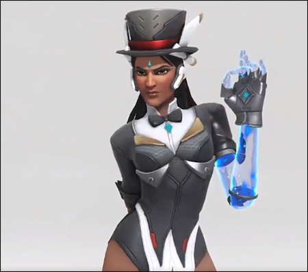
Tharja – Medieval Fantasy Body Stocking Technology
Jumping forward a few streams for this post, since this was back when I went way over our allotted time, and those old designs aren’t done yet… They’ll be done one day. ヽ༼ຈل͜ຈ༽ノ
So this was more of a fashion redesign exercise. Tharja, from Fire Emblem Awakening, is a sorceress. In terms of game mechanics, they tend to stay in the back and be pretty squishy, so I don’t expect her to wear full plate. I just wanted her to not wear… that thing. The body stocking, that somehow exists in this universe. Oh, and she comes from a hot desert region, so….
Since this is a fantasy universe that borrows very little from actual desert-dwelling peoples, I took inspiration from her counterpart, who’s from the same country. He looks like this:
So I took the skirt-like thing and the shirt he wears and adjusted it for Tharja. I liked her belt, so I kept it, and instead changed the waistline of the skirt to try and form some nice shapes.
Because of the skirt, however, the cape became redundant. I tried 2 different versions of it before scrapping it. Looking at it now, I should have just made it connect to her sleeves at the wrist. Without the cape, the little dangly things on it looked weird, and I hated her hair from the start, so I basically just moved the shapes around. Got rid of the ponytail thing, while adding a similar shape to her circlet, though I probably should have made it smaller. As for her tights, I was too lazy to paint over them, but in theory, they’d be like Henry’s (the boy above) legging-type things.
The last thing I did was adjust the color balance. Her colors were so muted in the original, especially her golden accents, so I upped the saturation on that to complement the purple.
Overall, I was trying to go for a more professional, distancing look. Tharja is antisocial and strange, after all. I do like the redesign, though there’s always things you see after you “finish” a work that could be improved upon. Honestly, I kind of want to redo Henry’s design, cause it’s kinda bad… Purple on purple; genus.
-Icy


@silks-stuff submitted:
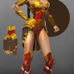
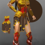
Awful WW design, 90% skin; DC Comics at it again
If only the men had the same outfits as WW!
Is that a big ol’ belly window in Wonder Woman’s already amazingly skimpy costume? Yes, it is.
Are those super heavy armors on all the male characters, including Superman who’s way more invincible than Diana? Yes, they are.
Truly, the double standard is but a cherry on top of the utter ugliness that is this overdesigned figure set.
This reminds me of the old Jimquisition video in which Jim uses another ridiculous Square Enix statue of egdelord Batman as a perfect metaphor for Squeenix’s skewed priorities in game and visual design:
~Ozzie