


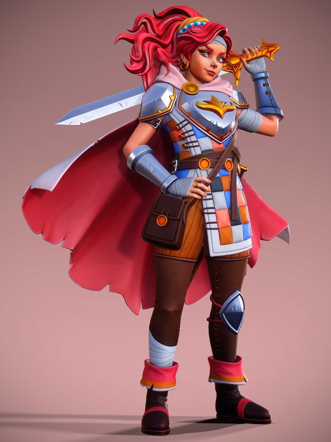
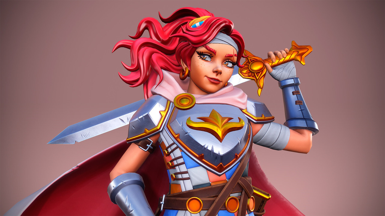
The Legend of King Arthur Realtime Character, by Vladimir Kovalevich
A fun design for a King Arthur contest on Artstation! I really like the DIY aspects of this, and especially the brightness of the colors. There are a lot of small details that add to this character’s story, and I like the rendering style as well. And of course, that crooked smirk is a staple in my redesigns, so… I’m not biased or anything. I just like sassy gals, ok???
Check out the project page for this piece for turnarounds and polygon breakdowns, if that’s your jam!
-Icy
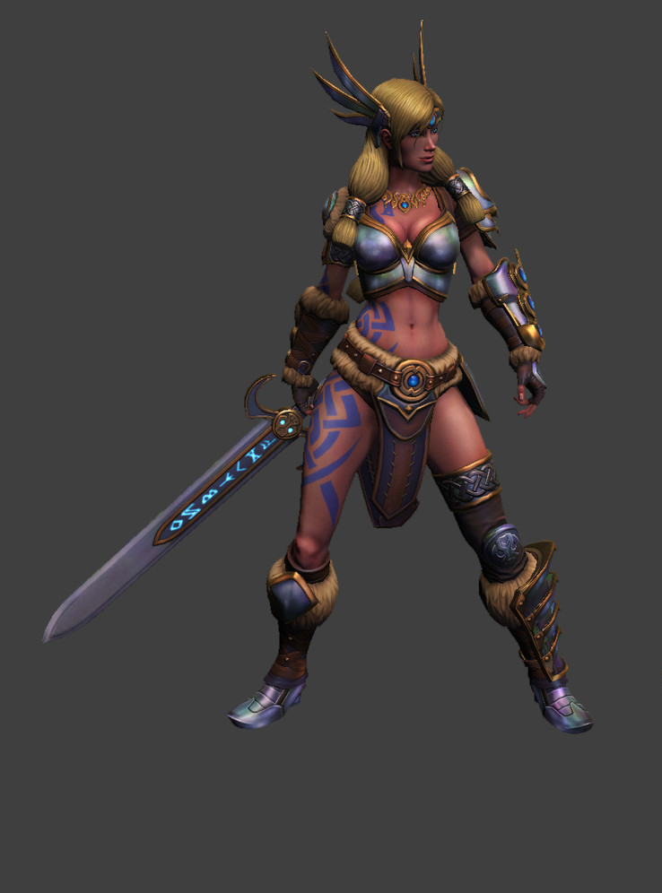

SMITE’s Freya Still Desperately Needs Pants
The original here is actually an updated version of Freya. As many characters in SMITE, she went through a few redesigns over time, with arguable quality of improvements (comparison source):
The redesign
This is the second character named Freya which I fixed, and this one also got a questionable update between getting bingo’d and redesigned on our platform. I swear it’s a total coincidence.
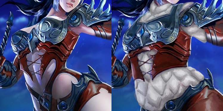
SMITE’s standards are below the bottom, so of course while she no longer had gravity-defying metal pasties for a top, it’s still a skin-tight boobplate.
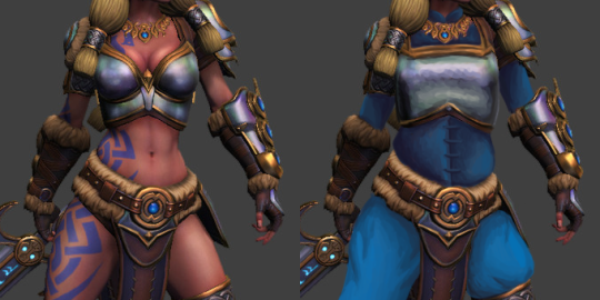
I didn’t go particularly wild with fixes this time. I liked the ornamentation and accessories well enough to leave them be, so the changes are limited to the shape of the breastplate and big blue gambeson under all of it. Thanks to it her pretty necklace suddenly popped out, since color theory is still a thing. ¯_(ツ)_/¯
Blue because it matched her existing color scheme, including those tacky Pict-like tattoos, which are already a cliche on many Norse/Viking characters, for some reason.
Not my most creative or labour-heavy redo, but I hope you guys like it!
~Ozzie
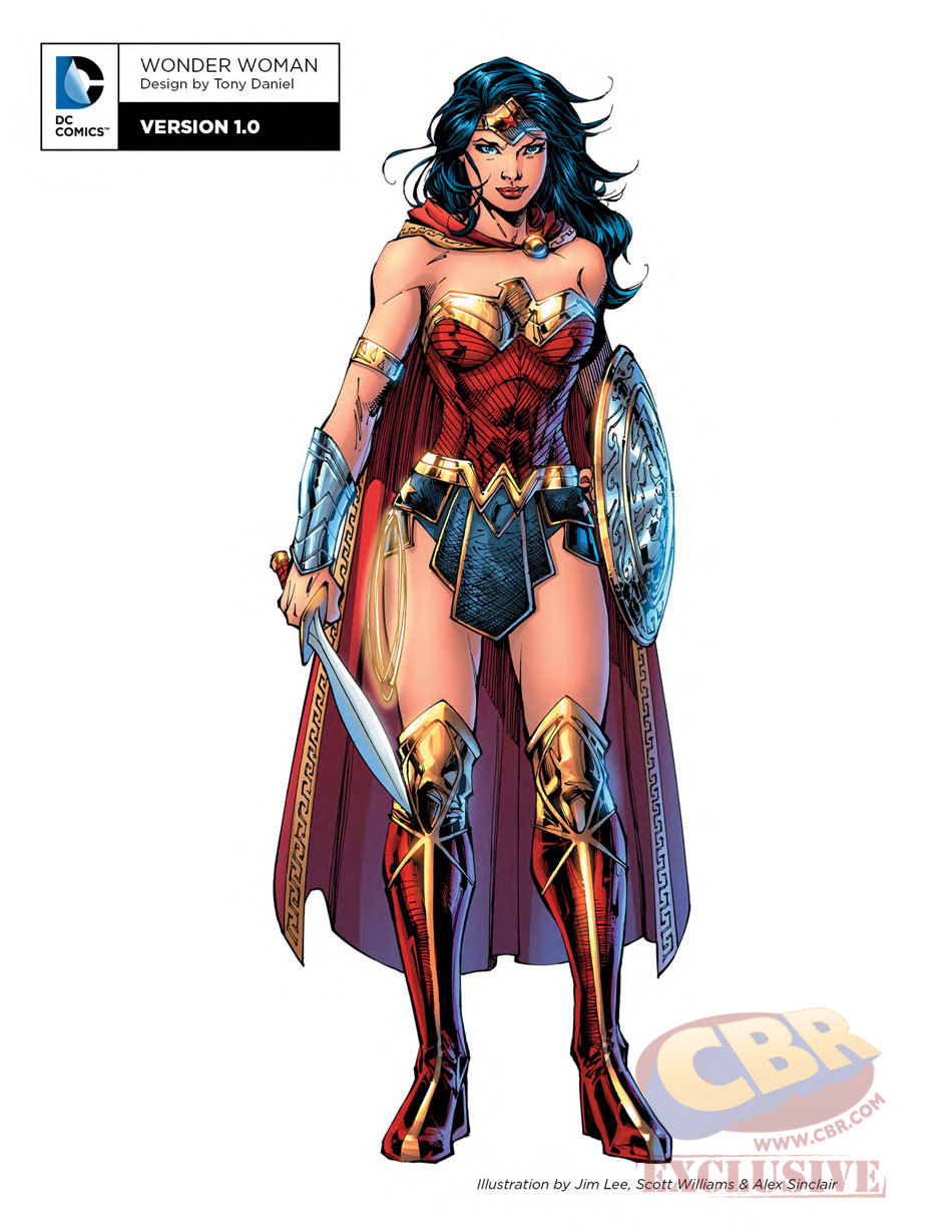
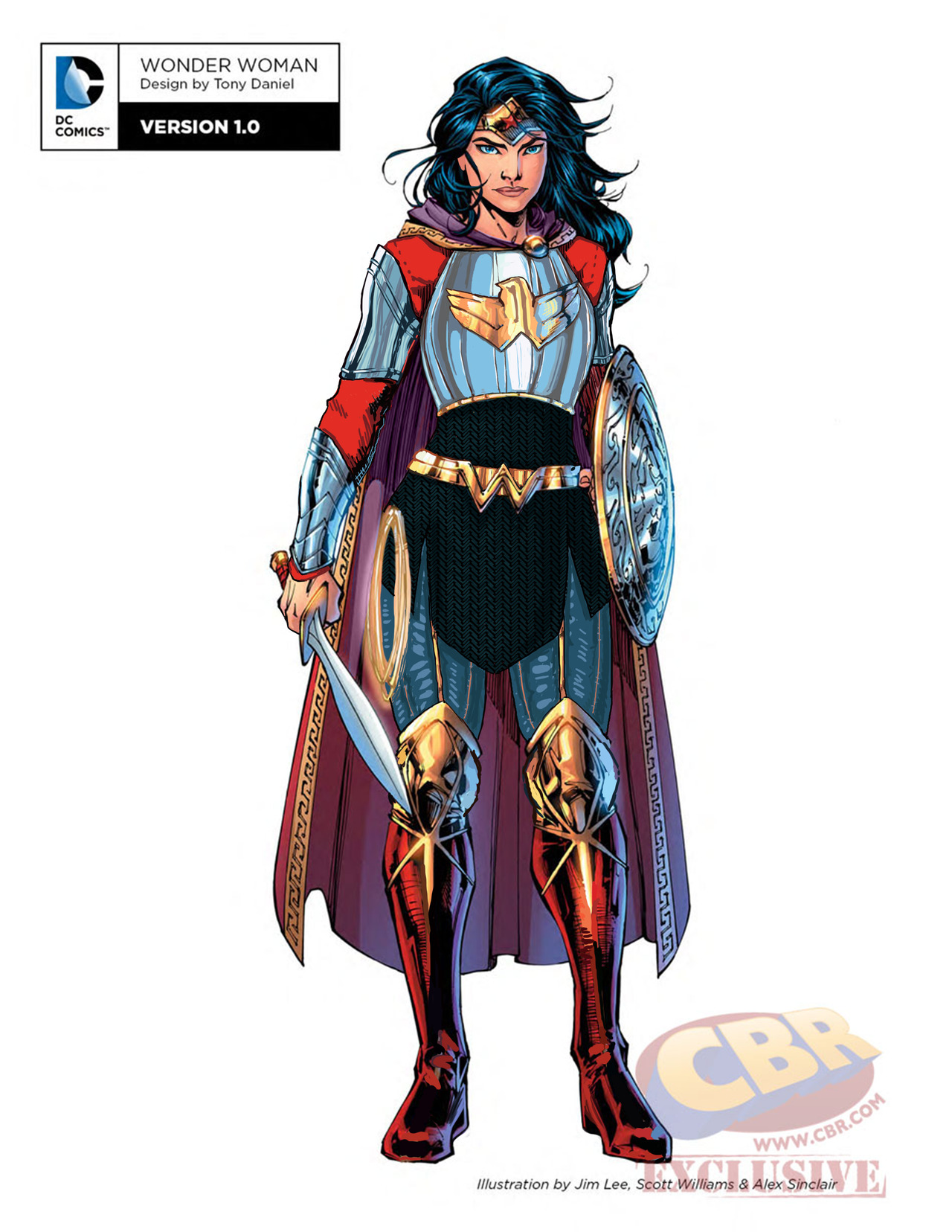
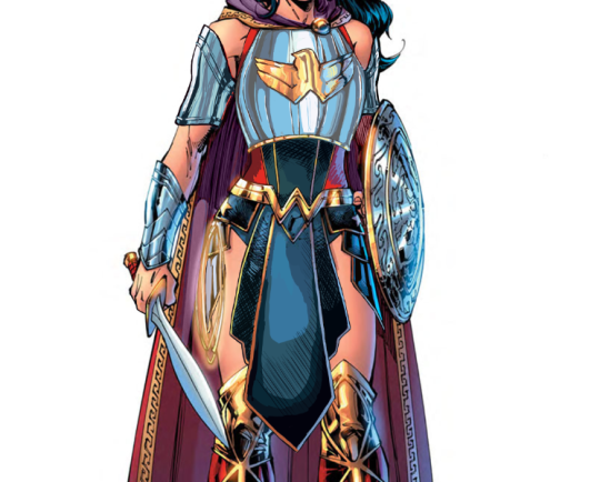
Another Wonder Woman, Why Not
Ozzie made a great Wonder Woman redesign waaaay back, but I wanted to try my hand at something more akin to the movie design. I enjoyed the Wonder Woman movie a lot, but that outfit of hers was such an eyesore. Also had to deal with constant second-hand cringe at imagining what it was like wearing it.
Sooo…. I ended up changing almost everything, obviously. I didn’t really have a specific theme or time period I was taking inspiration from; I just knew I wanted to give her a nice breastplate, and then worked around it for everything else. I gave her chainmail in a similar shape to her uhh… skirt? And then the gambeson makes a comback for the leggies.
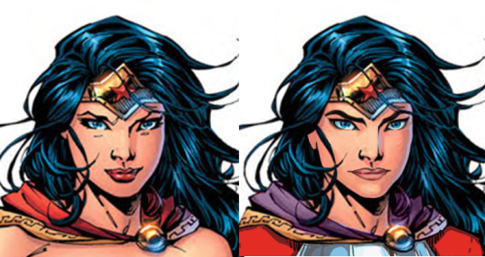
Since the design is pretty clear and simple, let’s instead show my first attempt at a redesign, where I was trying to make the skirt work… somehow.
After coming back to this later, I realized that I was just doing the redesign equivalent of this gif:
Sooooo I got rid of that tabbard and redid it all.
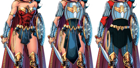
I also changed her face. I gave her thicker, more natural (but still fun) eyebrows, and a stronger nose. I also cut back on her makeup, and changed her expression to look more determined, rather than “awkwardly chuckling at someone’s joke on a first meeting.”
Overall, I think I gave it a good try. I feel like it’s missing something in some spots, but I can’t think of anything else to add besides like… some colored ribbon in her chainmail, but I don’t think that’s characteristic for her.
Would still have preferred my design over the original for the movie.
-Icy

De-failing League of Angels Part 1: Stabby leather lingerie
Apparently we felt like taking a challenge the day we made those edits, because, well, it’s League of Angels, the epitome of creative bankruptcy in video game marketing.
What I decided to redesign was this extra-stabby leather… um… outfit that I bingo’d before.
After the initial shock of how uncomfortable that “armor” must be, the literally biggest thing that caught my attention in this artwork were her thighs. HOW FREAKING HUGE ARE THEY IN PROPORTION TO THE REST OF THE BODY? Unfortunately this seemed mostly like an epic fail at foreshortening rather than an attempt at ‘thicc’ fetish, let alone at earnest fat representation… So I decided to reverse that.
Instead of shrinking the thighs to give her conventionally attractive model proportions, I readjusted the rest of the body to fit them, resulting in a chubbier figure.
Her arms now have some heft and her head isn’t tiny anymore.
Though most important changes went into the torso, which now has a human-sized waist and connects to other body parts at humanly possible angles, instead of those of a Tetris puzzle.
I am very satisfied with what I managed to do with that shameless boobplate. The idea was to still have it be a breast-oriented armor without making it look like two coconut halves with extra-emphasis on cleavage, and while retaining as much of the original’s decorative aesthetic. Basically a more sophisticated attempt at what I did with Regime Wonder Woman waaay back.
I also slightly reshaped the stabby laced leather part under it, because it looked cool enough… just not on bare skin. Speaking of which, of course there was no way I left this poor woman with no padding, so in place of all this pale skin I painted white gambeson, retaining the original color scheme. She also now has full leather pants, because why wouldn’t she?
All in all, I think I managed to improve this image significantly. Not all edits are seamless, but I’m quite proud of the way they came out. How do you guys like it?
~Ozzie


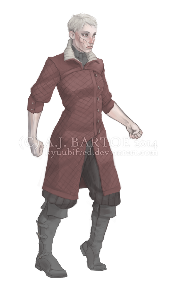

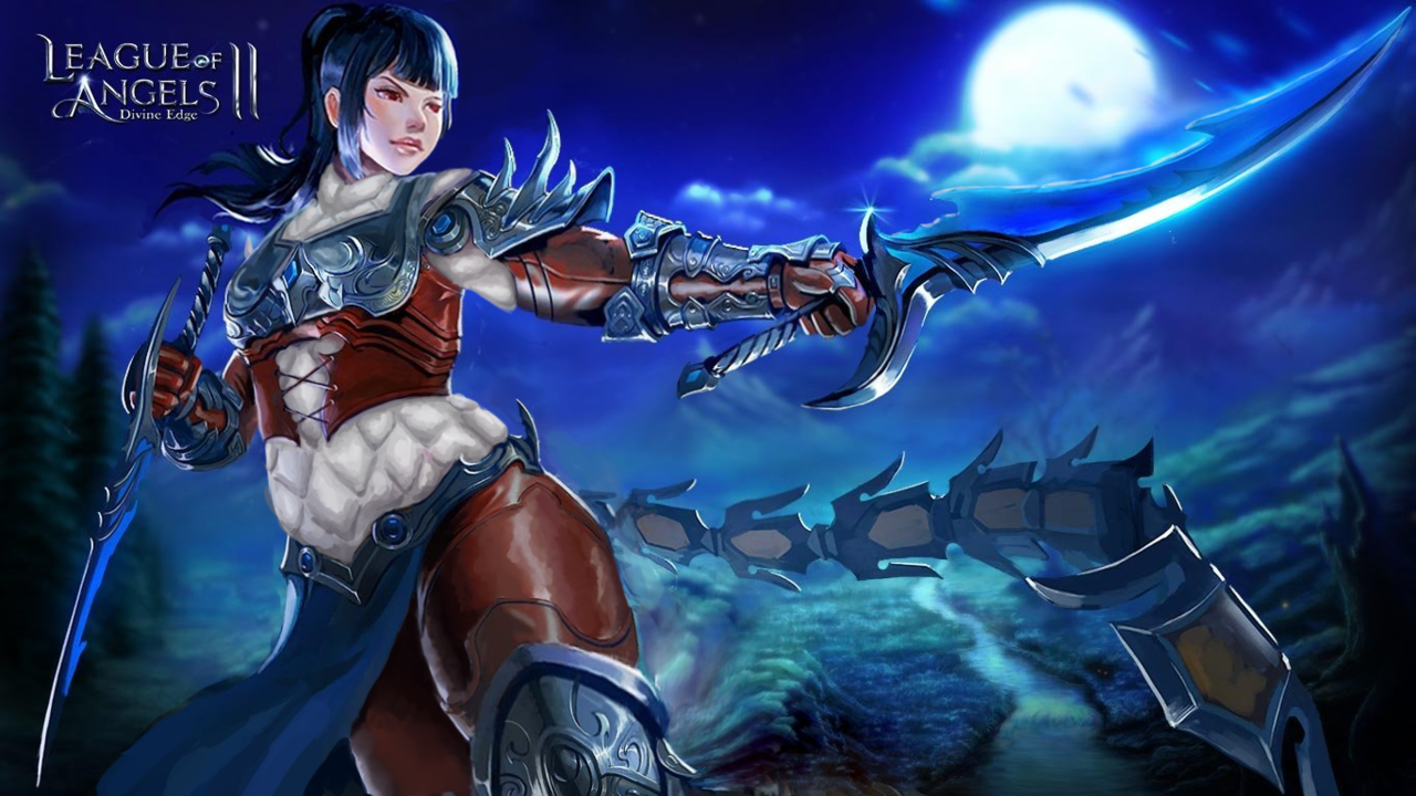
So I haven’t posted any of my own art on here in a while, but I did some character designs and they turned out pretty nice so I decided to share them.
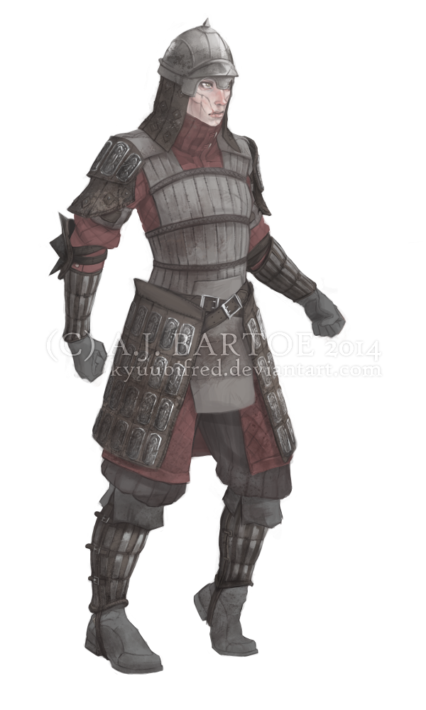
I’m lost for words on how awesome this character looks and what a great example and reference of protective layered armor on women she is.
~Ozzie
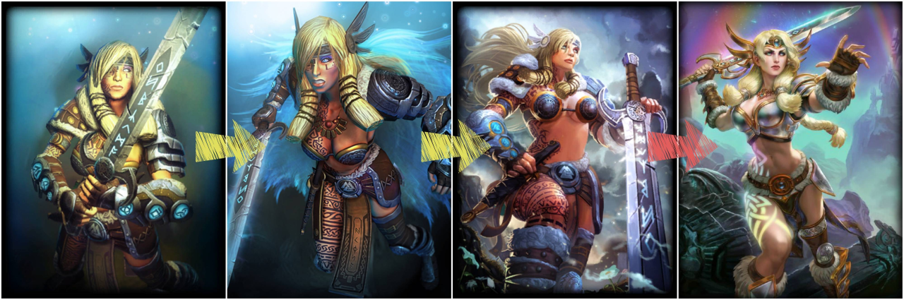
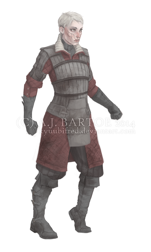
Today’s throwback: something that I got reminded of by this Monday’s positive example post.
Proper layer-by-layer female* armor design always deserves more love and exposure. For many reasons, including non–boob-shaped breastplate and the inclusion of gambeson padding. Always ready to be looked up in our reference and resource tags!
~Ozzie
*amazingly, no different from male ( ͡° ͜ʖ ͡ °)