This is why we don’t trust explanations for why female protagonists have to have convoluted sexy costumes…. because if nothing else it means that they’ve decided they’re comfortable with making that a cornerstone of their brand.
And… I don’t even know what to do with this except cringe.
– wincenworks
Posted on
Tidy Up Tuesday #99
It’s been a while since we did one of these.
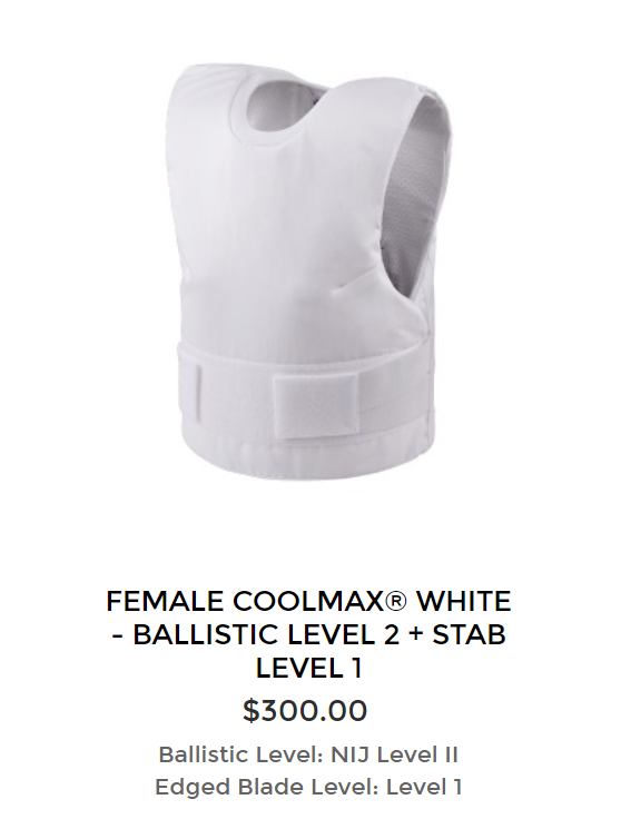
For who saw the recent Madalorian post and were curious about what better plate armor for busy women might look like – we’ve covered in a previous post.
Generally speaking, accommodations in armor are made for everyone – its just when you standardize your army, you standardize the accommodations and create the illusion that its “normal”.
The reason most armor like this is painfully uncomfortable to busty women is because in our extremely misogynistic society, the “default” armor designed for fairly flat chested men. (Military generally issues female soldiers “small” sized male armor, for example).
(Yes that one fairly flat chested vest was the entire catalog for women on that site with four separate categories for men)
“form fitting” is pretty much never a suitable accommodation for overt armor (ie not concealable) armor because it creates problems with energy transference and denting. The reason the female Mandalorians gear looks more comfy is it’s the sort of thing you’d expect under the plate armor.
The reason they settled on that the outer layer instead of more innovative solutions is the same reason why the female Mandalorians are smaller and have narrow waists. because once a show takes off, Creepy Marketing Guy inevitably wants to get involved.
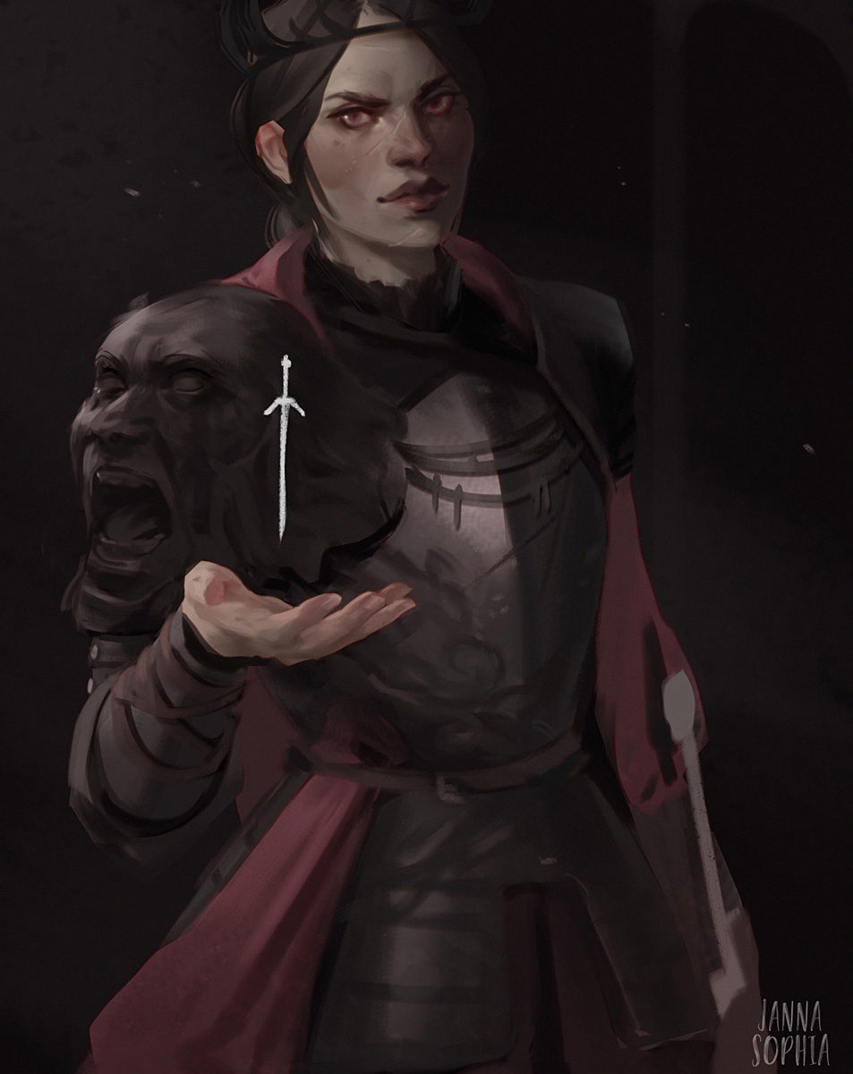
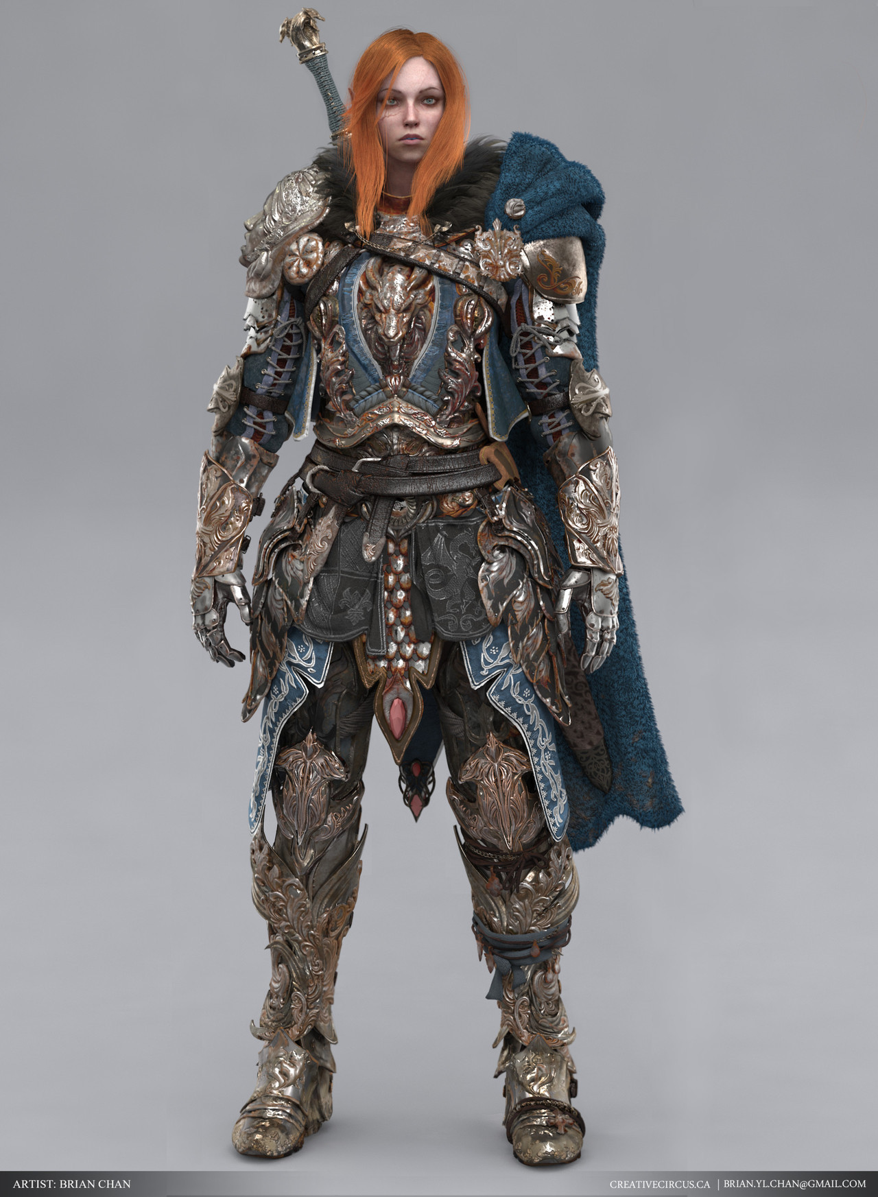
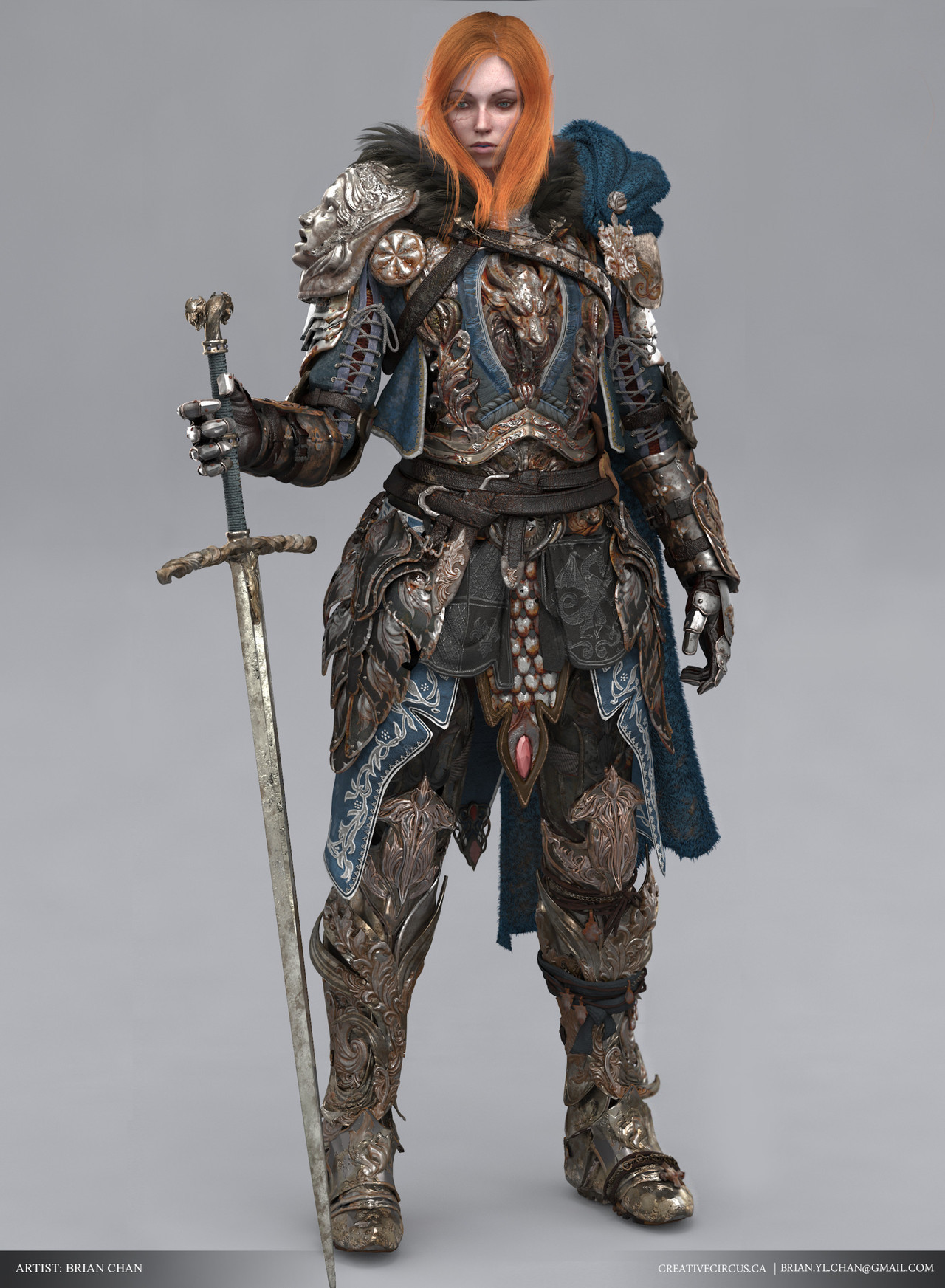
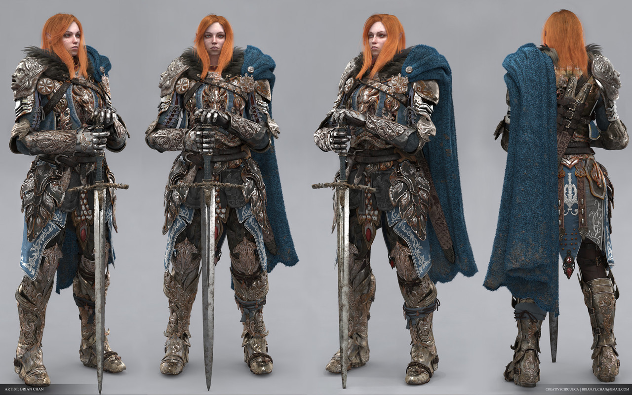
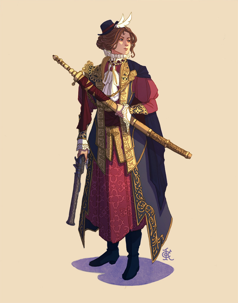
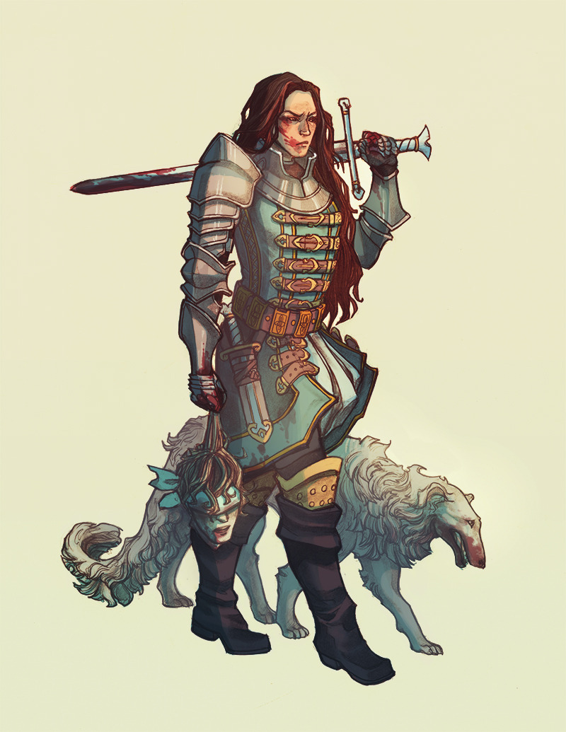
An excellent positive example of fantasy armor that is both lavish and regal, yet functional, battle hardened and just positively badass. Bonus points for the artist giving her a great looking battle scar.
The turnaround above gives a good view of the armor overall, but I highly recommend visiting the ArtStation page linked above to get a more in depth look. The artist has put so much beautiful and astonishing detail, it boggles the mind.
It’s almost criminal that this hasn’t gotten more attention; I would love to see this in a game.
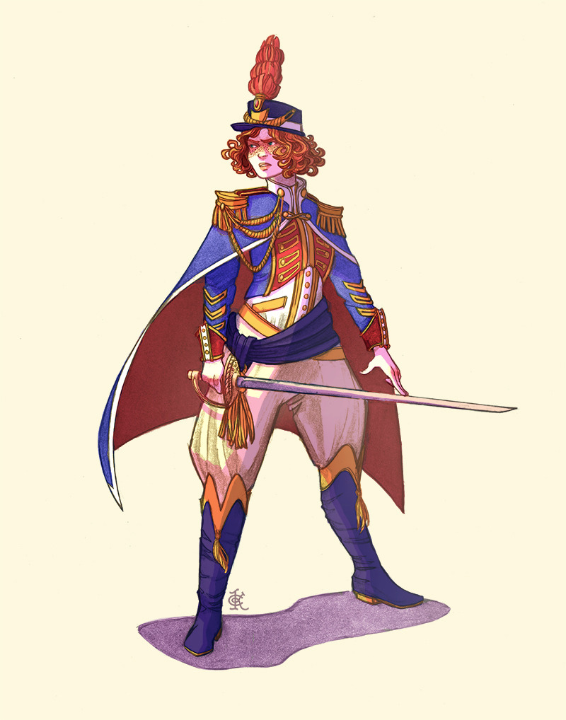
This is a bit too over-designed for my taste, but I definitely agree that this is a design more likely to be given to a man character.
And her scar is pretty nice! Definitely check this piece out on Artstation for detail shows and workflow breakdowns, if you’re into that kind of thing.
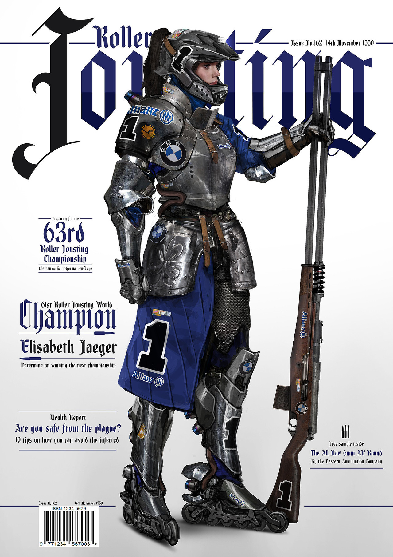
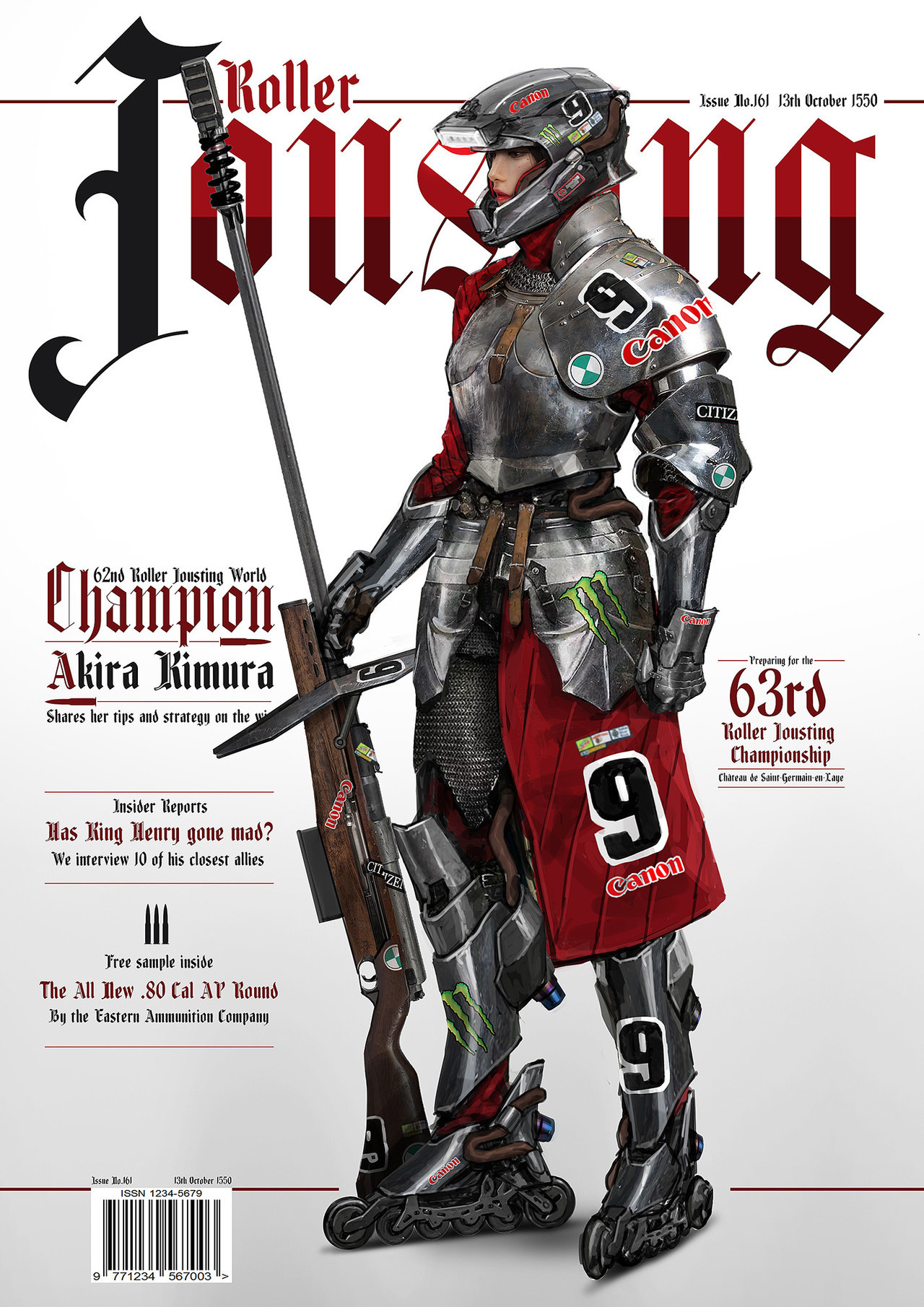
What a cool concept, and a cool mashup of armor styles! Even though it’s medieval breastplates with modern helmets, it still looks good and cohesive. I also really like the way they represent motor companies, like in a real racing sport. We really need more creative ideas like these in fantasy.
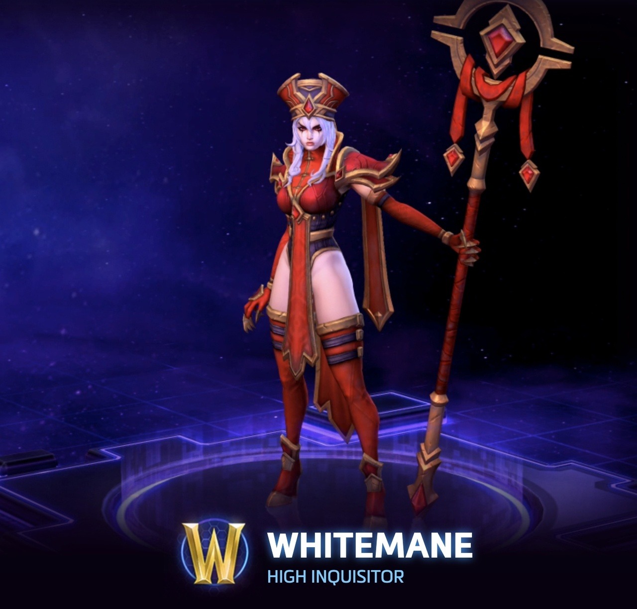
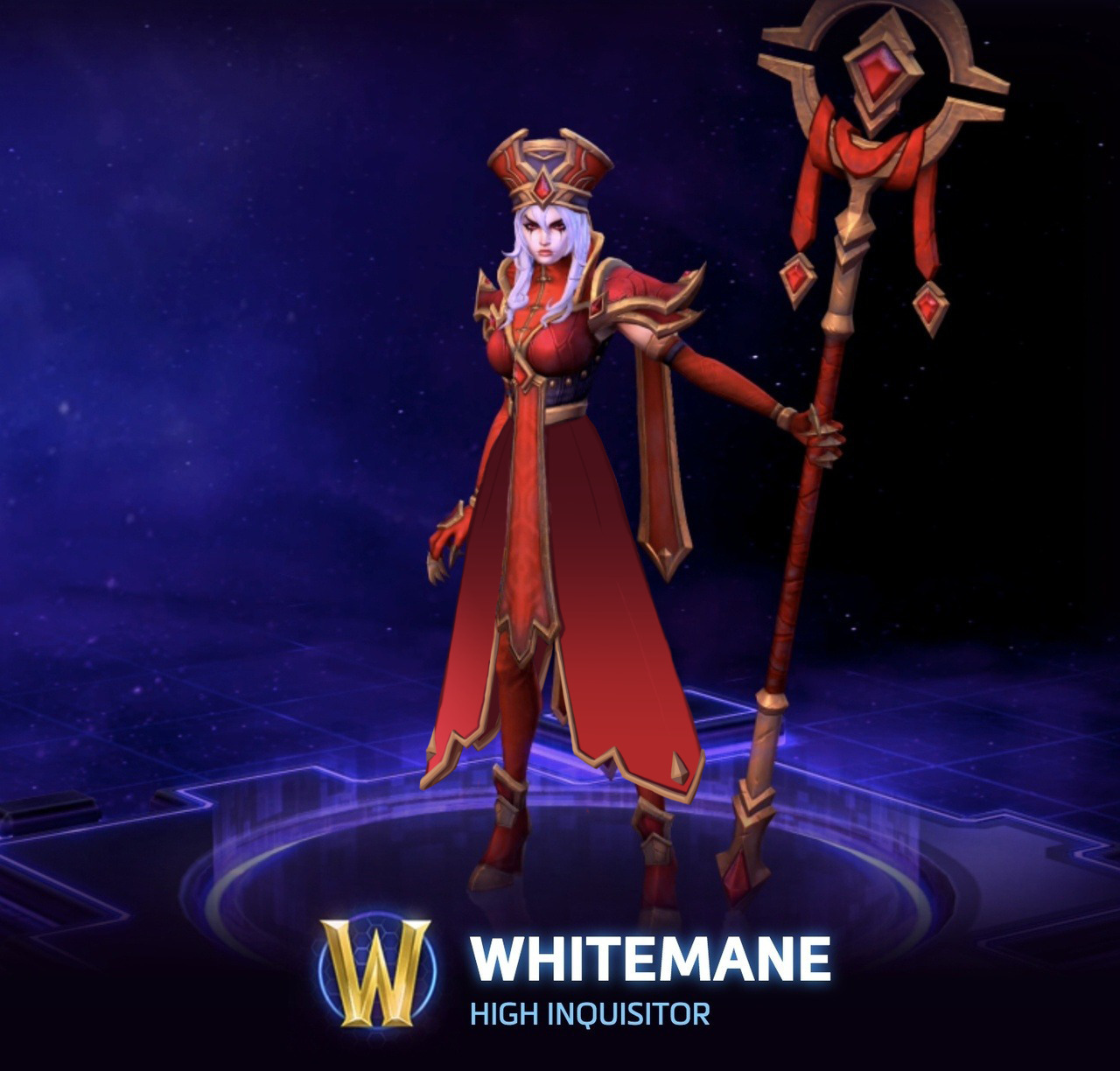
With Sally Whitemane’s High Inquisitor skin, I didn’t want to change much, as her design has some really cool elements and style. Rather, I chose to turn her leotard thing into a coat, keeping the style of her hanging banners. After all, the idea of an inquisitor is much more closely associated with flowing robes and coats, and a leotard isn’t usually considered appropriate attire for religious leaders.
Such a small change in the overall design, and suddenly she looks like a religious leader! I would love to see a skin similar to this one in-game, instead of what we ended up getting.
This isn’t the fault of the redesign, but covering her legs really highlights how the original artist considered Whitemane’s skin to be a color in her palette; without it, she just has red and gold, basically (the black is barely present). The original design just keeps disappointing, really.
One small thing, and granted, it’s hard to see in the picture, but I’d get rid of her ridiculous stiletto heels. I think overall, this redesign really showcases how inadequate the original is in its intent. Thank you so much for the submission!
That post about “attractive armor without bikini” actually left me wondering: why would you actually want an attractive armor? Sure, everyone loves an aesthethically pleasing armor, but we can’t just forget that armor is mostly made to be, well, intimidating. It’s supposed to make people both safer in combat and also more powerful. Not having to battle – because you look so threatening or even downright unbeatable – is some 40% of the purpose of an armor piece. Why does it need to be attractive?
But let’s set some things straight first: armor is done primarily to be protective. It sure helps if the design makes the wearer intimidating enough to make the opponents surrender right away, but at its core it was invented as a physical barrier between a person and whatever or whoever threatens their life or health.
That doesn’t mean there isn’t a place for decorative armor in the history. Highly ornamented muscle cuirass (male equivalent of boobplate) was designed to impress and worn by high-standing officers during non-battle special occasions, like parades.
That said, in the world of fiction the distinction between purely functional and decorative armor is not necessary. It’s not real, and unless the setting of choice is gritty life-like naturalism, the armor (and any other design) needs just to be believable, not realistic. We commented on it before.
This is where those two bingo squares come in. Fictional worlds, especially the more fantastic ones, can be stylized, sometimes even to ridiculous degree, as long as all of the world is consistent with its level of stylization. That’s why it’s not inherently bad to have people fight monsters in G-strings… It just needs to all make sense within its own narrative and preferably not be gendered (which basically never happens).
Hope that answers it.
~Ozzie
Sometimes we make comments about how attractive a person looks in armor, because a lot of the time, their design is going for that. Unfortunately, the shorthand for that tends to be More Skin, High Heels, the usual offenders. But even if a character is designed to be attractive, that can be done without resorting to tired sexist tropes. And so we bring attention to it sometimes, when it’s done well.
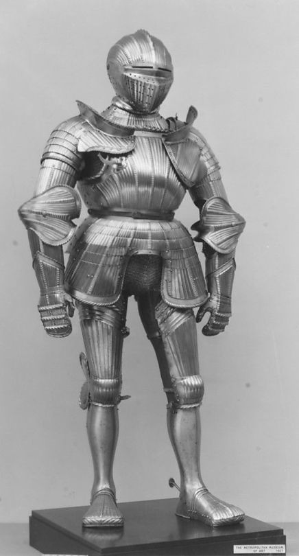
Historically speaking, a lot of European plate armor was quite ugly from a design perspective, actually.
Look at that silhouette, the tiny shapes everywhere, that scarecrow head-adjacent helmet, those duck feet. Beautiful.
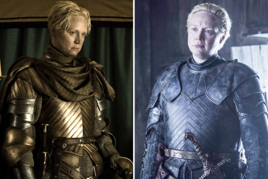
Compare that to any armor in Game of Thrones, which is functional, but is just so much nicer to look at.
As critics of art and design, we care more about seeing women’s designs being consistent (and good) in their universe, rather than having 100% Organic Free Range Realism. (Don’t worry though, we will continue to feature actual ladies in actual armor for positive examples.)