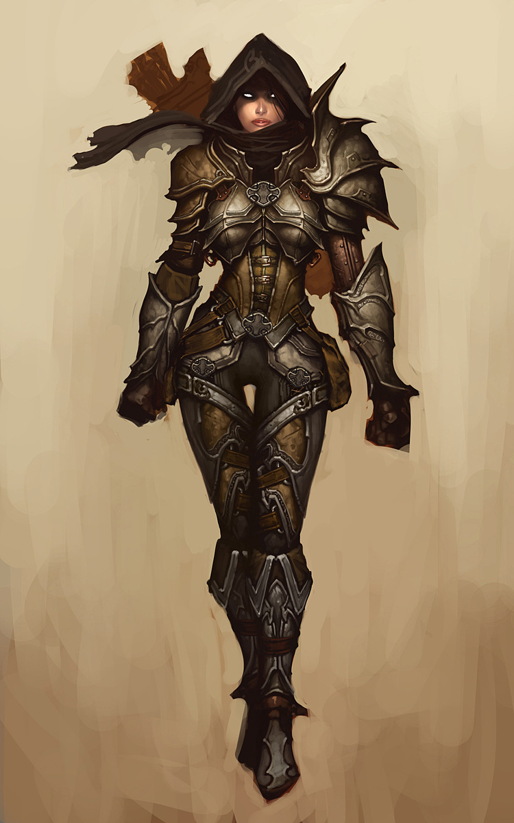
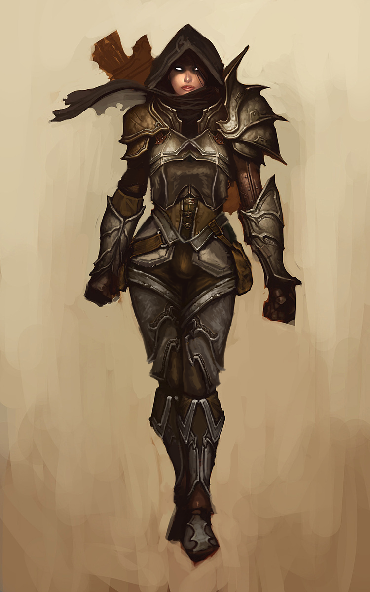
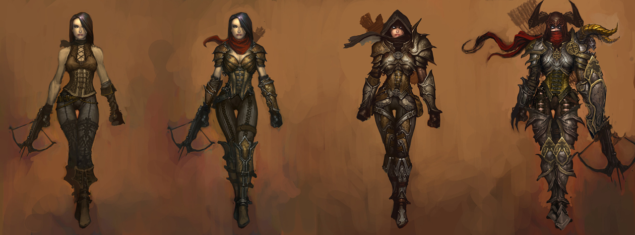
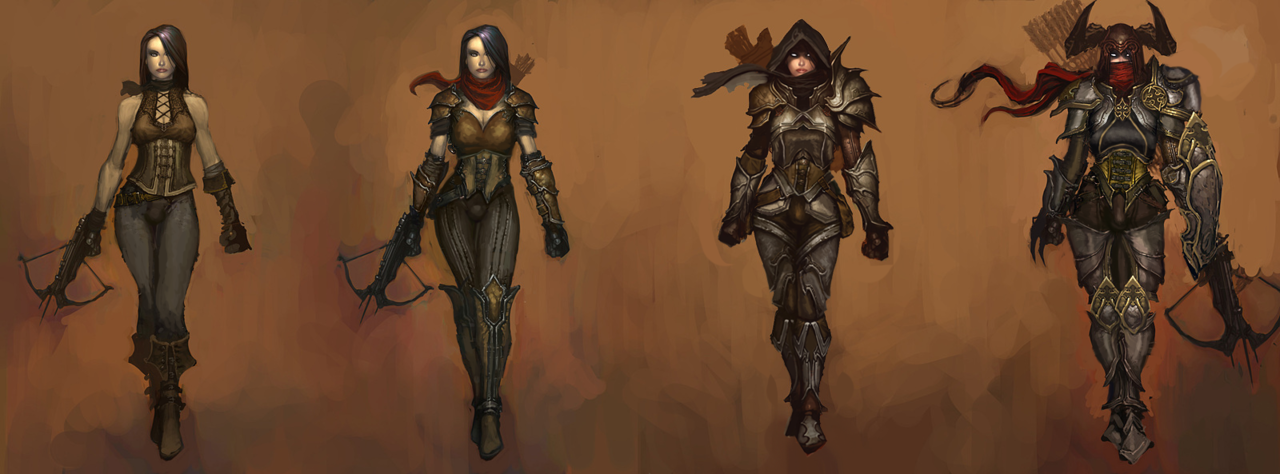
Simplifying the Diablo Ladies, Part 2
Demon Hunter from Diablo 3 was… a challenge, to say the least. Mainly because I couldn’t decide where to even start with that ridiculousness!
Not only is she super sexualized via the enforced “feminine” silhouette of skin-tight armor, boobplate and giant thigh gap, including a cameltoe… she’s also the most overdesigned thing I ever tried my Photoshop skill on.
Apparently to work as an artist at Blizzard, you have to willfully forget the most basic rule any design school worth its salt teaches: Less is more.
For concept art of what would ultimately be a small character model in-game, all those pieces have SO. MUCH. NEEDLESS. DETAIL! Teeny tiny little shapes of distracting ornamentation, basically nothing to rest your eye upon.
I feel really sorry for anyone who ever attempted cosplaying this shitshow – so much work added into recreating all those arbitrary seams, textures and spikes, sheesh.
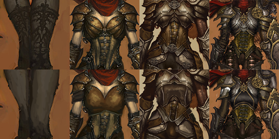
I was so busy simplifying the shape language that I overlooked some stuff I do pretty routinely, like getting rid of the cleavage in the first and second levels, and modifying the hourglass silhouette (I did add some bulk in higher levels, just not much).
Preparation for posting this redesign is why I threw back this post lately (also, you know, it’s just a good post to resurface) – because those level ups convey neither a better set of armor, nor more protective layers, except for pauldrons. The shape of her boobs and thin waist remain a constant, no matter how much more “armored up” she’s supposed to be.
Like with Ashe before, I decided that my version is a trans lady, with a noticeable crotch bulge
in the place of the creepy thigh gap. Though I discarded my initial gag related to its size, as it was just in poor taste and not my joke to make.
Overall, this thing took two or three weeks to finish (last level seemed unsalvagable at first), but hopefully I managed to put some actual design thought into this hot mess.
~Ozzie

