satan-general-irl submitted:

LET MOM CHARACTERS BE ATTRACTIVE & BADASS WITHOUT BEING OVERLY SEXUALIZED-

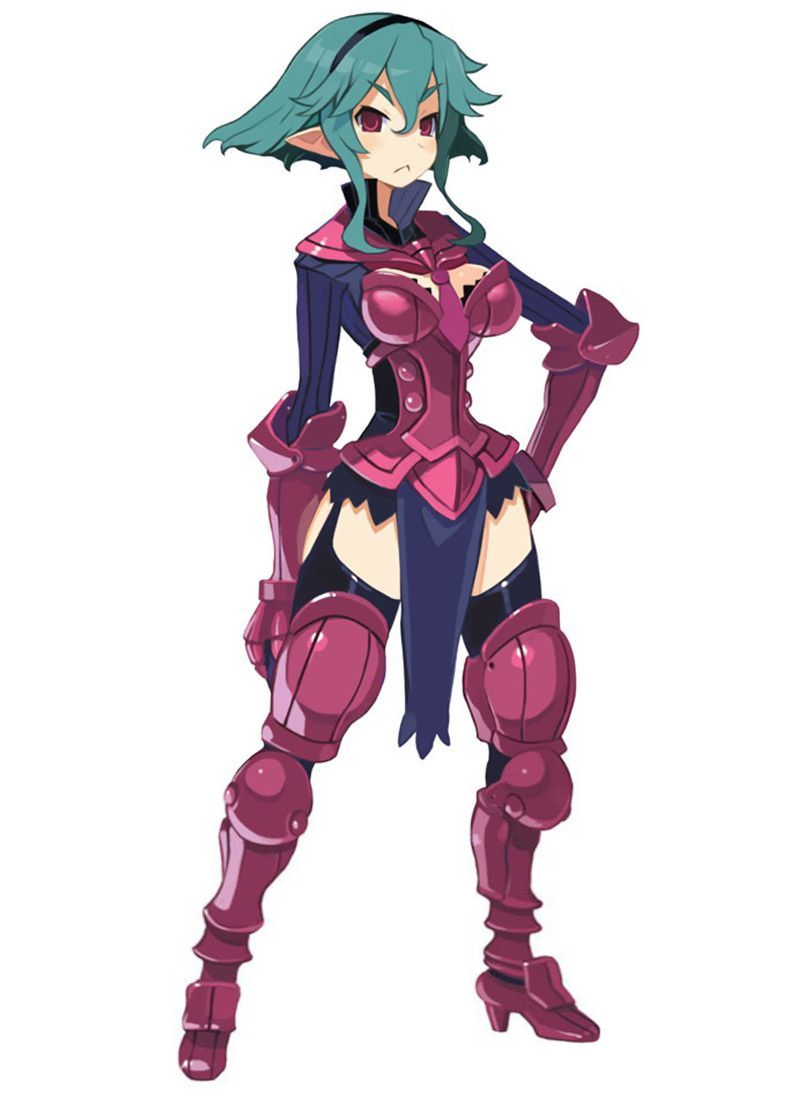
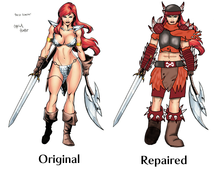
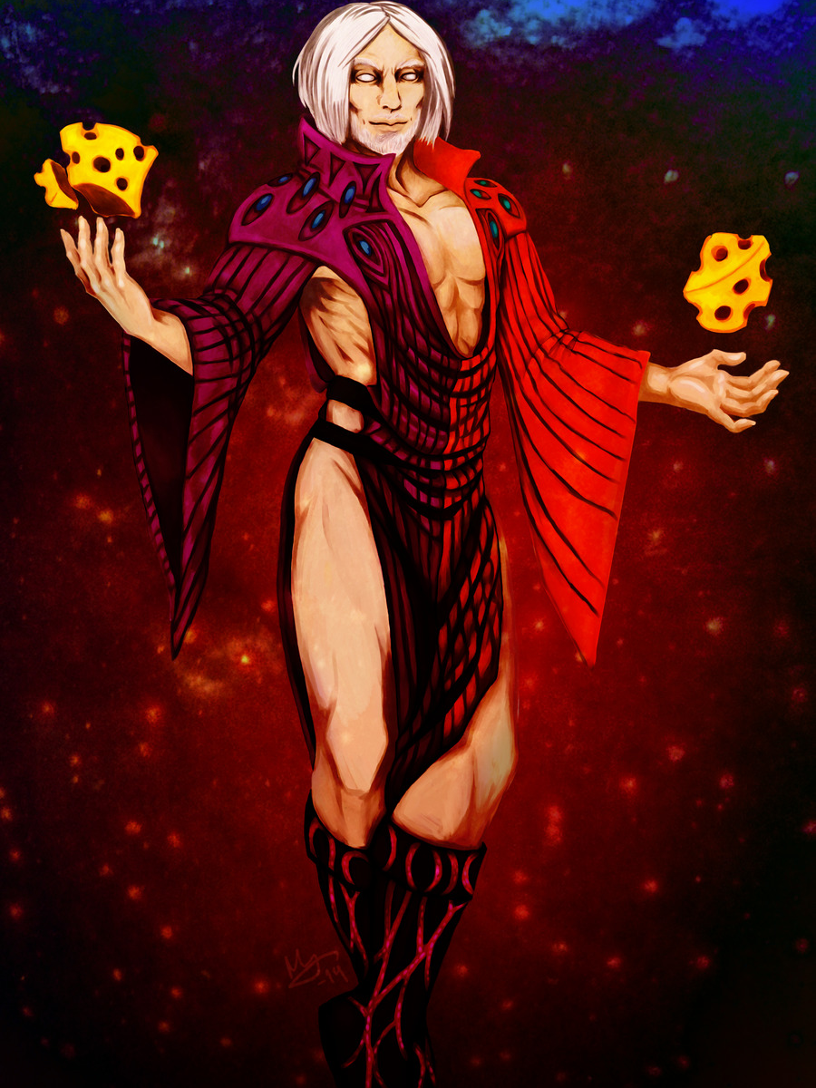
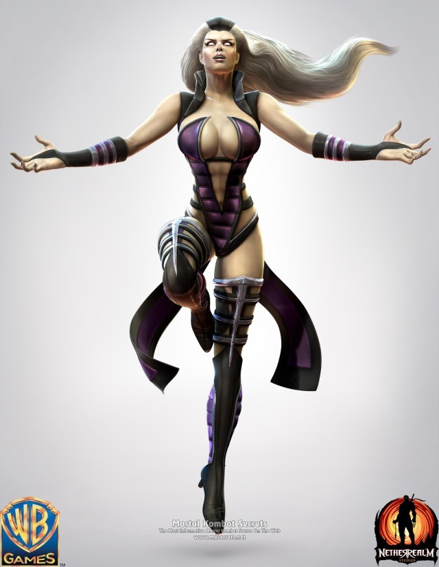
Sindel has such an interesting concept?? But then they tried to make her like… god, I can’t. I did this in like 20 minutes on my phone. No cruelty intended, but if you can’t design a scary older woman to where she’s hot without wearing a leather monokini, you’re not doing it right.

I emphasized the royalty motif with the jewelry & corset (so her impossibly tiny waist makes some semblance of sense). Hope you guys like it.

Emphasis mine, cause I agree 100%. For 20 minutes on your PHONE, trying to work around that disaster, this is such a huge improvement, it’s kind of embarrassing for the original. I wonder what other designs were on the drawing board before they picked this one. At least she seems to have abs in the original…. but damn, was this the worst way to show them? The answer is yes. Check out our bingo of the original “outfit” here.

The way I see it, this is one of those designs where you have to just scrap everything, except for that shrug thing maybe, to redo. I don’t think the corset is a great look (or great for fighting), but honestly, I wouldn’t be able to come up with any ideas in 20 minutes, as anyone who has watched our livestreams will confirm. ¯_(ツ)_/¯

I think this is a good example of just how easy it is to not give your character an ugly double-sided-tape-requiring swimsuit made out of that puffy coat material. But this was Mortal Kombat 9, where clothes went to die.

-Icy

Vampire Hunter (Judge), by Dmitry Bezrodniy

Wanted to showcase a cool character who’s designed for a more modern setting. There’s a lot of cool details here, from her knee pads to the holy water she has ready. She’s dressed for cool nights, exactly the kind of time a vampire hunter would be on the prowl. I also love the lamps she has on the big cross, and even on her backpack strap, I think that’s clever. There’s even a stake attached to her big cross! I highly recommend checking out the original, where you can see way more screenshots, as well interact with the 3D model itself.

-Icy

maispace:

Inspired by going on one of my classic Overwatch character design rants the other day and binging @bikiniarmorbattledamage yesterday, I took it upon myself to try to make Widowmaker’s design… less worse. Here’s what I changed:

  • I gave her pants. Widowmaker is a victim of the weirdly common Overwatch character design trope of “armor from the knees down, skin-tight from the knees up”. (Well, the armor is also somehow skin-tight, but.) Since Widowmaker is a sniper and Talon is supposed to be paramilitary, I decided to put her in some actual tactical pants. …Of course, I still forgot to draw pockets. Pretend they’re there.
  • I decided not to shorten her legs or widen her waist, despite how ridiculous both of those features are, because Widowmaker actually has a reason to look like that – her spider motif. On any other character, I wouldn’t stand for it.
  • I closed up her ridiculous cleavage window. Again, she’s a sniper. Lay down on a roof in that and you’ll get your chest absolutely cut up. While I was in the area, I gave her bodysuit some subtle segmentation for a “carapace” look.
  • I think the way I changed her shoes she’d still have her feet in the high-heel position, but I at least wanted to made them flat on the bottom so Widow doesn’t catch her foot on a gutter and faceplant into an alley while doing her whole parkour thing.
  • Purple isn’t a very “spidery” color, so I changed her to a dull greenish-brown with yellow accents to evoke an orb weaver’s color scheme.
  • I shortened her hair so it doesn’t get in the way while she’s fighting, and so it’s the almost exact shape of a spider abdomen, thus making her whole head a big spider design.
  • I made her skin a normal human color, with some subtle purplish tones on her nose, lips, ears, and cheeks. I also removed her earring.
  • I made her visor boxier both to look like a jumping spider and for a more realistic “tactical” look, which also gave me room to pop some more eyes on there. Plus I think it just looks better; the original looks like they were going for Giger and gave up.
  • Black widows are overplayed. I changed the hourglass light on her gun to the Talon logo, so she’s actually representing her organization somewhere on her design.

Thank you for @-ing us, @maispace​! 

It’s a second fan redesign of Widowmaker we share that adds roomy pants to her costume, so it probably tell us something about what’s the next most glaringly inadequate part of her design, right after the navel-deep cleavage. 

Not sure if I’m personally into the proposed color scheme, at least without invoking orb weaver’s interesting patterns in some ways. That would also add some much needed segmentation and contrast in her outfit. 
I agree, though, that the original colors were completely out of nowhere and should be revised. 

The ponytail combined with helmet creating a spider-like shape is definitely much better evoked than in Blizzard’s design and shoes being somewhat wearable are appreciated. 

All in all, good reminder that Overwatch, while it comes with many interesting ideas and motifs for character designs, seems to abandon committing to them halfway through, to sell something more generic and palatable to their presumed audience, as per Creepy Marketing Guy’s request. Same reason it often fits the “concept art POC turns into a pale white Barbie in the final product” problem that @otherwindow noted.

~Ozzie 

Disagreeing with Disgaea’s Designs, Part 2: Flonne

I feel like I’m going to get flack for this but oh well lol. So Flonne here, in her initial appearance, is an angel, assassin, otaku, ditz, and believer in love and justice. Hashtag relatable, am I right? I’m not sure why an assassin would have annoying detachable sleeves and hotpants. The color contrast between her pale-ass skin and white shirt isn’t even strong enough to make her shoulder an interesting standout shape. Maybe all the angels wear pajamas, which honestly, I can relate to. But not for assassinating.

For the redesign, I took inspiration from the lolita fashion style and gave her some fun shorts and a little cape. I was trying to maintain a lot of circles/rectangles in the redesign, since she is a force for good, even though the original had those bow triangles.. I guess they’re supposed to foreshadow her role in the sequel games? I’m not sure. I kept the color scheme, and I moved around some of the bows for balance in the design.

I think she could benefit from some socks, maybe, but I decided to forgo them cause I feel like even if she wore them, she’d forget to. She’s supposed to be an airhead, after all!

I’m not sure how I feel about the final product, this is the result of like 3 different tries, as usual. The only thing I’m really sure of is that cape. ?

-Icy

Disagreeing with Disgaea’s Designs, Part 1: Barbara’s Suit of Armor 

After the Beastmaster bingo, we agreed to do some character redesigns for Disgaea

The game’s wiki lists Barbara’s costume as a minor edit of the female Armor Knight, a rather inaptly named character class. Though yes, this is basically just recolor of their “armor”. 

image

Other than reshaping the ugly AF boobplate and patching up all the random skin showing I didn’t have a concept for this until @filipfatalattractionrblog​ suggested using the pin-stripe suit-like elements, which was a stroke of genius.
It ended up being a mix of 3-piece business suit with plate armor, with breastplate as the vest worn on top. 

image

While I didn’t manage to keep her proportions stylized like in the original (because, obviously, it was stylized in a very sexualized way),  I am really happy with how Barbara turned out. Hope you enjoy it.

~Ozzie

mintyeggs:

this is all fun and games folks, don’t get upsetti!

a while back, @bikiniarmorbattledamage​ reblogged my pink-overhaul doomguy illustration, and they’ve been on my radar ever since.  I’ve always wanted to try my hand at a redesign, and one of their newer posts caught my eye!

Angela, from the game Trials of Mana, has so many awesome motifs in her design, and she’s absolutely adorable.  I wanted to keep a lot of that, but also cover up them lovely legs and put the cloak in it’s rightful place, making her seem more like a magician from a colder place, rather than an attractive swimsuit model.

I took a lot of inspiration from Alena from the Dragon Quest series with this design, especially with the hat.  It was so tiny on her original design, so I gave it a little growth spurt.

I think the biggest change I implemented for this design was her dress.  I kept the slim waist, because hey, it’s cute as hell, but I added a lovely skirt that mimicked the design of her hat and her cape, which was rightfully relocated to her shoulders.

I really hope words can contain how impressive this redesign is, @mintyeggs! You brought out all the potential poor Angela had that Trials of Mana’s artists refused to take the advantage of! I especially like changing the butt cape into a regular cape while maintaining all the shapes where they belong. Also a big fan of the tunic you designed for her from scratch. 

If there’s one thing I’d  reconsider, it would be whether the inside of the cape’s color blends too much with her hair (maybe the lining should be dark

at the top

like her pants?), but that’s really a minor nitpick. 

~Ozzie 

Ohh, I absolutely love what you did with the shirt! I didn’t even notice those cuff things on her wrists until I looked at your redesign and saw that you turned them into a blouse. Well done! She definitely looks more like a magician now, and she won’t be freezing her buns off in her own house. And you still maintained the shape language and color scheme, too, what an inspiration for our own future redesigns.

-Icy