Harley’s Bad Joke of an… “Outfit”

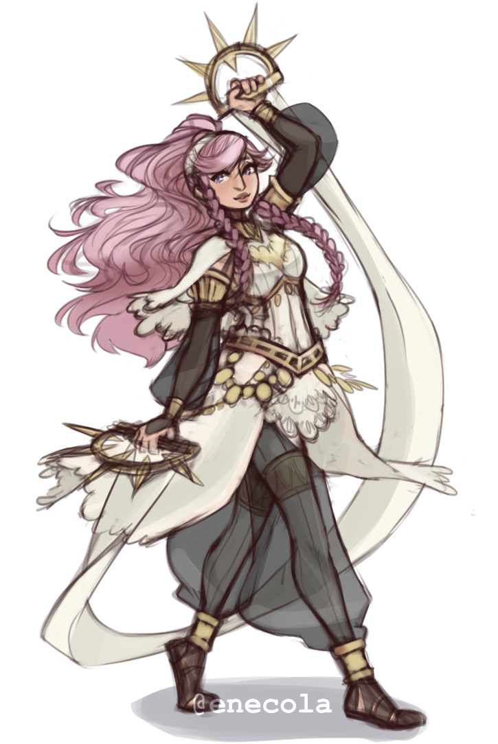
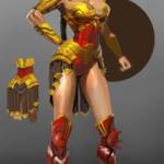
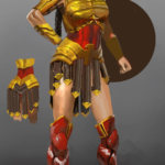
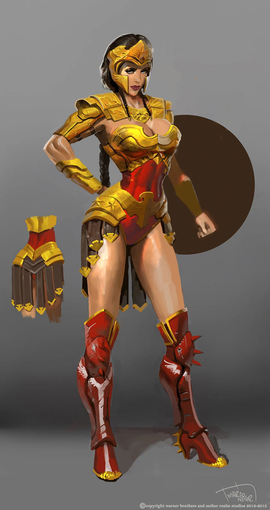
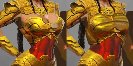
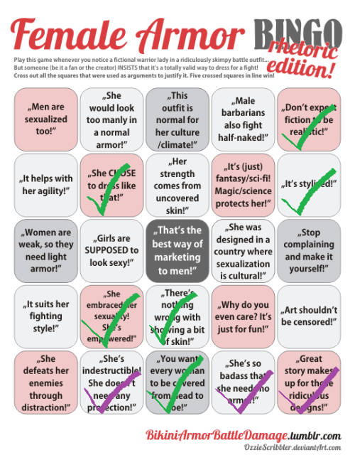
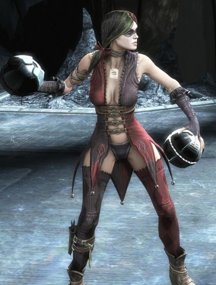
One of my earlier redesigns that I finished recently because of things was for Harley Quinn from Injustice. So, the problems here are pretty obvious… Lots of pointless and impractical skin, shit color saturation…. everything….

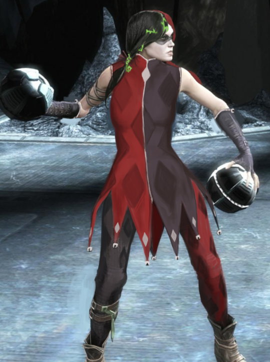
I originally was going to make her outfit more like a jester’s, in the vein of the original Harley design. I was just using the original design as a jumping-off point, but it was becoming very dull and uninteresting. 

[Pictured above: The diamond market crash]

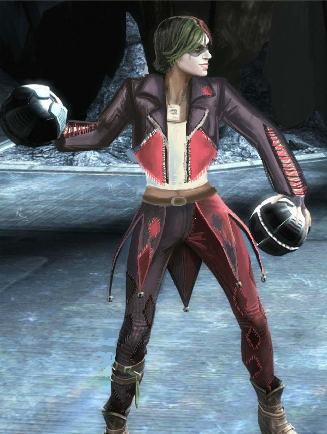
I ended up scrapping it for a more DIY look. I figured Harley would have fun making a quirky outfit to commit crimes in.

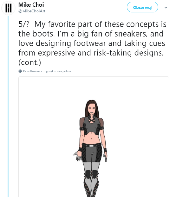
I kept the color scheme, though upped the saturation by a bunch. The idea is that she bought 2 pairs of identical but differently colored pants, a biker jacket, a tank top and some fabric. Then she went home, cut the pants in half and sewed them together, cut out huge chunks of the jacket in diamond shapes, and cut the jacket sleeves so they’re not as restricting. Then she just sewed a bunch of diamonds on everything, without any particular care for making it look professional. I think adding some sequins to her jacket would also not go amiss.

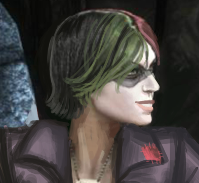
I hated her hair, so I cut it off. I also changed her face a little bit, and gave her back her smile!

image

Since she’s not a super-powered person with tons of money, I didn’t want to go with the standard power suit look, especially since I don’t think she would prefer one as a character. However, I also don’t think she would prefer to wear a Victoria’s Secret ensemble but with leather belts rubbing against her bare skin. She’d stick to her theme, but in a fun way, and that’s what I tried to convey in the redesign.

-Icy

King’s Raid is a mobile game with good graphics and artwork, typically addicting gameplay through psychologically rewarding progression mechanics, and a fun, cooperative Raid gameplay mode.

In other words, a Skinner box game with Sexy Girls, got it. Could have just said that, it’s much shorter.

I got an ad for this game the other day, so I decided to check out the wiki for some Bingo material, and now I’m feeling really bad for the poor Bingo card. This one is literally the first character listed under their first category in the Heroes tab: Aselica the Knight (she’s a Tank, can’t you tell??). Here’s a better look at her “armor:”

image

Good Graphics and Artwork™, as advertised.

And of course, this is what her lesser version looks like:

image

At least her wings acquired more protection…?

-Icy

enecola:

Armor Fix for Olivia!

Her legs must hurt… Olivia is pretty fun but I never understood why they made her use a sword when she had these cool rings. Like… that’s not less believable that chrom using his dumbass swords that he keeps sticking into the ground all the fucking time.

I think that fixing a plate armor design is fairly straight-forward in what needs to fixed: put a functional breastplate on the tiddy, add protection to some vital areas that got missed, and add some fabric in-between to pad the armor. I find it harder to fix armor for characters who don’t really wear it. This redesign did that wonderfully. It’s just so darn beautiful!

In Fire Emblem Awakening, Olivia starts out as a Dancer class, and boy do her dancing animations with that original getup look like absolute crap. But I would loooove to see the redesign in motion! There’s so much more potential for interesting movements with all that flowing fabric. I also never noticed Olivia even had a jingly belt until I saw the redesign, and then looked back at the original. That’s how you know you have a Quality Character Design.

I love the subtle touch of the seam lines going down her legs, which lets us know that even underneath the transparent fabric, she is wearing opaque tights. It really is the little things.

I definitely look forward to featuring more of this artist’s redesigns on the blog. <Sequel Hook>

-Icy

For those not aware, film creator and media critic Dan Olson (aka Foldable Human) has been on a quest to find games that are “so bad they’re good” in the same way some classic movies such as Plan 9 From Outer Space and Attack Of The Killer Tomatoes.  

Viking: Battle for Asgard is kind of amazing in that not only does have the promise of this – but if the steam page is to be believed the developers are still, to this day, convinced this is a great adaption of Norse myth and history.

image

Unsurprisingly, the studio decided this was probably not the direction they wanted to go long term and went back to making their regular games… until they got a license for an certain other totally creative property.

– wincenworks

Tharja – Medieval Fantasy Body Stocking Technology

Jumping forward a few streams for this post, since this was back when I went way over our allotted time, and those old designs aren’t done yet… They’ll be done one day. ヽ༼ຈل͜ຈ༽ノ

So this was more of a fashion redesign exercise. Tharja, from Fire Emblem Awakening, is a sorceress. In terms of game mechanics, they tend to stay in the back and be pretty squishy, so I don’t expect her to wear full plate. I just wanted her to not wear… that thing. The body stocking, that somehow exists in this universe. Oh, and she comes from a hot desert region, so….

Since this is a fantasy universe that borrows very little from actual desert-dwelling peoples, I took inspiration from her counterpart, who’s from the same country. He looks like this:

image

So I took the skirt-like thing and the shirt he wears and adjusted it for Tharja. I liked her belt, so I kept it, and instead changed the waistline of the skirt to try and form some nice shapes.

Because of the skirt, however, the cape became redundant. I tried 2 different versions of it before scrapping it. Looking at it now, I should have just made it connect to her sleeves at the wrist. Without the cape, the little dangly things on it looked weird, and I hated her hair from the start, so I basically just moved the shapes around. Got rid of the ponytail thing, while adding a similar shape to her circlet, though I probably should have made it smaller. As for her tights, I was too lazy to paint over them, but in theory, they’d be like Henry’s (the boy above) legging-type things.

The last thing I did was adjust the color balance. Her colors were so muted in the original, especially her golden accents, so I upped the saturation on that to complement the purple.

Overall, I was trying to go for a more professional, distancing look. Tharja is antisocial and strange, after all. I do like the redesign, though there’s always things you see after you “finish” a work that could be improved upon. Honestly, I kind of want to redo Henry’s design, cause it’s kinda bad… Purple on purple; genus.

-Icy

Wonder Woman and the Regime of Missed Opportunities 

I took Regime Wonder Woman from Injustice as my second stream fix project, because this concept art reeked of wasted potential.
And because as a big fan of the Cliff Chiang design I’d love to also prove that Diana can be done well while showing quite a lot of skin and doing a homage to Greco-Roman armor that fits her origin. 

There were elements to this costume which deserved to stay – the helmet, pauldrons and belt joined with tassets. Boobplate with giant cleavage, high heels and unarmored crotch had to go.
But first I gave Wondy a torso that can fit an adult woman’s internal organs. Funny how making her waist the right size all of sudden made her toned abs so much more apparent, even though they’ve always been there. 

image

I remodeled her chestpiece into a half-breastplate that actually contains the boobs while retaining some of their shape. Did my best to not emulate the look of cleavage or draw the eye to where it would have been. 

Got rid of the absurd high heels and edgelordy spikes from her shoes. Then duplicated some straps from the tassets to the front, as there was never a reason to put her crotch on display.

Final touches was giving Diana a tiny bit more distinct facial features: wider jaw and lips, aquiline nose. Minimal change, but hopefully for the better.

image

If there’s something I’d change if I had more time to work on that, it would be probably making her boots look less modern (and adding more gold accents to them) and drawing her right palm on top of her hip, which the original artists clearly was too lazy to do.

This was the first, but we keep coming back to redesigning Injustice regularly during our streams, because of how shamelessly “edgy” its sexualized female characters are.
And because its in-game color palettes are the ugliest ever! This piece is based on an official concept artwork, so the colors are quite brilliant, but once rendered into the actual game, everything gets murky and desaturated to the point of blending with dark backgrounds. 

~Ozzie

hellyeahteensuperheroes:

So, Mike Choi’s redesign of Laura Kinney’s costume for new X-23 series is controversial. To put it mildly. I decided that the best way to express what the flying boar in a submarine is wrong with this outfit would be to borrow the amazing Female Armor Bingo from @bikiniarmorbattledamage . Thankfully he had enough decency to not add a thong or it would score a full row.

Now, people have been telling me to go read Choi’s thread on Twitter, where he goes through his previous designs. Supposedly, it will change my mind about the costume. We’ll see about that.

He put his points in several threads, let’s start with the very first.

image

They wanted the outfit be different from her Wolverine outfit AND based on the X-Force one. This is bizarre. Her final Wolverine suit carries clear X-Force inspirations. It’s inspired by Logan’s X-Force costume. It just feels like they’re trying to bring back nostalgia to that specific time in Laura’s history. Which is funny, when you remember that the most of online fandom hated X-Force when she was on it (Kyle and Yost’s run). Despite the critical acclaim. It was seen as the epitome of why making comics darker and edgier is the worst thing you can ever do. I know, I got into arguments with these guys. But now the same people go online wanting it back if that means Laura will be showing off her midriff again. Go figure.

Now, if you pardon me breaking chronology a bit I want to address the second and sixth point on his thread together.

image
image
image
image
image

So let me get this straight – he was told by everyone (and agreed!) how pantless leotard is out of character for Laura, and then gave her equally skimpy short shorts on another try? All while completely aware that her outfit will be drawn by other artists who will likely make the shorts smaller and sexualize her further? He needed two separate attempts and two different arguments to understand Laura needs long pants?

Now back to the chronological order of these tweets. Third part.

image
image
image

Where do I even begin? If he accepts the blame for her having an exposed midriff, why not use an opportunity to fix it and give her an outfit that does not have one? What not being Wolverine has to do with practical costume design? Why cannot she still wear non-revealing outfit under new or old codename? How can he talk about respecting her agency and personality considering what book he is making these designs for? A series that, for all that we know so far, will force her back into a codename that she outgrew? Laura had a whole arc about it, with her proclaiming she is not X-23. To speak of respecting her character when such a big regression is done to her is just a sad joke. 

As a side note – the top picture? These words? They’re out of context. They directly quote a speech Laura makes in issue #19 of All-New Wolverine. A speech that starts with ‘I’m not X-23″ and ends with “I’m Wolverine”. They cherry-picked lines from that monologue and slammed them on a cover for a book that goes against the entire point. It takes away from her both Wolverine title and outfit and forces her back into codename and costume she left behind. In that context talking about respecting her character is just a piece of impudence.

 And this argument about her taste of clothes comes as asinine for a number of reasons. One is that she is a fictional character, she doesn’t really make a choice to dress like this – the artist does. Giving her a midriff always undermines her as a competent fighter. You end up saying she decided to expose herself in the fight, putting herself at risk for fashion.

These outfits would be okay as everyday clothes, I could tolerate them if she wasn’t wearing a costume but was just one of those superheroes who fight in whatever they are wearing at the moment like Luke Cage or Jessica Jones. But she is not, she goes and dresses for a mission, why should fashion sense or taste of clothes have anything to do with it? 

And finally…. if he cares about staying true to her character, why did he try to put her in shorts after being told bare legs are ooc for her?

Let’s go to the fourth part

image
image
image

I agree that talking about fictional character’s agency is an oxymoron. Which is why comparing Laura to real life women, who can choose their own wardrobe, makes no sense. While Choi acknowledges Laura as a fictional person, he still frames it as if he wasn’t the one in control of her looks. This is what trying to call the critics “narrow-minded orthodoxies” and claiming they accuse HER of being some sort of temptress boils down to. It is the artist we have a problem with, the artist who made a choice to dress her like that and now tries to say it’s liberating. He asked his students what they would wear as superheroes. They told him they wanted to express their independence. And somehow this shit is the only way to convey that he could think of?

image

And finally the fifth part. While he speaks about the boots, I need to bring attention to what he says about practicality and realism

image

Again with false equivalences. Superhero costumes can look cool while still being practical, many male outfits prove that. Hell, Snake-Eyes is a good example. And I’m pretty sure “that thing” on his face is eyes protection if a stylized, properly stylized, one. To say you cannot make a character look practical without losing the cool factor is an admission of a failure as an artist.

And for the finishing touch, I decided to put his arguments on the second famous feature from @bikiniarmorbattledamage , the Female Armor Rhetoric Bingo

image

 His points I spotted are in green. I also put in purple arguments I’ve seen from people trying to defend his designs and the fans. Arguments that were always thrown in defense of sexualized outfits for Laura, by the way. The “Great story makes up for these ridiculous designs” is one I especially need to highlight. People are coming to me saying that I should not judge Mariko Tamaki’s story before it appears. And I need to underline that I’m sure she can write a great story with Laura. In fact, I hope she does. But that will in no way change the fact this outfit is horrible.    

Just like is the case with Mike Choi’s designs – they suck, all of them, be it unused ones or the final one. And while I can understand some parts of his thought process in working on them, they do not justify what he created and cannot serve as a good defense for the outfit he went with.

– Admin

So not only all those new outfit ideas for Laura were the generic “must. show. female. skin!” shit and the one approved in the end is no better than the rest… The designer also walked us through his “creative” process and didn’t manage to give a single satisfactory explanation to why he landed on any of those! 

It’s pretty amazing how so many completely valid points, like consulting actual women, considering how other artists will draw it and referencing the character’s history were supposedly taken into consideration… and nothing about those boring rags informs us of that

~Ozzie 

Why does it feel like every time Mike Choi talks about the “research” and “introspection” he did with regards to women, he’s actually trying to blame them? 

Also, I really love that this veteran of the comics industry apparently assumes that, if anything has even one impractical element, then it is 100% impractical. If that’s the case, Laura’s outfit is immediately impractical, due to the fact that I don’t see any bra straps under that see-through fabric! And wearing a strapless bra into the kind of acrobatic fights that Laura gets into is a bad idea. Too bad he didn’t ask any of his students about that, though he probably would have ignored them anyway.

-Icy