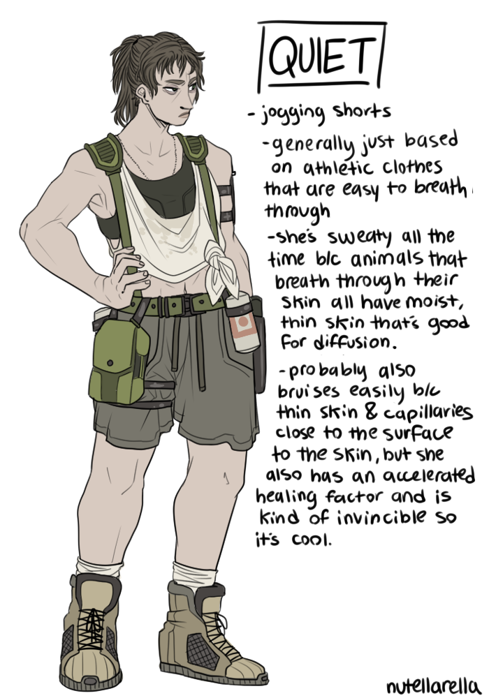
While we talked about Indivisible’s design being pretty damn awesome and varied, there were still issues we had to point out, like Phoebe’s whole costume.
Good to see a genuinely sexyfied male character added to the game!
Like, this sort of costume (high heels! underboob! thigh cutuouts!) and animations are very rarely used unironically on male characters.
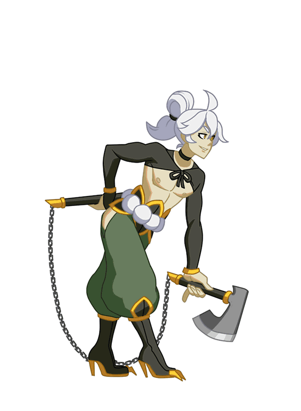
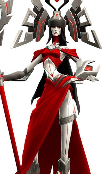
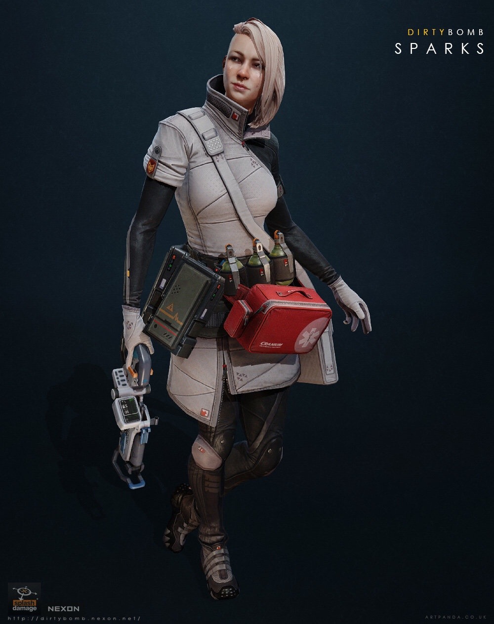
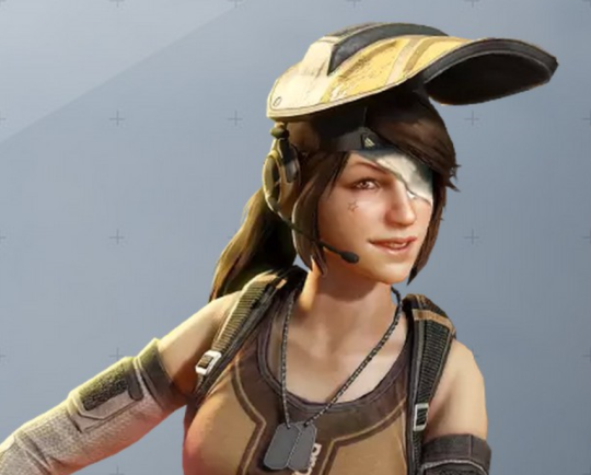
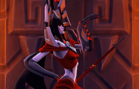
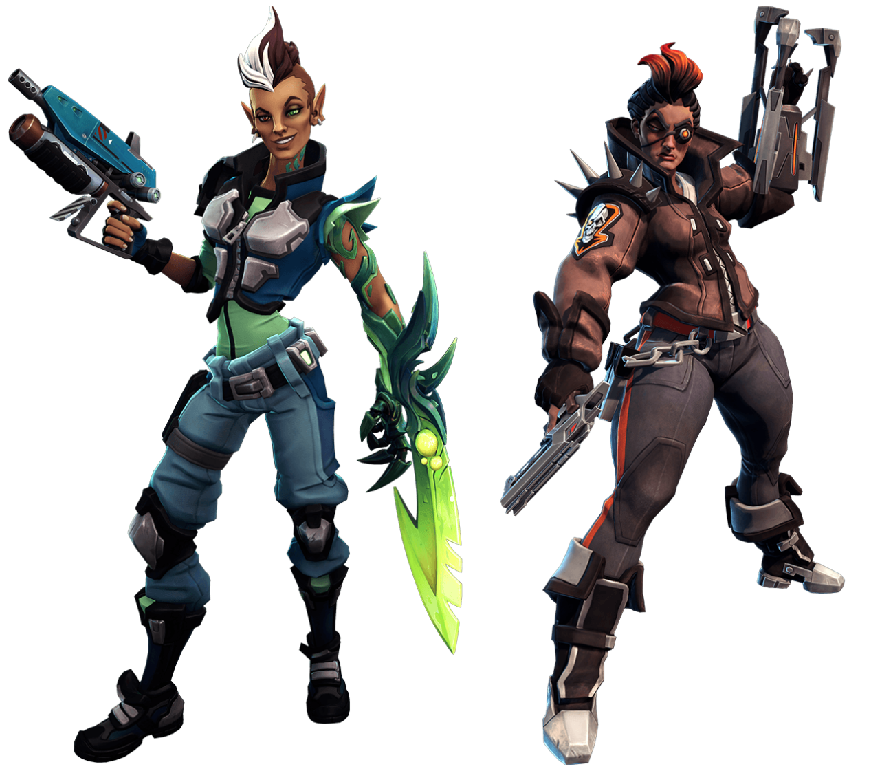
Same character class, same style of game, three different takes on it.
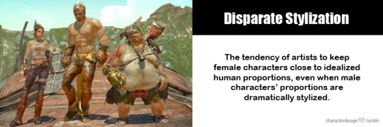
Stylistic choices don’t exist in a vacuum.
Dirty Bomb really doesn’t get enough credit for it’s walking the walk when it comes to egalitarian character designs and commitment to diversity. Every mercenary has a story, a personality and gear that is suitable to them – on top of that, they’re not afraid to let things get ugly. Have a look at how Proxy (basically their equivalent of Tracer in terms of personality) looks lately:
Needless to say Sparks as a white-clad medic who’s only thoughts on her profession is “Call me Sparks. I heal. I kill. Is ironic paradox. Yadda Yadda.” is a wonderful breath of fresh air in games.
Ambra from Battleborn is certainly not ideal, but as we’ve discussed before her design reeks of the Creepy Marketing Guy influence – but they at least made her a unique character and worked in no small amount of entertaining quirk.
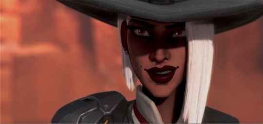
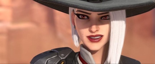
Mercy… oh Mercy.
– wincenworks
Before anyone comes to say we’re taking things out of context or comparing apples to oranges, yes, all those games have their own aesthetic and we should should judge how each character looks within it. Dirty Bomb is quite realistic, Battleborn is very cartoony and Overwatch lies somewhere in the middle.
And we’re still not okay with boobplate on Galilea, even though Battleborn is more heavily stylized.
Speaking of ensemble games with cartoony aesthetic, let’s not forget about Gigantic, which while not boobplate-free (on their healer character, no less), does really good with gender and age balance among their cast.
~Ozzie
This week’s throwback: a reminder that Blizzard’s bland approach to female character design really pales in comparison to competition.
Also that Battleborn never had to be asked to deliver Black (or Black-coded, considering the sci-fi fantasy setting) playable women.
if your female character doesn’t look like she has lived the life she leads and you can’t get a sense for her actual personality by looking at her because you’re too focused on making her pretty and perfect and palatable it’s bad character design and you should feel bad
It’s worth noting that, generally speaking – this is why concept artists want to be concept artists. They want to convey feelings, story and inspire the imagination. It’s not uncommon for concept artists to do staggering amounts of research in order to find ways to convey a type of character in a type of time period.
So, if you come across a product created by a major studio where they have extensive executive and production staff – it’s safe to say that any aggressively boring female character designs are done at the behest of a particular type of individual pushing a ridiculous myth to try to seem like a genius.
It is important to call out this kind of absurdity, not just to try to reduce the amount of gratuitous objectification in media – but to also spare these poor artists the indignity of having a guy try to convince them he invented anime tiddy.
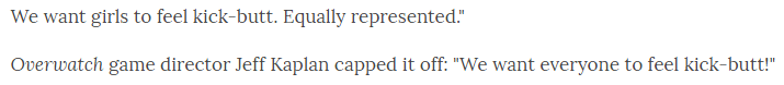
By far the most common certain demographic response seems to have been to claim that it’s fine that literally none of Overwatch’s 25 playable characters is a black woman because line up includes robots, an ape and a hamster… so naturally is the most diverse range possible.
That of course, is not even vaguely what “diversity” is about and even Blizzard executives Chris Metzen (now retired) and Jeff Kaplan (definitely not retired) understand that:
The problem is: Overwatch got prematurely rubber stamped for “good diversity” primarily for having higher than the (abysmal) industry standard for female, brown and old lady characters. (ie, some characters exist).
Now they’ve got that kudos, they’re not interested in actually delivering on promises or even maintaining the baseline.
Well it’s either that, or they decided that a key demographic who needs over representation is conventionally sexually attractive white women. Specifically ones who are almost identical to Widowmaker. [link]
Blizzard already has a bad track record for disregarding concepts of characters of color in favor of making them white and blonde (specifically Mercy and Junkrat) and otherwise ignored concepts for characters of color that they’ve showcased for PR but apparently will never develop
There is seriously no way that anyone can believe that Blizzard, as a company, have any interest in good representation and making everyone feel welcome beyond sound bytes and quick stunts they can do to seek publicity boosts.
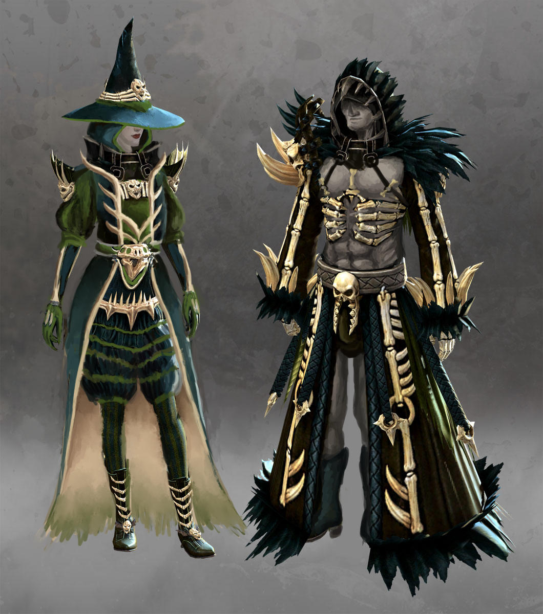
So, what does the original give us? Amazingly washed out monochromatic color palette, generic witch hat, bare thighs and shoulders, majorly over-designed bone ornamentation that looks super stabby (not to mention, frames her boobs)… and, of course, male version which looks nothing alike.
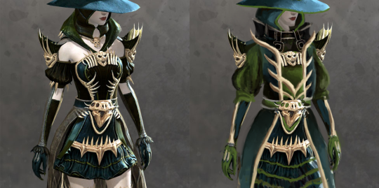
After covering the gratuitous bare skin parts with poofy pants and sleeves, I decided to stick to two priorities:
Make her color scheme more balanced (original, especially model sheet version I found on GW2 Wiki, is basically all just one shade of emerald!). Hope that dark teal, moss green and ebony compliment each other better when not so washed out.
Turn those needless small ornamental shapes into bigger, less distracting and less likely to stab her if she leans down. Obviously most of what was on her chest had to go in favor of something that doesn’t focus on the bebws.
All the actual design details and shapes were mostly incidental, as I was changing everything as I moved along, over two or three separate streaming sessions.
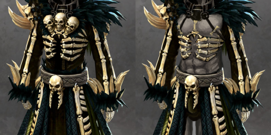
I guess I could have gone the path of whatwe did to Saint Seiya Online and change the lady’s design to that of her spooky (warlock? lich?) skeleton male version, but I don’t like his design either, just for reasons different than overt sexism. His bone motif is somehow even more overdone than hers (three little skulls on chest, one on right arm, another one on his… crotch?) and there’s the vague “witch doctor” vibe to him that puts this in exotification category.
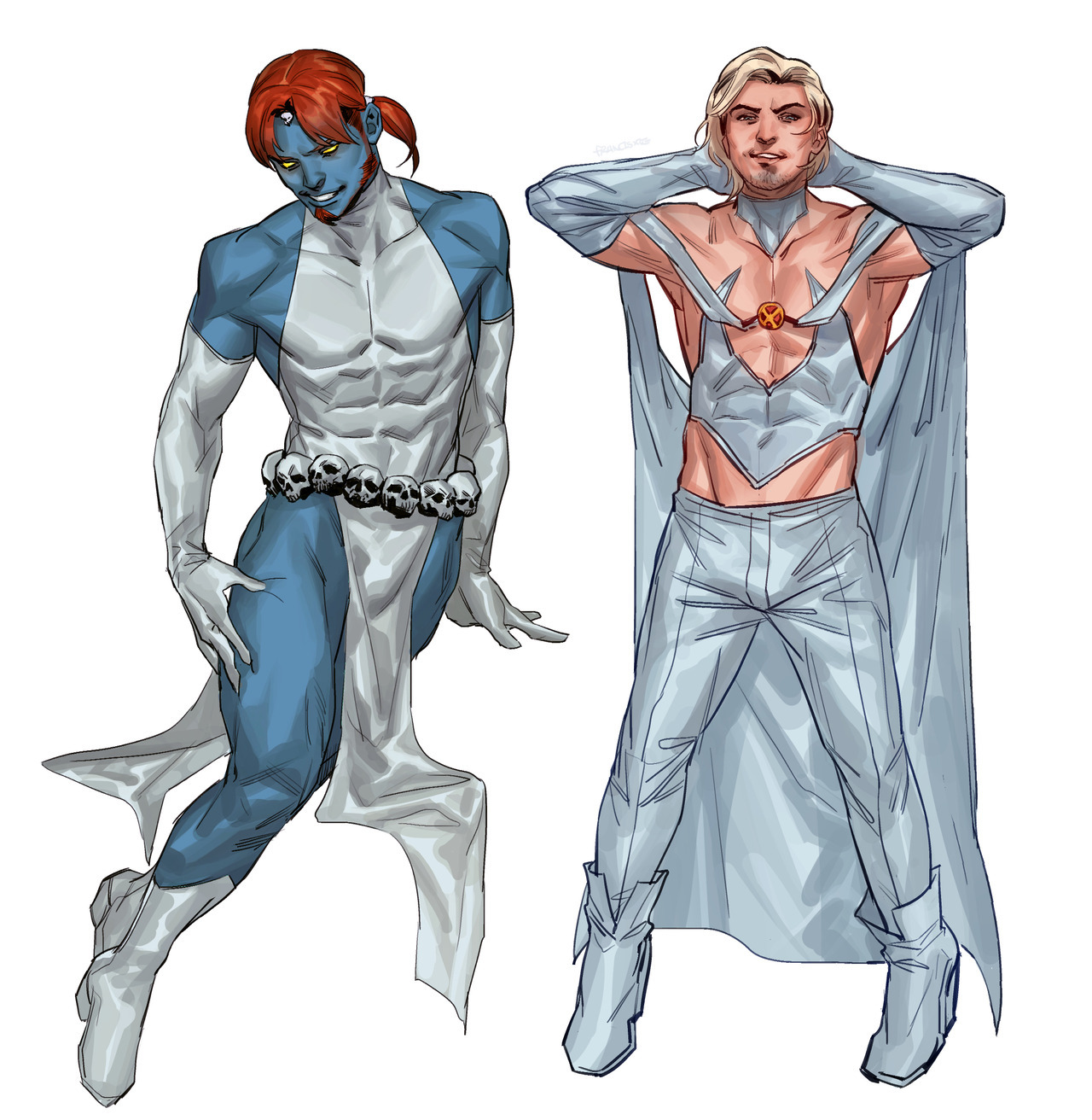
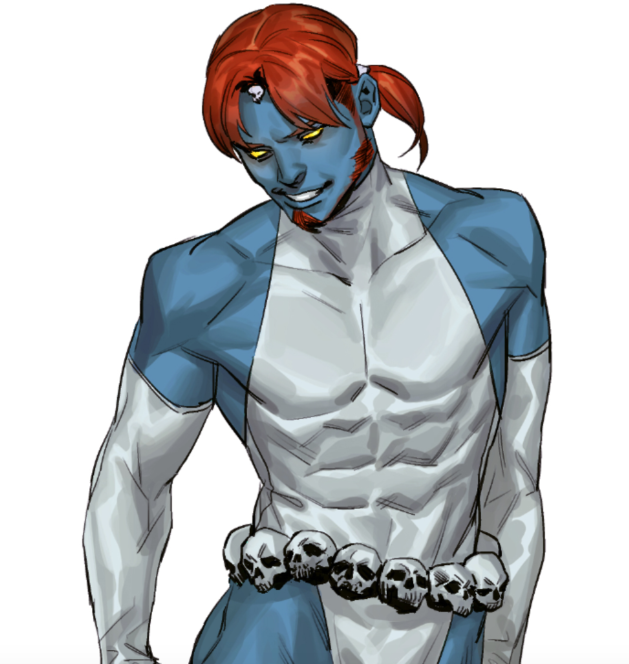
I decided to go with the traditional sexified male armor path of stripping him down to as little clothing as possible without changing the silhouette. And gave him face skin, because if lady witch doesn’t have a skull head, why should he?
Also made that weirdly suggestive crotch skull actually frame his package with its scary jaw, because we would never miss such opportunity.
Funny, because Emma Frost in particular is second only to Bayonetta among (dubious) examples that are thrown our way as a female character expressing her sexuality “done right”. Yet other than fans turning her into a dude, there’s no direct male equivalent to her brand of sexy empowerment.