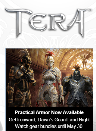
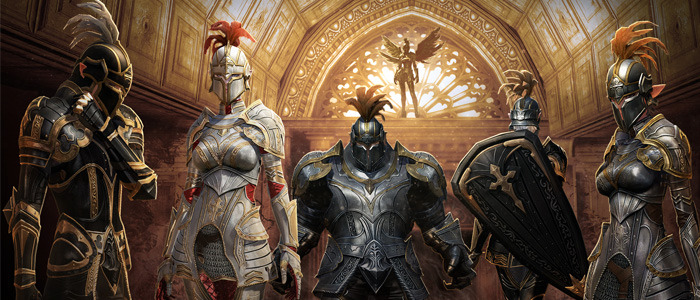
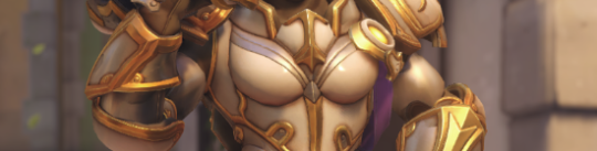
Whoah. The absurd of Tera, the universal example of logic-defying female battle outfits, advertising itself to have “practical armor”… that is skin-tight and boobsock-y on women leaves me astonished.
This armor is so totally practical that even Erik Larsen, the devoted anti-practicality in women’s costumes guy, probably wouldn’t mind it.
Dear Tera’s Creepy Maketing Guy: Just because boobplate and figure-hugging metal cover more than what you usually call “armor”, it doesn’t mean you should label it as “practical”.
~Ozzie
I feel it’s time to bring this back, not just because laughing at Tera’s idea of quality armor never gets old, there’s a funny thing I noticed. I feel like I’ve seen this… somewhere recently…
Yes to everyone assuring us that Blizzard is really trying… we have confirmation they are trying about as hard as Tera was last year.
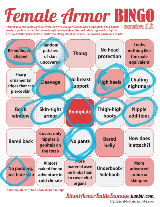
And on today’s episode of Doing Women Better™, Blizzard finally granted us the much requested Magician Symmetra. Only instead of going for something super classy like the many fan interpretations out there or even just ladies in suits from real life, they went with…this.
Lack of pants and framing her bust (what is even with those metal plates) aside, the fact that this is a legendary skin and costs 3000 credits when it’s so close to her default skin makes this whole thing very disappointing.
Thanks for submitting this highly requested post, including some quality scathing commentary! The Saga of Pantless Symmetra continues.
This would be insulting enough just by the virtue of being a fetishy leotard instead of a suit, but what the hell are those boob-holder bars?! They’re some sort of garbage afterthought slapped on to make this look more “sci-fi”, I guess? Why would a costume need that? Because you can’t be science fiction without framing the tits with random pieces of metal?
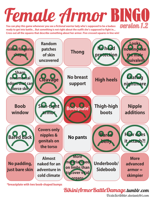
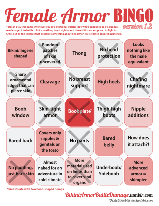
Since the bingo lacks a “What the fuck am I looking at?!” square, I marked “Boobplate” instead.
Fun fact: a convention I attended last week had an Overwatch: Character design done right! talk that I just couldn’t subject myself to come to, both out of the fear of my brain melting on sight and because I didn’t want to rain on some enthusiastic fan’s parade when the time for Q&A comes.
I’m still amused that at the same time Blizzard made THIS, easily disproving the “character designdone right” claim.
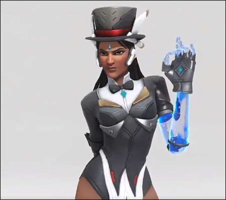
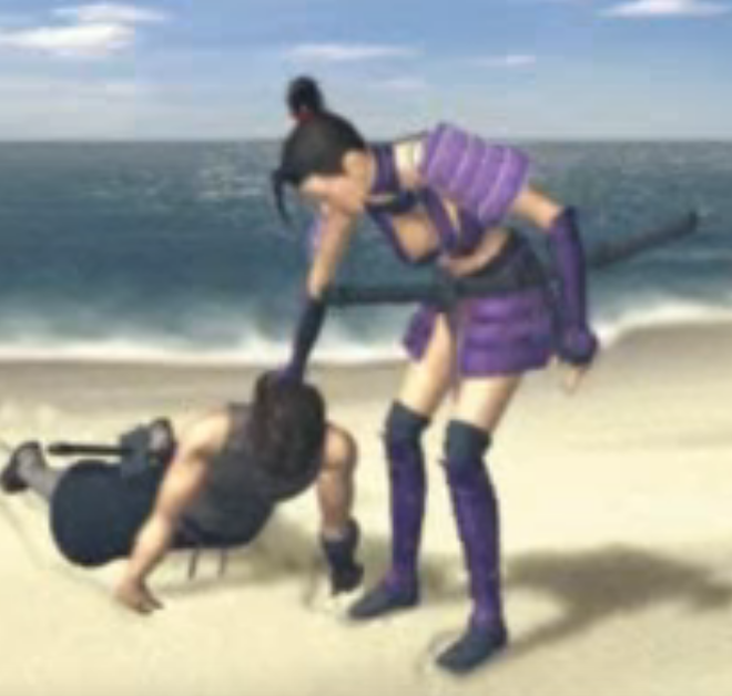
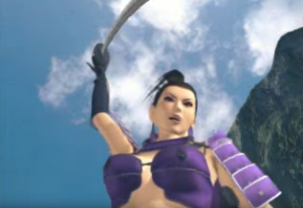
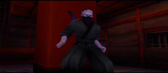
So Lady Kagami was the main antagonist of Tenchu 2… which was supposed to be an epic battle between ninja clans and rulers in Feudal Japan but somehow ended up with this as the major villain.
How seriously can you expect to take people take this kind of villain when facing off against a protagonist like this:
For those rushing to type that it’s an old game and doesn’t matter – it’s worth remembering what the final installment in core series was. Design aspects like this left unaddressed can kill otherwise unique and engaging properties.
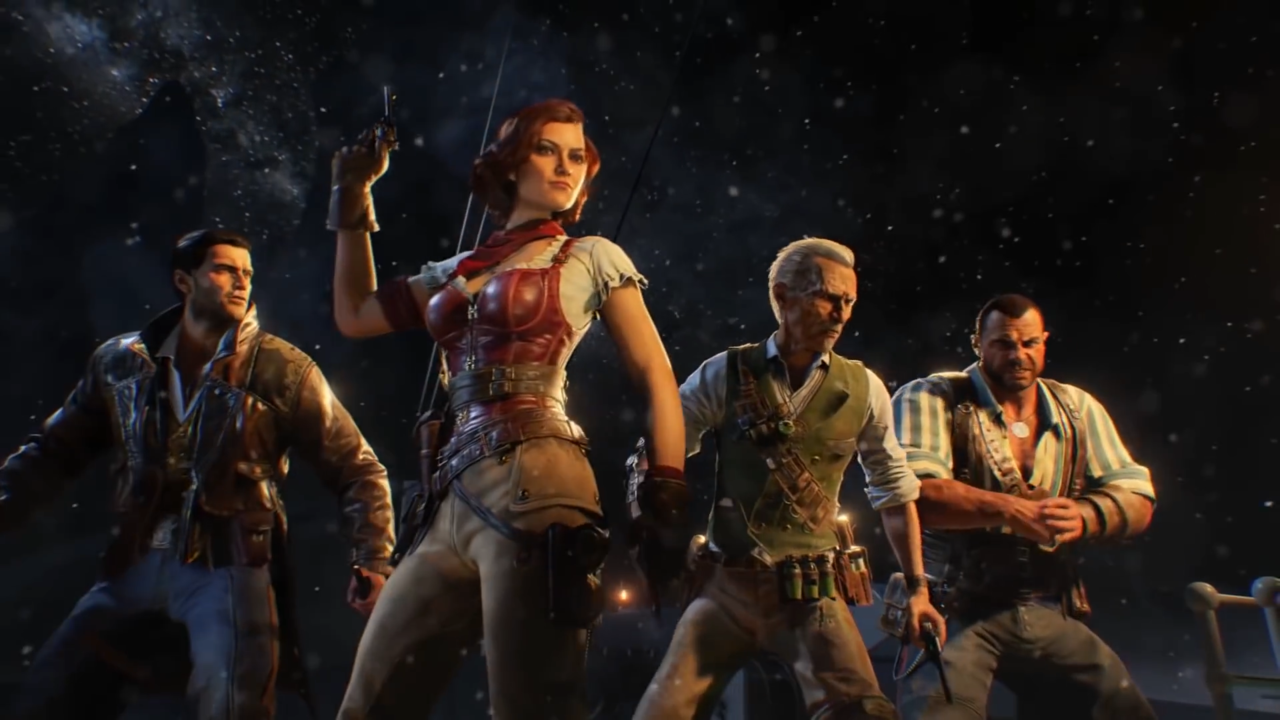
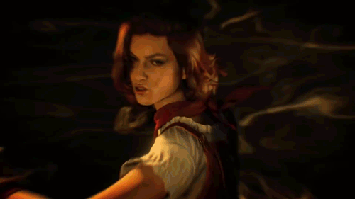
The upcoming game seems to incorporate time travel so they can have massive, carefully crafted settings with nonsensical outfits. Honestly, it makes no sense, since the same press footage they’re releasing confirms… they know how to make sexy badass ladies. I mean, look at this babe:
If you’re not in lustlove you’re just not paying attention.
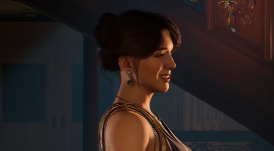
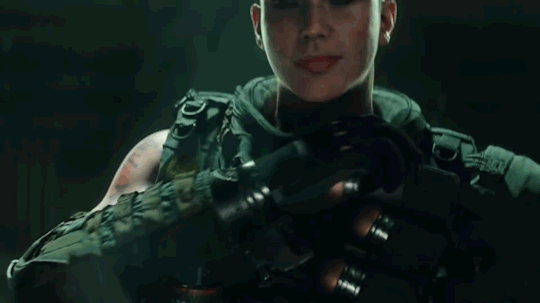
Of course, most of the current fuss is not over the zombie mode but rather over the lack of a single player campaign. Though personally, I’m glad we get this moment that I’m choosing to believe depicts a female character getting to meet the Creepy Marketing Guy responsible for this.
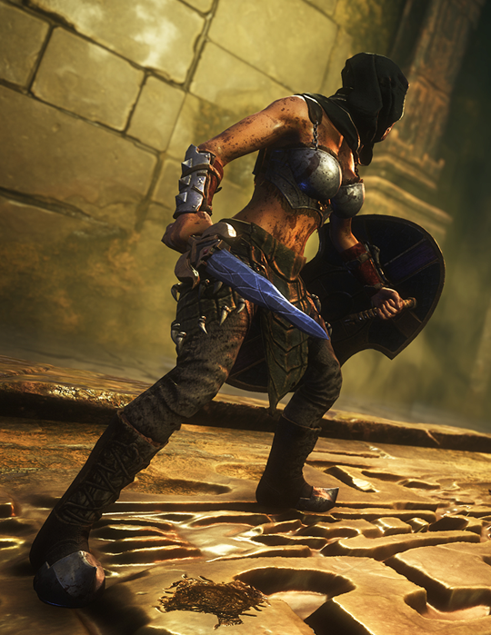
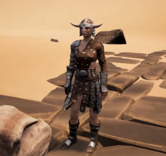
Ironically, despite this armor being the first “screenshot” image on Conan Exiles’ Steam page – I can’t find any evidence that it is or has ever actually been in the game. The reason why is not particularly clear. After all, this is “heavy armor”:
The part that is most amazing about it is that the lower half is covered in pants that seem far beyond the heavy armor but then have a nightmarish boobplate that seems to have been designed with zero considerations for protection.
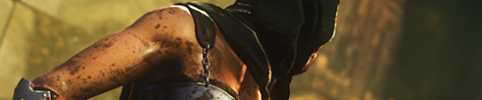
It gets chafing nightmare because it seems that after adding a layer of padding under the metal… they decided that a bare steel chain strap will be fine.
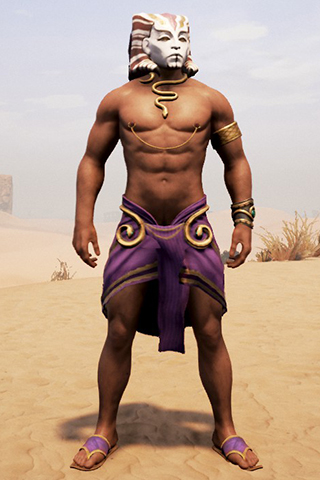
This is doubly a shame because not only does a certain marketing strategy seem to impeding them giving a solid representation of the game but they’re also missing the opportunity to show the real empowerment in the game:
– wincenworks
Update: Apparently it is possible to recreate the outfit, but requires mixing and matching bits, @p75369 created the female version here and… well I’m sure you’ll be shocked the male version is different.
Excuse me, but literally the first concept for this character is fully armored, in reasonable plate, with no Tiddies and with actual pants??
E X C U S E M E ? ? ?
-Icy
Just in case the “no pants” part wasn’t clear enough from the image used by the OP, here’s some concept art for the final design, pants definitely not included:
I think it’s reasonable to say that Dragon’s Dogma, both with outright bad stuff and clearly missed opportunities, like this one, belongs firmly on our Wall of Shame.
Are those super heavy armors on all the male characters, including Superman who’s way more invincible than Diana? Yes, they are.
Truly, the double standard is but a cherry on top of the utter ugliness that is this overdesigned figure set.
This reminds me of the old Jimquisition video in which Jim uses another ridiculous Square Enix statue of egdelord Batman as a perfect metaphor for Squeenix’s skewed priorities in game and visual design:
~Ozzie
Posted on
Posted on
Wonder Woman and the Regime of Missed Opportunities
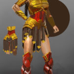
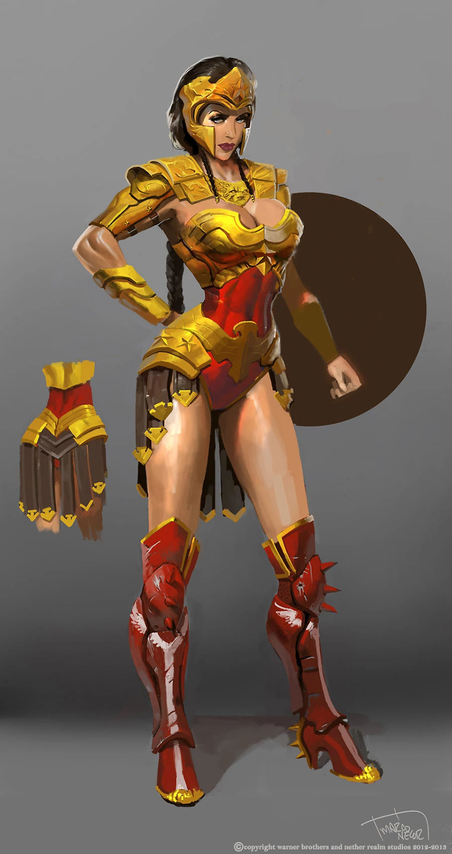
I took Regime Wonder Woman from Injustice as my second stream fix project, because this concept art reeked of wasted potential. And because as a big fan of the Cliff Chiangdesign I’d love to also prove that Diana can be done well while showing quite a lot of skin and doing a homage to Greco-Roman armor that fits her origin.
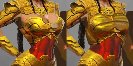
There were elements to this costume which deserved to stay – the helmet, pauldrons and belt joined with tassets. Boobplate with giant cleavage, high heels and unarmored crotch had to go. But first I gave Wondy a torso that can fit an adult woman’s internal organs. Funny how making her waist the right size all of sudden made her toned abs so much more apparent, even though they’ve always been there.
I remodeled her chestpiece into a half-breastplate that actually contains the boobs while retaining some of their shape. Did my best to not emulate the look of cleavage or draw the eye to where it would have been.
Got rid of the absurd high heels and edgelordy spikes from her shoes. Then duplicated some straps from the tassets to the front, as there was never a reason to put her crotch on display.
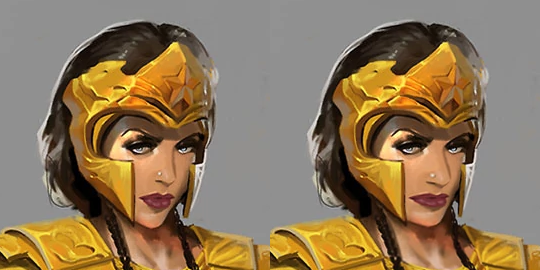
Final touches was giving Diana a tiny bit more distinct facial features: wider jaw and lips, aquiline nose. Minimal change, but hopefully for the better.
If there’s something I’d change if I had more time to work on that, it would be probably making her boots look less modern (and adding more gold accents to them) and drawing her right palm on top of her hip, which the original artists clearly was too lazy to do.
This was the first, but we keep coming back to redesigning Injustice regularly during our streams, because of how shamelessly “edgy” its sexualized female characters are. And because its in-game color palettes are the ugliest ever! This piece is based on an official concept artwork, so the colors are quite brilliant, but once rendered into the actual game, everything gets murky and desaturated to the point of blending with dark backgrounds.