We’ll be finishing up the Disgaea Gals this week. And we’re back to our normal schedule!
So come hang out with us on Saturday at 10:30 AM PT / 7:30 PM CEST.
~Ozzie and Icy
We’ll be finishing up the Disgaea Gals this week. And we’re back to our normal schedule!
So come hang out with us on Saturday at 10:30 AM PT / 7:30 PM CEST.
~Ozzie and Icy
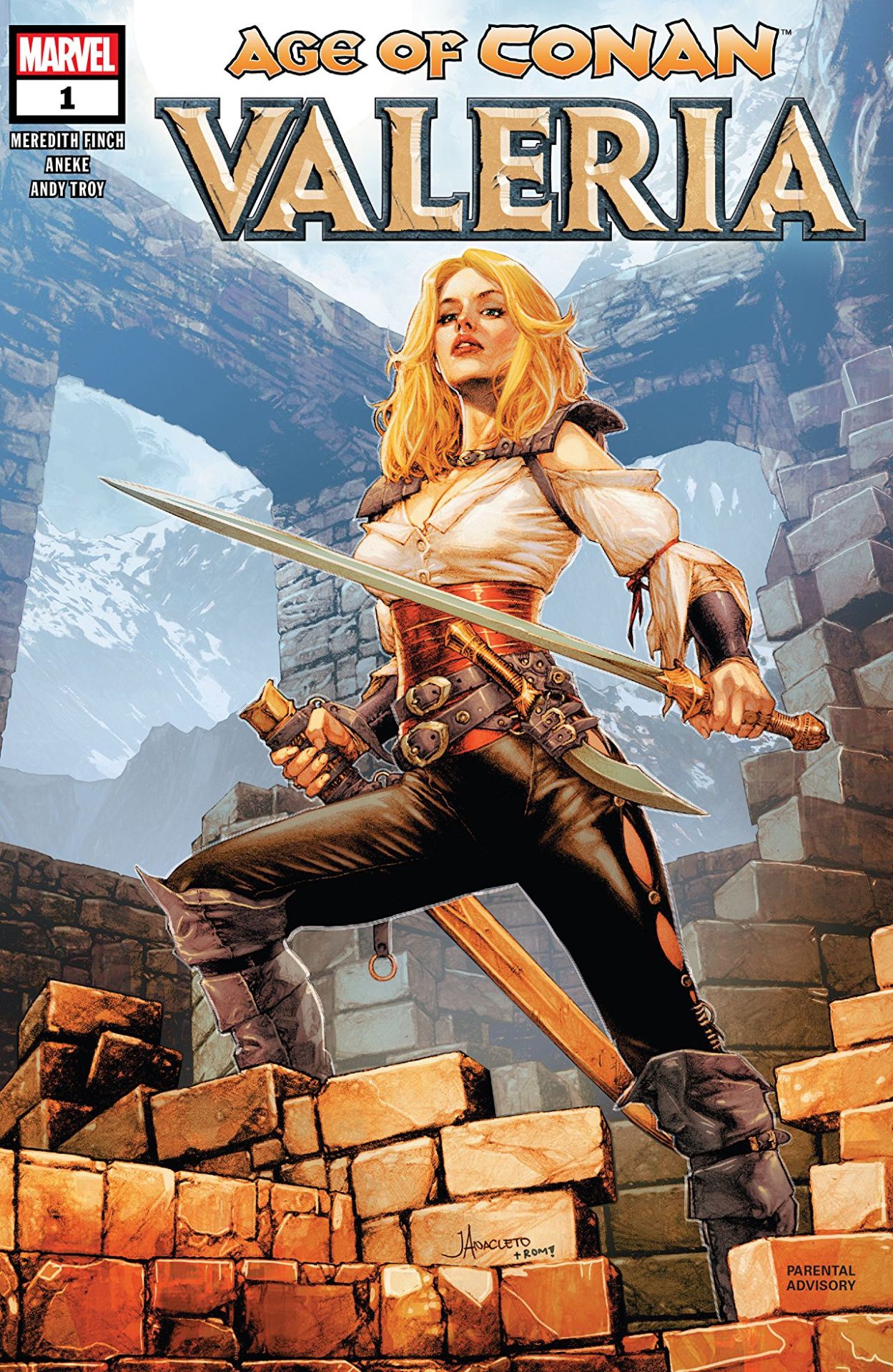


This comic opens with this line, then outlines the brutal deaths of the protagonists parents in a manner plenty of people will find disturbing. The core plot for this is the protagonist avenging her brother.
So, it’s a little confusing why ever single cover depicts her like one of her like less armoured version of a long forgotten pulp fantasy character. I mean, okay it’s a an improvement on her famous appearance in 1982:
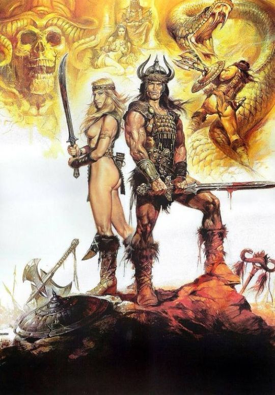
However at some point, the creators of these things really need to decide if they want them to be a:
‘Cause this weird thing of wanting to have the 80s pinup camp along with the “we have serious stories” grit really isn’t going to do them any favours.
-wincenworks
From Generic Bikini, to Generic Swashbuckler. What creativity!!
-Icy
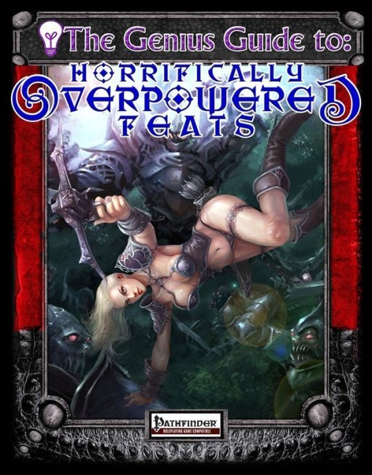

@noknightinarmor submitted:
What class is she? Horrifically Overpowered Titninja?
I love playing Pathfinder, but I don’t understand why someone chose this for the cover…
So I looked up what that book is supposed to be… and it’s a “What not to do” kind of guide. Fair enough, I guess?
Quote from the publisher’s description:
We’re not suggesting any GM should allow these feats into a campaign. In fact, we advise against it. Seriously, the whole product is called “Horrifically Overpowered Feats,” which seemed like a dead giveaway that we’re not encouraging anyone to use these rules.
Is the cover also supposed to be a dead giveaway to this being intentionally ridiculous? ? Because straight-up recreating something bad/nonsensical does not yet satire make. Satirizing sexist game art is actually really hard, as @wundergeek taught us.
This cover is up there with Macho Women With Guns and Special Forces as something supposedly parodying sexist depictions of warrior women media by pretty unironically reproducing such depictions.
~Ozzie
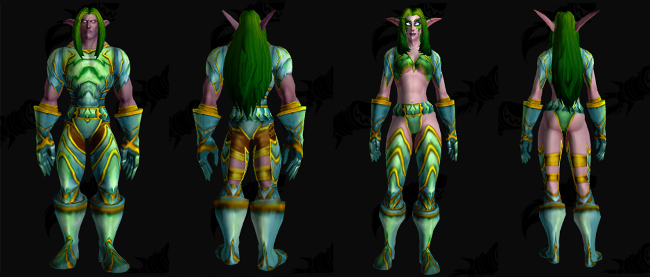
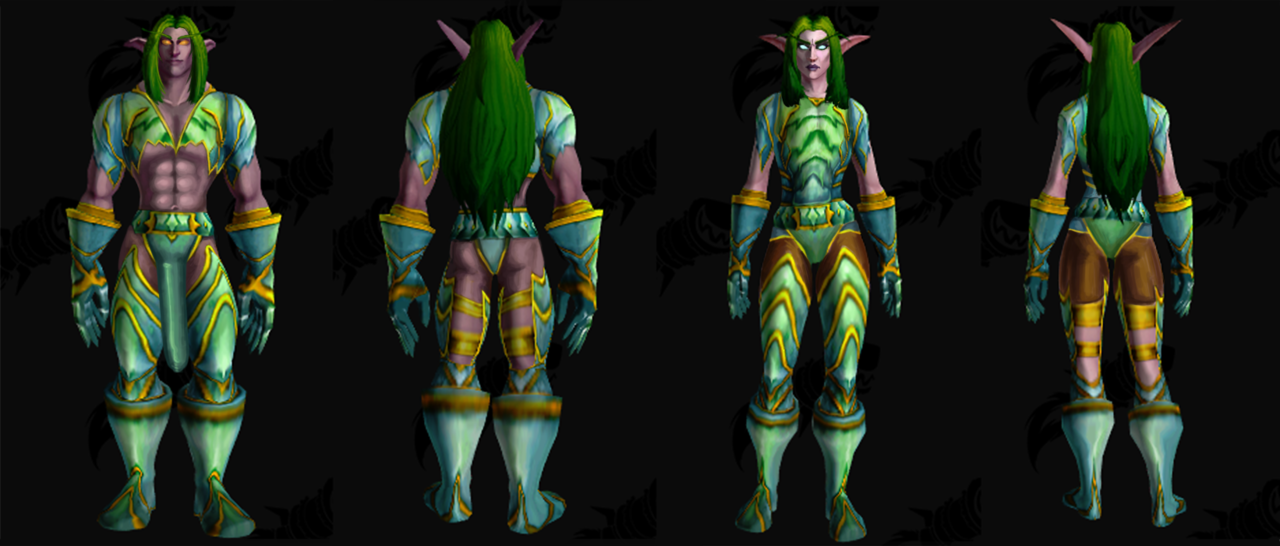

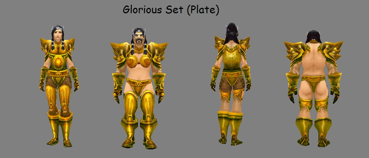
Like with Saint Seiya Online and Riders of Icarus before, we subjected some armor double standard in Blizzard’s MMORPG classic to a switch of designs between genders.
After all, if those are supposed to be exactly equal in function, then why not make the dudes show off their flesh?
This was a relatively laid-back stream. I was actually pretty surprised that we had not tackled WoW in a stream before! I ended up picking the Jade Armor just because of that underboob… it was just taunting me… I had to do it. It wasn’t my fault! Please, don’t–!
So besides switching the outfits between the 2 characters, I also switched their facial expressions! I gave the maaale an attractive, nonthreatening smile, while making the lady more intimidating. I also added the at-this-point Patented Icy Redesign Dick. I mean, if we can’t tell he has a penis, how are we supposed to know he’s a man, Blizzard?? How???
-Icy
This change was pretty basic copypasting job with adjustments according to character silhouettes. Bonus change was giving the guy’s cool braids to the lady, as she deserves an interesting haircut as well!
~Ozzie


Raid Shadow Legends is a game that hilariously has ridiculous bikini armor and chose not to put it into their marketing. (Which clearly has an epic budget)
Why? Well perhaps they figured out after the fact that if you’re trying to make a game about begin an epic hero that’s kind of undermined if your “hero” looks like they’re showing up for a fantasy themed lingerie shoot.
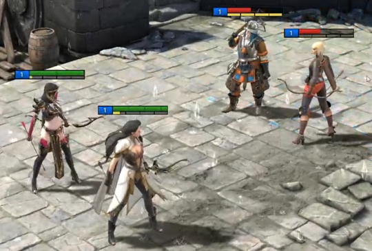
So naturally they did the only thing they could to make their product seem credible – they tried not to draw too much attention to the bikini armor in the promotional material and put a cheap She-Ra rip off in as the tutorial:
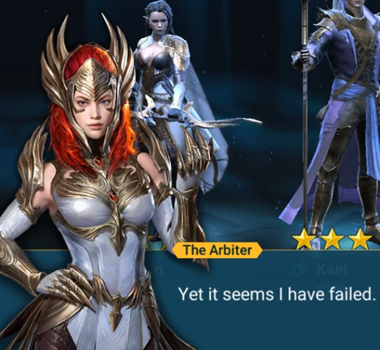
– wincenworks
(And yes, it is my opinion that “protection from light strikes with small objects at one point of my forehead” does not count as “head protection”)


Another game I’ve never played but felt that it would be fun to do an armor fix for!
BlackRose from .hack
I remember back in the day I thought she looked really cool, and that hasn’t really changed but I wanted to just give her some protection.Also what kinda sword is that I am so confused.
Man, this brings back memories. Mostly of a very depressed and quiet protagonist either sitting around or looking confused/concerned at various set-pieces. (Can you tell that I found the series boring?) Oh, there was also a cat lady. In the games, at least.
I really like the redesign! There are so many small but great changes, like the pattern on her stomach that breaks up the large overall shapes much better than in the original (what large shapes). I especially like the knee guards; they make it really obvious how the original’s inclusion of teal/grey is not enough to tie the design together, but it looks great in the redesign.
I’m also not mad about the sword being changed; I always wondered how it attached to her, even when I used to watch the show.
-Icy
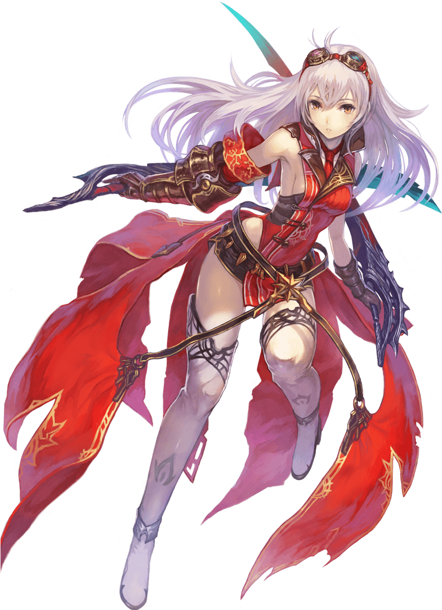
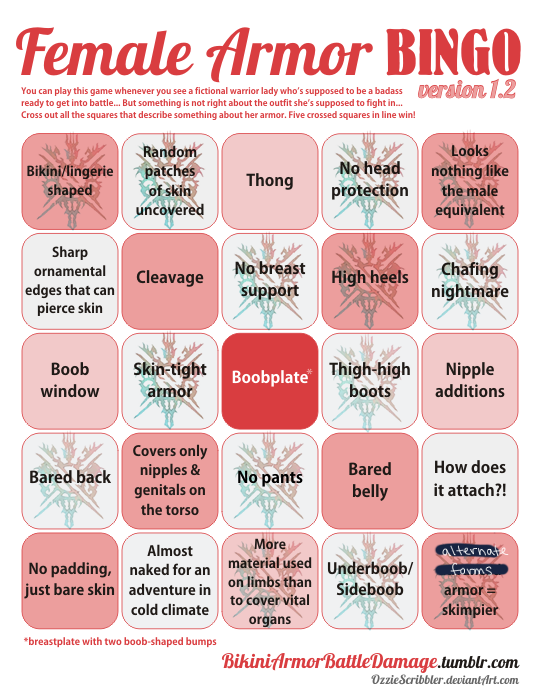
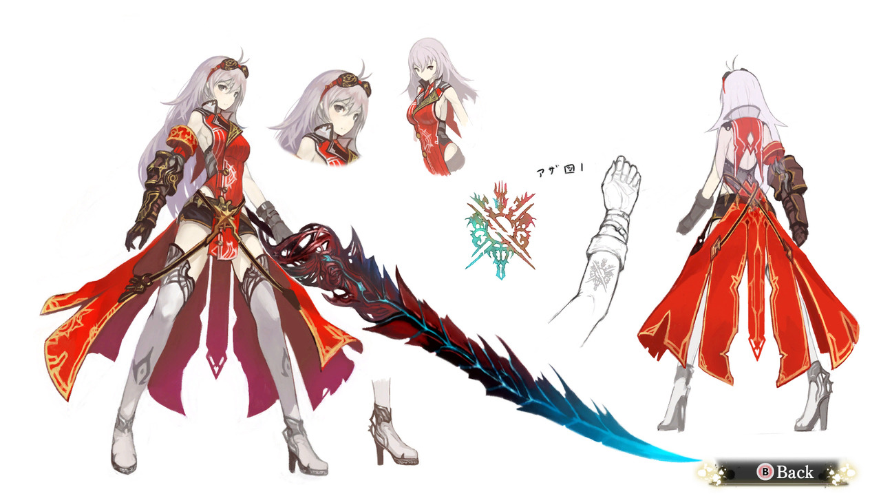
Contrary to her appearance, Arnice here is not in fact another card from Granblue Fantasy; she is actually the protagonist of a real RPG, Nights of Azure, where she transforms into various demon forms to fight things. This post is only about her main look, because each of her 5 alternate forms can warrant its own bingo.
Her design reminds me a bit of Velvet from Tales of Berseria, except they have the opposite problem in the front: Velvet has a bare stomach, and Arnice has bare sides and back. I suppose that putting them together will make one good design, at least from the waist-up.
Also, I checked whether that tiny piece of black fabric on her hips is a skirt or shorts, and it’s a skirt, because of course.
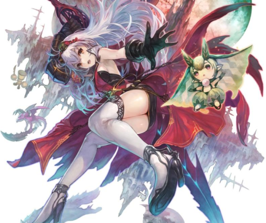
It seems we also have another attack of the Samus Piss Shoes…

-Icy
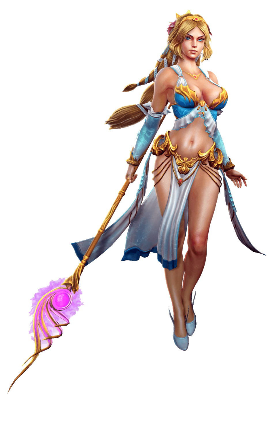
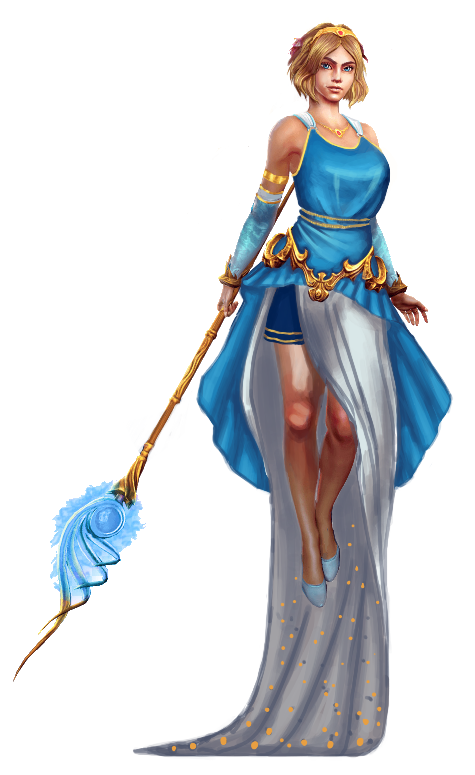
When picking out a goddess out of the SMITE pantheon to redo this time, I decided I wanted to try to make a “sexy” design that doesn’t rely on the Victoria’s Secret catalog. So here we are.
I didn’t change her body proportions at all, I only took the “in bra cup” shape out of her boobs. I gave her a draping shirt that’s more similar to ancient Greek attire. Isn’t it weird that the male Greek gods are designed to look more inspired by ancient Greek styles…. hmmmmm.
I did not give her pants, due to the ancient Greek influences, but I decided to make something out of the fact that she floats (for whatever reason). I ended up giving her a weighted skirt that would drag behind her when she moves. I imagine she could use it to great effect to look sexy or intimidating.
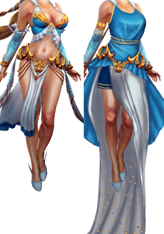
I left the belt in-place mostly because I didn’t have anything better to replace it with, but it’s definitely a bit much for the redesigned version. I think my shapes ended up being all over the place, but it’s still more interesting than the original. And I didn’t have to rely on lingerie for my design, what a shocker.
And last but not least, I changed her face to have more of an attitude and confidence.
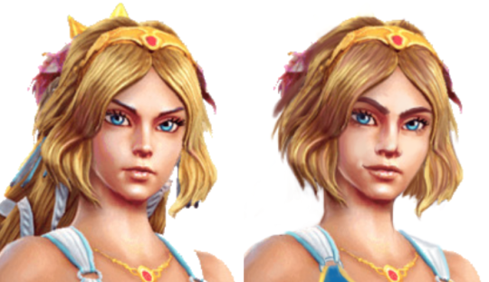
Being beautiful and sexy doesn’t mean only having a specific type of face.
-Icy