Flavie - originalFlavie - Icy's redesignMarica - originalMarica - Ozzie's redesign

Kanpani Girlfriends

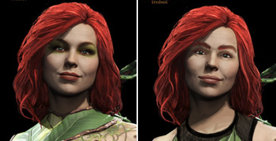
When we discovered that Kanpani Girls is a perfect candidate for our Wall of Shame, we dug through their massive library of really badly designed waifus and picked some relatively easy fixes. Reading up their bios, our choice were two Holy Knight friends, Flavie and Marica, whose defining characteristic is being self conscious about being too short and too tall, respectively. 

Liking the cute dynamic of them both helping overcome one another’s complexes, we decided our versions should be girlfriends. 


Flavie 

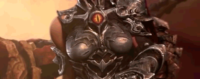
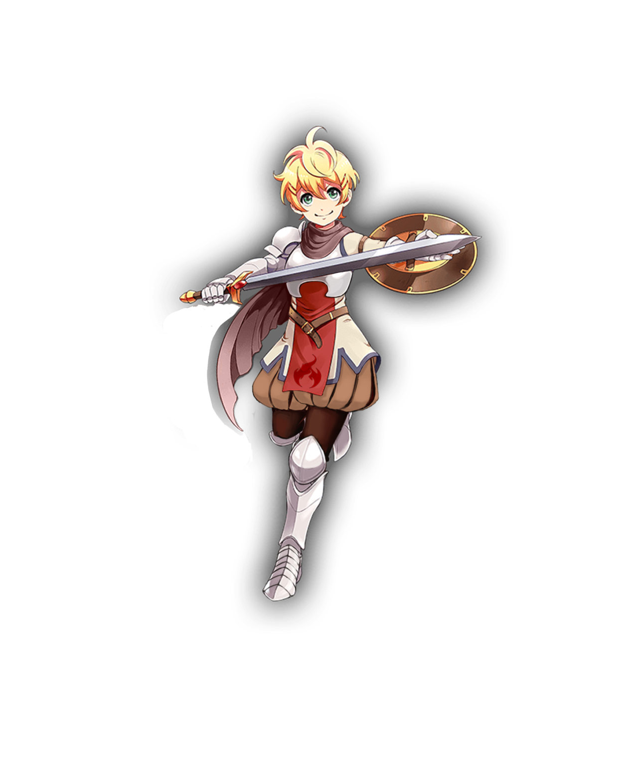
Well, the obvious first thing to go was that single-breasted boob plate, which was a…. unique design, I guess? I instead changed it to a design I saw when looking up armor references for my OCs.

image

I gave her Elizabethan poofy pants because everyone should wear them, honestly. I decided to go for an overall brown and cream color scheme, but left in the red and added some blue to tie the colors in with Marica’s red and blue details, since they are girlfriends. The flame on her tabbard comes from her element in the game, which is fire. Her design is basically all large and medium-sized shapes, so I wanted to add something small. It’s hard to see, but I also gave her a cream-colored sleeve on her left arm. Finally, I adjusted the scarf shapes to look better, both around her neck and as it blows in the wind.

Even though the final redraw is fairly simple, it was definitely fun to work on. I ended up trying like 3 different pants shapes for her before I settled on these. Cell shading is definitely not my thing, though.

-Icy


Marica 

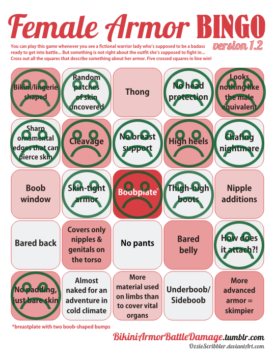
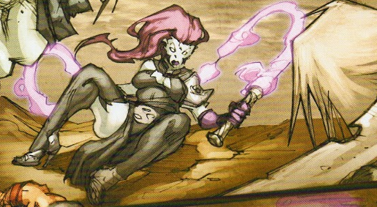
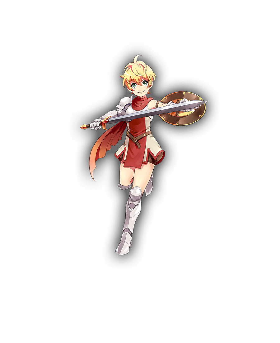
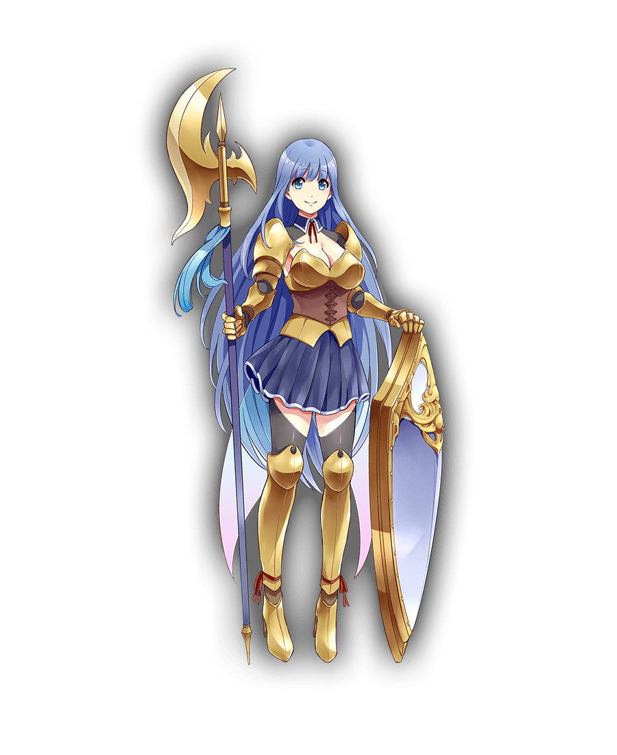
It was one of those designs that’s very close to working as a stylized girly armor, but doesn’t, because someone HAD to give her big ol’ cleavage and exposed thighs. So, my aim was to bring back its potential. 

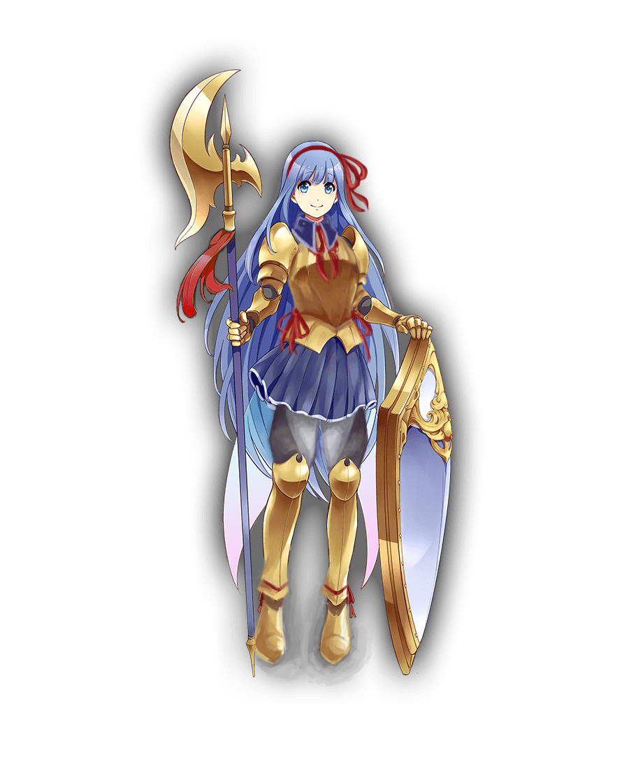
I’m quite happy with how the breastplate shape came out, with its high curve and slightly bigger tassets. First I intended to incorporate that leather cincher into it, but it just didn’t work. I also gave her semi-poofy pants with diagonal pattern similar the absurd shape of her original  thigh-baring stockings. 

Another thing was to make her shoes at least a tiny bit flatter and more planted on ground, considering the original artist drew her as if she was floating in air rather than supporting her own weight on her feet. High heels not only are universally stupid footwear for a knight, but Marica is supposed to dislike being tall! Why would she wear shoes that add to her height? 

Finishing touches were to establish her better as the girlish one of the couple (big part of her and Flavie’s actual bios) by making her red ribbon/bow motif more significant, especially with hair bow that nicely contrasts with her blue locks (inspired largely by the ending of one of my favorite anime). Also last minute change: decorative piece on her halberd is now red too, to tie everything together.

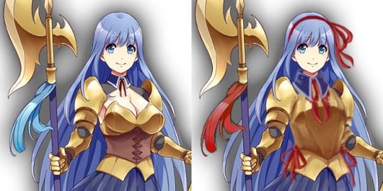
Bonus point that red accents connect her to Flavie 🙂

If I were to do it today, I’d also turn her skirt and collar into the same graphite color as her armor joints and dark part of her pants, so that they wouldn’t blend into her blue hair.
All in all, not my best or most complex rework (I also had big trouble with cel shading style, obviously), but I think it goes to show how small changes can make a difference between gratuitous sexualization and cute girlishness. 

~Ozzie

Tidy up Tuesday #80

For those who personally dislike our stream redesigns aesthetically – please just say that instead of trying to justify your negative opinions with character lore.

Using Thermian arguments to validate your dislike of someone’s artwork is not a flattering look.

Regarding our reference to the Jessica Price controversy in last week’s throwback: Even if we believed that she grossly stepped out of line (she didn’t) or that Deroir didn’t mansplain to her (he did), or that Peter Fries firing proves it’s not about sexism (it does not) – we do not and will not support the actions and statements of Mike O’Brien, and by extension: AreaNet.

A couple days before that post we made a reblog about Mike Choi telling his critics to go fuck themselves and listed a couple other male professionals displaying similar behavior and keeping their jobs. That tells you everything you need to know about double standards in the industry and is, by far, the critical aspect of the conversation. 

For in-depth analysis of the Price case, we highly recommend this comprehensive Twitter thread by John Teasdale.

~Ozzie, – wincenworks & -Icy

Joust for Fun: A Historically Inaccurate Card Game

Joust for Fun: A Historically Inaccurate Card Game

Joust for Fun seems right up our alley, with the super adorable artwork and inclusive characters. 

“Historically inaccurate card game” is such nice, cheeky tagline for a game that *gasp* dares to have such characters as well-armored princesses and Mexican wrestlers joust against each other. 

Who cares about “historical accuracy” when you can be awesome and cute instead?

Also, props for making their Kickstarter promo video a Princess Bride reference (+ a gender non-conforming princess!). 

~Ozzie

So, Darksiders III is coming out in November and of course we’re getting the promo videos and Fury looks… well the kindest thing that can be said is that she looks better than the comic indicated she would.

image

Naturally this has led to a certain demographic deciding that her appearance is… unsatisfactory and they last year they needed to declare their discontent and declare it representative of “gamers” and alleges that the design above makes her “armored up to the point of being unfeminine and almost no more clearly recognizable as woman.” (actual quote, after having a year to edit it)

image

I mean…

image

– wincenworks 

When I first watched that trailer, what struck me most is how SERIOUSLY it takes itself, while having a heroine who looks just. that. silly. 

And gamer dudebros apparently think that THIS is “SJW pandering”, REALLY? Being encased in skin-tight metal, including a boobplate so ridiculous and badly designed it doesn’t even warrant breast support of a basic bra? 

So now, in salty dudebro terms, both this and this is a “politically correct” armor “too unfeminine and no longer recognizable as a woman”: 

image

~Ozzie

“Sex sells. Deal with It.”

“Sex sells. Deal with It.”

bikiniarmorbattledamage:

castleintheairwaves:

This is a great article that does a good job of explaining exactly why arguments excusing ”sexy armor” are invalid and altogether ridiculous.

This awesome article not only thoroughly explains why there’s no way to logically justify sexualization of female characters in video games, but also highlights the struggles that women in the industry go through:

The thing is, in this industry, you don’t want to be “that girl.” The world has communicated very thoroughly, with Anita Sarkeesian’s death threats, with so many comments on Kotaku, and with comments in the hallways of the workplace and the podiums of conventions, that being “that girl” is bad. Real bad. Potentially end of career bad.

But it’s not just dangerous for potential ramifications on career trajectory. There’s also a social component of how “that girl” is insufferable, annoying, and should be punishable by shaming. 

Many female game designers, anonymously and publicly alike, confess how they have to deal with sexist standards of the industry, just so they can keep their jobs. It’s a legit problem that men, especially the ones chanting “sex sells!” or “it’s intended for male gamers!”, are either blissfully unaware of or willfully ignorant (my bets are on the latter option, though).

Please guys, read the whole thing.

~Ozzie

People are often quick to dismiss arguments against the conventional wisdom that “sex sells” as “politically correct” idealism.  But one of the most compelling argument against the slogan comes from the other side of the political spectrum.

David Ogilvy was one of, if not The great iconic Ad Men of the 1960’s.  Unsurprisingly he was deeply invested in the idea of gender roles and claimed “I am less offended by obscenity than by tasteless typography, banal photographs, clumsy copy, and cheap jingles”.  He also (literally) wrote the book on how to create effective advertising and measure the effectiveness of your advertising. 

He was, amazingly, admantly against introducing sex to sell any product that wasn’t inherently sexual in itself for one simple reason:

All his research and experience in advertising told him it would not work.

What did Ogilvy very sincerely believed was the first step in creating effective advertising an massive sales? To create a high quality product.

That way all that was required was to sincerely show the customers why it was a great product and the rest would take care of itself.

So when developers distort their products (comics, books, movies, video games, etc) by cramming sexualised imagery into them with the mentality of “sex sells” so “more sex will sell even more” they are actually sabotaging their product’s reception, reputation, sales and it’s marketing campaigns.

At least according to an old white man from the 1960s who always assumed women should be house wives… and also happened to be one of the greatest thinkers in advertising.

-wincenworks

This week’s throwback – an article analyzing the very dubious idea of “sex selling” everything, including decidedly non-erotic properties, in video games. 

Bringing it back particularly because it mentions how it is a professional suicide

for women in the industry to call out sexism in game design and narrative.
And, in light Jessica Price’s of ArenaNet firing, we learned how even talking back to a male gamer community member can lead to the same. 

Sadly, we still operate firmly in the reality where “sex” (or rather: erosion of female self-esteem) is considered a marketing booster and women speaking out for themselves in any way get shoved aside, so we don’t have to have the uncomfortable conversation that maybe they have a point.

~Ozzie

Couldn’t help but make this joke out of the accompanying image from the Jessica Price article linked above.

image

Don’t know if the writer did it on purpose or not, but thanks!

-Icy

Poison Ivy’s Design Team has Clearly Never Touched a Plant

We’re going back in time a little with this one, as I was working on this at the same time that Ozzie was doing her Starfire redraw. With this one, I was mainly focusing on giving her an actually plausible costume for the Gritty and Realistic “aesthetic” (insert a few more quotes around that word) of Injustice 2. Wearing plants against bare skin sounds like a bad idea to me, so I instead decided to give her a sports bra and shorts, and a leaf dress on top. After all, Black Canary and Harley Quinn (and Catwoman, sorta) get to wear Real People clothes. Why does Ivy have to (ironically) get the rash?

I also wasn’t really a fan of the almost militaristic “plants should rule the world” motivation she has the game, so I decided to just make her into an overenthusiastic plant lover. Although her vine…. things, have bigger teeth, she’s got a bracelet and flowers on her sensible non-high-heel shoes, as well as moss on her legs so that the green is not restricted to only the top half of the design.

image

Her makeup was predictably hideous, so I reduced it and gave her a more defined face shape, though I should have given her deeper eye sockets. I decided to give her lip gloss instead of the cliche red lipstick, because I was thinking that if I was going to a fight, what kind of don’t-have-to-worry-about makeup would I put on in 5 minutes? Mascara and gloss were the ones.

image

I think with more time, I probably could have worked the design to be more interesting, with vines and flowers everywhere. As it is now, it’s a pretty simple design overall. I rendered the crap out of those frigging dress leaves though!

-Icy

Tidy Up Tuesday #79

Things to address this week: 

When submitting a bingo, please make sure you’re also submitting the image of its subject.

Yes, we agree there are some problematic aspects with the recent Hanzo pic,  specifically the idea of masculine Japanese men being yakuza and the depiction of dominance of a Chinese and Korean woman.

The artist made questionable choices, however we find it difficult to put the blame entirely on them. Blizzard has created Hanzo as a combination of samurai, ninja and yakuza with essentially no supporting cast – to the extent the female East Asian characters are Mei and D.va.

But hey… we have the diversity of hamster version of D.va now so…

image

~Ozzie, – wincenworks & -Icy

“Unsung Hero #1″ by Chris Casciano

Do you love the rough, painterly metal aesthetic, and illustrations of people in armor? Well, then do I have the art series for you!

This definitely looks like a realistic armor, which means that while it may not be designed with aesthetics first, this piece feels real. It definitely looks like a portrait of an actual knight. I love these kinds of works because they normalize women in armor. She looks like just another knight, and wouldn’t that be nice, if woman fighters were seen as normal and mundane as men. Not to mention, the style is wonderful.

I definitely recommend checking out the Iron Cast series. 

-Icy