The hilarious front line in the tragic war against ridiculous female armor
Tag: bikini armor battle damage
Posted on
Posted on
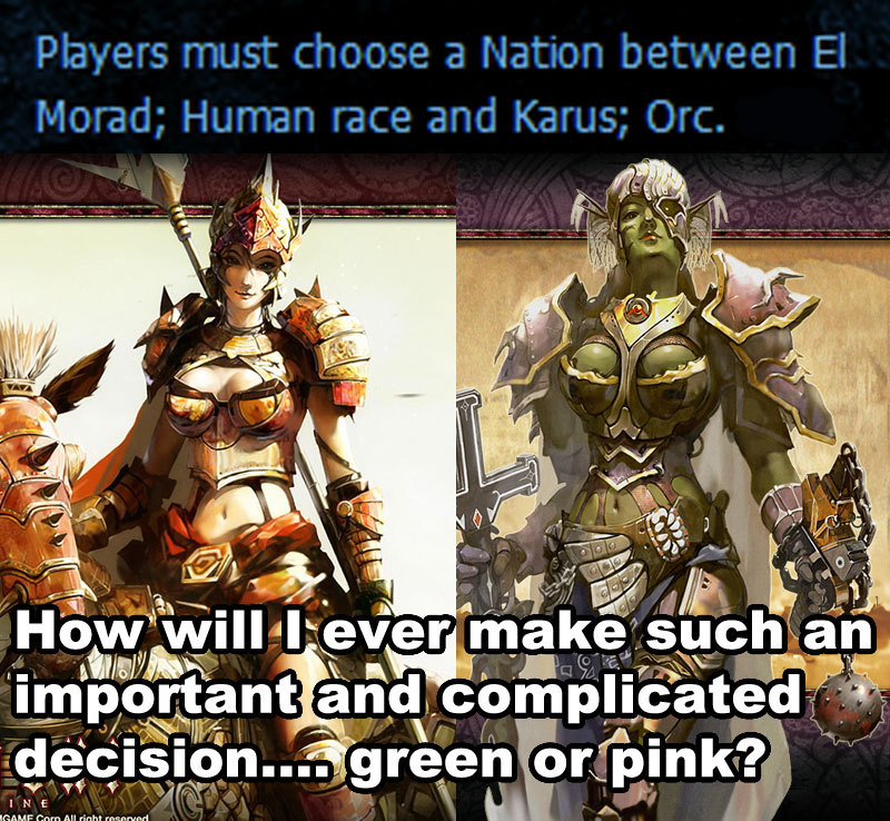
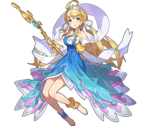
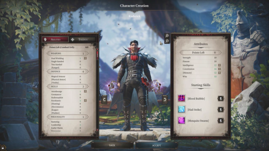
Boring LoL ladies redesign, Part 2
Unimaginative and pointless bikini armor? Clothes that don’t make sense? A two-color color scheme? We’re got it all, on this week’s League of Legends redesign feature.
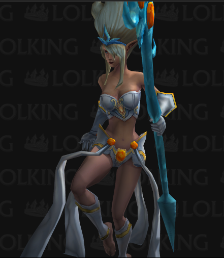
(We included a bonus image cause the redesign picture doesn’t show the full Generic-ness in all its glory. Enjoy!)
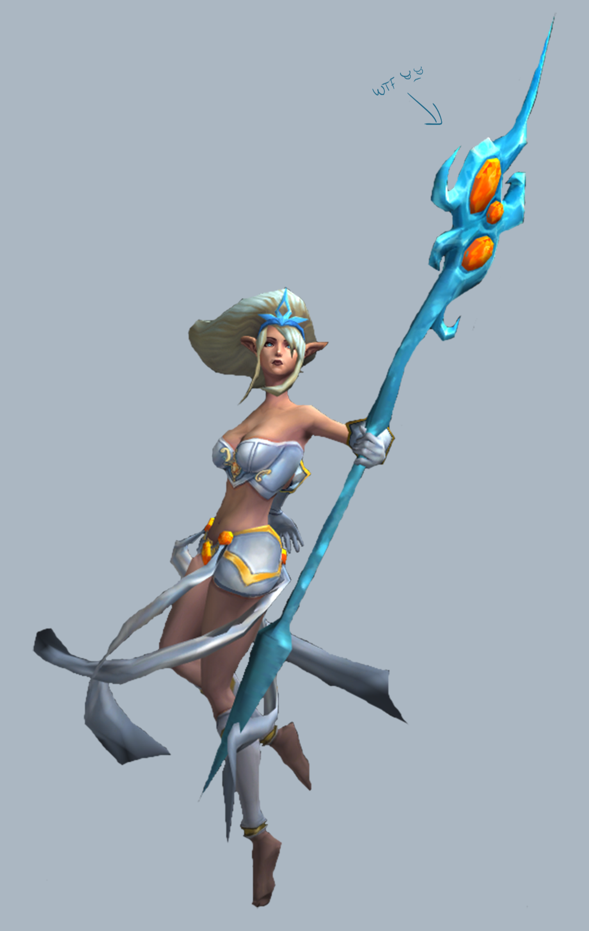
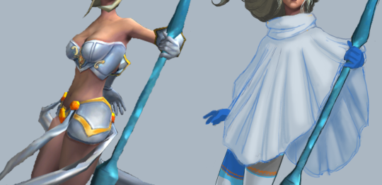
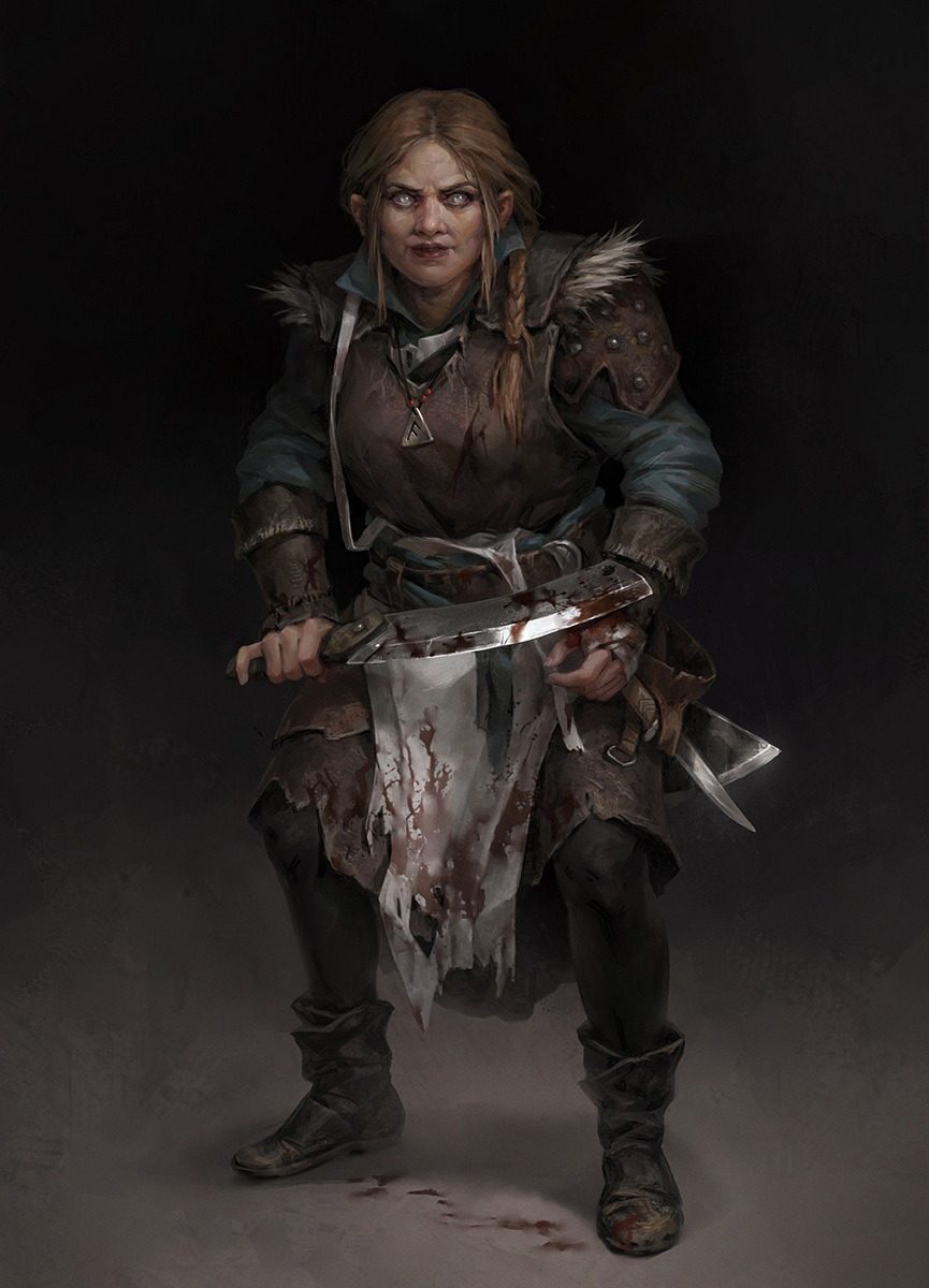
Boy, do I know how to pick the worst ones. So according to her (old) backstory blurb, Janna is an Extremely Talented wind sorceress, to the extent where she sort of became one with the wind. She’s aloof and fickle, focused entirely on her craft. Maybe that’s why the designers thought they could dress her in a swimsuit? “She doesn’t care what she’d wear, right? Just put her in underwear!”
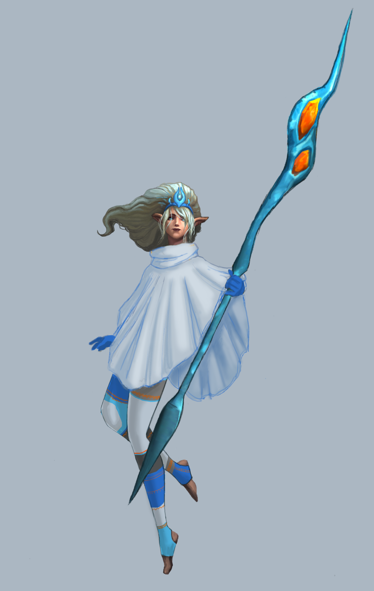
I figured the opposite: being surrounded by wind (she floats and everything), she’d probably want to be warm. I decided on a sleeved poncho so that she would be warm, while also wearing a loose cloth that can flutter in the wind, for the Aesthetic.
I made it a single, large, flowy shape, keeping the smaller shapes to frame it. I found some fun winter tights online that I used as reference. I made them asymmetrical because besides the staff, her design would end up perfectly symmetrical (hair doesn’t count), and I try to avoid that when I can. I kept the original color scheme to a simple light/dark greys and blue, colors that I associated with the wind and clouds.
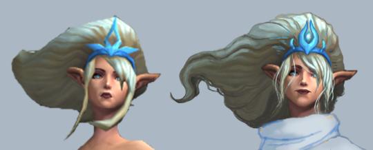
The blurb said her powers gave her an “otherworldly appearance,” but her face was just bland and generic, like most of the LoL ladies. I gave her a more elongated, narrow face, with wide narrow lips. The hair detail was mostly just me trying to work with the low-res original I had. I did shorten her bangs, to unify the hair shapes.
Finally, I changed her awful staff into a more simple wind-looking shape, and added some orange to her tights to tie the color of the gems in the staff to the rest of the design.
For people who keep up with the LoL lore (the LoLore, if you will), this design will not work for her new backstory as a wind spirit. Still, for the original concept, I’m pretty proud of this one. I feel like it’s one of my better full redesigns. It did take me longer to do than a single livestream, but I think it was worth it.
-Icy
Posted on
Posted on
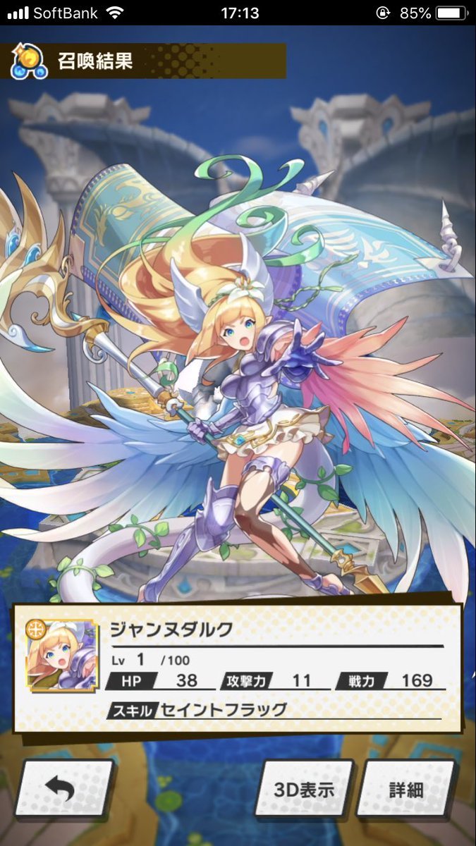
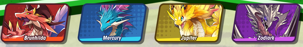
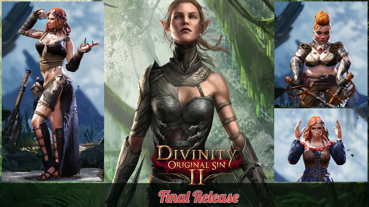
So… this latest version of Jeanne D’Arc (aka Joan of Arc) is apparently a dragon (hence the tail) but seems to also have incredibly ridiculous armor. Why does she look like a generic waifu? Um… honestly I have no idea, and I think I’m happiest not knowing – this is what the “main” dragons look like:
I’ve been trying to play the game since it came out, but the ridiculous outfits the ladies have are very distracting, and not in a “battle tactic” way; in a really off-putting way. And that’s without even talking about the game’s depiction of the protagonist’s sister.
Around May 2017 they started using their current iconic line up, the front and center lead of which has such a ridiculous costume it appears their advertising team feels the need to hide it:
Ironically, despite this apparently being less of Creepy Marketing Guy and more part of the studio culture, a lot of the content could be pretty good and they could probably get a lot more female players if they didn’t strive to save the booplate.
Alas, it seems to commitment knows no bounds:
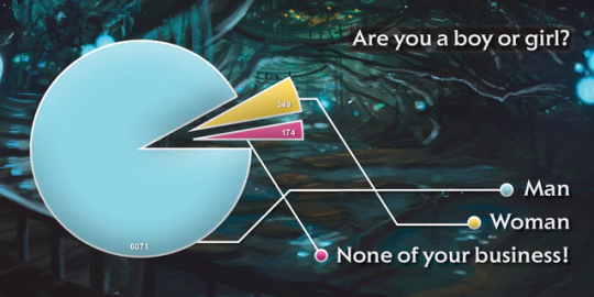
Can’t imagine why they have so few female players…
(Also for anyone rushing to accuse us of being selective of images… the comparison images are the ones Larian picked for themselves, unsurprisingly)
This is the world we live in.
– wincenworks
Posted on
Posted on
Posted on
Return of the Sexy SMITE Gentlemen
After the last time we sexyfied SMITE’s male gods, it was time to get back to it. After all, there was such an inequality among the character designs: the men were almost never allowed to be hot! We couldn’t have that.
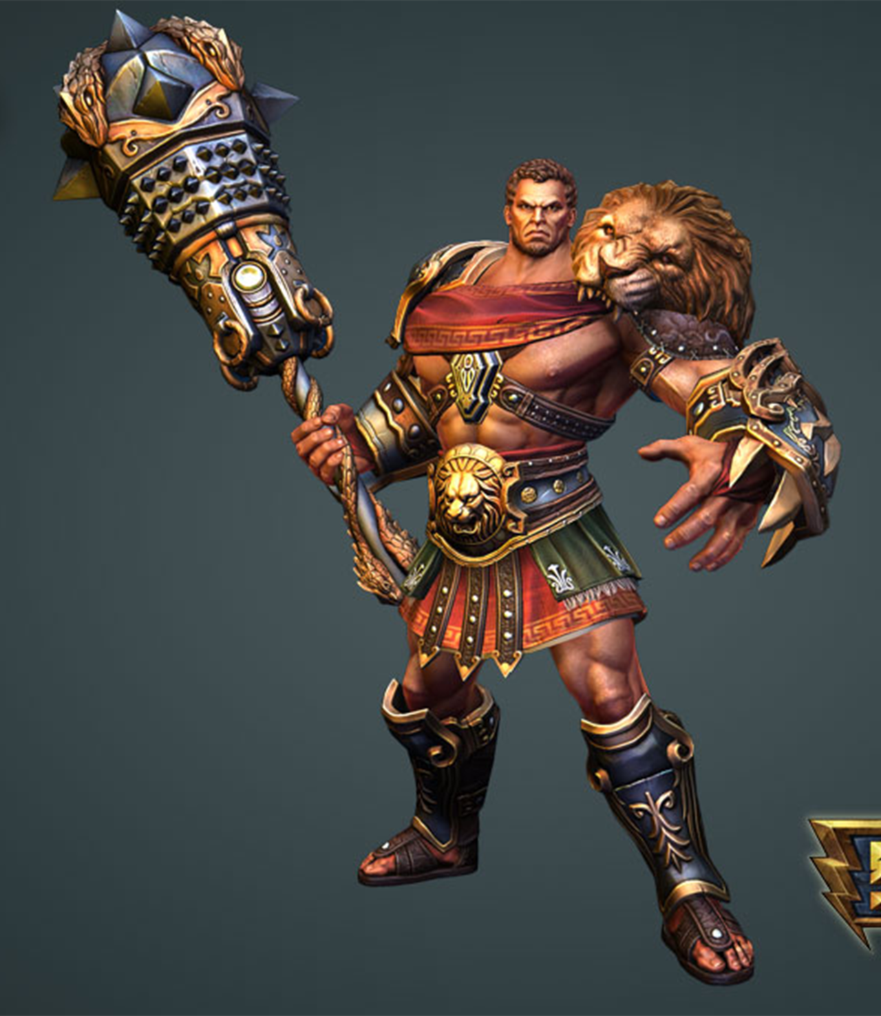
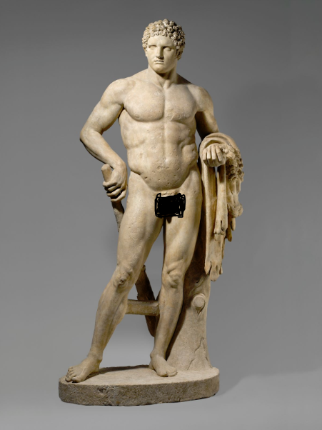
Hercules
I decided to go for the easy choice, Hercules (not Heracles, for some reason?), mostly cause I hated almost everything about his original design. Not even from a not-sexy-enough standpoint, just in general. That ugly face, the weird proportions (that lion head is like 4 times bigger than his), even the colors. So I changed all of that crap.
I made his head bigger and made him look younger, more innocent. I took away all of his ugly clothes. There isn’t even a loincloth there. I moved the lion’s head into his hand instead to cover his uh… lion, as it were. I decided to give him a furry little cape in its place on his shoulder so that his beautiful face wouldn’t be literally overshadowed.
In the end, I was trying to shade the lion so that it contrasted against Hercules’ skin, but I should have just made the mane dark brown instead of sticking to the original color scheme. But I think now he’s worthy of his Roman depictions.
-Icy
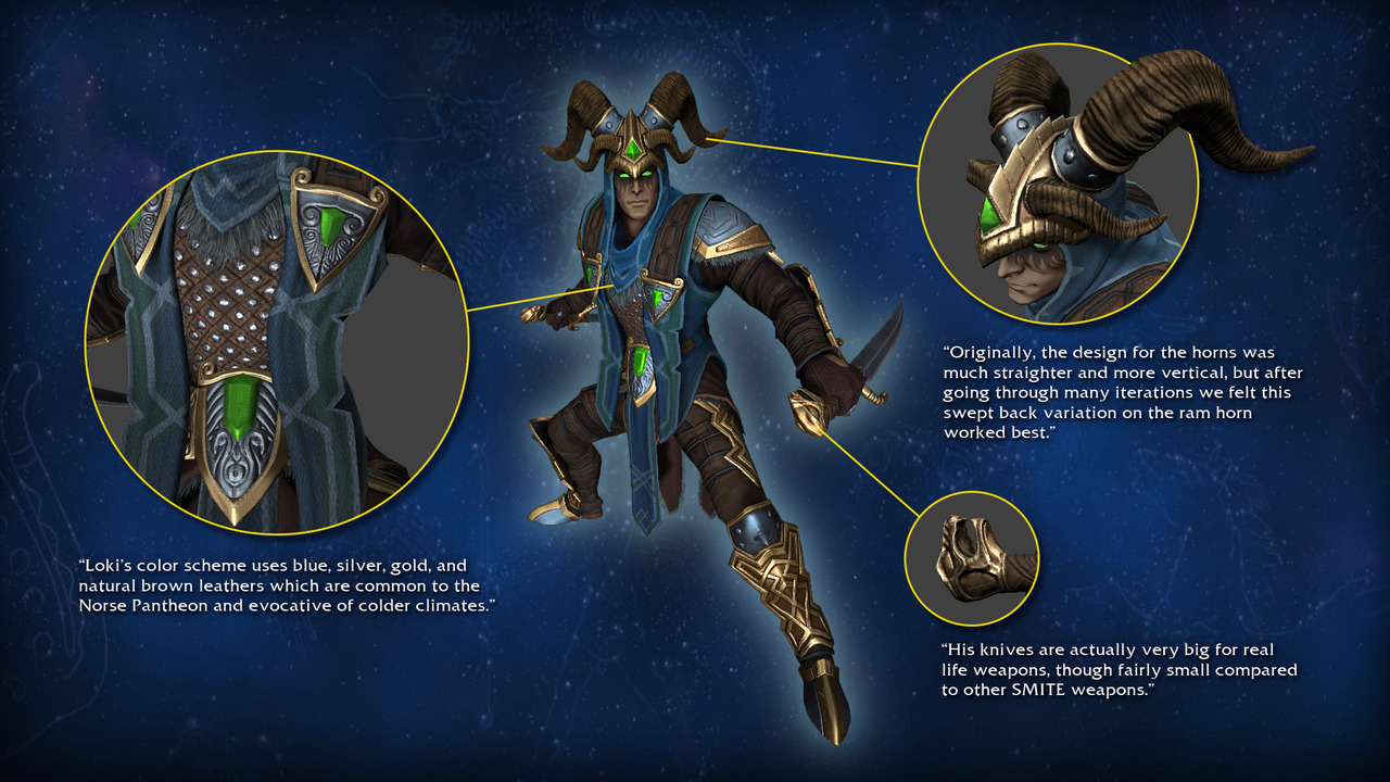
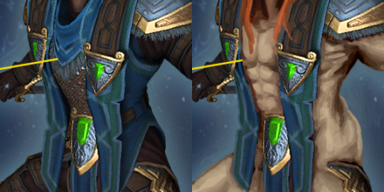
Loki
The Norse god of mischief was always plenty intriguing, even before Tom Hiddleston made Sexy Loki a thing. So I decided to very unsubtly make it clear with my redesign – by showing as much skin as possible short of making it porn.
In real bikini armor fashion, I got rid of almost all the clothes Loki had other than the sash, loincloth and armoring on his limbs. Made his skin a bit lighter and less sickly colored, because while we’re all for Norse characters being more than just white, it’s less problematic to sexualize a white dude than a man of color. Hope you all like those lovingly rendered muscles, I spent a lot of time painting them!
I also replaced his edgy hood with long fiery red hair, more traditional for the depictions of this character. Another, more subtle touch was the scar on his lips, from the time he was punished by having his mouth sewn shut.
A god who can get himself in and out of almost any trouble by shapeshifting and seducing whoever, including a horse, should really wear his sexuality on his sleeve!