

2goldensnitches submitted (and Ozzie bingo’d):
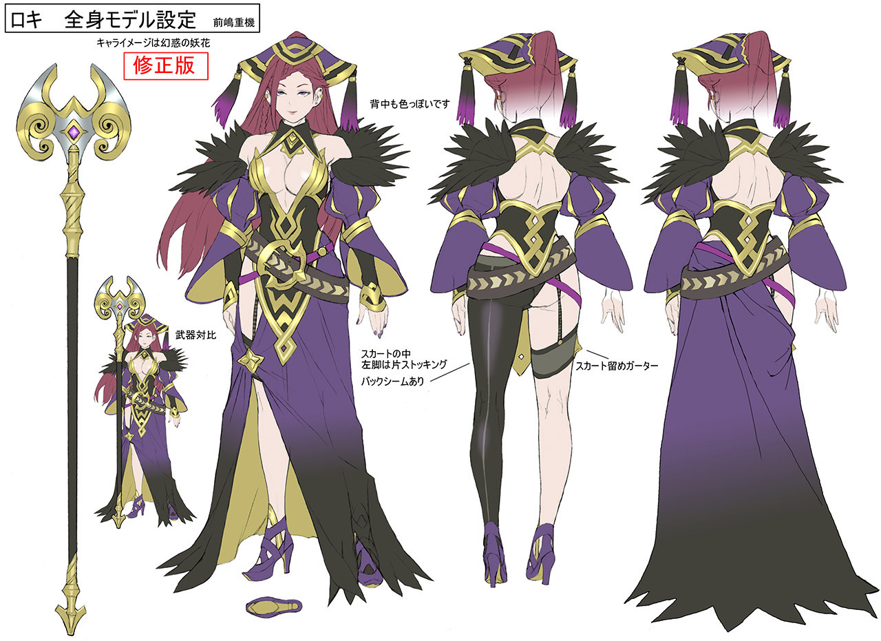
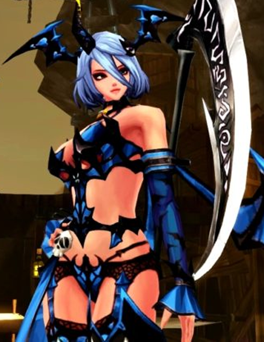
Loki from Fire Emblem Heroes. I don’t even know how to describe this.
Remember that Fire Emblem costume seemingly designed with random lasso tool movements followed by CTRL + X? Yeah, that’s hers.
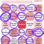
Somehow the whole thing is even worse than any individual part of it. And every part is awful. So I figured she might be in a need of a bingo.
Also thanks to other readers who let us know this character’s name.
~Ozzie
Bingo: Soul Saga
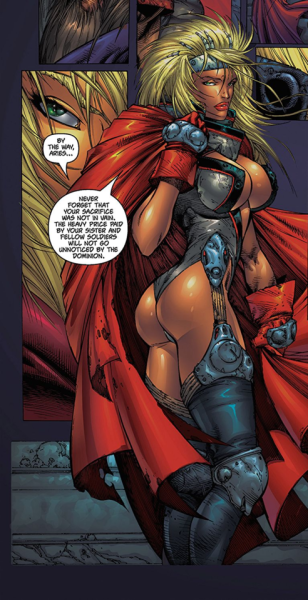
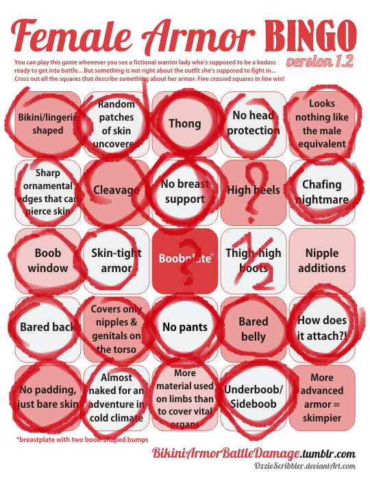

Oh Soul Saga, the distilled essence of 90s comic art… made in the early 2000s. An atrocity we featured on BABD before (decidedly not safe for work… or safe for viewing whenever)… I have one word to summarize it: WHY?
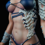
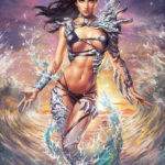
Found the first one while looking through art of Aspen’s late creator, Michael Turner, on EscheGirls. Seems like interior artist for issue #2 (second image) agreed with Turner about the boobs & butt pose, then was selective about the costume elements, like the thigh-high boots.
~Ozzie

giantpurplecat submitted:
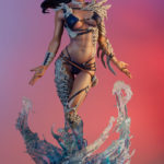
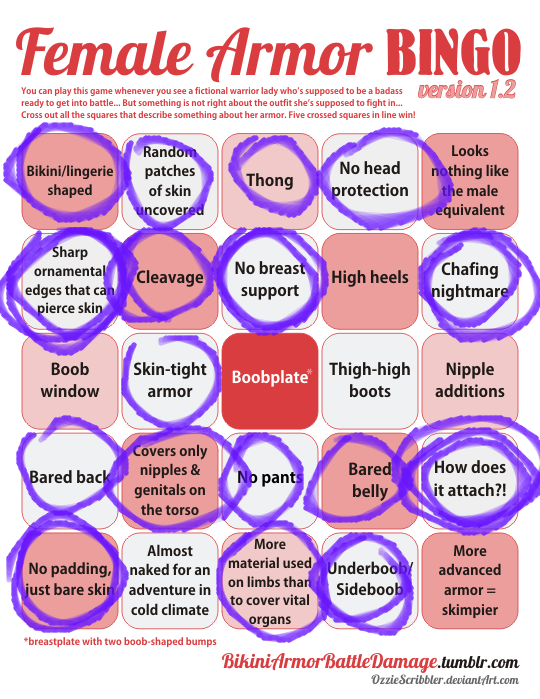
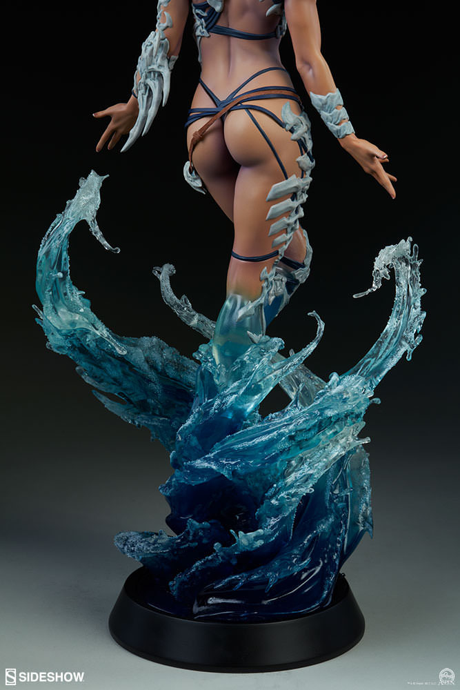
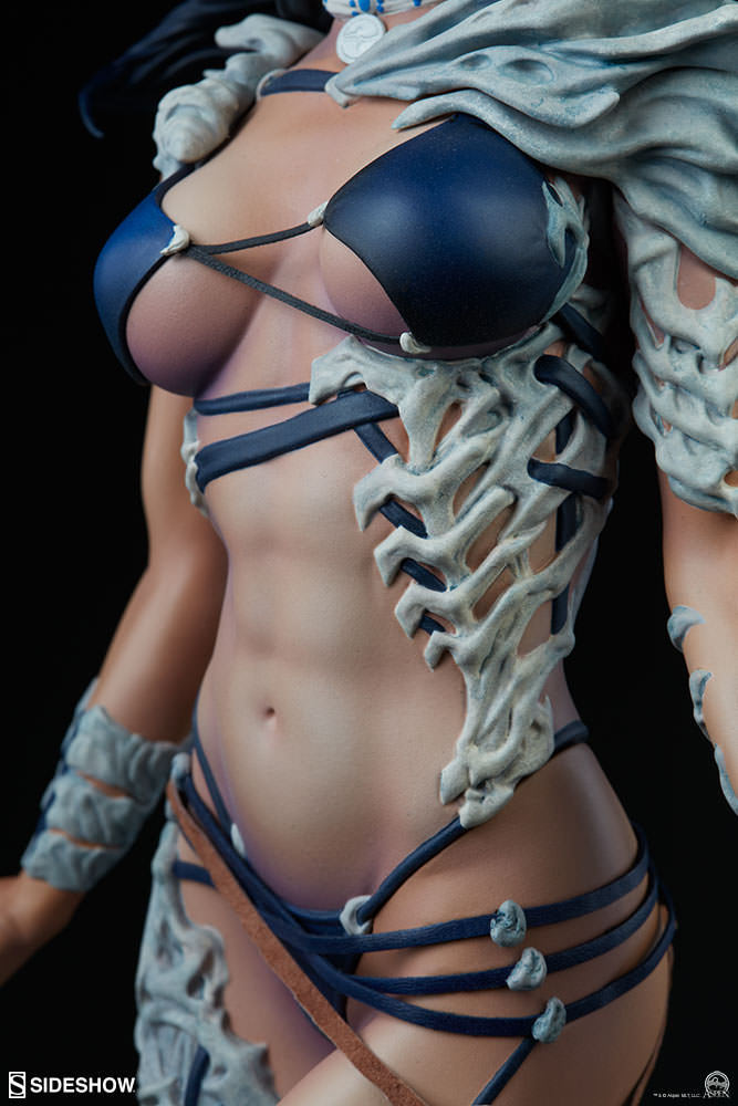
I got an email notification from Sideshow Toys and saw this statue featured in my email. I’m just questioning how that bra stays on and doesn’t snap and how the bones aren’t piercing her skin. (I imagine they would if she were to move around.) This also feels very BABD Bingo worthy.

It always disappoints me how much detail goes into making high quality figures of such shitty character designs.
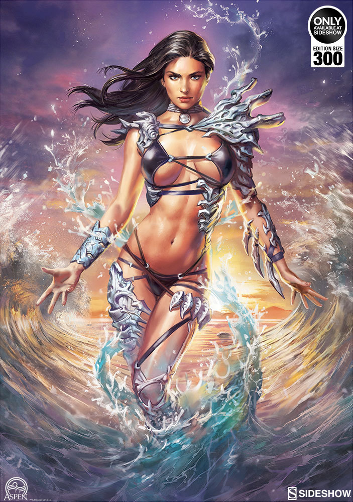
Clearly people who translated this atrocity from the comic Fathom into 3D form put a lot more thought and hard work into the toy than late Michael Turner who came up with Aspen’s appearance in the first place.
I think it’s safe to say that we’ll be revisiting at least one figure from that collection sometime soon:

~Ozzie
Speaking of the description:
The Aspen Premium Format™ Figure stands 22” tall atop a helix of water, which swirls and swells under her command. Aspen is stepping through the surf with ease, with windswept hair and a comfortable, confident pose featuring semi-translucent legs as her aquatic abilities are at work. … Fans of the Fathom legacy will recognize Ernie the seahorse frolicking in the waves beneath her feet.
If that is indeed what the creators consider a “comfortable pose,” then they might want to consider doing professional gymnastics. But Ernie the seahorse is indeed the best part of this disaster.
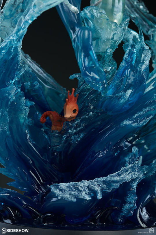
Can we get a solo Ernie statue, please?
-Icy
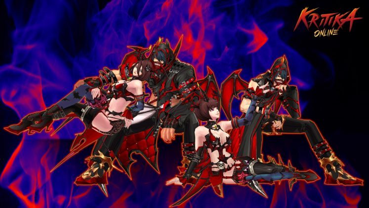
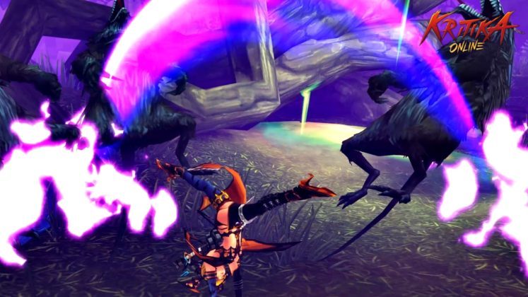
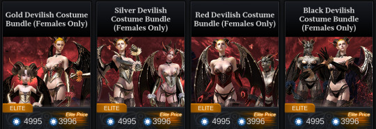
From the same publisher as TERA Online, it seems that Kritika Online has decided the best way to celebrate Halloween is to release the most generic bikini armor humanly possible.
What’s worse than the obvious complete lack of any attempt at creativity is that this may literally be a rejected version of a concept on sale in TERA’s own Halloween store specials.
– wincenworks
Warhammer Battle Bikini Brigade (and more)!
@universe63 submitted:
From this article
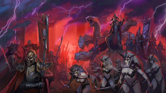
This was the first image in the rotating slides for the article about Warhammer: Total War. It doesn’t get much better. Later in the article we have these two Dark Elves.
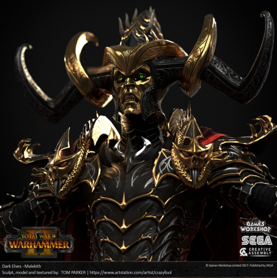
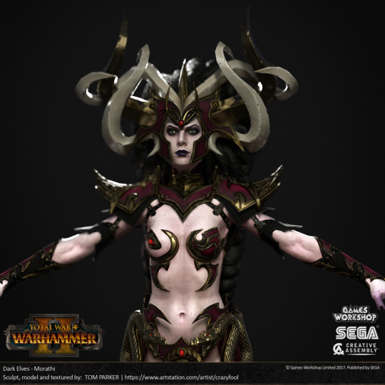
Even his frickin’ FACE is covered, but for her? Armor? NOOOOoooooo. We get… whatever those things are on her boobs that are going to gut her like a fish if she bends over and can’t possibly stay on without glue or piercings. I guess all her armor budget went into that hat.
OTOH, after showcasing the horrible, I wanted to showcase the one good female armor in there:
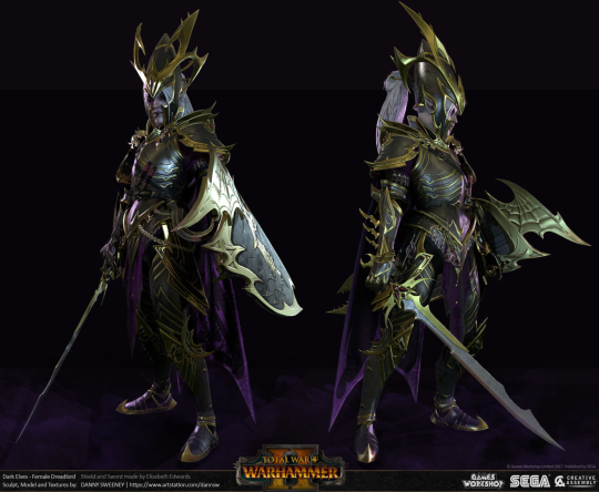
…but you have to scroll through tons of images (including more bikini armors) before you can find this one. And I can’t tell for sure if it’s a trick of the light or if she actually has a bare middrift because reasons. [sigh]
Personally I think the greatest display of priorities in these designs is this piece of concept art which could almost be “spot the difference” game:
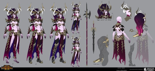
(And in case there is any doubt as to whether this is the artist or the studio/Games Workshop’s decision, I invite you to compare and contrast with the other works in Evgeniya Egorova’s Artstation gallery)
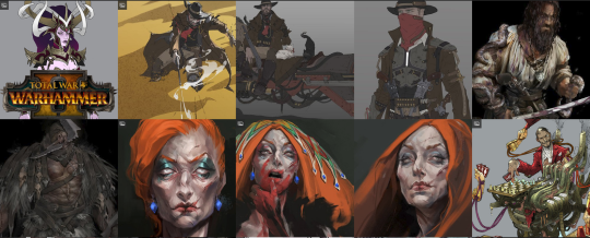
Yeah.
As is so often the case with Warhammer (and many other fantasy settings), there’s so many things to unpack in these: Bikini armor. Evil is sexy, and of course: Nipple armor.
The worst part is that I can’t even bring myself to be surprised.
– wincenworks
Evelynn
EdwardGein submitted:
Evelynn from “League of Legends” just got reworked. And it is… horrendous.
Her attire was always awful, and her splash art as well. Reworking champions should give Riot the opportunity to fix some of the generic-babe-material they started with in 2010. But here we are. 7 years later and not a thing learned. Let’s open the history book on this one…
This was her original art:
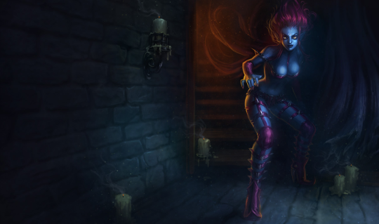
It represented so much being wrong while retaining not an ounce of appeal, at least to most male humans I know. You should get a spooky vibe, but there was just nothing there. Just spikes and leather and… not even a weapon. And those heels. The character even jokes ingame about the fact that it is hard to move in those shoes. NO KIDDING.
Then, a while ago, they updated the art. To this:
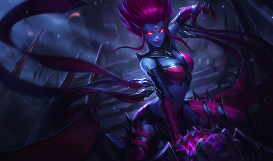
I actually like this one a tad more. The outfit is the same (because only the splash art got changed, not the ingame model) but it conveys at least something. Still not much to characterise or read into and escher-esque. But at least stuff happens and you get an idea how the character is going to play ingame. And she seems kind of lethal or at least unhinged and dangerous, which is more than you can say of most bikini-clad-“no seriously she is dangerous and can fight”-girls in video game art.
But now, they remade the character. New abilities! New story! New background! A fresh new page to change things! Aaaaand… this happened:
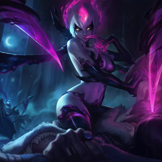
No. Nope. I’m done. Why? Why succubus all of a sudden? Why ditch the spikes and go just down to lingerie? Does that make it better instead of even more generic? Why not add a tattoo that says “I am a metaphor for sex, you guys” and ditch the whole effort?
There obviously was reason to change things, and good thing that they noticed that. But why did they take it in the complete opposite direction to make it just plain stupid. I am not an artist, who can point out all the little signs where this went wrong, but the moment I saw this, I was even more done with the game than I already was.
Oh and one of her new abilities is named “Lust Dust”.
What’s really amusing about the promotional video is that the opening the sinister assassin would suggest that Evelynn is essentially defined by her power of seduction… but then it quickly becomes apparent she’s more defined by spikes:
Now, spikes honestly makes more sense since League of Legends is basically a video game that more resembles at fantasy tabletop war game than a roleplaying game, but apparently someone at Riot Games just really, really wanted to pay an voice actress to record a lot of innuendo lines and pay an artist to draw boobs.
– wincenworks


