Marvel Villainesses: Hulk-stomping edition!
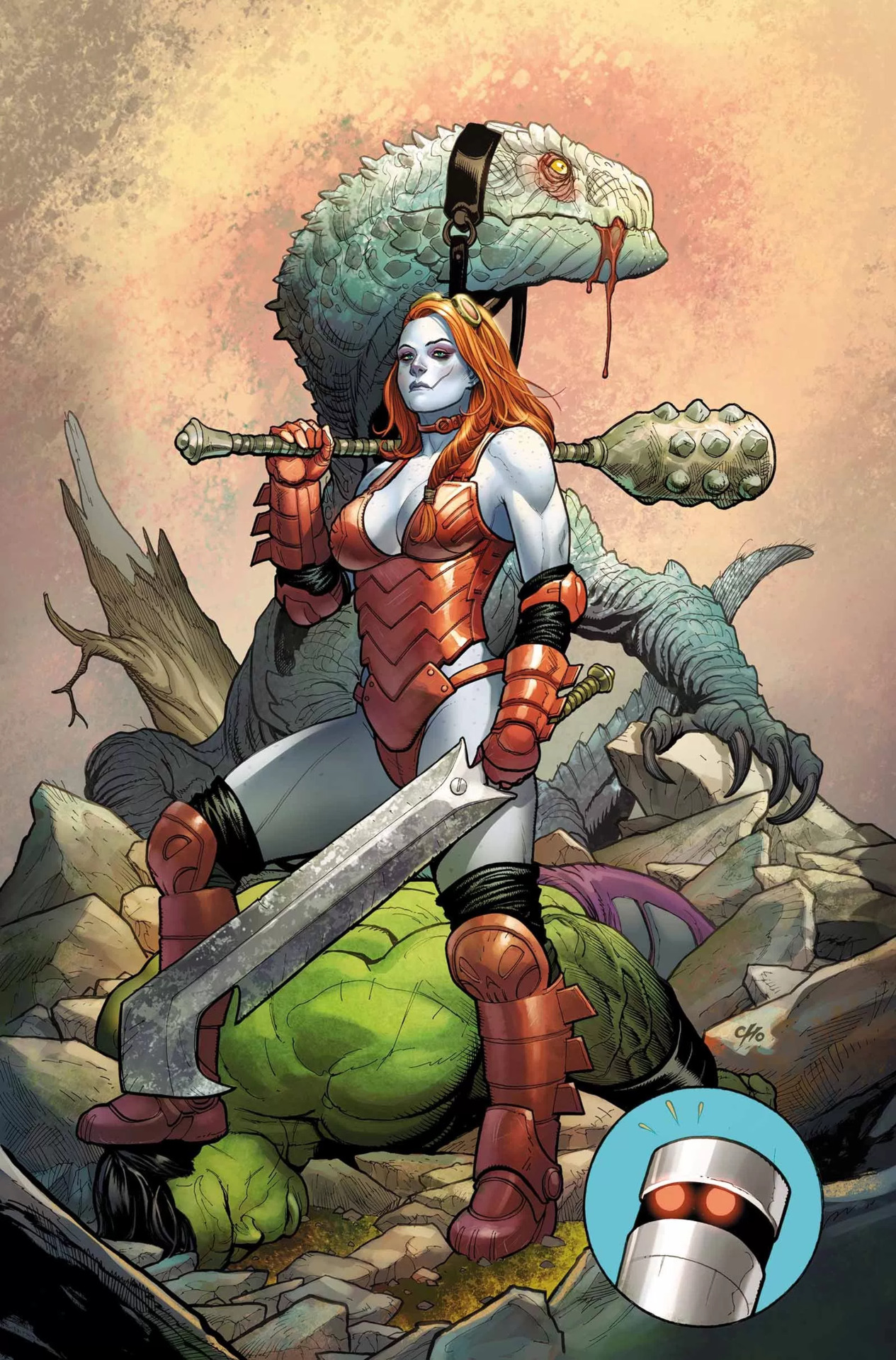
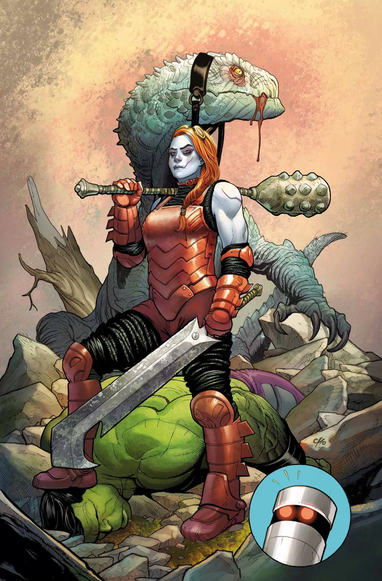
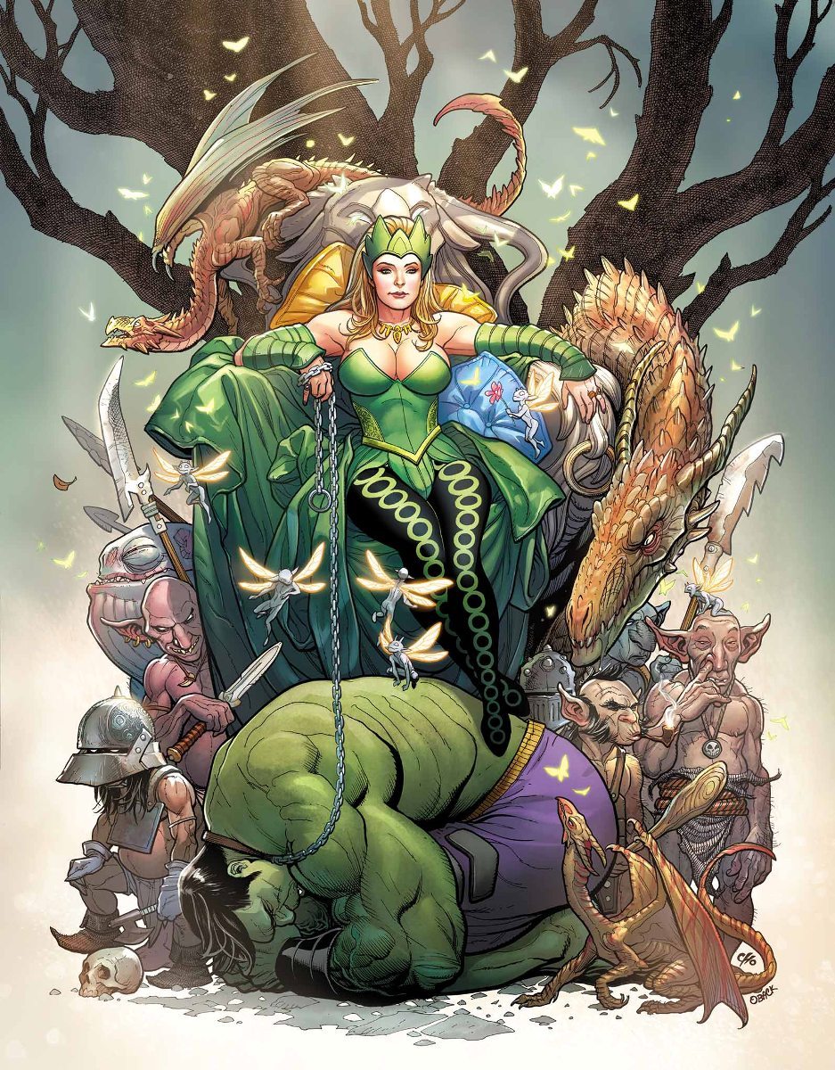
Not long after our last take on DC evil sexy ladies, we decided to balance things out with some Marvel characters as well. And by complete coincidence, we both chose artwork in which they stomp on Amadeus Cho! Clearly, that means they’re dating.
While Frank Cho is a human dildo, I will admit that unlike most other whiny dudebro artists he has actual skill and grasp of human anatomy (when he wants to, at least). This is a technically good drawing, with Hellbender’s bizarrely sexualized costume as the only real flaw
(again, those panty-line bars! (ノಠ_ಠ)ノ).
Obviously I started the fix by getting rid of the cleavage, boob cups and pinched waist from her metal leotard. It no longer looks skin-tight, especially since I’ve added some padding in the form of the same black fabric she wears under her boots and gauntlets. I liked that material enough to extend it into faux-pantlegs that cover what her new shorts (replacing what seemed like a thong) don’t reach.
Along with her armor, I reshaped her upper body. The suggestion of muscular arms was nice, so now they’re bigger, with solid thick torso to match. And a brand new arm scar, fitting the facial one.
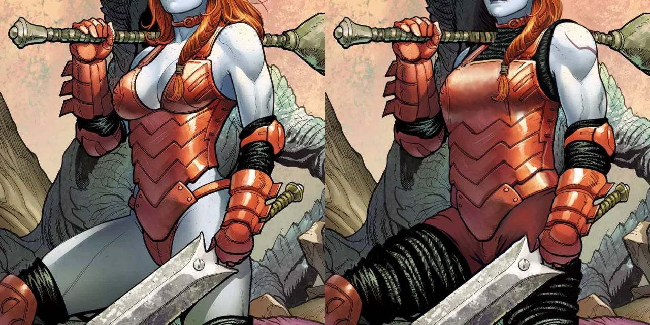
One last thing about her costume that needed fixing was her left foot, which inexplicably is drawn as if the boot was a wedge heel, asymmetrical to right foot’s flat sole.
After I was done with the outfit, her face called for some un-genericking. There is a promise of unique features in there (mainly the visible scar), but it falls short, quite obviously due to Cho’s cowardice at making her *too* far from conventionally attractive. As we mentioned before, the color scheme makes her look quite close to Harley Quinn (and arguably also Poison Ivy), which is just bad character design.
I started by changing the hairstyle into more practical one – the braid was already there, so why not make all the hair be part of it instead of flying loosely? It’s also not visible at this angle, but I decided that her right temple has some undercut action going.
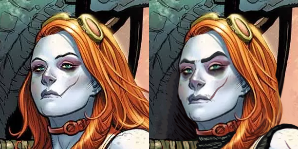
Next I made her scar more prominent with color change. Then very subtly turned her features a little more square, gave her a bigger nose, thick natural eyebrows and a tiny bit of facial hair that so much mainstream media denies to depict on women. Also extended the dark lower eyeshadow.
Final touch was, of course, the expression – no more vacant supermodel stare. Someone stomping the Hulk to the ground deserves to make an intimidating face at the camera.
It’s one of the most satisfying redesigns for me. Hope you guys enjoy it too!
~Ozzie
Enchantress
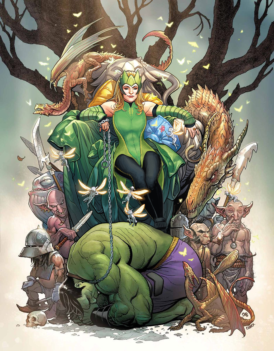
Another Hot Chick who was supposed to look intimidating but does not at all; is this a redesign type I have? All of my design choices centered on this one around making Enchantress into someone to take seriously. Most of the changes were small, outside of her tiddy situation.
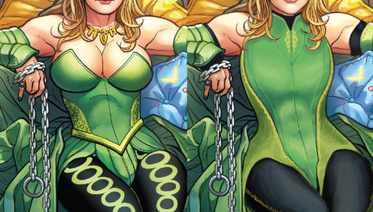
I gave her a leotard-type of thing with some nice lines to break up the big shape, and some small details in strategic places. I also made her weird side embroidery into a larger part of the color scheme. I gave her some sick abs under that costume, as well as bigger shoulder and arm muscles. To finish off the upper body, I gave her spots of black to tie her color scheme together. It’s honestly kind of jarring how only her legs have the black in the original.
Next, the leggies! I got rid of the big circles that were Bad, and gave her some stitching down the side of the leggings instead. And I gave her platform shoes to really stomp on that Hulk, rather than… daintily breaking perspective with how the Hulk’s got no shadows on him, but the chain and foot are in front of him….?
Finally, I changed her face and headpiece. I wanted her to actually look menacing, rather than like a beauty queen wearing a tacky green crown.
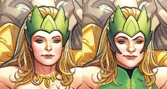
And yeah, I guess I got a thing for one-sided smirks, but she’s still hot. She’s just got more attitude and control and a more interesting face than… nothing. Y’all really have no idea how I hate the White Girl Nose so many lady characters get in comics.
This was definitely a fun one and I like what I ended up with. I personally think Ozzie and I did super well with faces this time around. Give us more Intimidating Looking Ladies!
-Icy

BattleWrong – We’re sure that Joke hasn’t been done before!
Battlerite’s a bit of a disappointment in its character design. They seem to have cool ideas (for the male characters and Iva), and their art style is cute and colorful… and yet. So why not try to fix some of their more uninspired designs?
Blossom
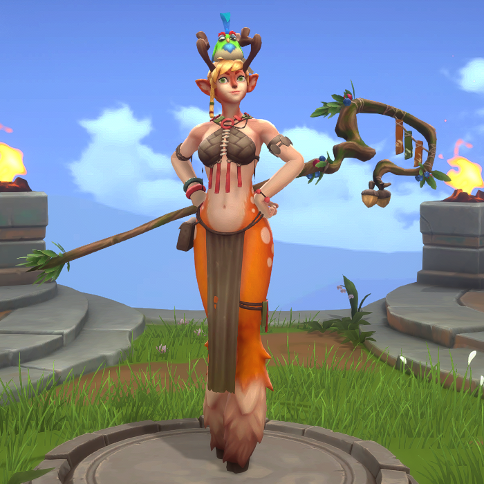
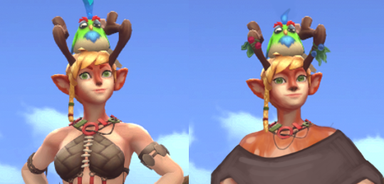
To be honest, my desire to redesign Blossom was from my deep-seated frustration with animal-looking characters having a humanoid body shape. Why couldn’t she just be like Puss in Boots from the Shrek movies? Just a deer that stands on her back legs, without breasts and a skinny waist and hips. I realize that she’s a “faun” according to the wiki, which means human/animal hybrid, but the fact that she has both hair and fur on her head/face makes it look like they just slapped some tits on an upright deer. Maybe they were going for something new, but boy did it not work.
I tried to give her more clothes at first, but then decided…. screw it. She’s a deer now. Why does she wear clothes? So in the end, I just gave her a simple poncho. I did want to show off her deer-ness, so I left her shoulders uncovered and gave her upper body some fur, so it’s not weird that she has the same on her face.
I also changed her face to be less Generic Cute Girl.
After I finished the edits, we started making jokes about just Photoshopping a deer head on her instead, so I did that. Got some images of a deer and a birb off the internet, and so Blossom’s True Form came to be. (You can still see the lines from the stock image watermark.)
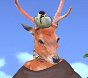
[She’s beauty, she’s grace, she’ll throw an acorn at your face.]
The result is fairly simple and could probably use some embroidery or patches of different-colored cloth, and some people might say this was an easy cop-out on my part. But I just want her to be a deer, not a deer with boobs; is that too much to ask for?
-Icy
Freya
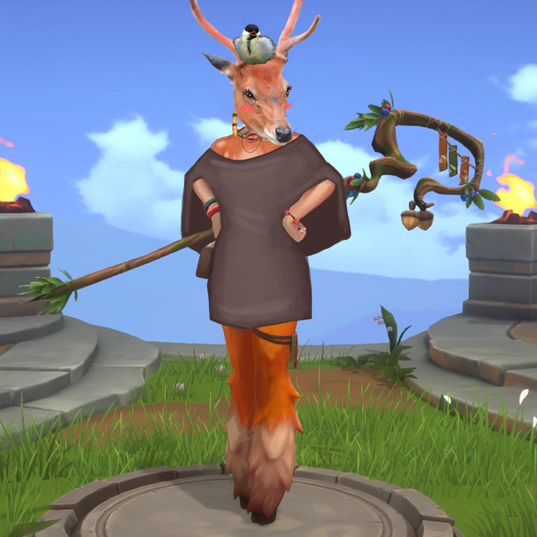
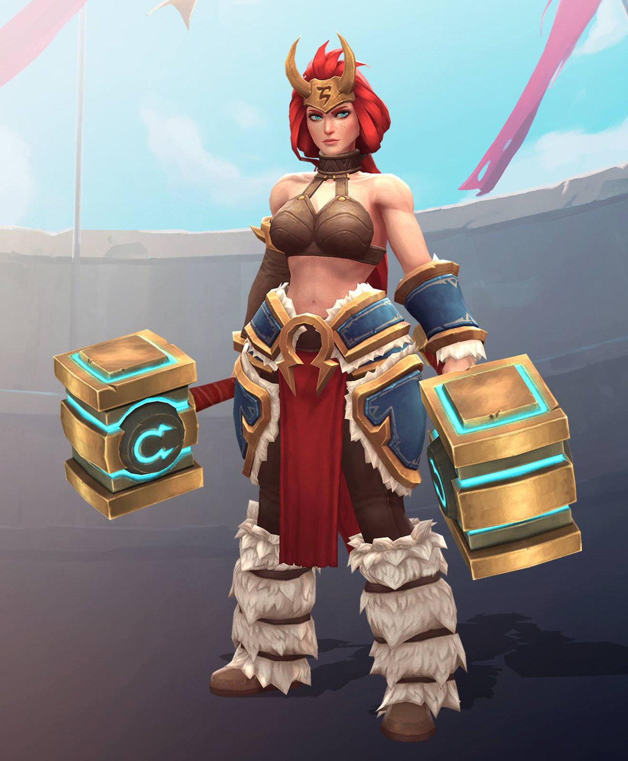
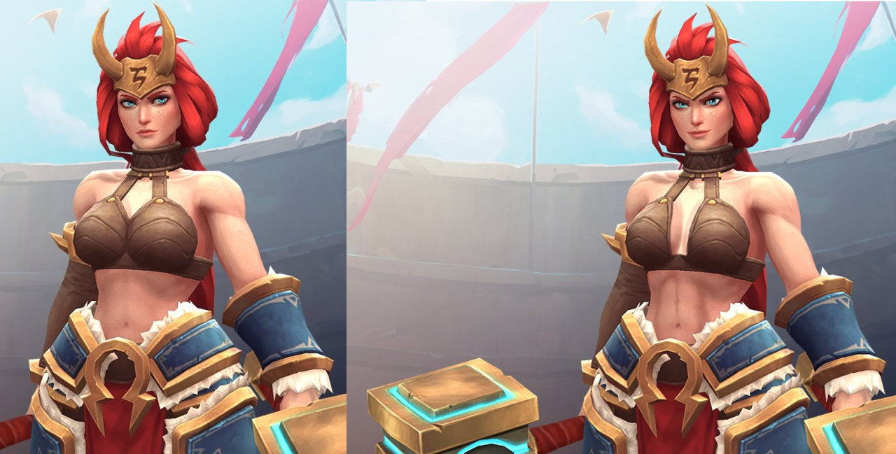
Thing about Freya’s original design is that I don’t actually find it overall bad – the random bikini top that looks like coconut shells strapped to a choker is the only thing that ruins it.
As mentioned back when we bingo’d her pre-update design (with even worse, sideboob-y bikini top!), she looks pretty great from waist down. Also, while far from unique, her face shape is allowed to be a tiny bit more angular… when viewed from certain angles, at least.
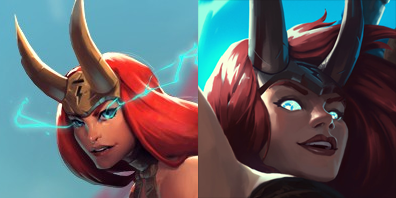
(basically it’s Zarya level of safe approach to diversity in female facial features – still conveniently attractive and wears makeup, but allowed to have square-ish jawline, given that you tilt your head and squint)
But since I couldn’t spend 2 hours of stream only painting her a decent top, I decided to build upon what’s there and add some more actually distinct features.
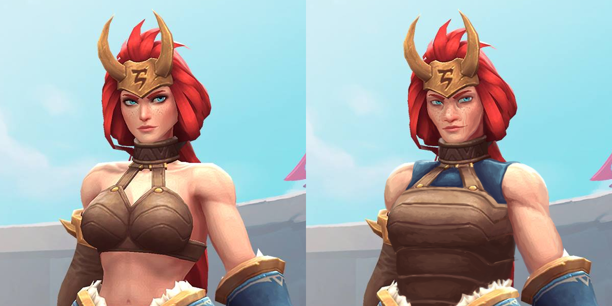
Of course, the boobplate had to go first. Since it bore some resemblance to Angela’s (coincidentally, also character associated with Norse mythology), I decided to base Freya’s new breastplate on my earlier Angela redesign. Also a blue tank top matching her bracer and tassets, for minimal layering. Left her shoulders bare, just gave them a tiny bit more heft.
I approached tweaking her face to create a more believable character. No makeup (which, unfortunately made her blue eyes with orange eyebrows stand out less), more prominent freckles, bigger nose, more sunken cheeks… All to create an image of a warrior who’s more concerned with surviving battles than spending hours in front of the mirror.
I’m rather pleased with the subtle changes to this design and my painting technique in this piece. Hope you guys like it too.
~Ozzie
PS: I didn’t know that while doing this redesign, but apparently some genius on Reddit, upon seeing slightly more boob coverage on Freya’s official updated design decided to “fix” her back to her original bikini. (╯°□°)╯︵ ┻━┻
Actual Barbarian Women (NSFW)
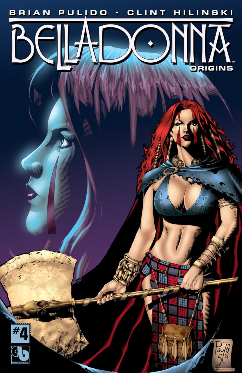
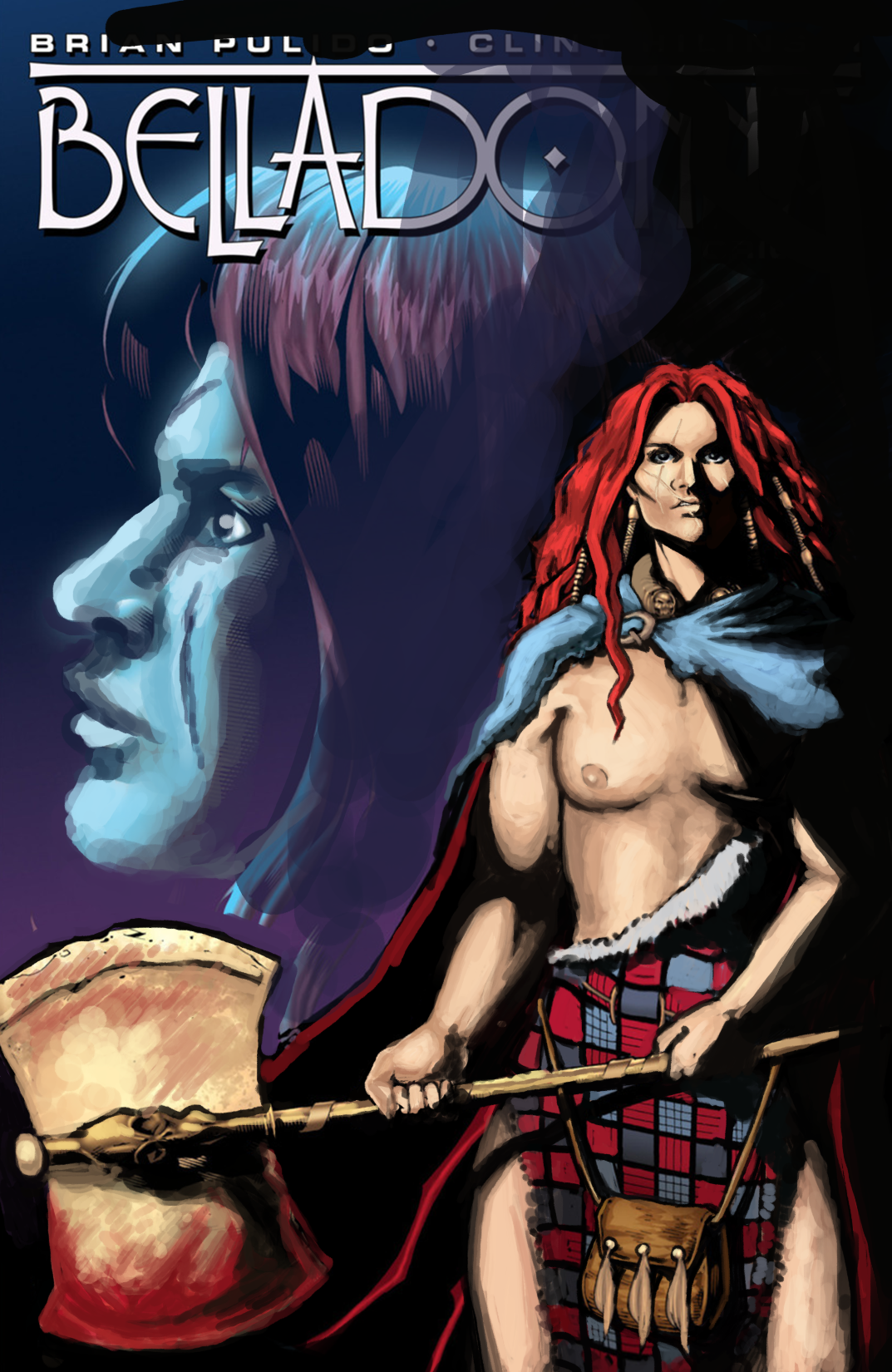
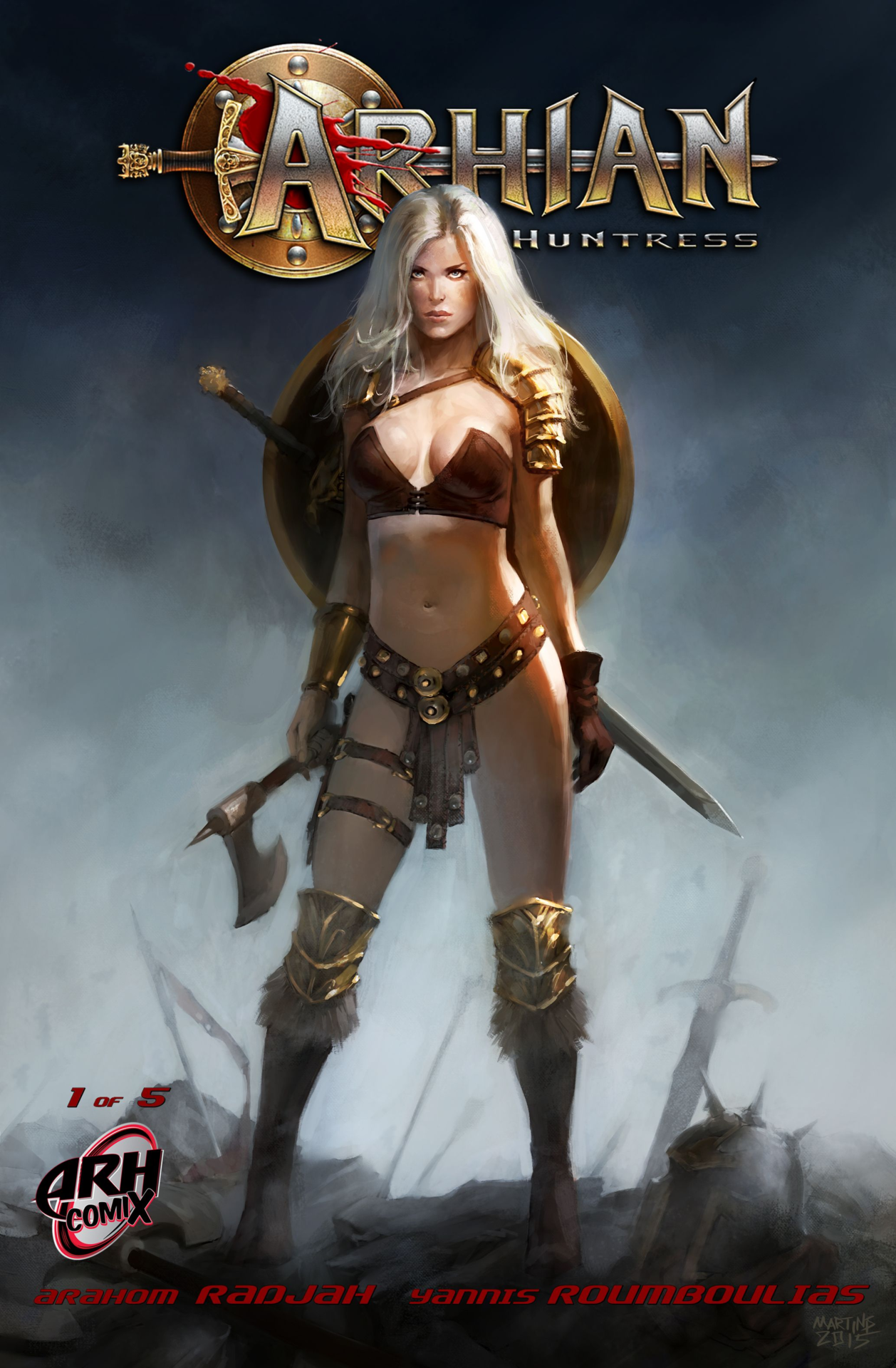
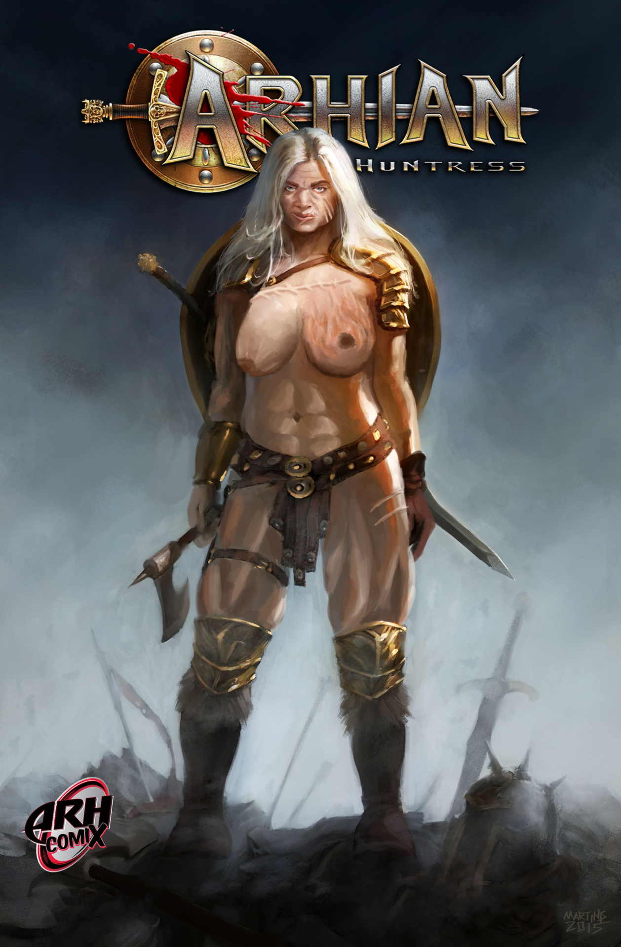
Seeing as how many “barbarian” ladies grace our blog, we thought we had a great opportunity to see the kinds of barbarian women we actually wanted to see; by drawing them ourselves! Here are our takes on 2 barbarian characters that appeared on BABD before: Belladonna and Arhian. It’s a shame we couldn’t redesign their names, honestly.
Belladonna
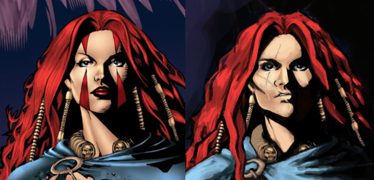
So the first thing that had to change was Bella’s boring, impassive face. I wanted her to be formidable, and I decided to play up the dramatic lighting that the cover artist tried to do, in a half-assed way. I removed her makeup and tried to make her look intimidating and experienced, overall, with the obligatory battle scars. I decided to play with the scars a bit, and so ended up giving her a slightly-disfiguring lip scar. Also, messy hair!
As for the rest of her, first thing was to get rid of her awful top. Her clothes in general seemed too manufactured-looking, so I ended up making her kilt into a more ripped and imperfect-looking garment.
I then gave her more muscle and an overall larger frame, and changed the way she was holding the axe, because her original hold on it looks like a nail polish ad pose. The thing doesn’t even look like it’s heavy in the original! Now it has blood on it, too, which was to add to the intimidation factor.
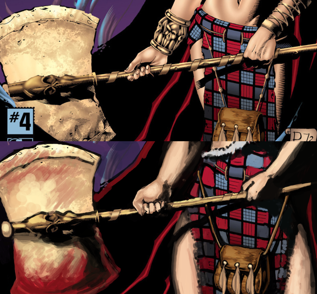
Her face in the background was like a 2-min afterthought I did at the very end cause it looked so goddamn boring. Overall, I’m very happy with the changes I did to her face and attire, though my rendering wasn’t as good as I wish it were now. I should have given her some body scars, too, but at least she has more stage presence on her own cover than none at all.
-Icy
Arhian
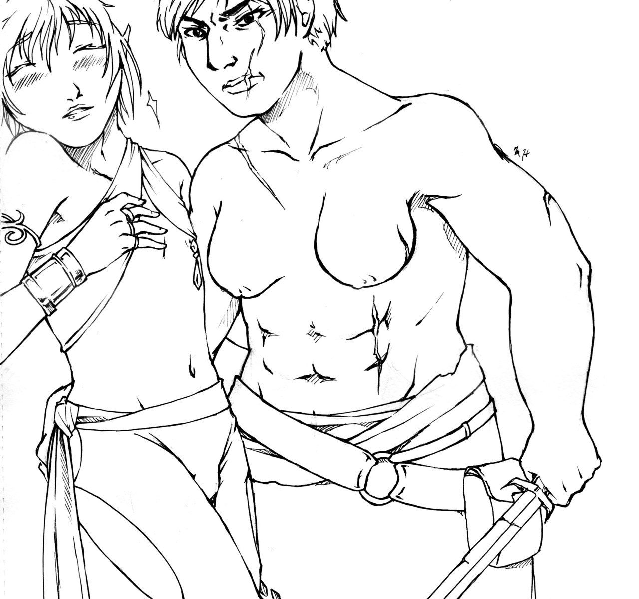
I decided to leave most of her skimpy costume as is, just getting rid of the physically impossible bra – Barbarians either go topless or wear something comfortable, not… this thing!
Her platinum, almost white hair inspired me to turn Arhian into a significantly older character. And in the Barbarian warrior’s life, with age come scars. Lots and lots of scars. Most prominent one is the big burn scar tissue on her left breast, which I referenced from real life. Perhaps a “gift” from a dragon?
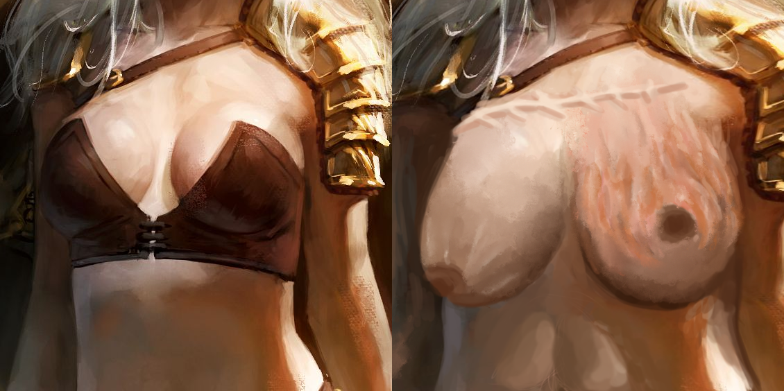
Then there’s the giant stitch scar above her breasts and some cuts here and there, especially her face. Speaking of which, I made it my priority to give her unique facial features instead of the generic conventionally beautiful supermodel mug.
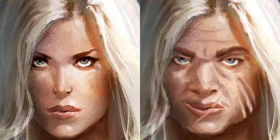
It’s by far my most satisfying face redo. I drastically changed the shape to be more squat and angular, with strong jawline. He original nose was a disproportionately small vestigial organ, so I have her a schnooze she can breathe through, and also made it broken, to match the scarred aesthetic. Then completed the look by getting rid of her makeup, undoing the obviously tweezed eyebrows, adding wrinkles and scars. I also changed her expression from vacant, vaguely “sultry” stare into a scowl of a veteran warrior.
As for her body, I just made it visibly more muscular, with prominent abs and thigh muscles. Her breasts are bigger in my version, as I wanted to present what time and gravity (and some scorching burns) actually do to the breast tissue. Nipples not only do exist, but they tend to point downwards the bigger the breast is! Also, boob stretch marks are a thing! Who knew?
All in all, I’m quite proud of that redesign. Hope you guys like it too!
-Ozzie
Mom, thanks by
This is one of the coolest things I’ve ever seen.
Oh man, am I ever here for this kind of thing.
It’s really amazing how storytelling you can convey when you focus on the characters and the story itself rather than dipping into cheap tropes that take a lot of work to say thing.
Especially if you’re willing to commit to letting your female characters get a little roughed up and scarred.
Beautiful.
– wincenworks


