The hilarious front line in the tragic war against ridiculous female armor
Tag: armor design
Posted on
Simplifying the Diablo Ladies, Part 1
We’ve talked about how Diablo makes such an effort to make very disappointing characters. So, it was finally time to take on some of those designs and try to make them less overdone and less….
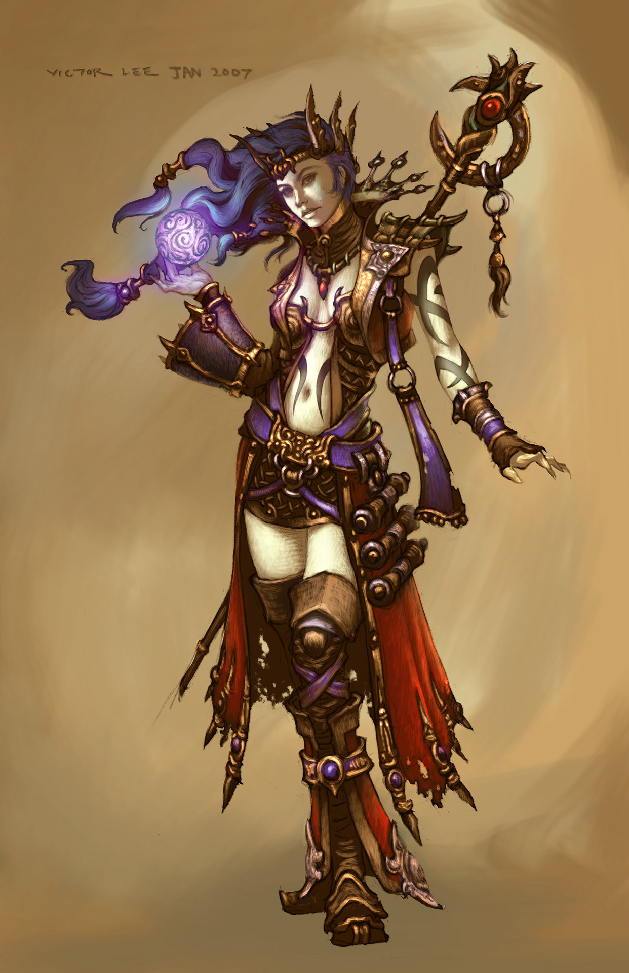
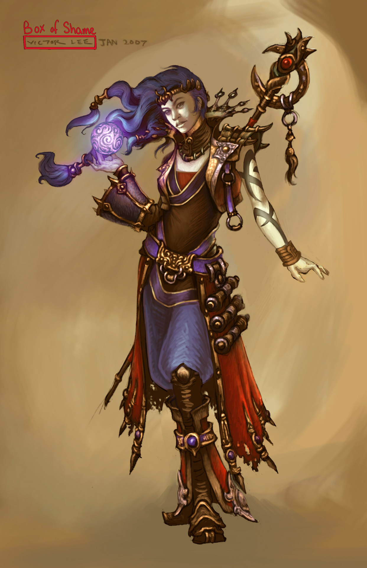
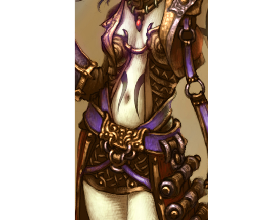
Anyway, I went for a concept art of the Wizard from Diablo 3. I stayed in the color scheme because I was more distracted by…. everything else that was happening. All the tiny details that only highlighted how little she was wearing… it had to go. I ended up giving her a simple tunic and pants, in order to have some grounded large shapes in the middle of all the small ones. I do like the shoes (below the knee, anyway) and the jacket, so I left them alone.
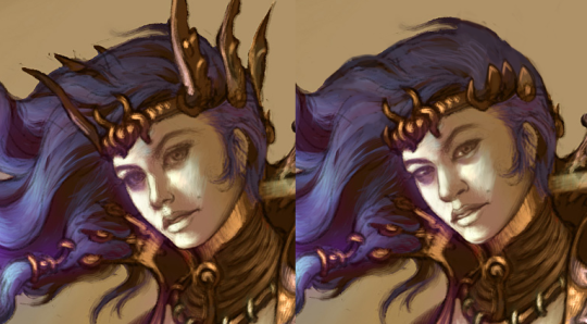
I did remove some weird-looking accessories, like the not-glove and the awful crown sharps, and I changed her face as I always do.
Definitely a simpler redesign, but it was still not easy to work around all the things that I wanted to keep in the design. I probably should have made her tunic a different color, but it’s still way easier to look at than the original. Hope y’all enjoy!
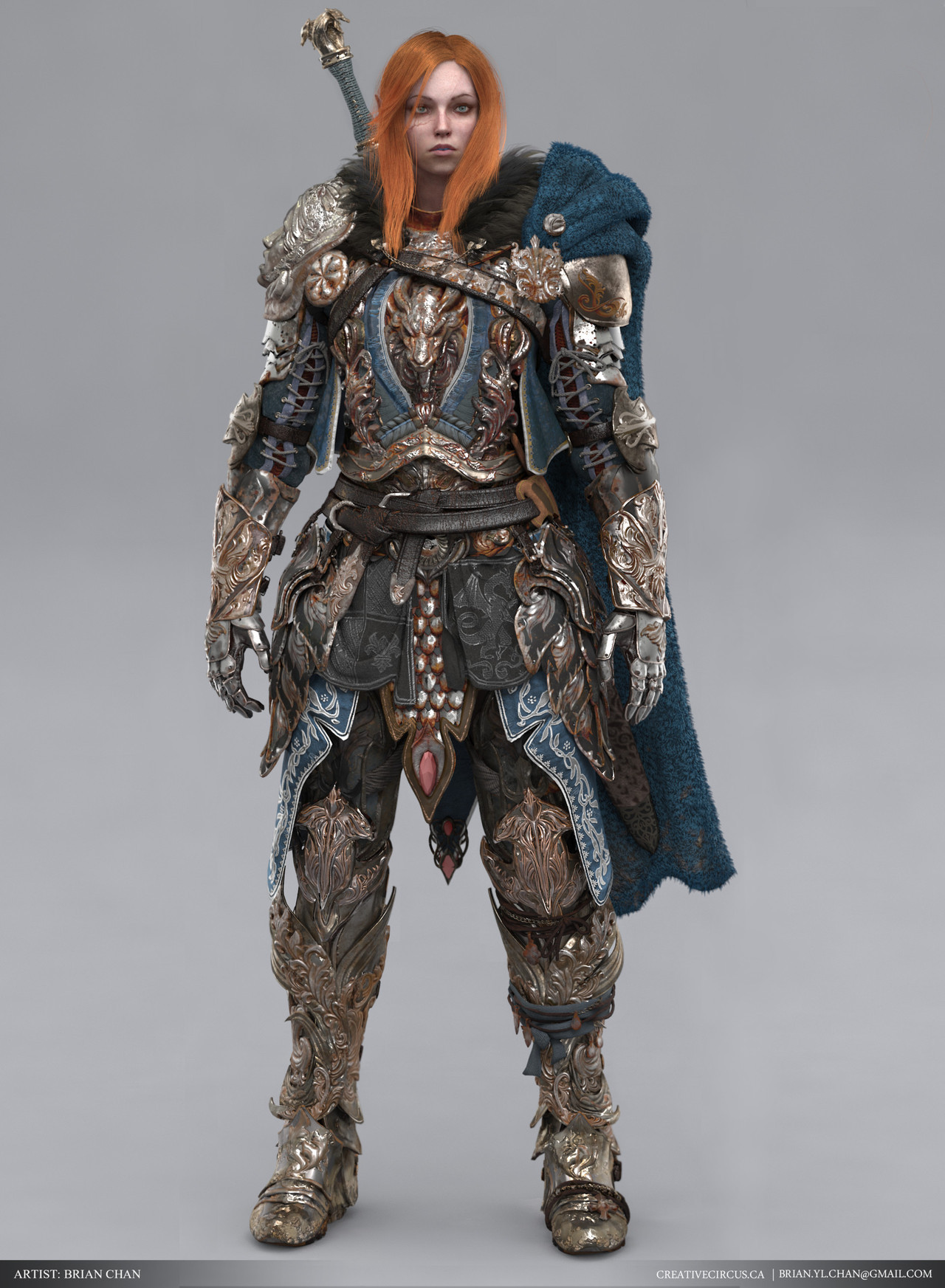
An excellent positive example of fantasy armor that is both lavish and regal, yet functional, battle hardened and just positively badass. Bonus points for the artist giving her a great looking battle scar.
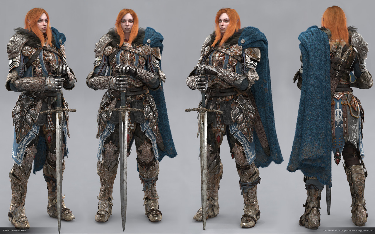
The turnaround above gives a good view of the armor overall, but I highly recommend visiting the ArtStation page linked above to get a more in depth look. The artist has put so much beautiful and astonishing detail, it boggles the mind.
It’s almost criminal that this hasn’t gotten more attention; I would love to see this in a game.
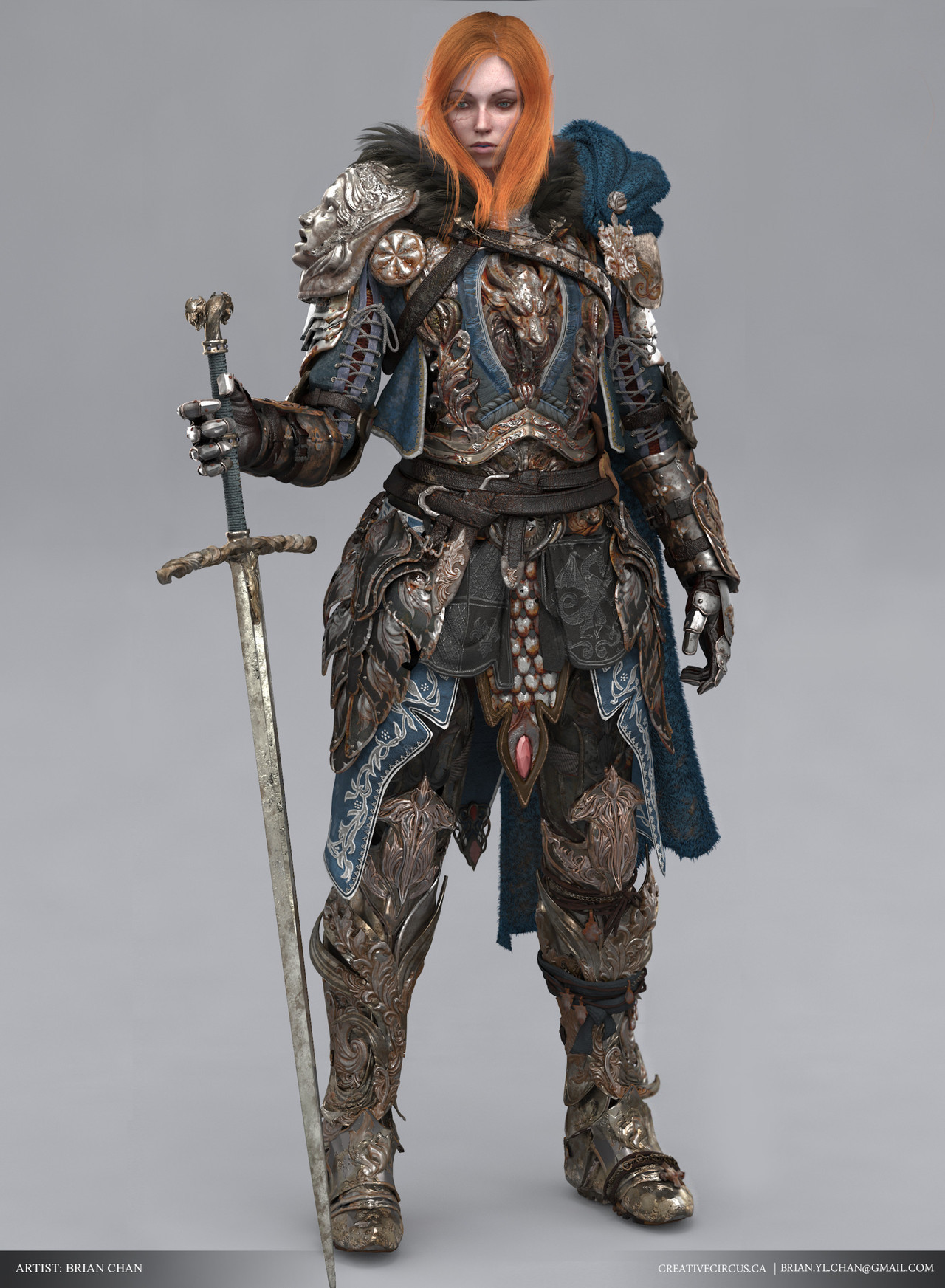
This is a bit too over-designed for my taste, but I definitely agree that this is a design more likely to be given to a man character.
And her scar is pretty nice! Definitely check this piece out on Artstation for detail shows and workflow breakdowns, if you’re into that kind of thing.
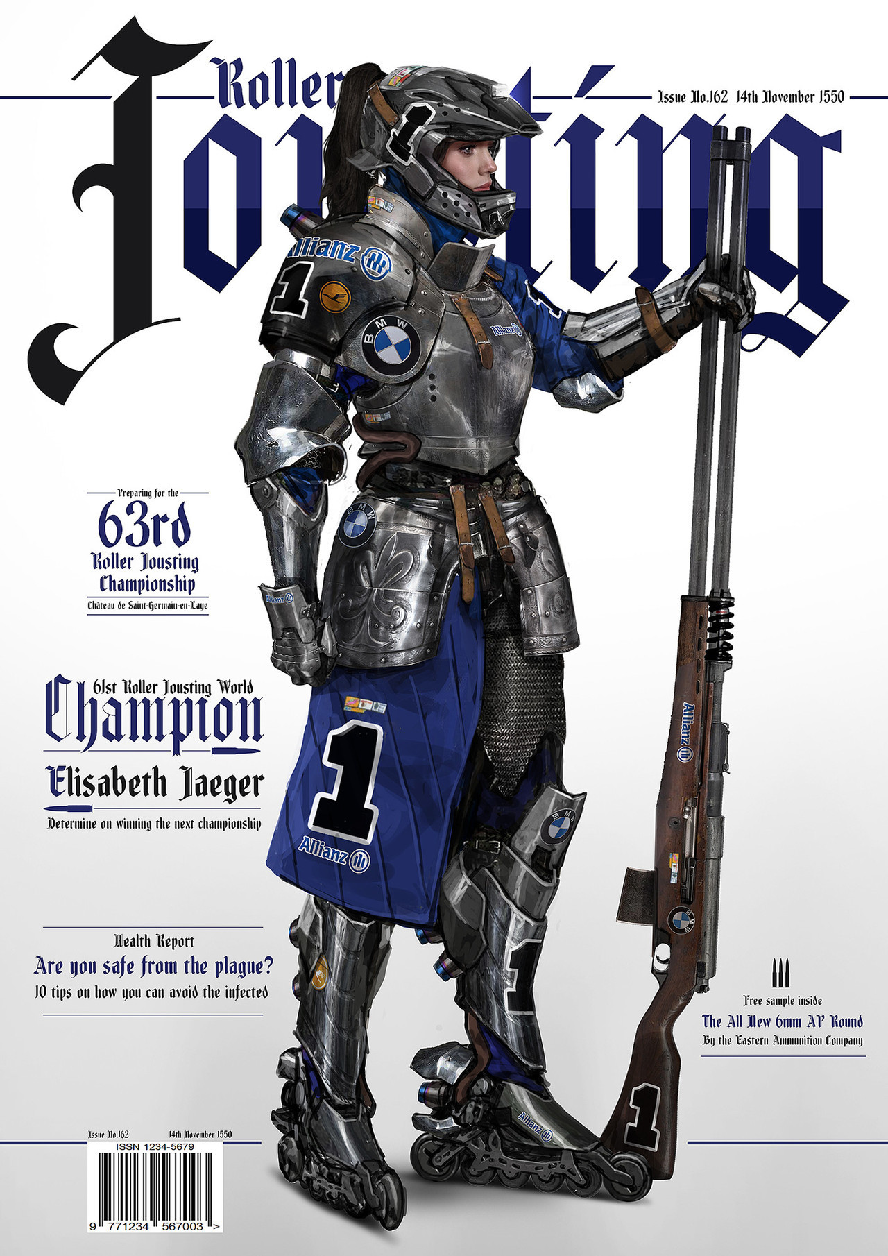
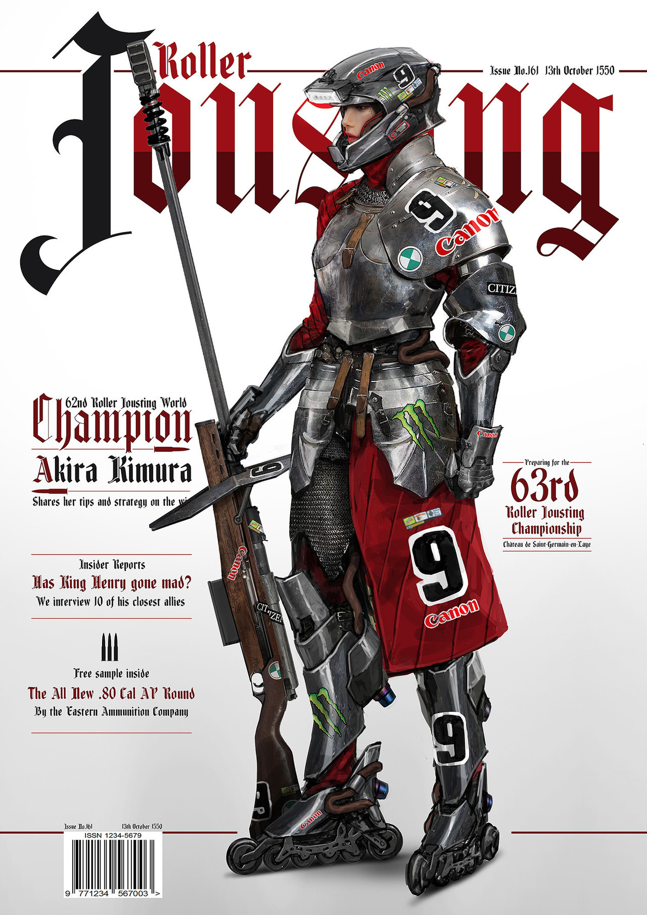
What a cool concept, and a cool mashup of armor styles! Even though it’s medieval breastplates with modern helmets, it still looks good and cohesive. I also really like the way they represent motor companies, like in a real racing sport. We really need more creative ideas like these in fantasy.
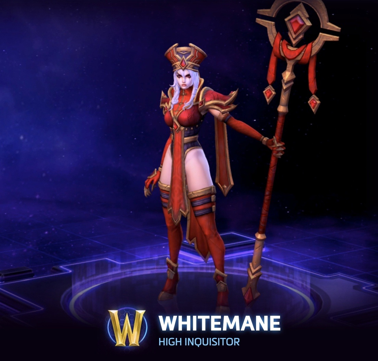
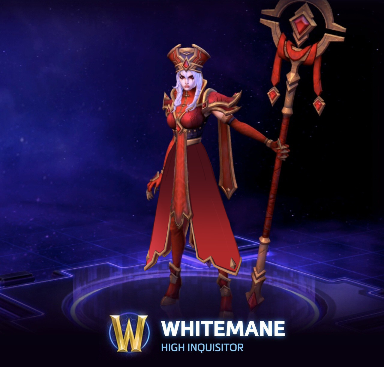
With Sally Whitemane’s High Inquisitor skin, I didn’t want to change much, as her design has some really cool elements and style. Rather, I chose to turn her leotard thing into a coat, keeping the style of her hanging banners. After all, the idea of an inquisitor is much more closely associated with flowing robes and coats, and a leotard isn’t usually considered appropriate attire for religious leaders.
Such a small change in the overall design, and suddenly she looks like a religious leader! I would love to see a skin similar to this one in-game, instead of what we ended up getting.
This isn’t the fault of the redesign, but covering her legs really highlights how the original artist considered Whitemane’s skin to be a color in her palette; without it, she just has red and gold, basically (the black is barely present). The original design just keeps disappointing, really.
One small thing, and granted, it’s hard to see in the picture, but I’d get rid of her ridiculous stiletto heels. I think overall, this redesign really showcases how inadequate the original is in its intent. Thank you so much for the submission!
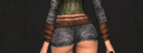
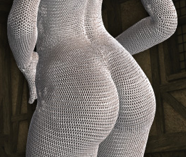
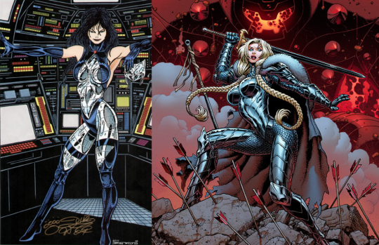
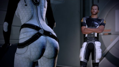
It’s bad enough when a sci-fi setting has all the ladies wearing painted-on tights so snug that you can see all the way up their respective buttcracks, but then they go and do it with the armour, too.
Like, it’s armour.
It’s a solid chunk of heavy, rigid material.
How does that work?
How do you walk with a pair of inflexible domes tightly cupping your glutes?
Hell, how do you even stand when you’ve got a quarter-inch durasteel plate wedged so far up your ass you’re tasting metal?
That said, butts or no butts, armor so snug it looks like shiny bodypaint/metal spandex is a blight on costume design that should be stopped.
~Ozzie
As we throwback this nightmare fuel this week, I’d just like to casually remind everyone that, at least when it comes to 3D modeling, giving a character individual butt cheeks and individual boobs is way more work than giving them actual Real Person clothes. So there are still people in the gaming industry who look at their budget, look at their specs, and then decide that, yes, spending that money on individually-modeled boobs and butts is a Good Investment.
That’s not even metal, and even it looks physically painful.
-Icy
Posted on
Posted on
Uprooting the Sexy Flower Warriors
[We’re not sure how a draft gets posted without our permission, but Tumblr might as well start collapsing from all sides at this point. Here’s the actual full post!]
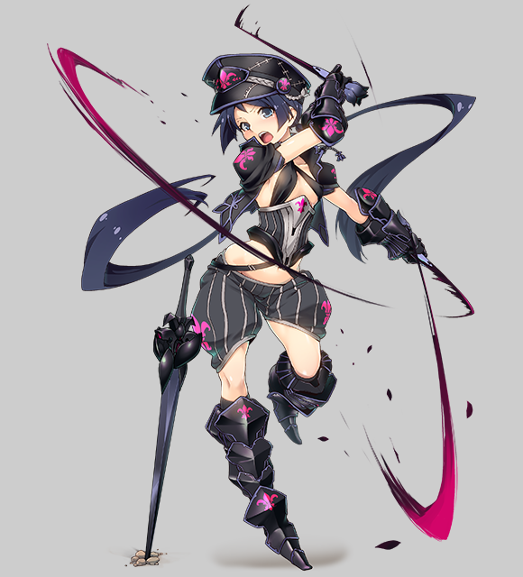
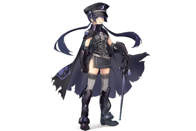
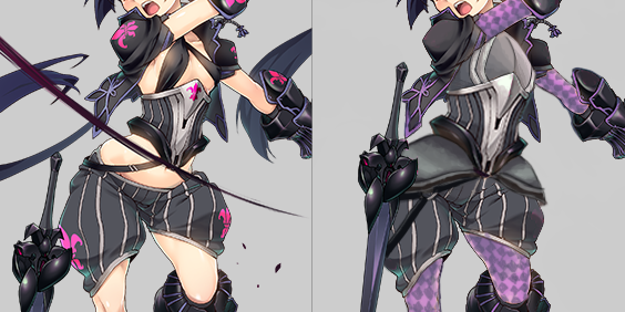
This dominatrix-looking lady apparently “evolved” by exchanging a short dress and no pants for short pants and two ribbons. Her previous form, for comparison:
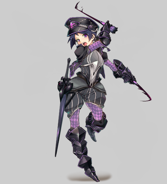
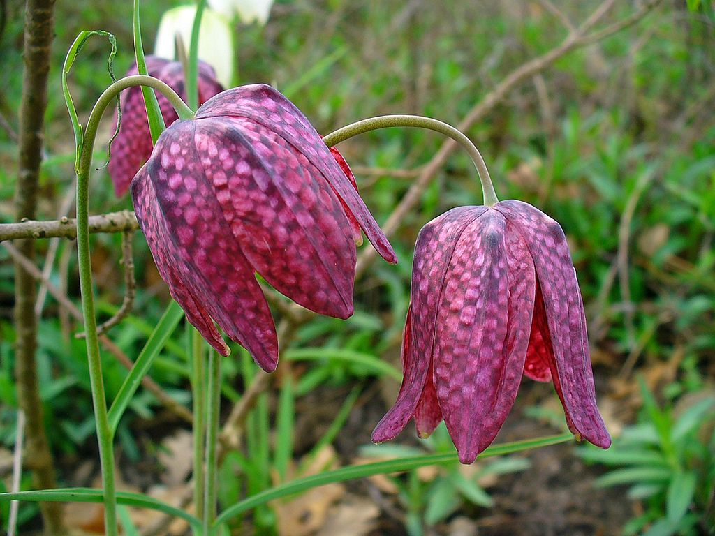
Looking for inspiration, I just googled “fritillaria” and I learned that in Polish we call this kind of lily a “chessboard flower”, for pretty obvious reasons, once you look at its petals:
I decided that though this character seems based different species, fritillaria camschatcensis (there was no info on her being “chocolate lily” back then), fritillaria meleagris is much more striking visually, so I included its colors and chessboard pattern in my redesign. She doesn’t resemble her actual flower in the first place anyway.
While the costume is amazingly skimpy and objectifying (especially that excuse for a “bra”), it’s not without a potential. There’s promising metal cincher, which I decided to enlarge and turn into full breastplate, and she comes with POOFY PANTS, a staple of BABD redesign streams, which I adorned with tassets that compliment their shape and match the breastplate.
I got rid
of her long-ass pigtails and of all the action lines, which collectively made the composition more chaotic than dynamic. Minor thing that bothered me was her sword being stuck in the ground for some reason instead of fastened to her belt, so I quickly fixed that too. The final touch were, of course, sleeves and tights with purple chessboard pattern, which tie the whole thing together.
I found the abundance of fleur-de-lis symbols on her to be hilariously excessive, to the point I erased all of them during the stream. After some deliberation I figured that maybe the one on her hat fits, so I just muted its color, because magenta doesn’t fit the new scheme I gave her.
All in all, I find Fritillaria to be one of my most inspired redesigns, which makes me doubly disappointed in her creators, considering they could have just googled a flower photo to get some non-boring ideas.
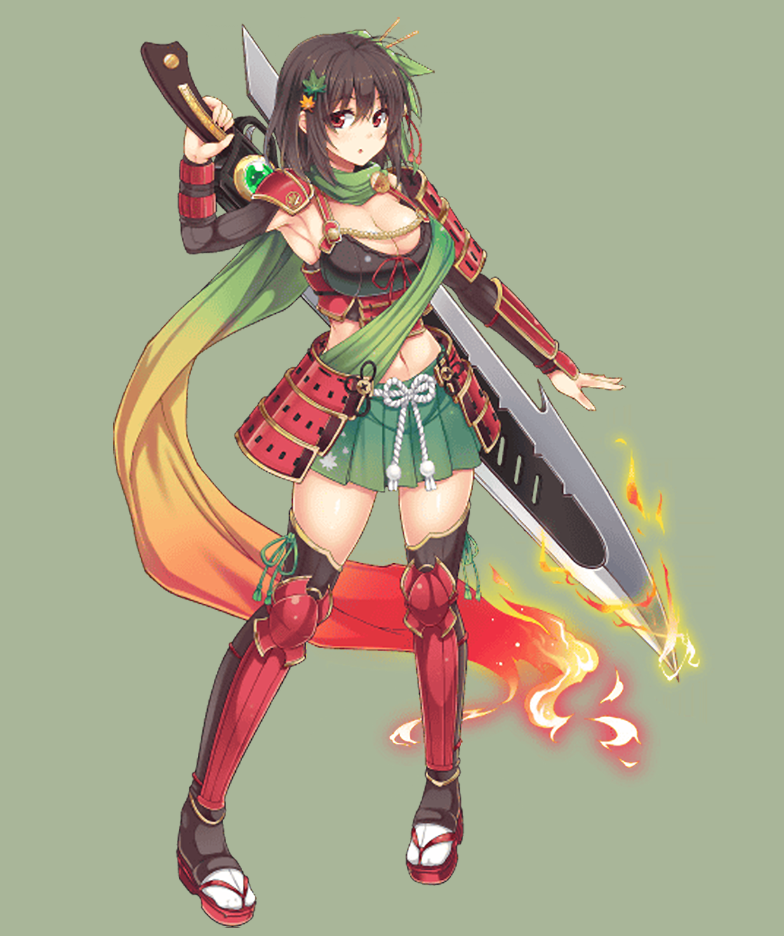
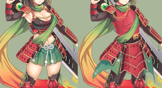
Love how she’s apparently Maple by the fact that she has some maple leaf hair clips and a bit of a maple leaf pattern on one small part of her mini skirt. So for this one, I channeled my inner Blizzard character artist, in that I wanted to way overdo the whole maple leaf theme. (I used samurai armor as reference.)
I ended up redoing almost her entire torso, since I needed to give her an actual breastplate, instead of… I guess it’s a crop top camisole? (Do those exist?) Then I gave her actual kusazuri (the plates hanging down her legs), and made them maple leaf shaped!
I did give her a less traditional chest piece, but there are so many small shapes in the design that we needed the main armor pieces to be bigger, I think. I did break it up with a huge maple leaf on it though.
I also hated everything about her face and hair, so I gave her a more traditional hairstyle to match her more determined expression. There were also a lot of smaller edits, like flipping her foot around so she’s not standing as awkwardly, and adding some volume and muscle to her sword arm.
And finally, I added a few more small maple leafs to her “skirt,” to really reinforce that maple leaf theme. I’d hate for people to miss it. Though, honestly, after finishing this redesign, I think she should just wear a maple leaf costume.
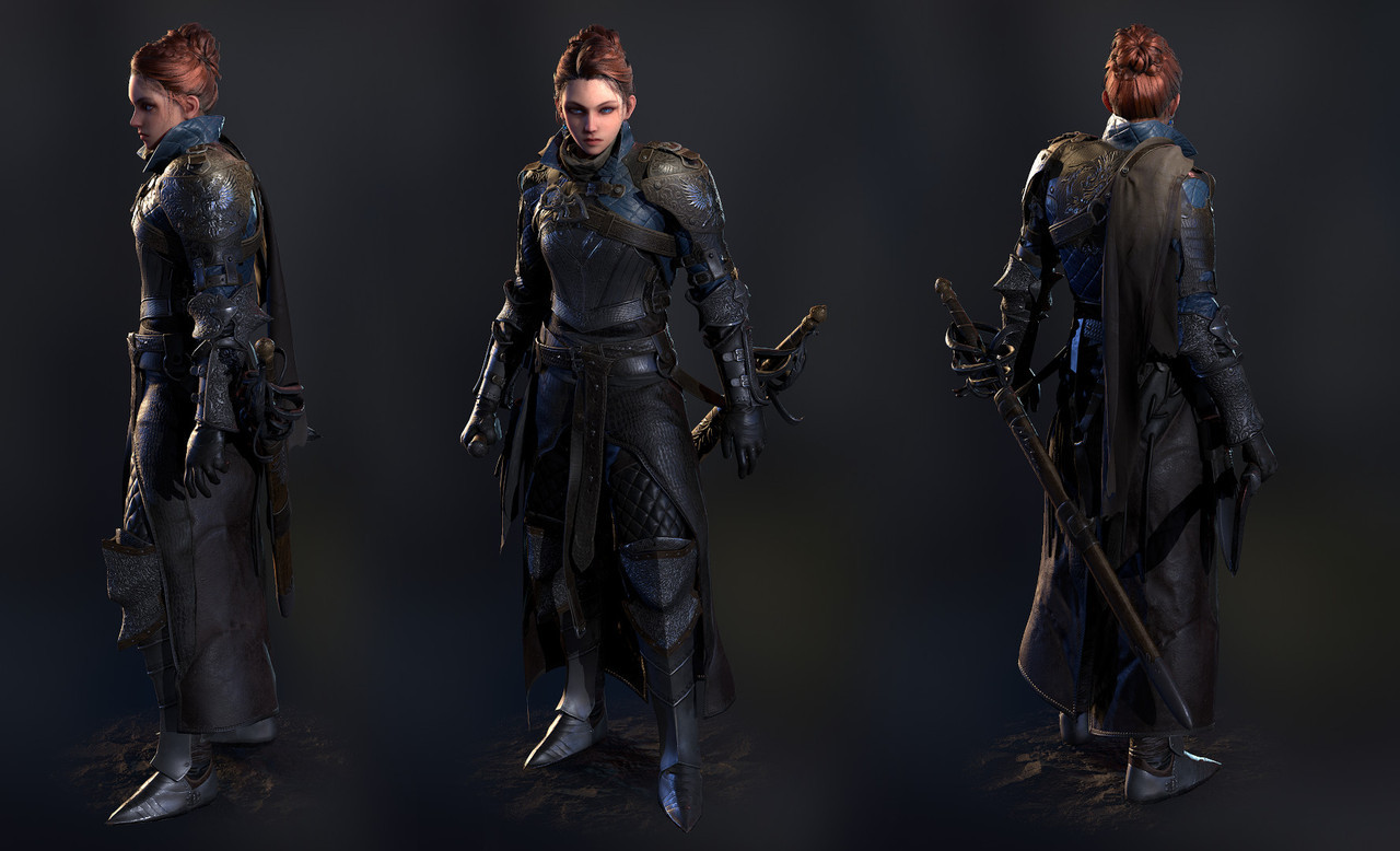
This work may not be finished yet, but it still looks amazing, and I wanted to show it off here. Everything in this design, from the sensible yet feminine hair to the balance of the different materials, works for me. The designs on the armor make me think that this may be a Grey Warden character from Dragon Age, but that’s unconfirmed.
The project page for this has a lot of detail and modeling breakdowns, so I highly recommend checking it out, because there are so many lovely details that are hard to see without the close-ups.