Tidy Up Tuesday #99

It’s been a while since we did one of these.

For who saw the recent Madalorian post and were curious about what better plate armor for busy women might look like – we’ve covered in a previous post.

Generally speaking, accommodations in armor are made for everyone – its just when you standardize your army, you standardize the accommodations and create the illusion that its “normal”.

The reason most armor like this is painfully uncomfortable to busty women is because in our extremely misogynistic society, the “default” armor designed for fairly flat chested men. (Military generally issues female soldiers “small” sized male armor, for example).
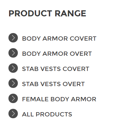
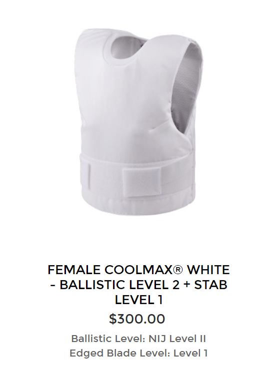
(Yes that one fairly flat chested vest was the entire catalog for women on that site with four separate categories for men)

form fitting” is pretty much never a suitable accommodation for overt armor (ie not concealable) armor because it creates problems with energy transference and denting. The reason the female Mandalorians gear looks more comfy is it’s the sort of thing you’d expect under the plate armor.

The reason they settled on that the outer layer instead of more innovative solutions is the same reason why the female Mandalorians are smaller and have narrow waists. because once a show takes off, Creepy Marketing Guy inevitably wants to get involved.

-wincenworks

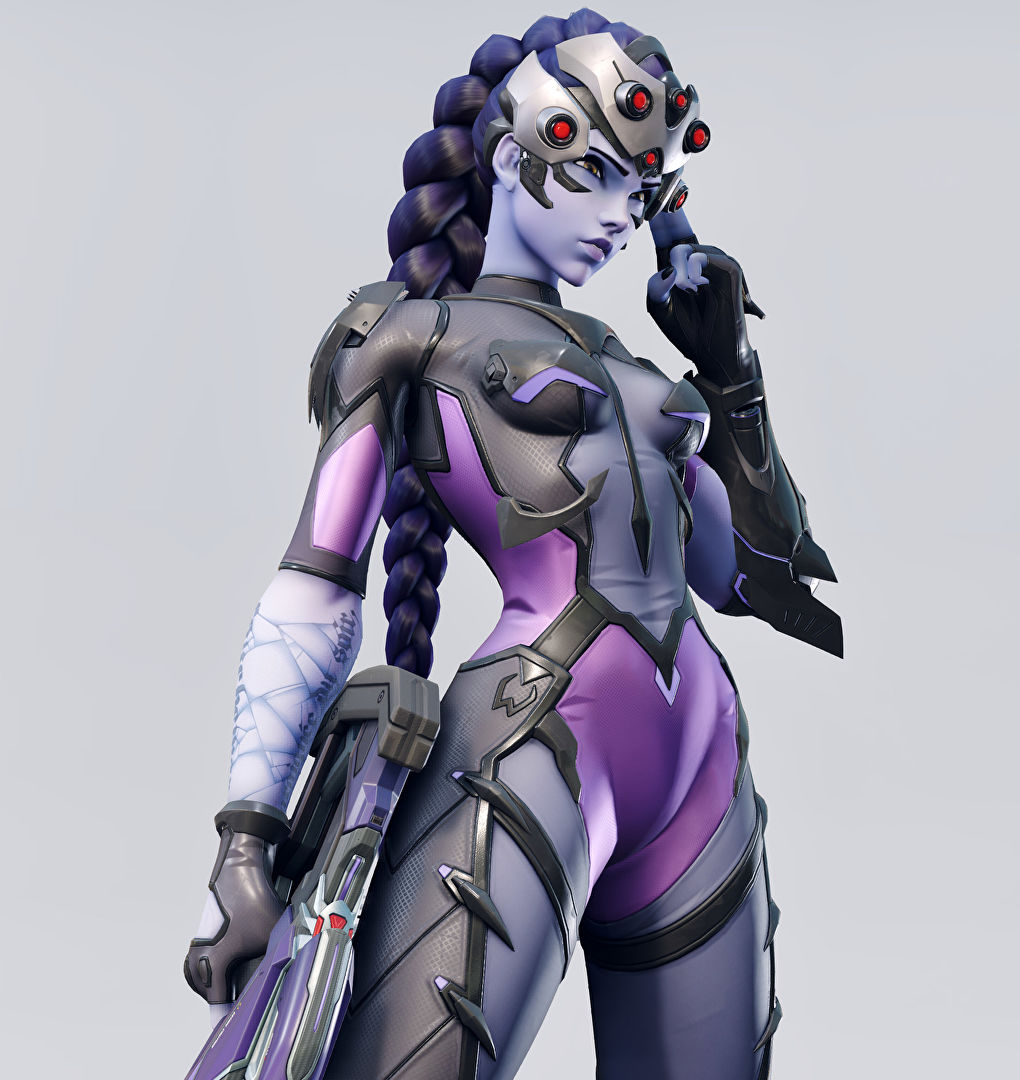
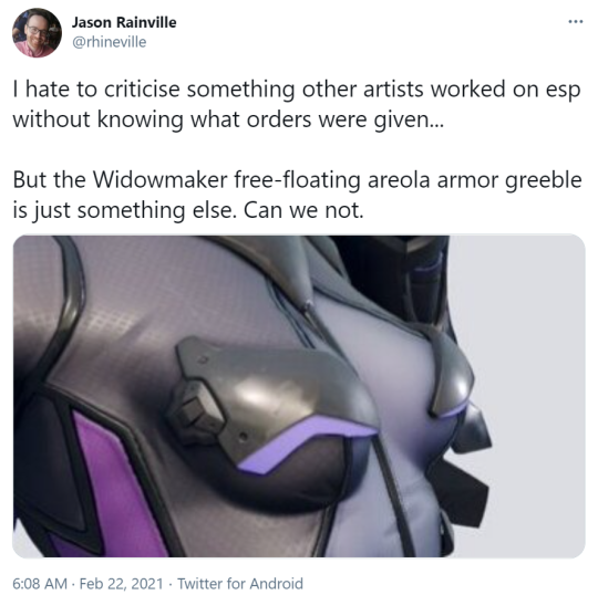
So, incredibly, Blizzard has managed to come up for yet another outfit for Widowmaker that makes less sense than her original outfit – and it works as a pretty iconic example of a costume as the sort of complete nonsense when you get cis men trying to design sexy lady fashion without taking the time to study actual fashion and clothing design.

Bayonetta is beloved by many women, because while her outfits are ridiculous they also scream “fashion” and thus convey a sort of narrative that she looks like that because she wants to has the power to. It’s not unlike how Duke Nukem runs around in an ultra manly sleeveless top… except that well, it only got signed off on because it appealed to horny cishet men.

This outfit conveys that the artist likes naked (skinny, conventionally attractive) women and has tried to obfuscate it by adding random accessories and design quirks until it looks “unique” (in the same way a randomly generated hash code is unique).  How it fits into fashion or even just clothing is secondary to how many extra polygons it has.

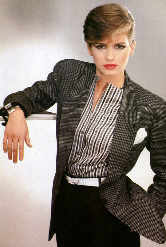
Now I know what you’re thinking, “Kim, you just want her to wear a suit.” and that is not incorrect, but more importantly I want Blizzard to look at how real fashion designers make real woman look powerful.  More like, say, how Giorgio Armani dressed Gia Carangi:

image

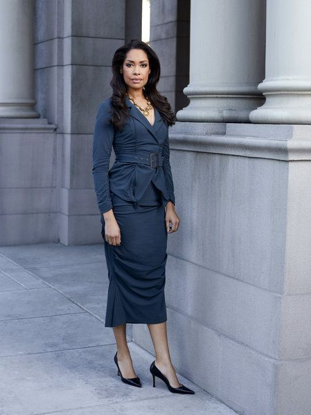
Or Gina Torres was dressed in suits:

image

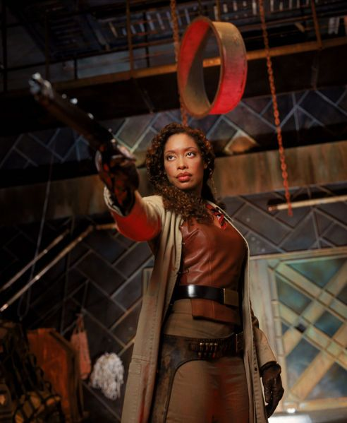
And how Gina Torres was dressed in Firefly:

image

And learn how to mix it up into functional, aesthetically pleasing designs that convey power and story and character.

And we could avoid… so many problems

image

(tweet here)

– wincenworks

caitsketches:

Daytime reblog and also I’m gonna tag @bikiniarmorbattledamage

caitsketches:

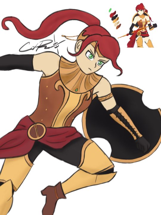
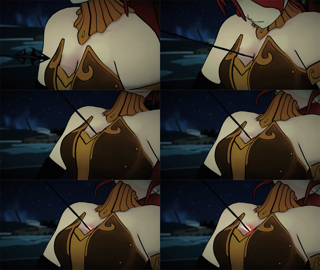
I wanted to do one from the front so it’s easier to see what I did with her chest plate! I just made it a lil more protective while keeping with the design

What do you think?

I think she would not get an arrow through her cleavage if she wore this armor!* 

image

Good job in fixing Pyrrha, @caitsketches​! I appreciate how much difference such a simple change can make. 

Personally, as a big opposer of Sameface Syndrome, I have a huge beef with RWBY’s character and costume designs in general. I welcome any fix to their absurd double standards and obsession with making everything look gratuitously “cool” and anime-like without questioning how much it fits the characters and worldbuilding. Especially the casual sexualization of teenage girls. Uuugh. ?

~Ozzie 

Comparing between this and the original honestly points out how embarrassingly close the creators were to a good design. 

Literally connect the neck thing to the chest piece, and give her pants, and we wouldn’t need a redesign. 

-Icy 

*Sorry not sorry for spoiling ancient seasons. 
Also, while plate armor isn’t considered a fool-proof protection against arrows, it’s obviously better than no protection at all

redtallin:

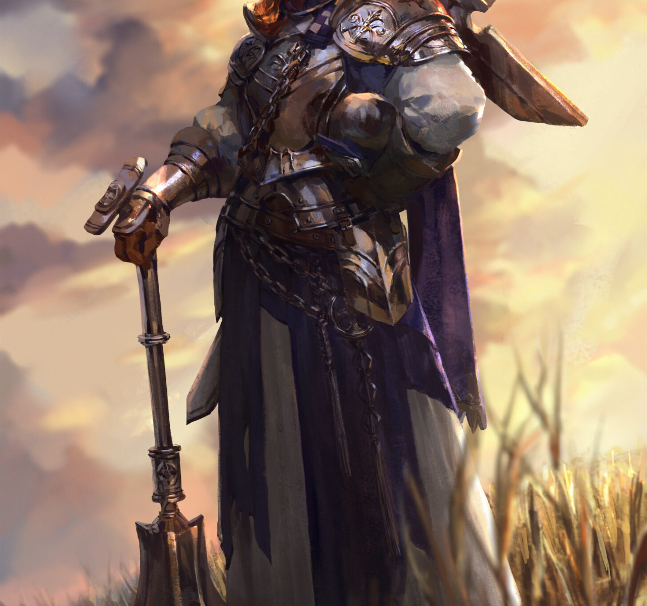
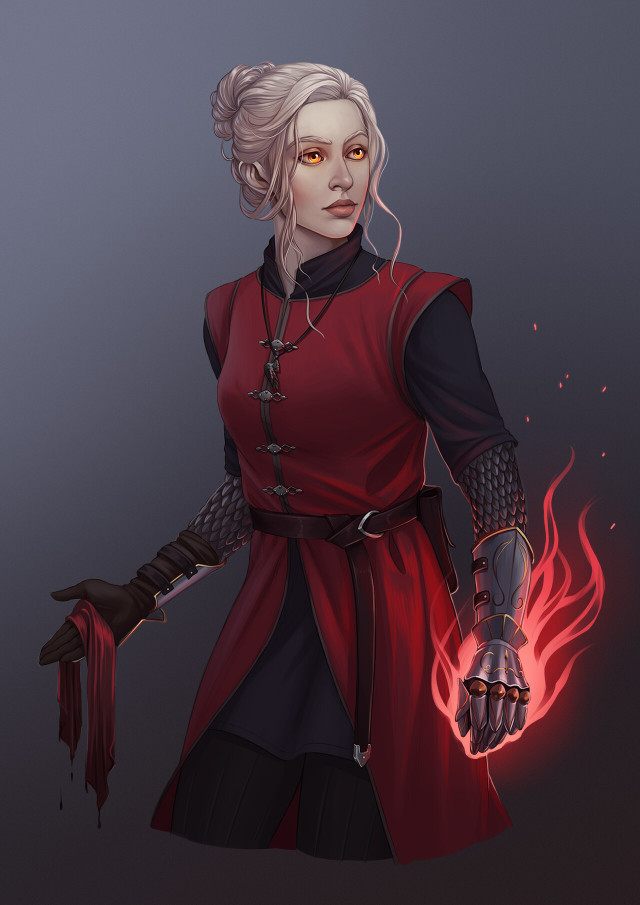
An Aasimar Cleric for a friend of mine! Painting the gauntlets and flames was so much fun!

Oh, I really like how her outfit is overall uncomplicated, so the eye is drawn to the flaming gauntlet and her golden eyes. The choice to break up the shapes in this way, with the big central shape surrounded (and bisected) by smaller ones, also helps the eye take in the entire design. It’s also just a nice way to “casually” wear armor.

Even though this design is made up of “simple” clothes, it’s still interesting and pleasing to look at, and I really like the color scheme. And the rendering is just so crisp and nice!

-Icy

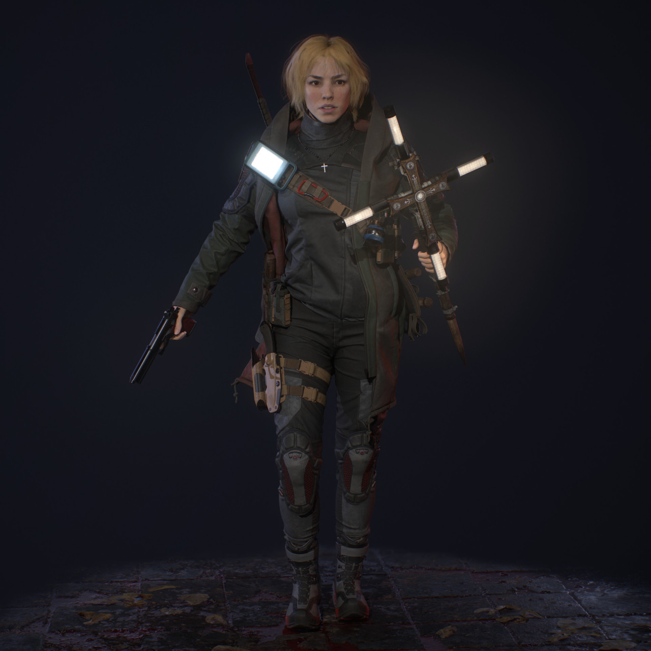
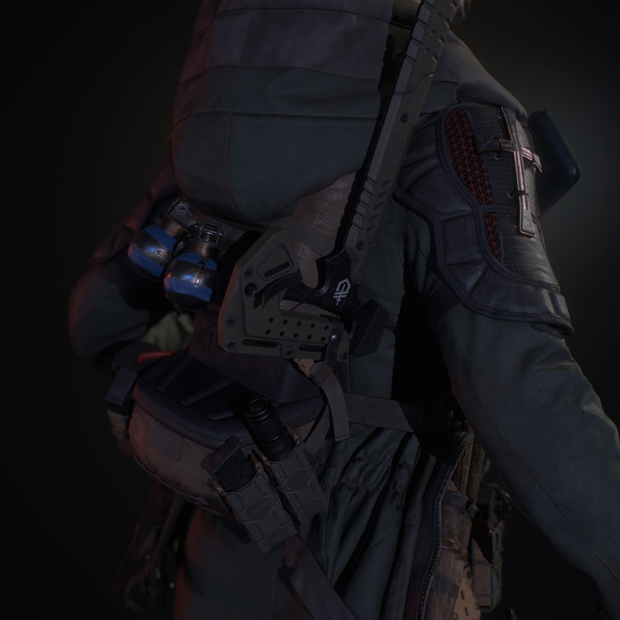
Vampire Hunter (Judge), by Dmitry Bezrodniy

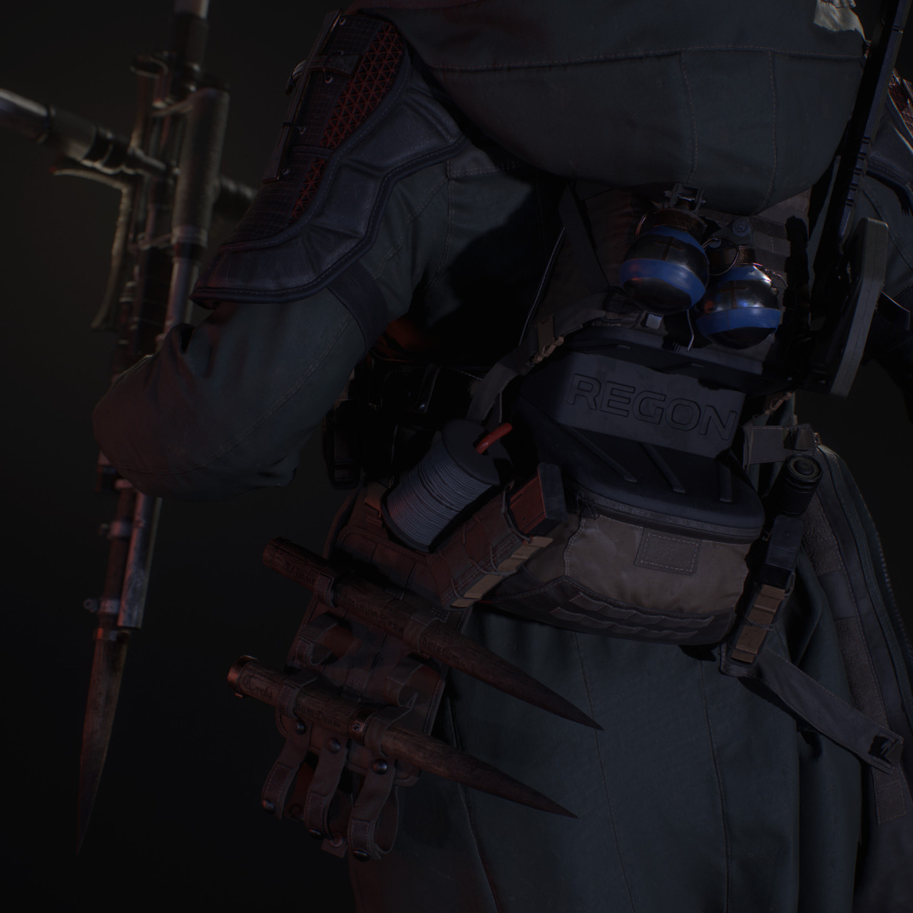
Wanted to showcase a cool character who’s designed for a more modern setting. There’s a lot of cool details here, from her knee pads to the holy water she has ready. She’s dressed for cool nights, exactly the kind of time a vampire hunter would be on the prowl. I also love the lamps she has on the big cross, and even on her backpack strap, I think that’s clever. There’s even a stake attached to her big cross! I highly recommend checking out the original, where you can see way more screenshots, as well interact with the 3D model itself.

-Icy

kainissoable:

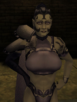
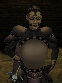
I tried giving Umah from Blood Omen 2 some proper armour, design based broadly off the single piece of armour to her name – that weird double pauldron thing. Edited the bottom half of her bikini into a fantasy tabard, and if I’d thought to use a fuller screenshot I’d have put the dragon from her Defiance concept art on there, but thought of that way too late. Come up with your own reason for why she has the Soul Reaver, preferably one more interesting than the fact that it’s hiding some lop sided hip armour that would have been a pain to fix. Another case of not as good as I was hoping for but automatically an improvement on the bare skin chafing nightmare of the original.

Personally I ascribe to @bikiniarmorbattledamage‘s tongue in cheek philosophy that women in fantasy should be fully armoured while men should wear something tastefully revealing. Legacy of Kain at least gets halfway there with the well muscled men in leather pants, just a shame about the prevalence of bikini armour.

Wow, the original is a yikes, especially the huge boob part made from unidentifiable material. I guess it counts as better than most booplates we’ve  seen on BABD because there’s no boob window/exposed cleavage, but that’s one low bar to clear. Also, one huge grey boob blob on her chest is somehow extremely distracting and boring at the same time. At least put some symbol on it or something! 

I like your simplistic redesign, @kainissoable. If me or Icy were doing it we’d probably put some design (likely sampled from other part of the costume) on the breastplate, to break up this huge shape, which was also the original’s problem. It still works objectively better than the generic garbage the original was. 

~Ozzie