The different takes on Edi with his explanation for how he was trying to push the uncanny valley and make something intentionally kind of creepy is what really gives me those “how it could have been~“ feelings.
I feel like any time you say “I’m disappointed they just went for sexy with this design” you get a mob of people from the internet jumping all over you to say “Well that’s her choice she has the agency to be sexy it’s very empowering yadda yadda yadda" but in reality those designs uuuusually represent a meeting where the designers presented a wide range of options exploring a variety of concepts and the powers the be say “We want the sexy one but make it sexier". I have done design work for clients and experienced that trickle down of “Make this character look really old and ugly. Well not too ugly. I mean, she should look like she used to be hot when she was younger. Actually come to think of it just draw someone that looks like [this attractive actress]. Well that actress but when she was younger. Don’t make her look tired or angry. Let’s say she’s actually in her twenties but looks like she could be a teenager.“ firsthand. It’s disappointing, and even moreso when you express disappointment with the final version that the higher ups on a project settled on and people act as though you’re a monster for suggesting this imaginary character did not actually choose to look the way they did and was in reality designed, revised, and approved by a group of people with the power to make them look like absolutely anything at all.
It’s really interesting to see the design process behind a lot of these things though, I really get a kick out of that description of how designing Fenris went “He was like a game of musical chairs. His design kept changing until the music stopped and the version we had was the version we had to live with.” Especially considering how many people complained that his final look didn’t suit the world of Thedas and looked “too JRPG"
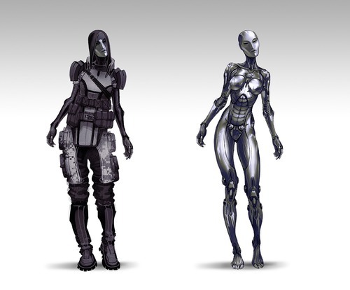
I also know it got thrown out super early but I gotta say I am mad in love with the idea of Shep having to use Reaper tech to take down Saren and looking all piecemeal and roboty.
My favourite concept art books are the ones that are just like “here are all the things we tried that didn’t work and this is why they didn’t work and these are the things that we really liked but they wouldn’t let us do" because there is so much push and pull in character design of what’s exciting and creative versus what’s marketable.
Some thoughts on character design from a professional. A bit off-topic, but still relevant to what we discuss here.
Some parts bolded by yours truly
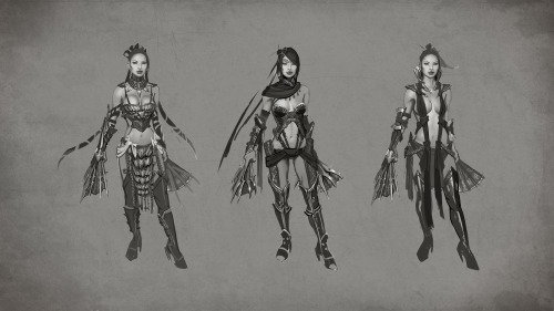
Bringing this back since it relates to the recent post regarding Mortal Kombat X. Concept art can be a really good indicator of a studio’s lack of interest in exploring character ideas too.
If the concept art for female characters is endless variations on sexy lady themes…
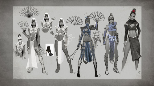
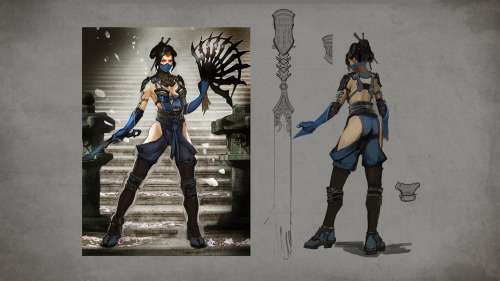
Kitana is a signature member of the Mortal Kombat roster, so we wanted to come up with something exciting and fresh for her look in Mortal Kombat X.
Past incarnations have tended to favor the royal qualities of the character over the warrior aspects, so we decided to reverse that for her costume. She has a stealthier, more ninja inspired design with blue as an accent color against the black parts of her costume.
The design:
Yeah this makes the actual design priorities pretty obvious.